Working with Color in Generative Art

Color is something that many generative artists struggle with. It can be frustratingly difficult to get right, and there are no simple rules that work 100% of the time. I highly recommend that you study the color work of traditional artists as well as read about color theory. The more tools you have in your bag, the better. Today I'll be describing some of the common techniques and patterns that I use when working with colors in generative artwork.
EDIT: In 2021, I went much more in-depth on the arrangement of colors, so have a look at that once you’ve finished this article.
HSB
One of the simplest and most effective things you can do to improve your generative color work is to switch from expressing colors with RGB to HSB (Hue, Saturation, Brightness). This allows you to control colors by their three essential components. If you're coming from using RGB, this will change the way that you select your colors and think about their relationships. For example, being able to easily specify that all of your colors have the same hue, but different levels of saturation and brightness, is a game changer. RGB is for machines, HSB is for artists.
In Quil (Processing), I set my colors up like so:
(color-mode :hsb 360 100 100 1.0)This gives the hue a range of [0, 360], the saturation a range of [0, 100], the brightness a range of [0, 100], and alpha (transparency) a range of [0.0, 1.0].
RGB is for machines, HSB is for artists.
Randomization
Once you're using HSB, it can make sense to randomly alter the components of your colors. For example, you might keep the saturation and brightness consistent, but allow some minor variation in the hue:
(fill (random 150 155) 40 70)With small levels of variation, I've found that this can help to give images a slightly more natural, organic feeling. As a bonus, this technique combines nicely with the next two things I'll describe.
Gradients
Gradients are a fantastic way to add controlled variation to your colors. I use them in almost every work that I make. The idea is simple: as one variable changes (x position, y position, distance from a point, iteration number, etc), transition from one color to another. Often the gradient will apply to only one component of the color (the hue, saturation, or brightness), but sometimes it makes sense to adjust all three components.
I have a utility function that I use all of the time to make this easy:
(defn rescale
  "Rescales value from range [old-min, old-max] to [new-min, new-max]"
  [value old-min old-max new-min new-max]
  (let [old-spread (- old-max old-min)
        new-spread (- new-max new-min)]
    (+ (* (- value old-min) (/ new-spread old-spread))
       new-min)))
Using this, it's easy to create a gradient from green to blue down the y-axis of the image:
; loop y from 0 to 1000 in increments of 5
(doseq [y (range 0 1000 5)]
  ; green at the top, blue at the bottom
  (let [hue (rescale y 0 1000 130 220)]
    (fill hue 90 90)
    ; draw a rectangle that spans the width of the image
    (rect 0 y 1000 5)))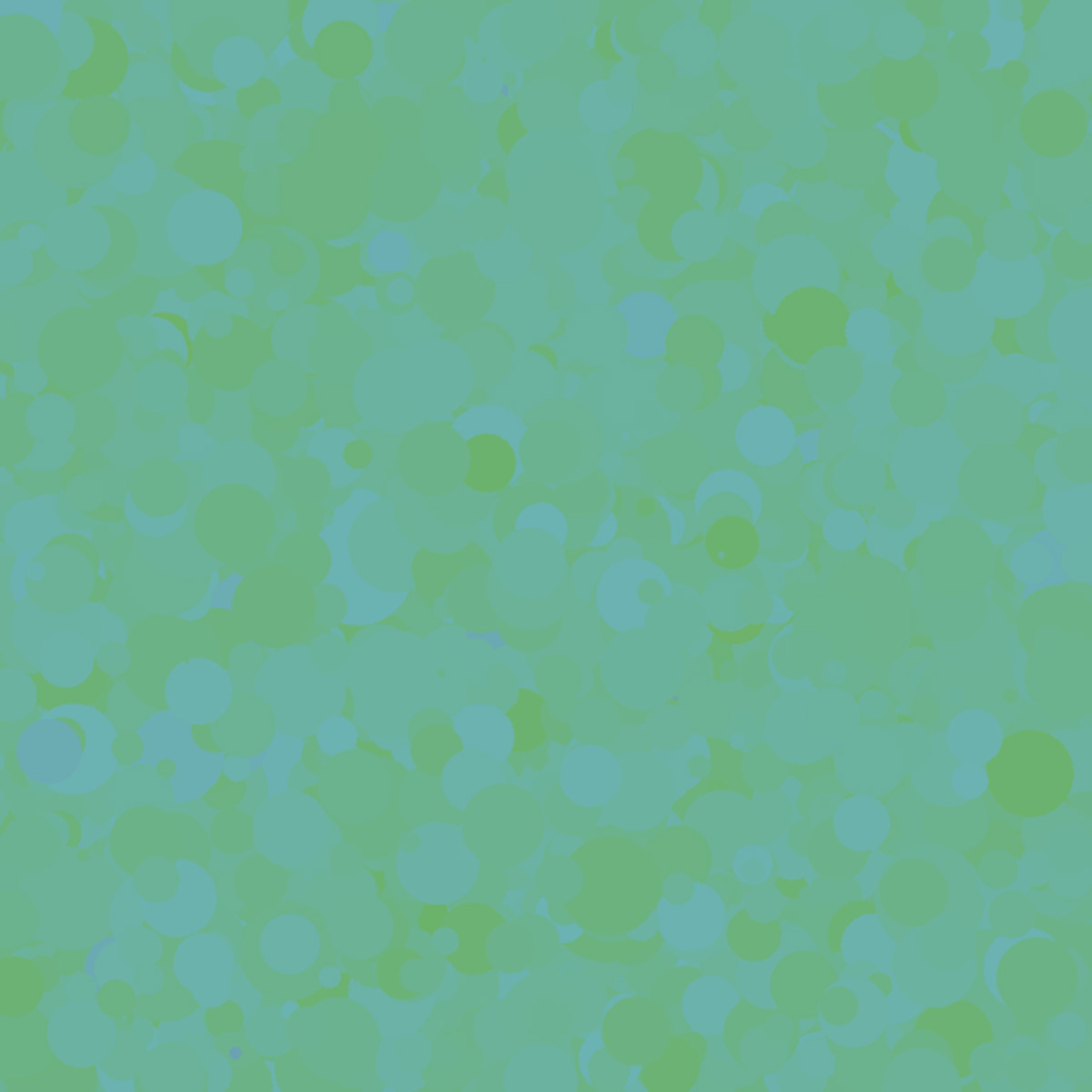
Sometimes it's good to make the gradient less than perfect by introducing random variation. For example, I might do something like this to slightly change the "value" of y that we're picking the color based on:
; green at the top, blue at the bottom
(let [hue (rescale (random y (+ y 100)) 0 1000 130 220)]
There are so many ways to utilize this technique. It's extremely versatile. I recommend you play around with all sorts of variables that you can base the gradient on. The gradient also doesn't have to be linear, quadratic or logarithmic gradients are also handy.
Probability Distributions
I usually specify my color palette in terms of a probability distribution. For example, this means that when my program is selecting the color for an element, it has a 70% chance of choosing white, a 20% chance of choosing blue, and a 10% chance of choosing red.
To make this simple, I defined a weighted-choice function:
(defn weighted-choice
  "Given a sequence of alternating item, weight arguments, chooses one of the
  items with a probability equal to the weight.  Each weight should be
  between 0.0 and 1.0, and all weights should sum to 1.0."
  [& items-and-weights]
  (assert (zero? (mod (count items-and-weights) 2)))
  (assert (>= (count items-and-weights) 2))
  (let [r (random 0 1.0)]
    (loop [weight-seen 0
           remaining-items items-and-weights]
      (if (<= (count remaining-items) 2)
        (first remaining-items)
        (let [new-weight (second remaining-items)
              end-bound (+ weight-seen new-weight)]
          (if (between? r weight-seen end-bound)
            (first remaining-items)
            (recur (+ weight-seen (second remaining-items))
                   (drop 2 remaining-items))))))))
Continuing my example, I would pick colors like so:
(apply fill
       (weighted-choice
         [  0  0 100] 0.70    ; white, 70% chance
         [220 50  50] 0.20    ; blue, 20% chance
         [  0 80  80] 0.10))  ; red, 10% chance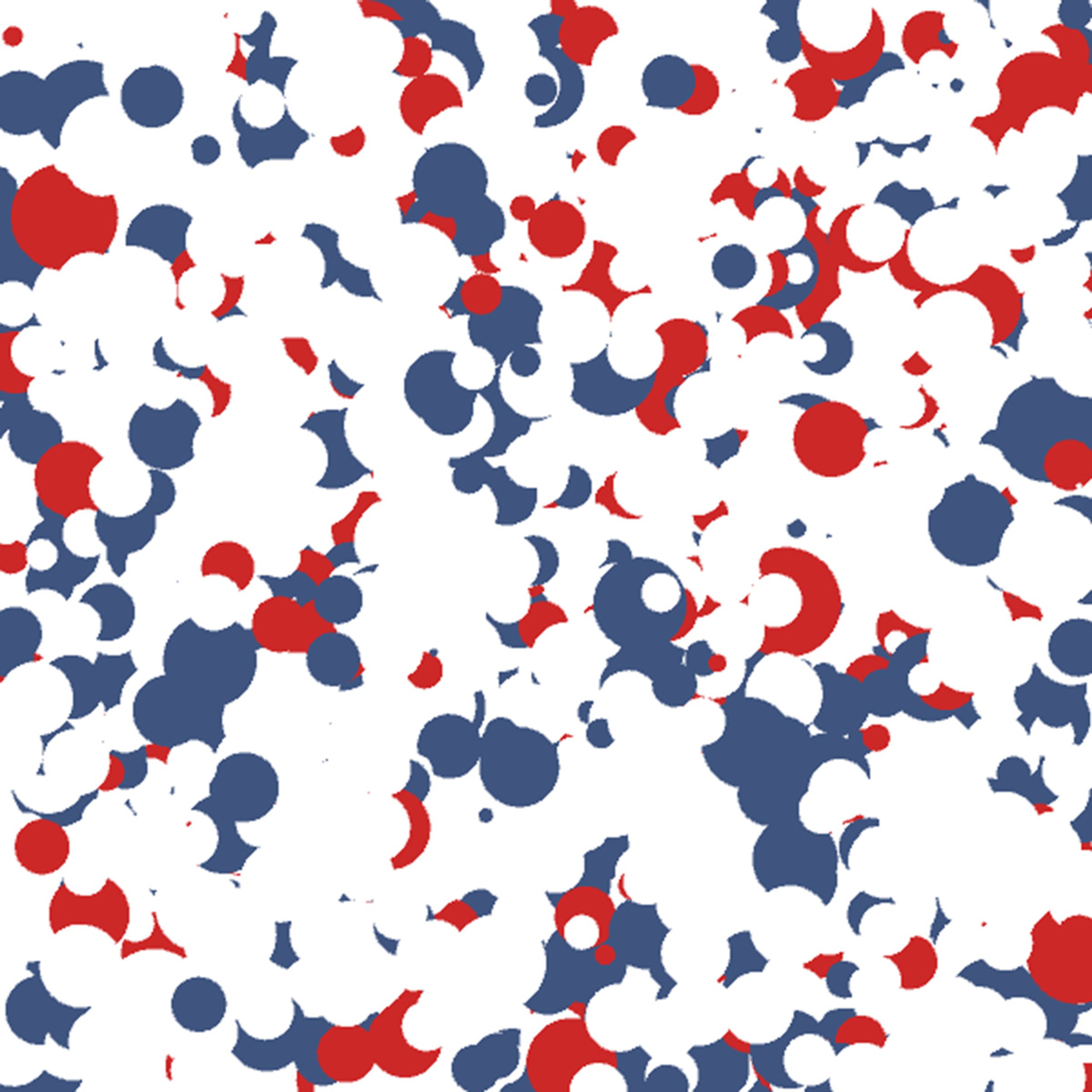
There are a few techniques I combine with this. First, I might slightly randomize some of the colors each time, like so:
(let [blue-hue (random 200 200)]
  (apply
    fill
    (weighted-choice
      [0  0 100] 0.70        ; white, 70% chance
      [blue-hue 50  50] 0.20 ; blue, 20% chance
      [0 80  80] 0.10)))     ; red, 10% chance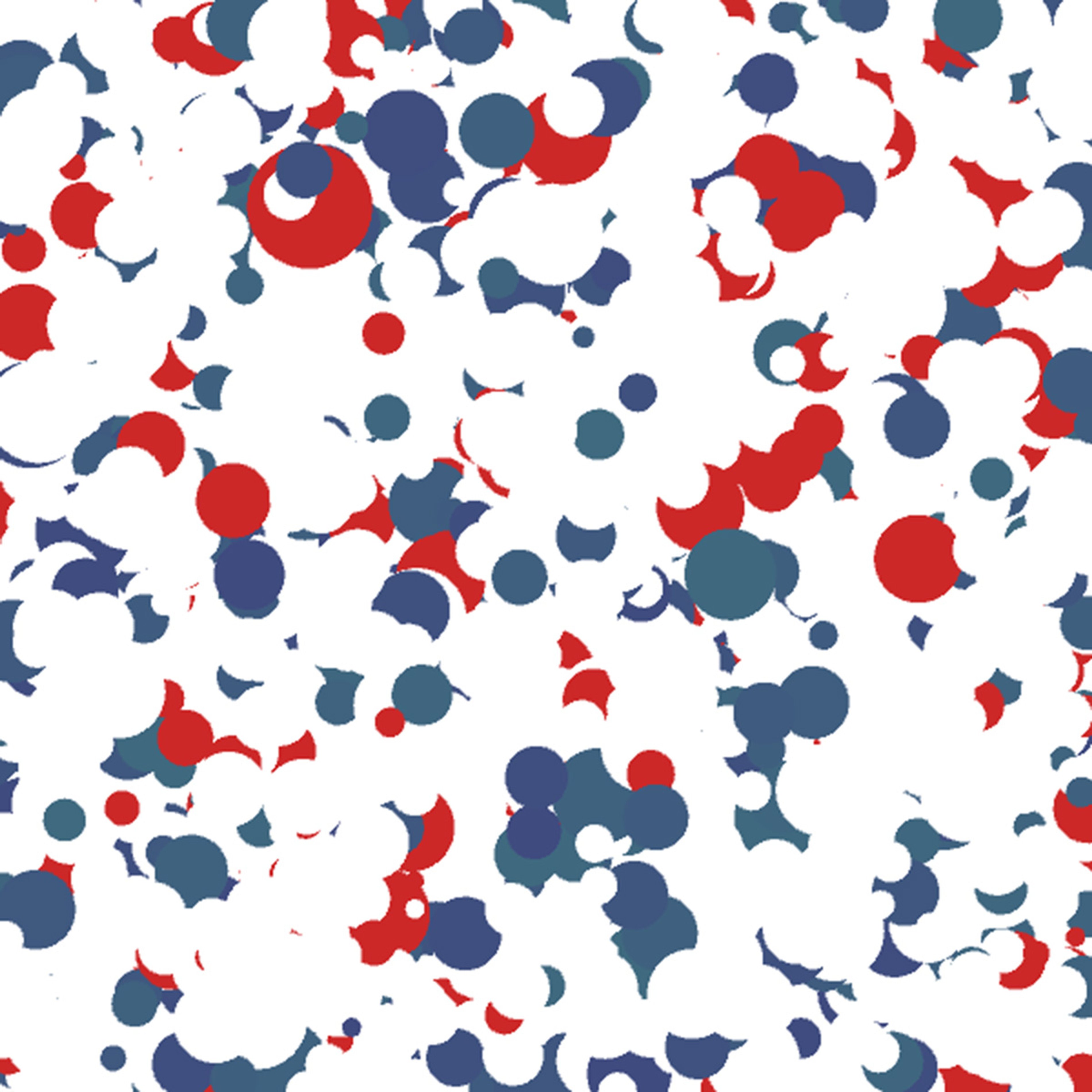
This way I'll always get the same whites and reds, but the blues will have some variation. Another technique I use is to have multiple probability distributions (i.e. color palettes) and select one of them, based on some other criteria. As a very simple example:
(apply fill
  (if (< radius 50)
    ; pick from the warm color palette
    (weighted-choice [ 0  0 100] 0.70     ; white, 70% chance
                     [54 90  95] 0.20     ; yellow, 20% chance
                     [ 0 80  80] 0.10)    ; red, 10% chance
    ; pick from the cool color palette
    (weighted-choice [  0  0 100] 0.70    ; white, 70% chance
                     [220 50  50] 0.20    ; blue, 20% chance
                     [120 50  80] 0.10))) ; green, 10% chance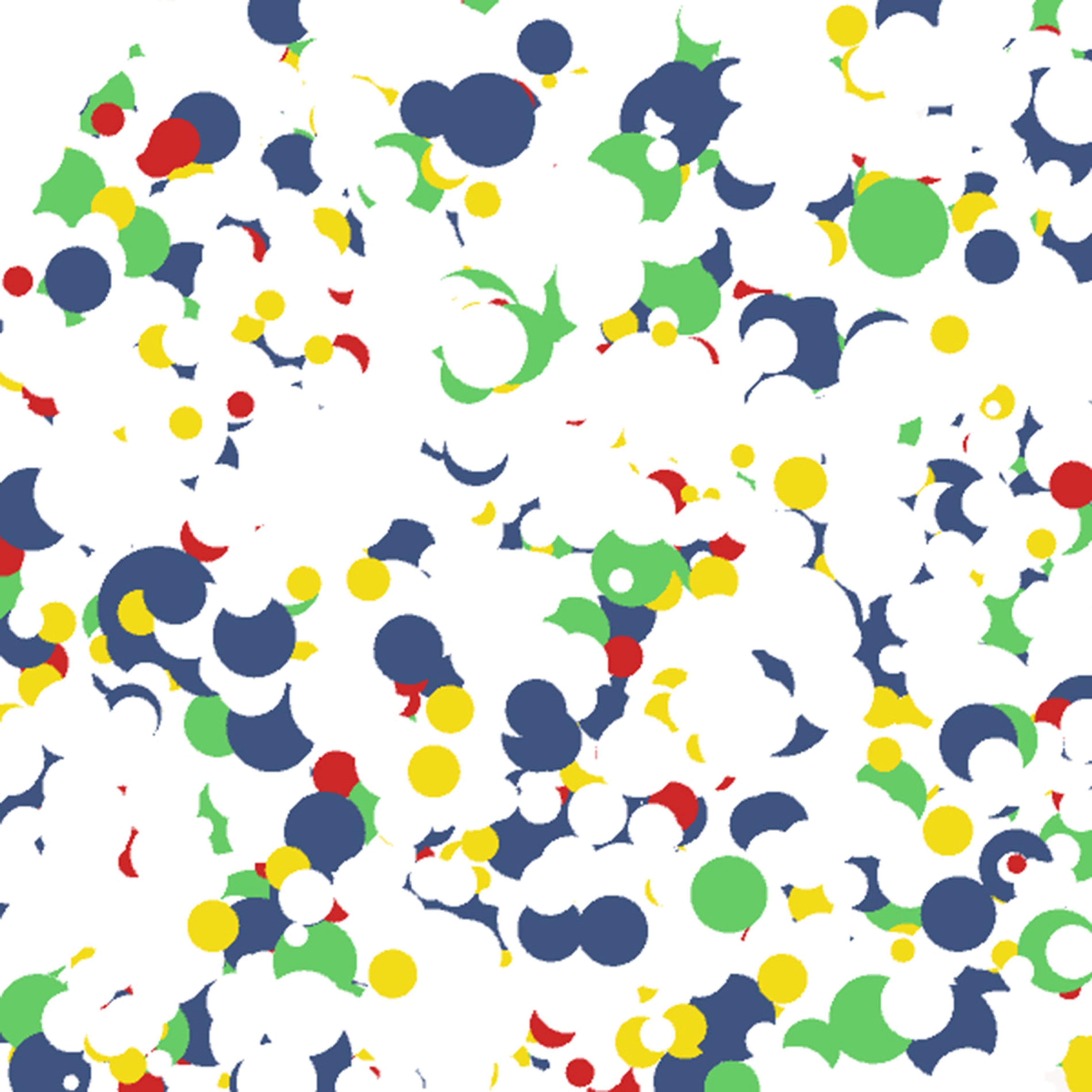
Last, you can utilize gradients to alter the colors or even the probabilities. For example, to shift from more blue to more red while moving down the image, you can do something like this:
(let [blue-odds (rescale y 0 1000 0.30 0.0)
      red-odds (- 0.30 blue-odds)]
  (apply fill (weighted-choice [  0  0 100] 0.70        ; white, 70% chance
                               [220 50  50] blue-odds   ; blue
                               [  0 80  80] red-odds))) ; red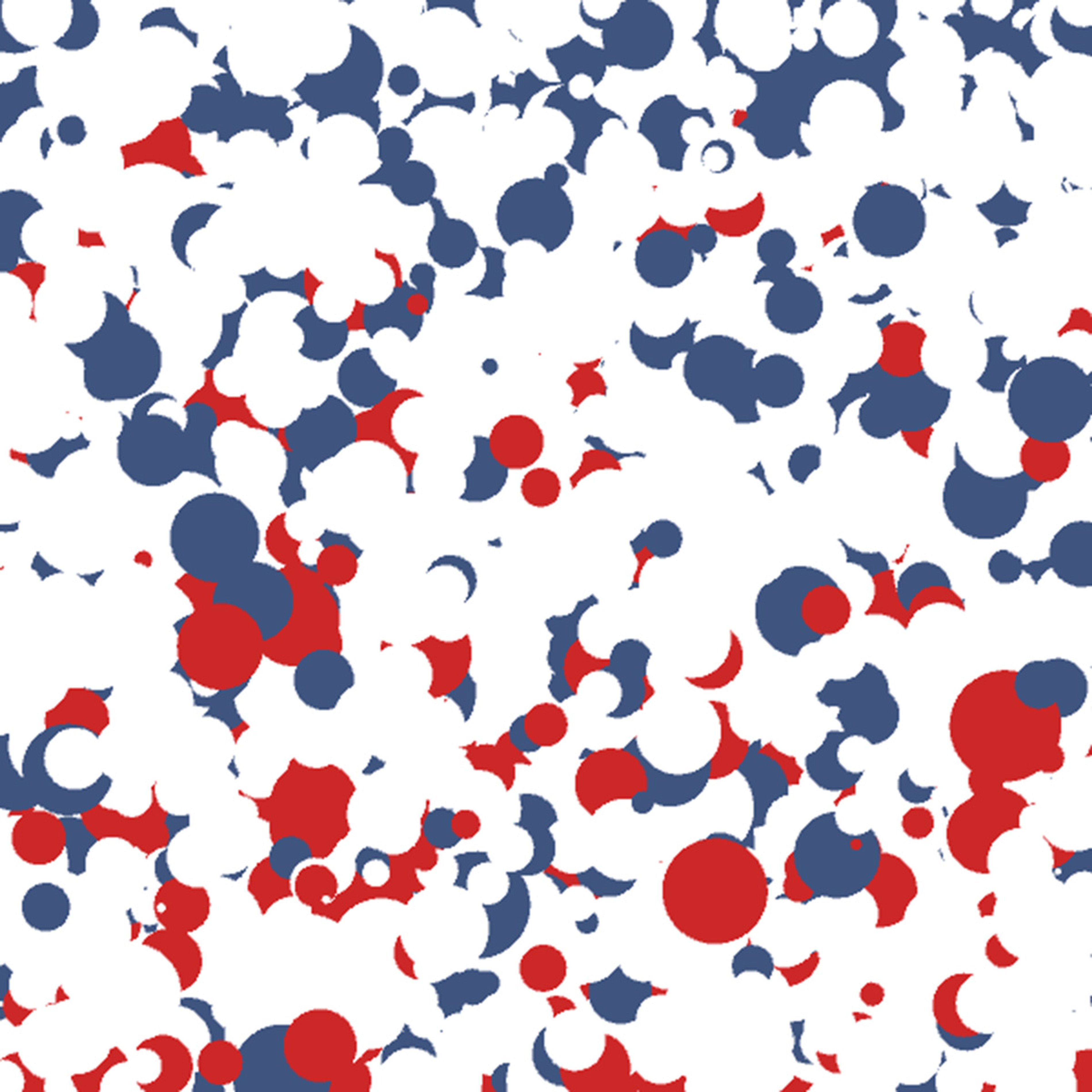
Again, there are a lot of options for how to use these. For example, you can utilize a gradient to slowly transition from one color palette to another. What I've described here is just a starting point.
Closing
Hopefully, the techniques I've outlined here will give you a good start on improving the colors in your generative artwork. I plan to cover other techniques that I use for working with colors in the future.
–
From time to time, I write about my thoughts and artistic process. If you'd like to be notified the next time I publish an essay, sign up for my newsletter in the menu.