How to Hack a Painting
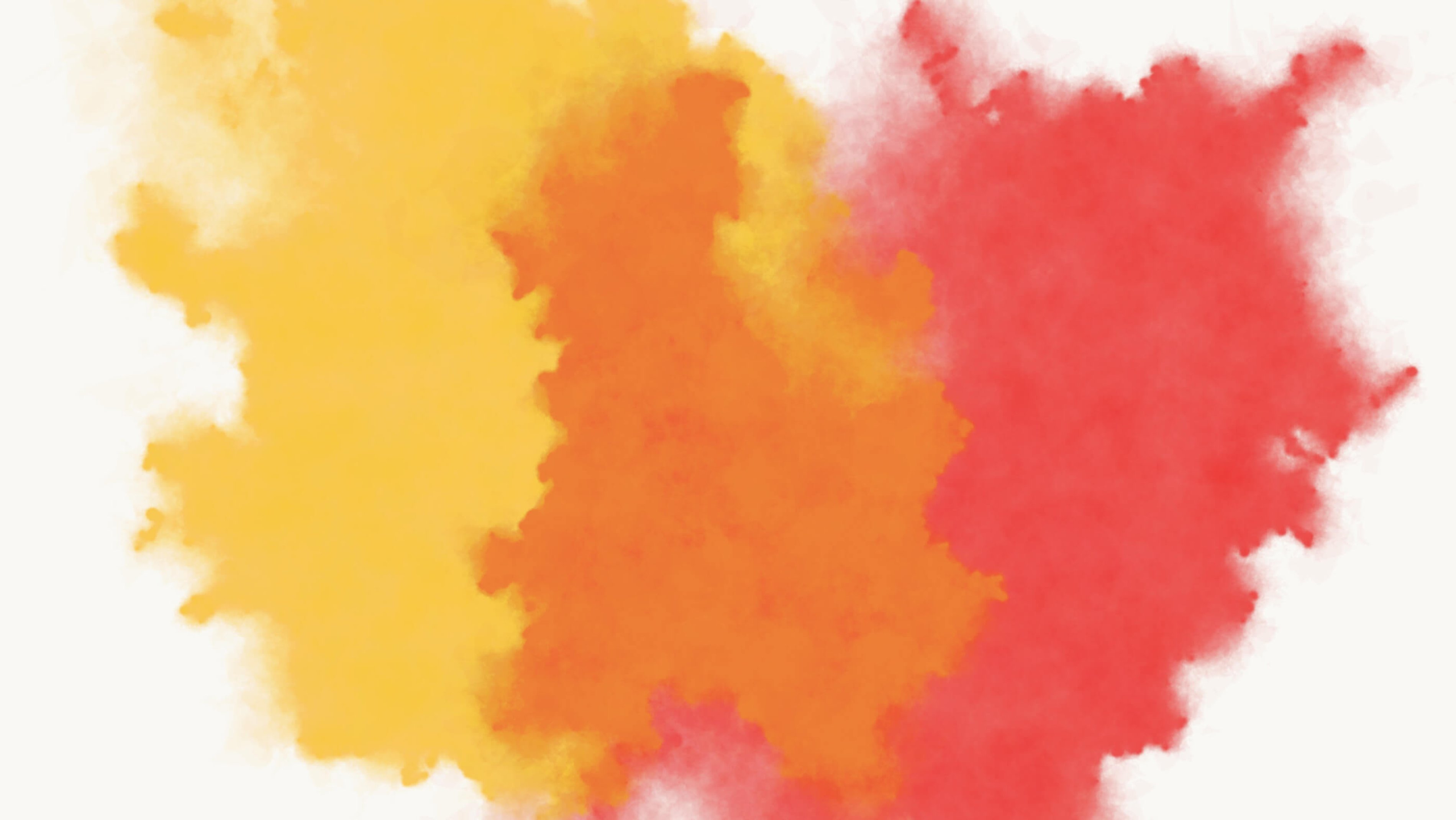
This talk was given at Strange Loop 2017, and describes a watercolor-inspired generative art algorithm that I created.
[A transcript, lightly edited for readability, follows]
Thank you very much for coming out! I'm really excited to talk to you about a topic that I find incredibly fascinating, which is generative artwork, or writing programs that generate artwork. I think it's particularly interesting for programmers because it takes a mindset that we all developed when we learned how to program, and it applies it to an analysis of the visual world around us, and also to how we can create visual artwork.
To give you a little bit of background about myself, I have a traditional programming background. I have a degree in computer science. I worked for many years on an opensource distributed database called Apache Cassandra. Some of you may have used that, and I apologize for any bugs that you hit. You can blame them on me.
I've always really loved artwork. I've always loved painting and drawing. A few years ago, I decided to try and take artwork a little bit more seriously. I looked around to figure out what skills I could bring to bear on my artwork, and programming was the most obvious option for me.
I stumbled my way into the world of generative artwork. I didn't even really know that it existed, at the time. But I got obsessed with it. I kept making it, over and over again. A few years later now, I've made maybe 500 pieces of generative artwork. I was lucky enough to switch over to being an artist full-time earlier this year.
As an aside, I have to say programming artwork is way, waaay more fun that programming a database. There's no bug trackers. There's no code reviews. Nobody's nitpicking my variable names, or white space. Zero tests. I've literally never written a test.
No documentation. No daily stand-ups. I hate standing up in the morning. I would much rather just program. Basically, generative artwork has all of the fun, exciting parts of programming, and it doesn't have any of the parts that you get paid for. Artists just don't get paid. That's the way it is.
My Artwork
To give you an idea of the sort of artwork that I make, I'll show you a few images. These are just a couple of my favorites. These are fairly recent. I think both of these are from last year (2016), and a couple more from this year (2017).
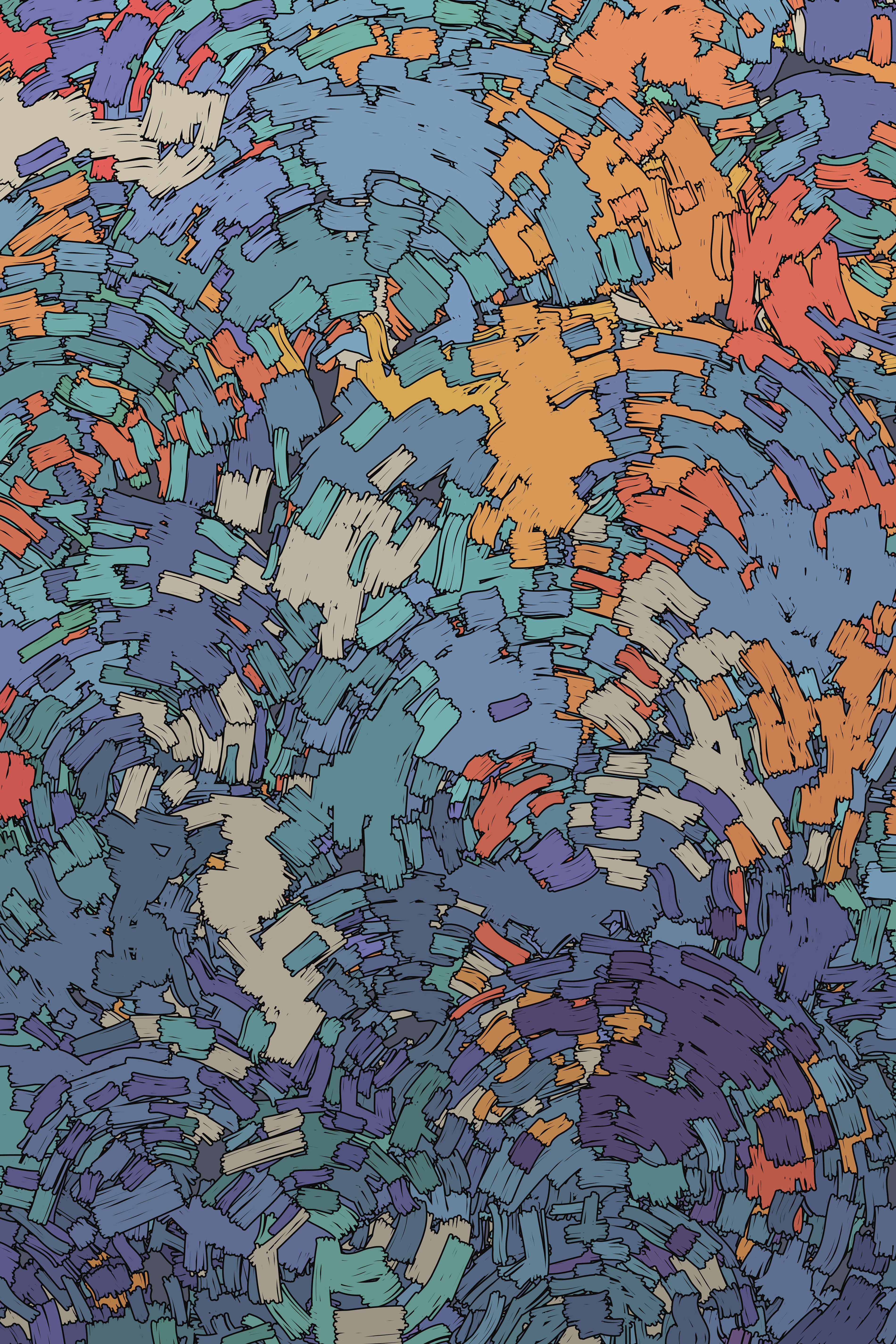
Indigo Dreams, 2016
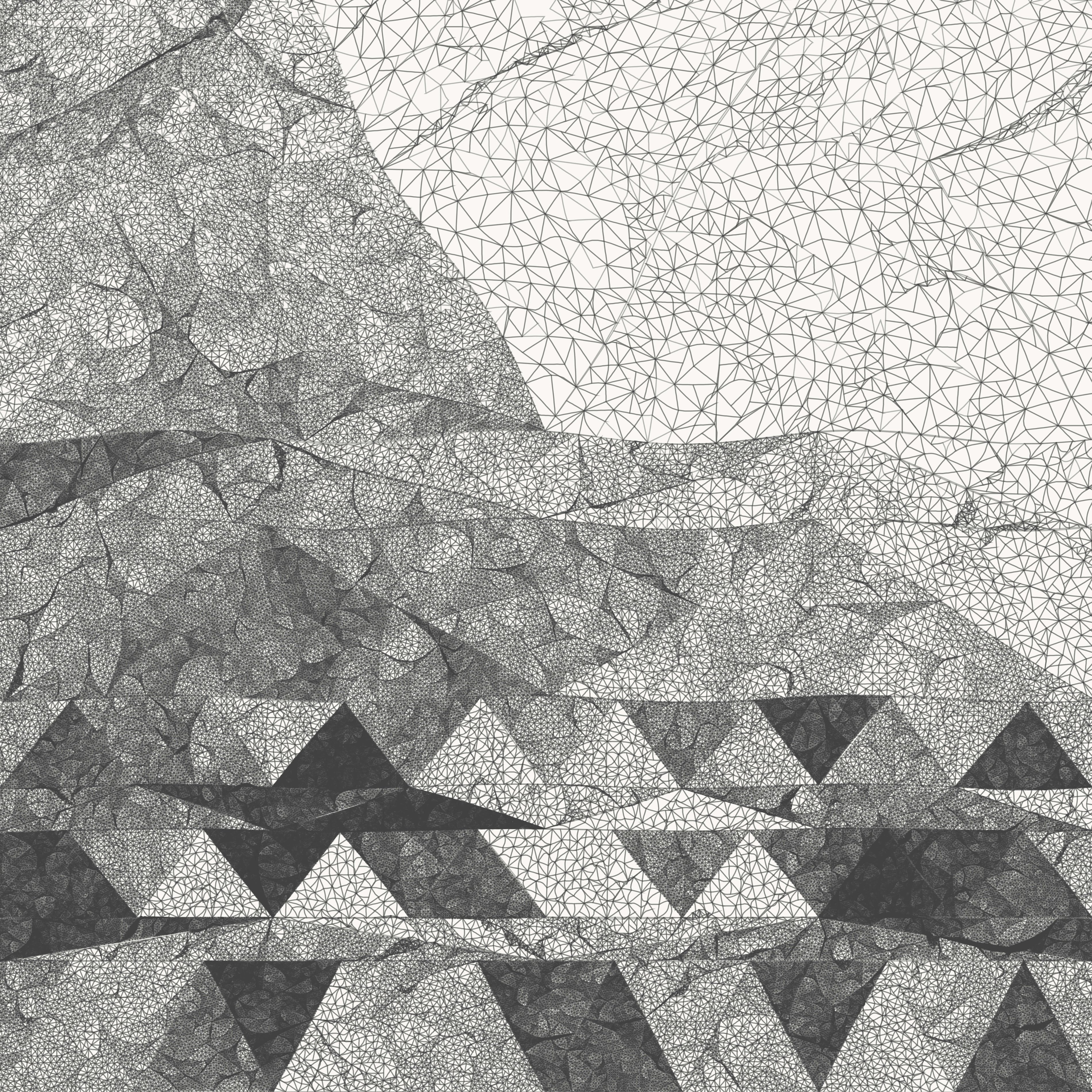
Voyage, 2017
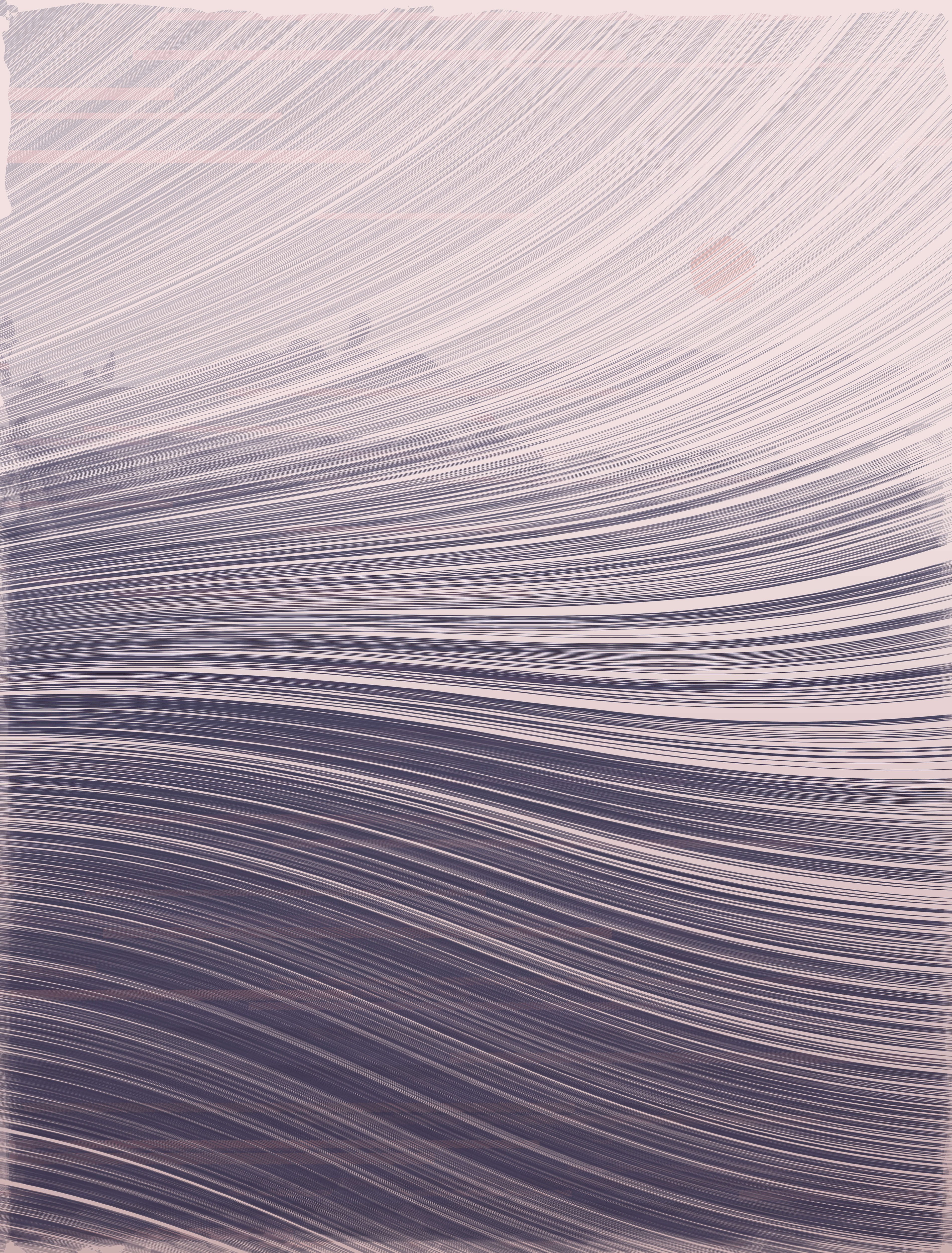
Untitled (Landscape), 2017
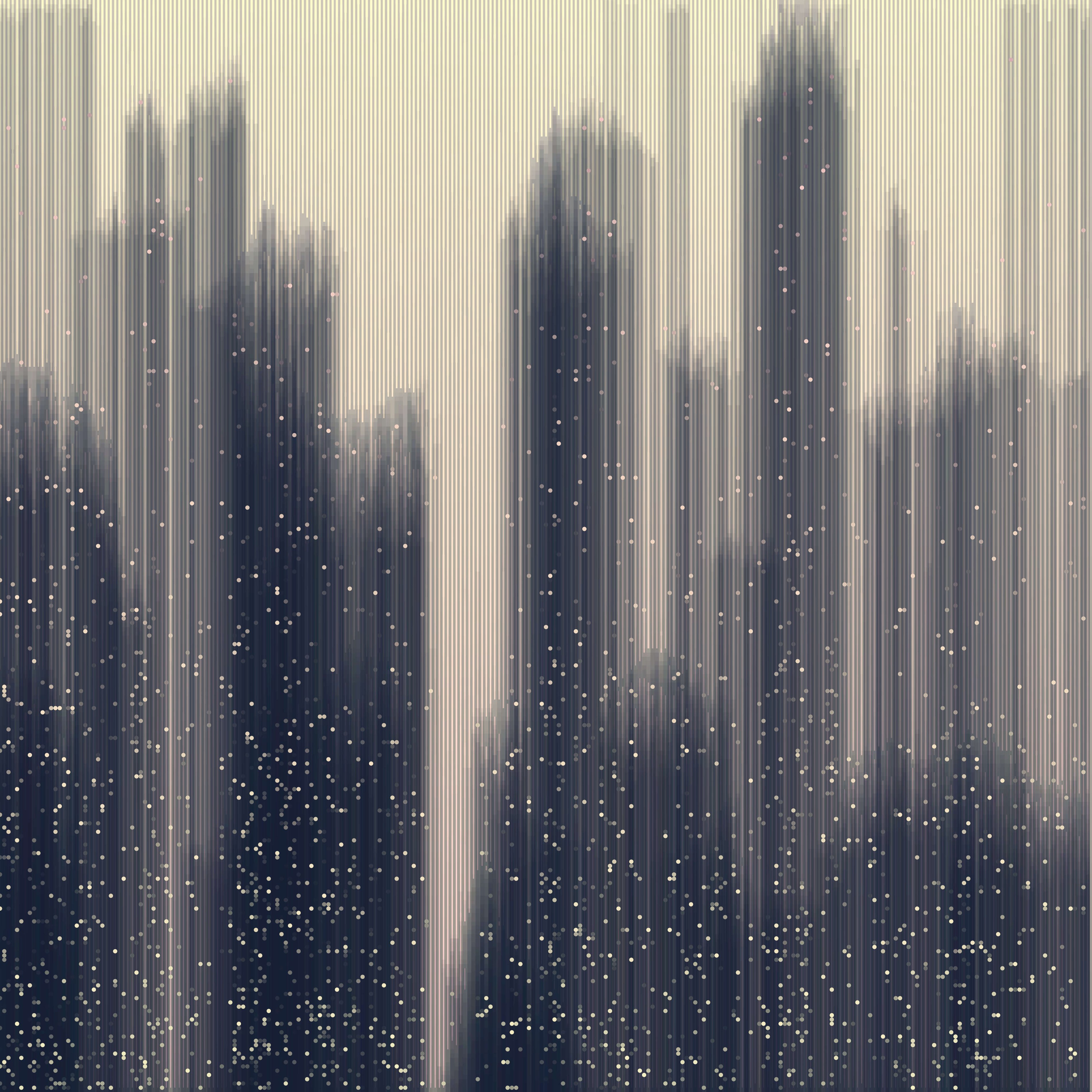
Untitled (Cityscape), 2016
Like most generative artists, I'm starting from a blank canvas here. I'm not doing data visualization. There's no data set that I'm working with here. I'm not doing any sort of image processing. I'm just writing a program that needs to draw something interesting. I also don't use Photoshop, Illustrator, or anything like that. It's done exclusively through programming.
This is my recent work, but when I got started, I created the kind of work that you might expect somebody with a programming and computer science background to create. It was very geometric, very obviously mathematically inspired. I felt like it needed something else. I felt like I could take it a little bit further by introducing more organic and natural elements to the artwork.
Studies of the Real World
To me, the best way to do that was to go out and actually study the natural world around me. I grabbed my camera. I went outside, and I looked for things that I found aesthetically appealing, but that I thought I could maybe take a stab at reproducing with the generative process.
I did a few studies. These are a couple of them. On the left, this is of a field of dry, dormant grass. On the right, it's a wooden fence board. This is the generative artwork, or output. Not the original photograph.
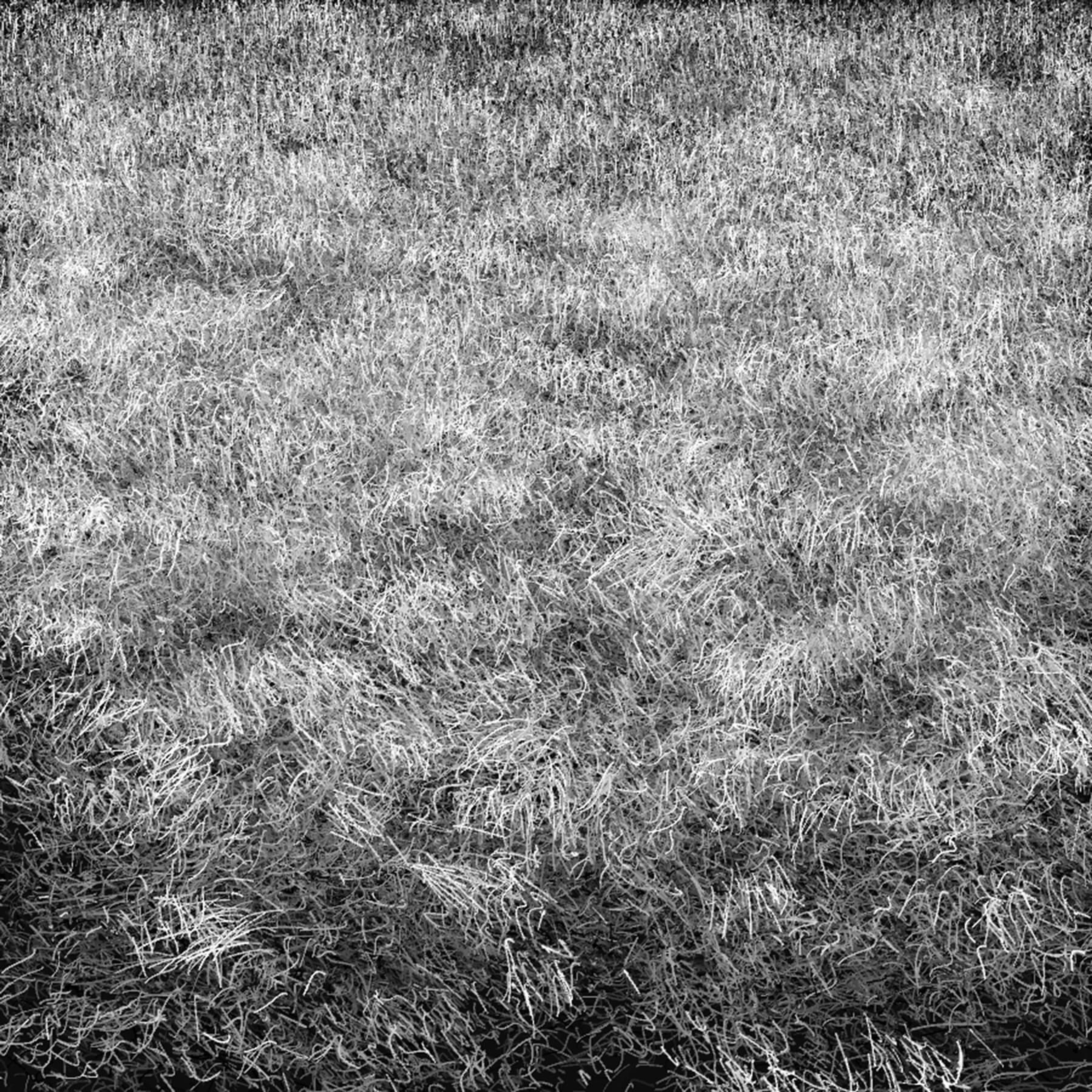
Dormant Grass Study, 2014
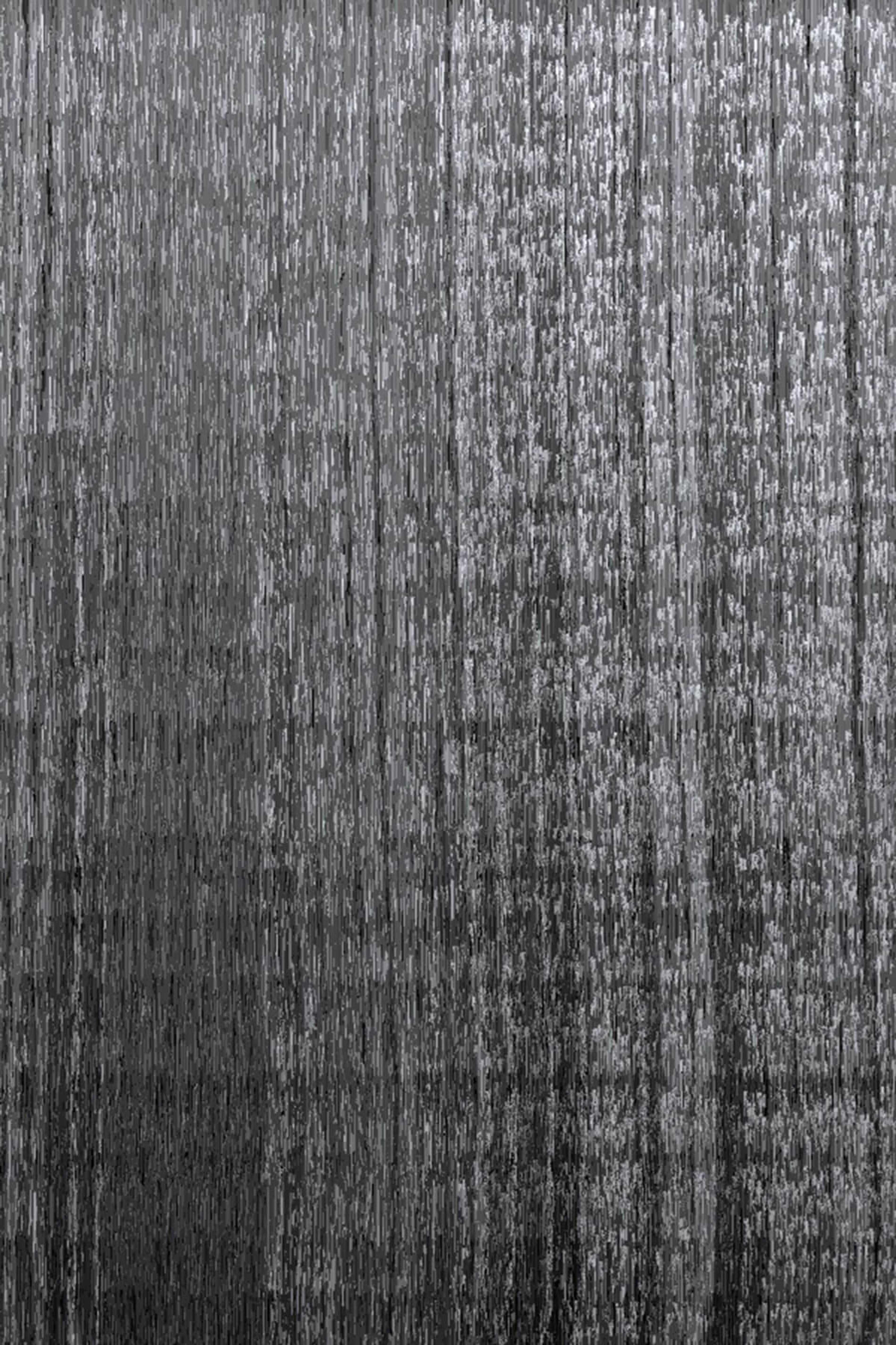
Wooden Fenceboard Study, 2014
When I did these studies, I tried to reproduce it as carefully as I could, trying to capture all of the patterns that I could really discern. I learned a couple of really, really interesting lessons from doing these studies.
Lessons Learned from Studying Nature
The first lesson that I learned was the world is insanely, mind-mindbogglingly complex and detailed. I mean, any little portion of it that you really look at closely and study has an immense amount of detail in it. It's pretty astounding.
But the second lesson that I learned was that despite all of that detail and variety, my fairly simple generative programs could actually do a reasonably good job of reproducing what I saw. I thought that was pretty interesting, but I realized that the reason for that is this: the world itself is generative.
We have laws of physics, laws of chemistry, laws of biology. These are all rule-sets that govern how the matter in the universe is organized. Any time you have rule-sets like that, patterns are naturally going to occur.
But if you go out and you actually look around in the natural world, you don't just see clean, mathematical patterns or obvious geometric organization. You see a big, tangled mess. That's because there's another side to the universe besides these rules. We have forces that we perceive as randomness. Forces of entropy, and chaotic processes.
The world is really the combination of these two things. The structural elements, and the random elements, and that's where we get a lot of interesting effects.
How Computing Enters the Mix
That puts generative artwork in a really interesting place, because computers are really good at both sides of that. One the one hand, it's pretty obvious, computers and algorithms are great for describing patterns, and processes, and organization.
But interestingly, on the other hand, computers are excellent at working with randomness. They ironically allow us to be very specific about the kinds of randomness that we want. Any sort of probability distribution that you can think of, you can express, and you basically get a free, endless stream of samples from that distribution.
Generative artwork is basically the perfect medium for exploring the intersection of these two things. I think that makes it a very interesting and powerful medium. That's just one of the reasons why I really love it. I wish I could talk about all of the other reasons, but this is the one that I'm going to focus on a little bit today.
When I did these studies, I learned an awful lot, but I couldn't really directly apply the patterns that I saw here to artwork that I was creating. It's hard to work a wooden fence board into a painting that you might want to create. Fortunately, I stumbled across something else that was a lot more useful to me.
Inspiration from the Sketchbook
I still love to draw and paint all of the time, so I was flipping through a sketchbook, and something really stood out to me. It was just a pretty simple, abstract, small watercolor painting. But I looked at the watercolor, and I was really astounded by the really interesting patterns that you see in the shapes that developed there. There are lots of different textures, fine details, and variety in the behavior.
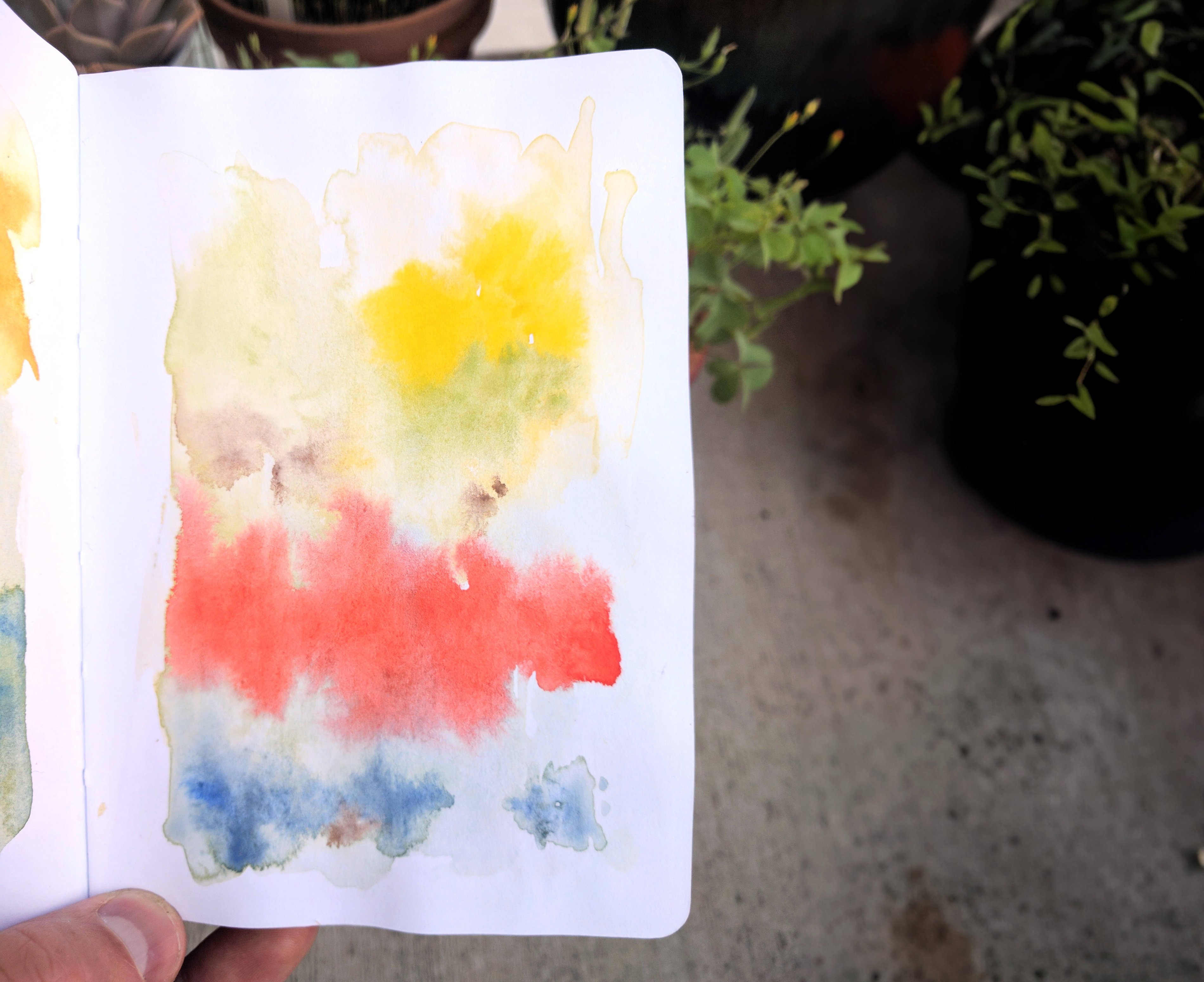
A watercolor doodle from my sketchbook
I decided I wanted to try to capture some of that with the generative process. I thought paint was especially nice to try and do this with, because it's very abstract and very malleable. I could reshape it to any purpose that I want, and it's very open to interpretation. The viewer can see paint as pretty much any object, or even abstract emotional qualities. Paint makes an ideal thing to reuse in other generative artwork.
What it Means to Make a Sketch
Before I dive into my generative model of how I tried to recreate watercolor paint, I want to make something clear about my goals here. This is a sketch by Rembrandt, and when Rembrandt made this sketch, he ignored about 95% of what he saw. What Rembrandt was really excellent at was picking out the five percent that was really essential to the image, that really defined it to him.
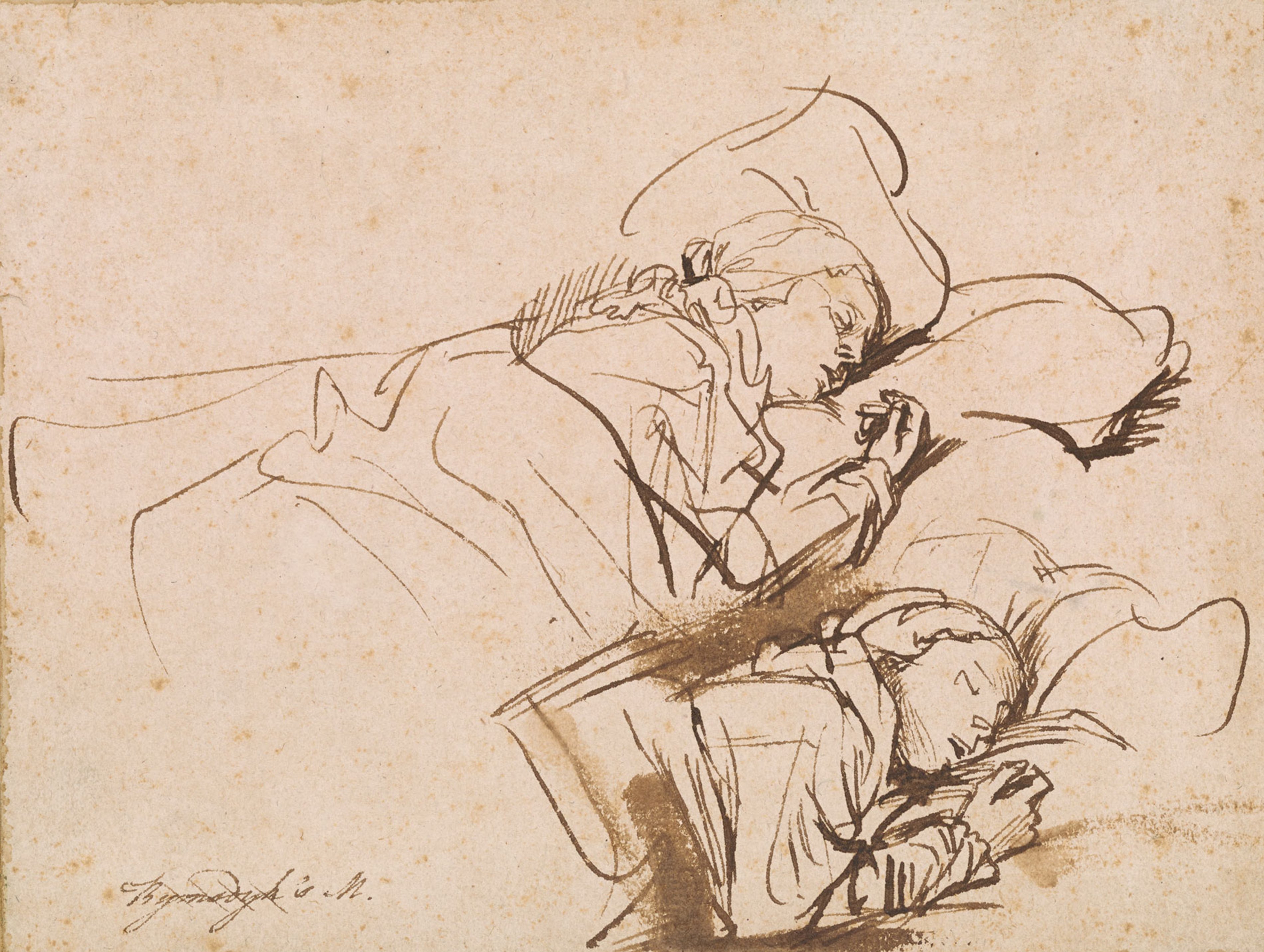
Rembrandt, Two Studies of a Woman Asleep (Saskia?), ca. 1635-1637
I'm going to do something similar with watercolor. My goal is not to make something photorealistic, or physically accurate simulation, but rather to try to extract the essence of it. That five percent that's really characteristic of it, and makes it special.
Why Design a Simple Model?
Besides focusing on the essential parts, having a simple model has a couple of other upsides. The first is that I want to be able to fully understand this process or algorithm that I'm working with. I want to be able to fit it all in my working memory. As an artist, you really have to know every tool that you work with from the top to the bottom. As a generative artist, your algorithms are your tools, so you want to understand every aspect of them.
I'm not doing a sketch of a single image. I'm doing a sketch of an entire process.
The other upside to a really simple model is that I'm not doing a sketch of a single image. I'm doing a sketch of an entire process. I want to be able to adjust that process for different uses. I want to be able to tweak the parameters and understand what they're going to do. I want to be able to tweak the algorithm itself.
Basically, my process for modeling this watercolor is pretty simple, but I think there's a lot of upsides to that. It makes it easier to explain to you guys, as well.
Looking at Some Actual Paint
Let’s look at some actual watercolor paint. This is pretty close to what I'll be basing my model on. I want you to look pretty carefully at this, for just a few seconds. When I looked at this, there were three main characteristics that stood out to me as being essential to the watercolor. By the way, the way I created this was I took a brush with only water, dampened the paper, loaded the brush with paint, painted just a small circle, and waited for it to dry.
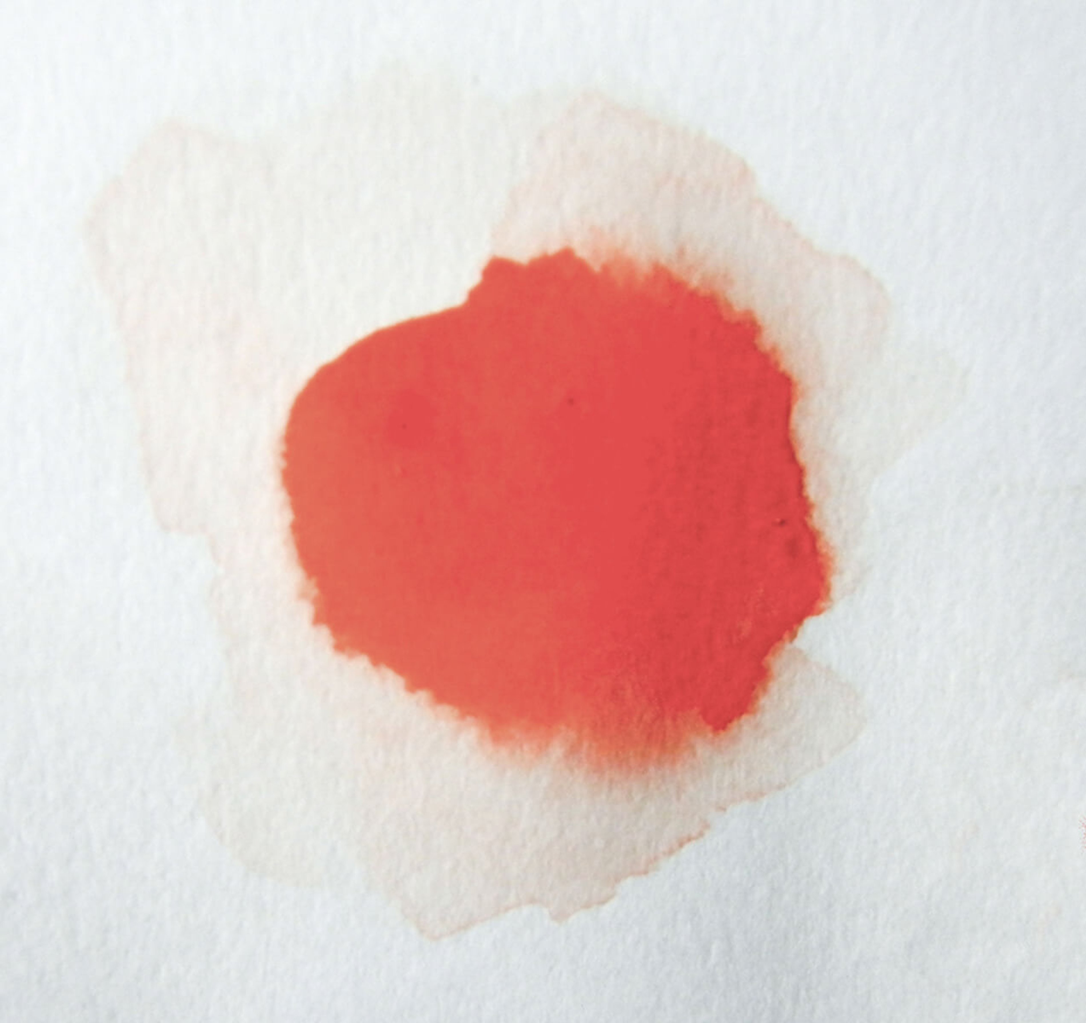
When I look at this, there were three big characteristics that stood out. The first is that the paint didn't stay where I painted the small circle. It expanded outward, and it deformed a little bit. It's not really a perfect circle anymore.
The second is that, pretty obviously, it doesn't have smooth curves around the edges. It has a rougher texture. It reminds me of aerial photographs of a shoreline, where it has a fractal nature, where parts of it jut in and out, but if you zoom in at the smaller scales, you see the same patterns repeat, even down to pretty small scales. That's especially true of some other watercolor examples I looked at.
The last characteristic that's pretty important is that a lot of the edges are still pretty soft here. We see a lot of areas where it blends smoothly from having a lot of pigment, all the way out to pure paper. Those three characteristics are what I focused on with my model. Having the expansion and distortion, the rough, shoreline-like edges, and then having a more smooth, blended transition.
Creating the Generative Model
On to the actual model. I'm doing this with Processing, which is an open-source Java graphics library. It's pretty low-level, but I like it that way. Like any good programmer, I hate writing Java, so I use a Clojure wrapper called Quil for it. I highly recommend that.
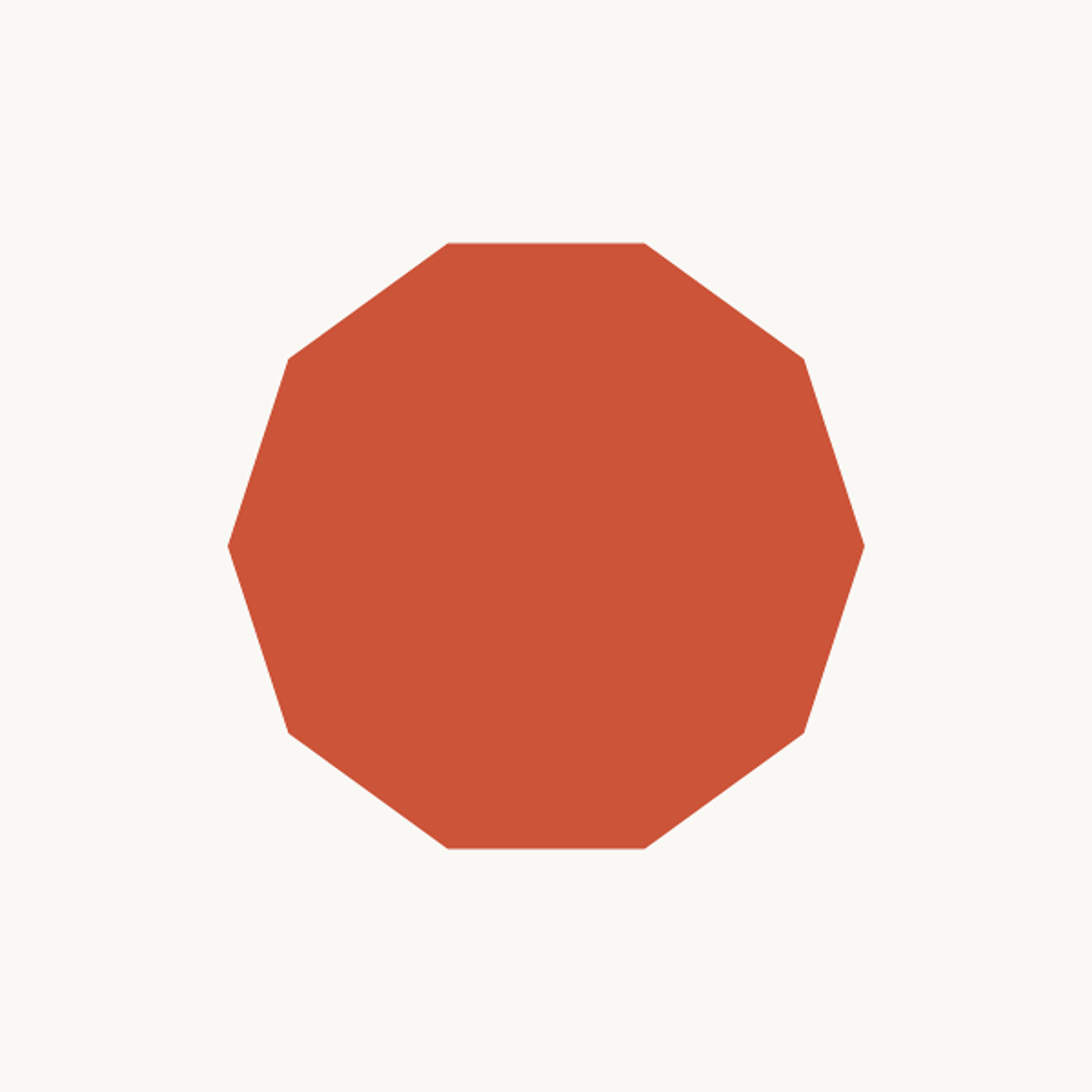
The starting input polygon for our algorithm
I started out with just this very basic polygon, and we're going to first work on doing the expansion and deformation of the polygon. The model for doing that is pretty simple. We're going to walk around and deform one edge at a time, and we're going to just make it jut outward by some amount.
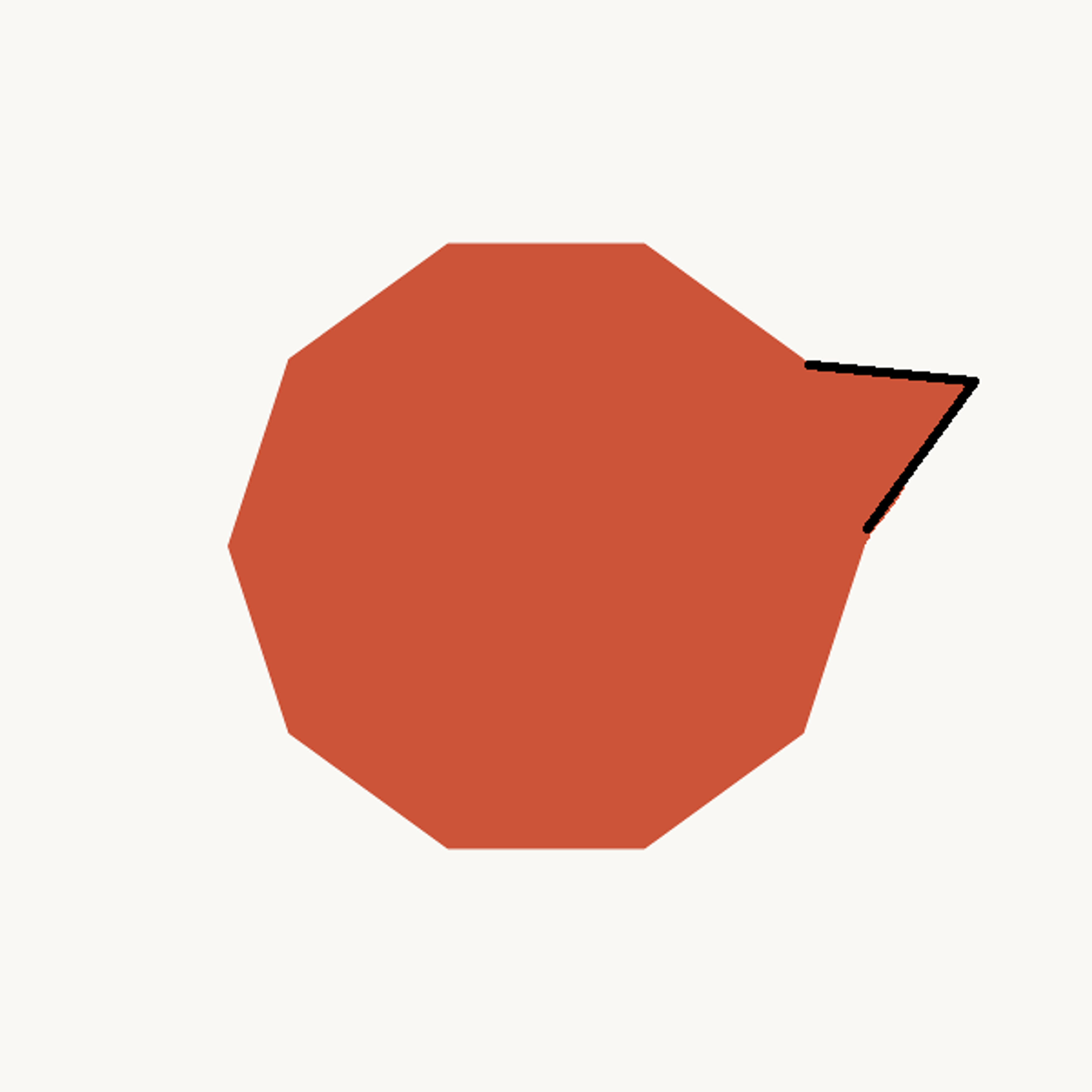
The type of “jutting” deformation we will apply to the polygon
We have to decide exactly how each edge is going to jut out. There are three variables as to how each edge is going to jut out like that:
- The first is to pick a starting point in the middle of each edge. This is where we're going to break the existing edge and then bend it outward.
- The second variable is the angle that we're going to bend that edge outward at.
- The last variable is the magnitude of that vector — how far out it's going to extend.
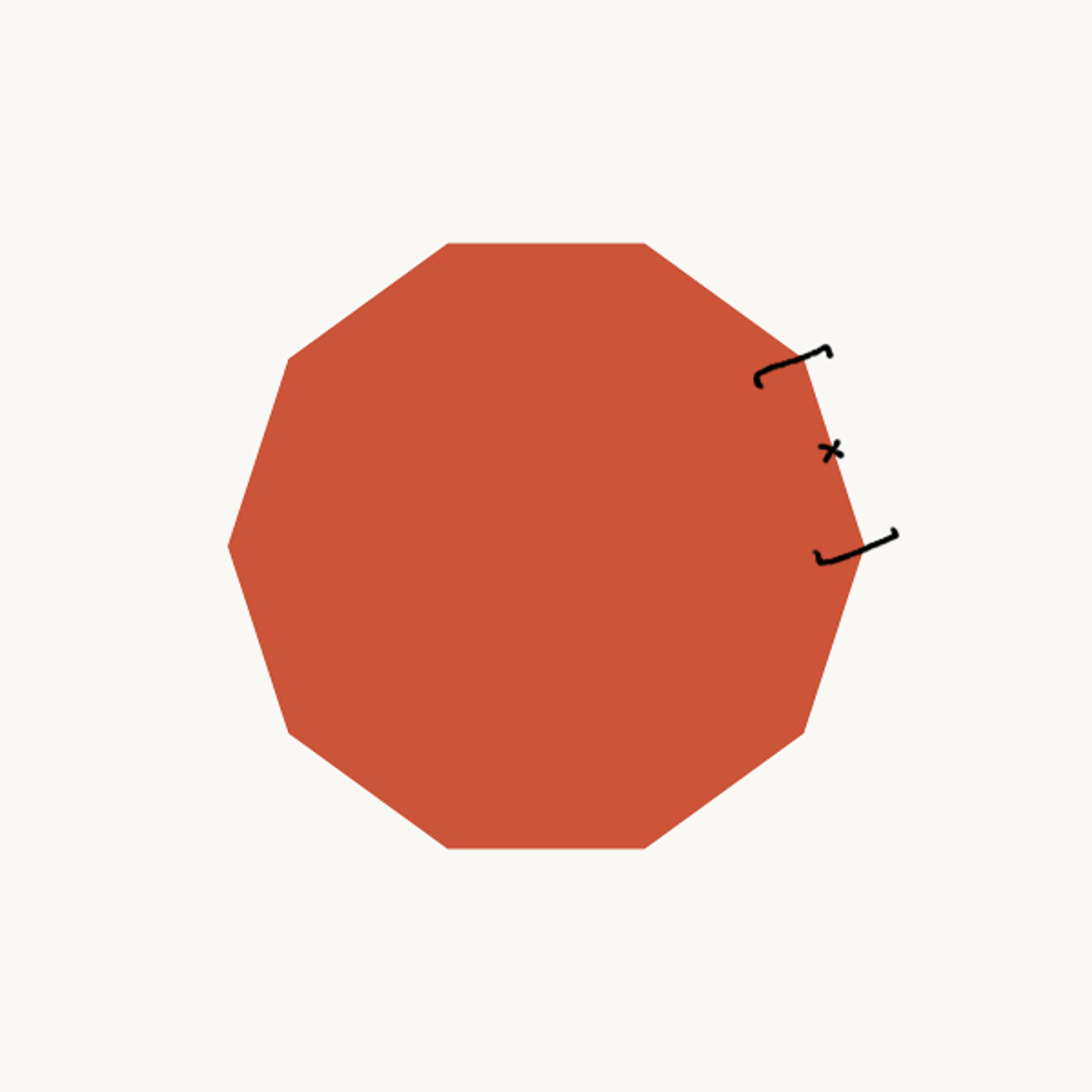
Variable 1: where do we break the existing edge?
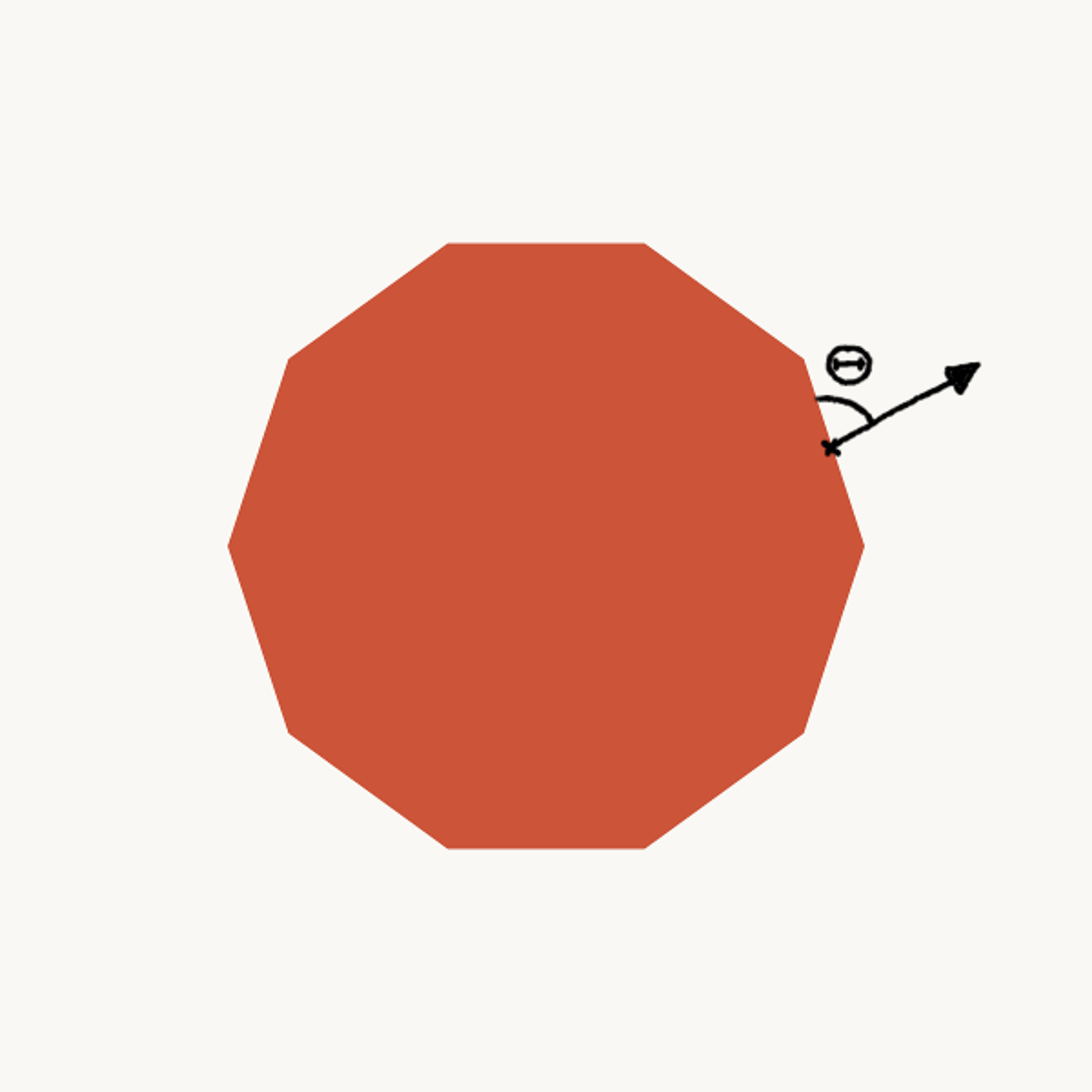
Variable 2: what angle do we jut outwards at?
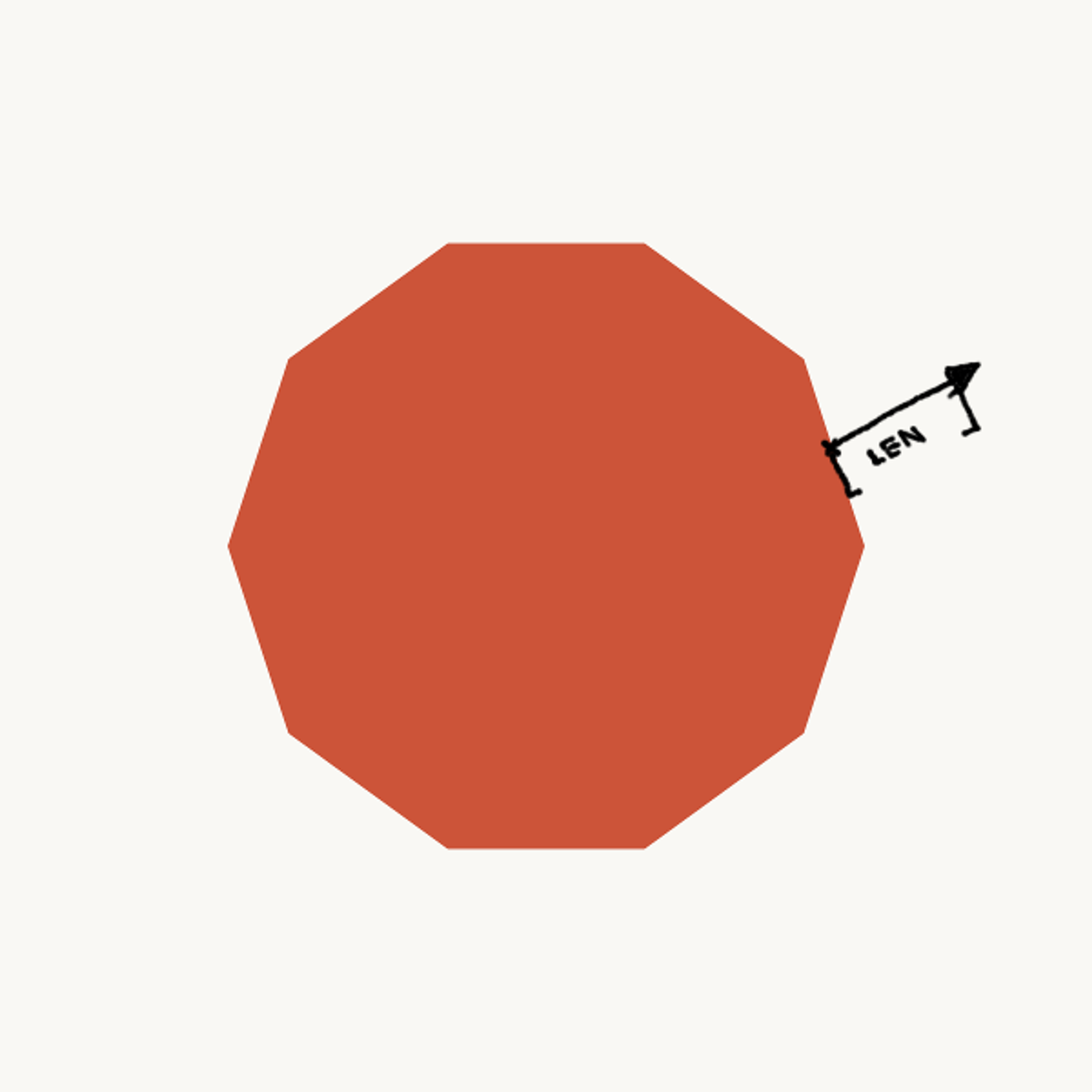
Variable 3: the magnitude of the deformation
When we combine those, we basically get something like this:

We need to be really careful about how we decide to do this, because it's going to have a really big impact on the sort of effect that we get.
The Importance of Probability Distributions
This is where that careful utilization of randomness is really important. There are a couple of main probability distributions that usually come up when you're working on artwork.
The first is the uniform distribution, which almost every programmer has to have used, I'm sure. Obviously, you get a uniform probability of picking a number anywhere within a range.

Uniform probability distribution
But in the natural world, you don't really see the uniform distribution that often, if ever. You see much more frequently the Gaussian distribution, or the normal distribution. Also called the bell curve. That's where you specify a mean, and an amount of variance, which controls how far away from the mean you might draw your values.

Gaussian probability distribution
If you want to get natural effects, the way to go is to go with the Gaussian distribution for things. That's exactly what I did here. For each of these variables, I used a Gaussian distribution. For the first variable, the mean is centered in the middle of the edge, and I might pick values further and further away from that, with decreasing probability.
For the angle, the mean is perpendicular, but I might have some variance away from it being perfectly perpendicular. And for the magnitude, it's a truncated distribution. I only want positive values, because it never shrinks inward, it only goes outward. It's likely to only expand out a short distance, but occasionally I might get parts that stick out quite a bit.
Running the Algorithm
With these nicely tuned distributions, if I run just one round of this on the polygon, I get something that looks a like this:
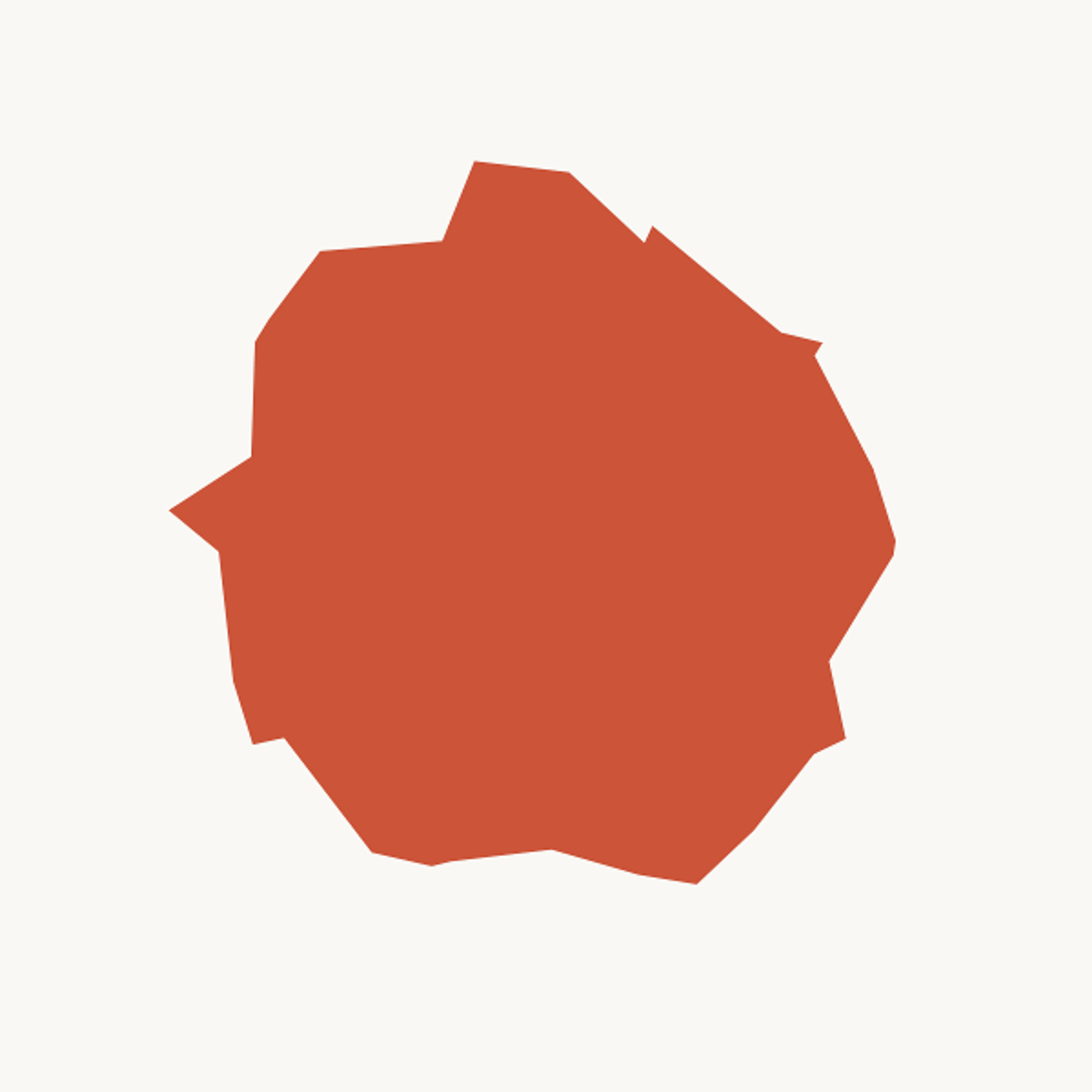
One round of the polygon deformation algorithm
This is a pretty good start. This gives us that growth and that weird, blobby distortion. So I think it's time to move on to getting those rough details. The fine-tuning.
What I'm going to do is take advantage of that fractal-like nature, where you see the same patterns repeating at smaller and smaller scales. I'm just going to apply this function recursively to the new polygon.
The only thing I have to do is make one small adjustment. When I pick the magnitude variable, I want to scale that by the length of the edge, so that as I'm dealing with smaller and smaller edges, it's sticking out less and less each time.
I run this recursively six times. Now I suddenly get a lot more detail:
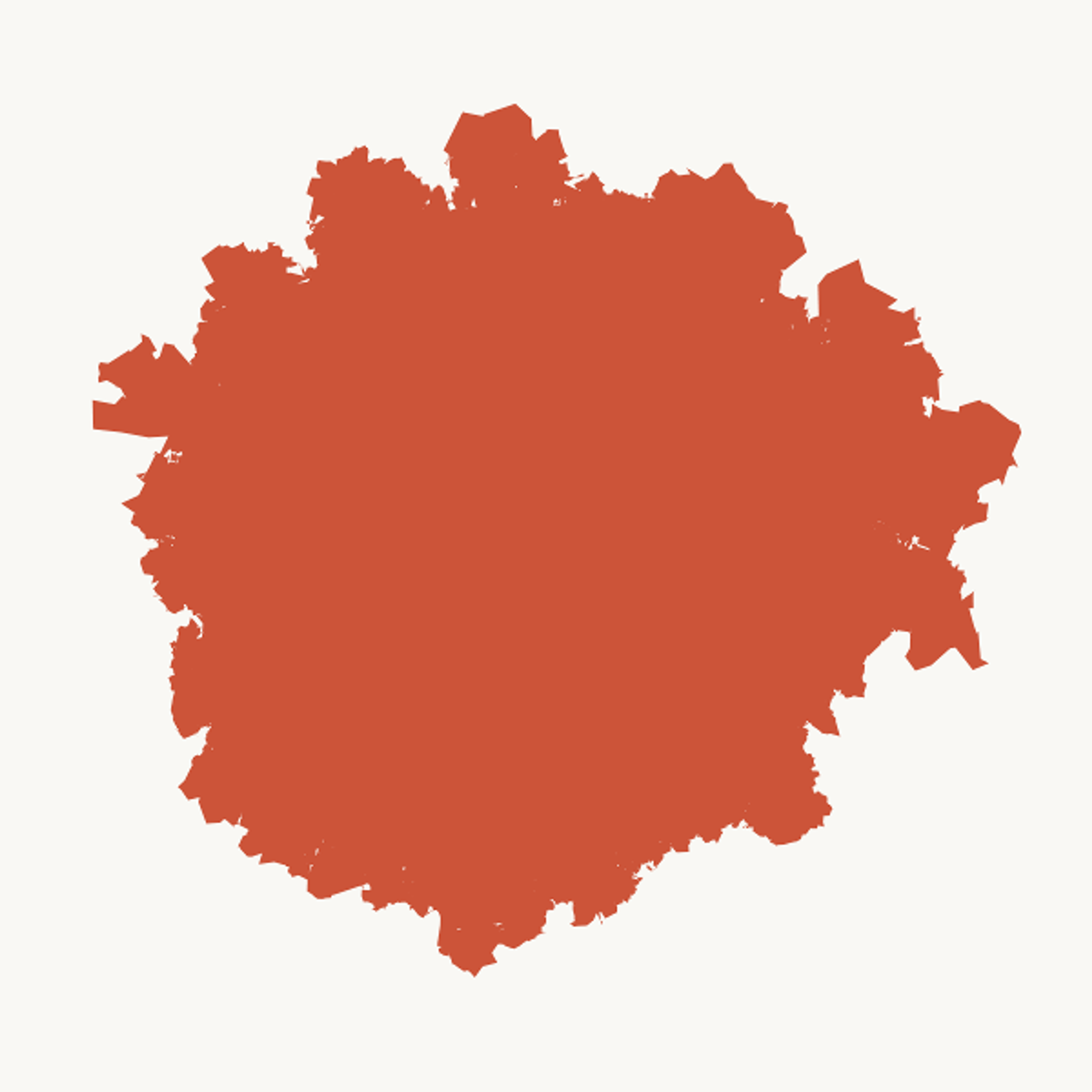
With six rounds of recursive polygon deformation applied
This looks pretty good to me. This reminds me of that rough edged texture that I see in a lot of the watercolor paint.
Softening the Edges
The next step is to start thinking about the soft edges, and how we can make things blend a little bit. Normally, when I want to create a blend around a shape, I'll take the polygon and I'll stack a bunch of nearly-transparent layers. Low-opacity. With each one, I'll just slightly shift them around. That gives you a pretty good effect.
But there's actually something better that we already have on hand here for doing that. This function that we just used to deform the polygon is already really good for making small, random changes to a polygon. What I'm going to do is take advantage of that to get differences in the layers.
Here's the basic approach: I take our original starting polygon, and I just run it through three rounds of deformation. We just saw what it looked like with six, so with only three, it will not be as fully detailed.
I make about 50 layers. For each layer, I start from that base polygon with three rounds, and I run it through three more rounds to get all of the fine details. I draw the layer with really low opacity, move on to the next layer. Start again from that same base polygon, run it through three different rounds of deformation, and lay down a second layer.
Each layer's going to have a lot of really subtle differences, but on a macro scale, all parts of the shape are going to be the same. When we do something like that, we get our nice, soft texture here:
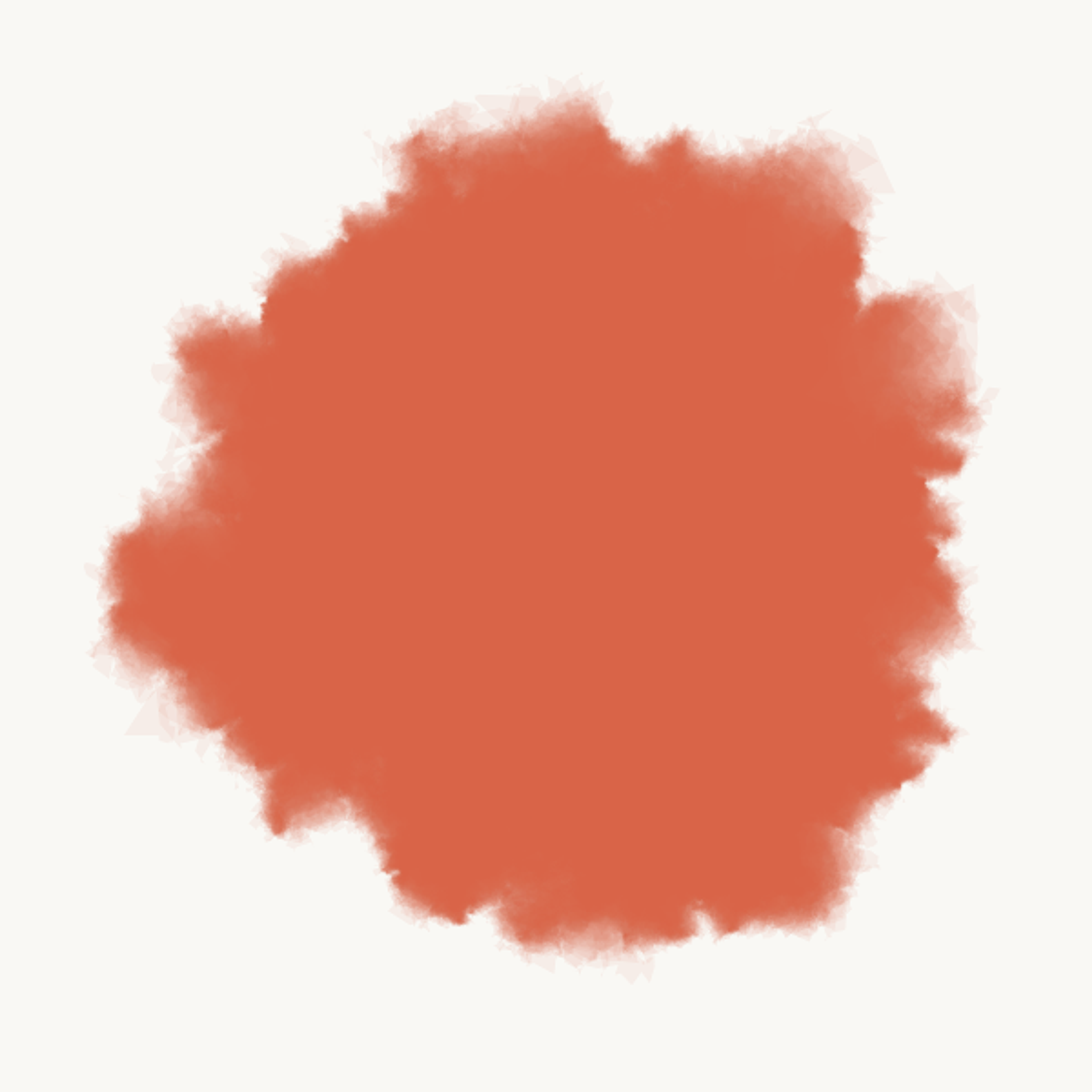
With many stacked low-opacity layers, each with subtle variations
Unfortunately, Processing isn't perfect with really low-opacity layers, so you still do see some edges of polygons, and that's just a fact of life.
Adding Variety to the Expansion
There's one thing that I want to try and improve about this, and that's the variety, in terms of having some parts of the edge be sharp, and other parts being a lot softer, and a lot more gradual blending transition. This is pretty uniformly soft, all the way around. I want to exaggerate that variation more.
I came up with a pretty basic approach for modeling this, and it looks like this. For each edge in the original polygon, we go through and we assign a level of variance. That's going to control that magnitude variable. How far out that edge will jut.
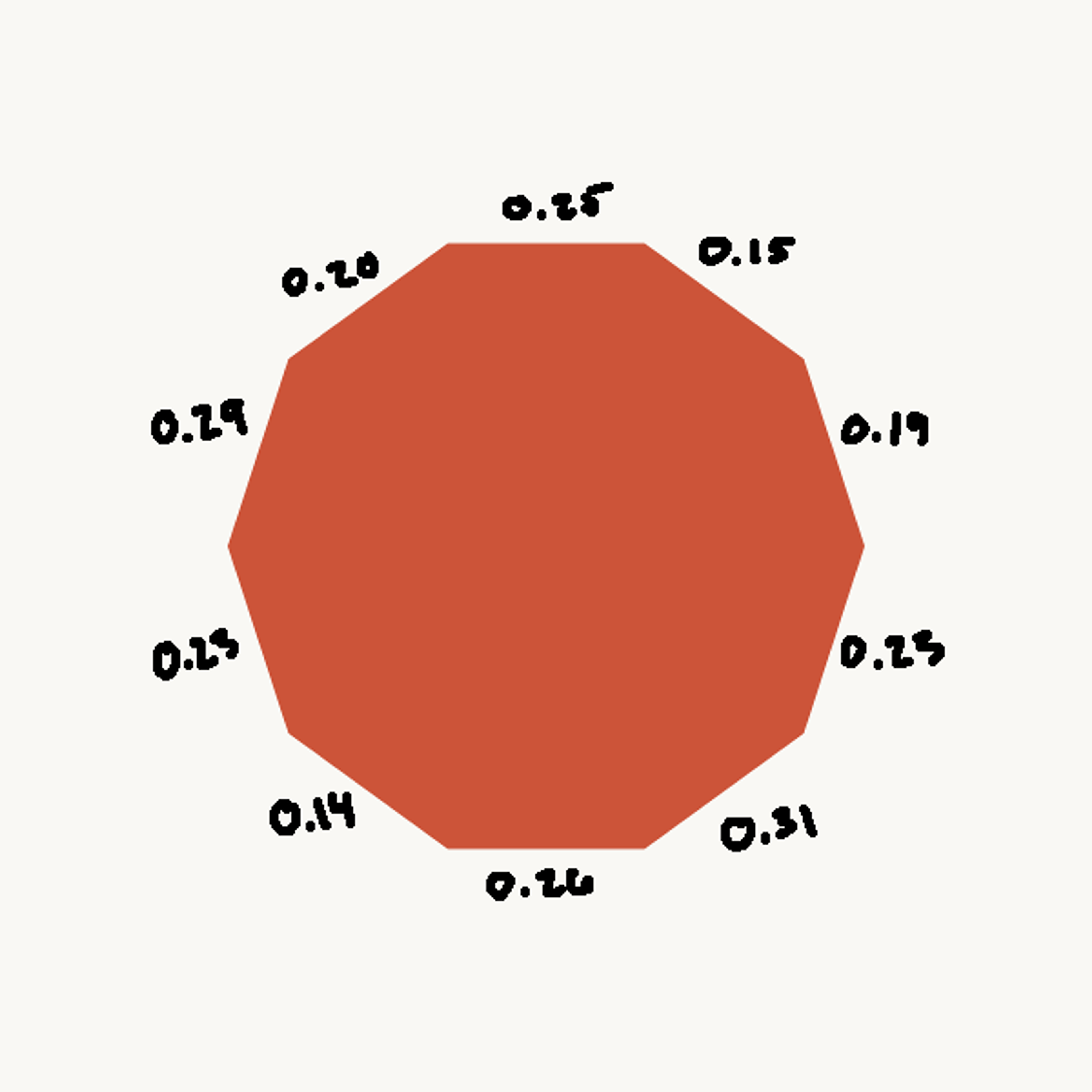
Variance levels are assigned to each edge in the polygon
We can assign these variance levels, and whenever we do break the edge and extend it outward, we create two child edges, and those inherit the variance level, with some small amount of variation. We're going to keep that part of the blob consistent, in terms of how much variation it is. The higher variance levels will be softer, and the lower variance levels will have a sharper edge.
You can think of this as maybe being analogous to parts of the paper being more wet than other parts. The wet parts of the paper transport the pigment more readily. The dry parts tend to stop more abruptly.
If we apply our variance change, we get something that looks like this:
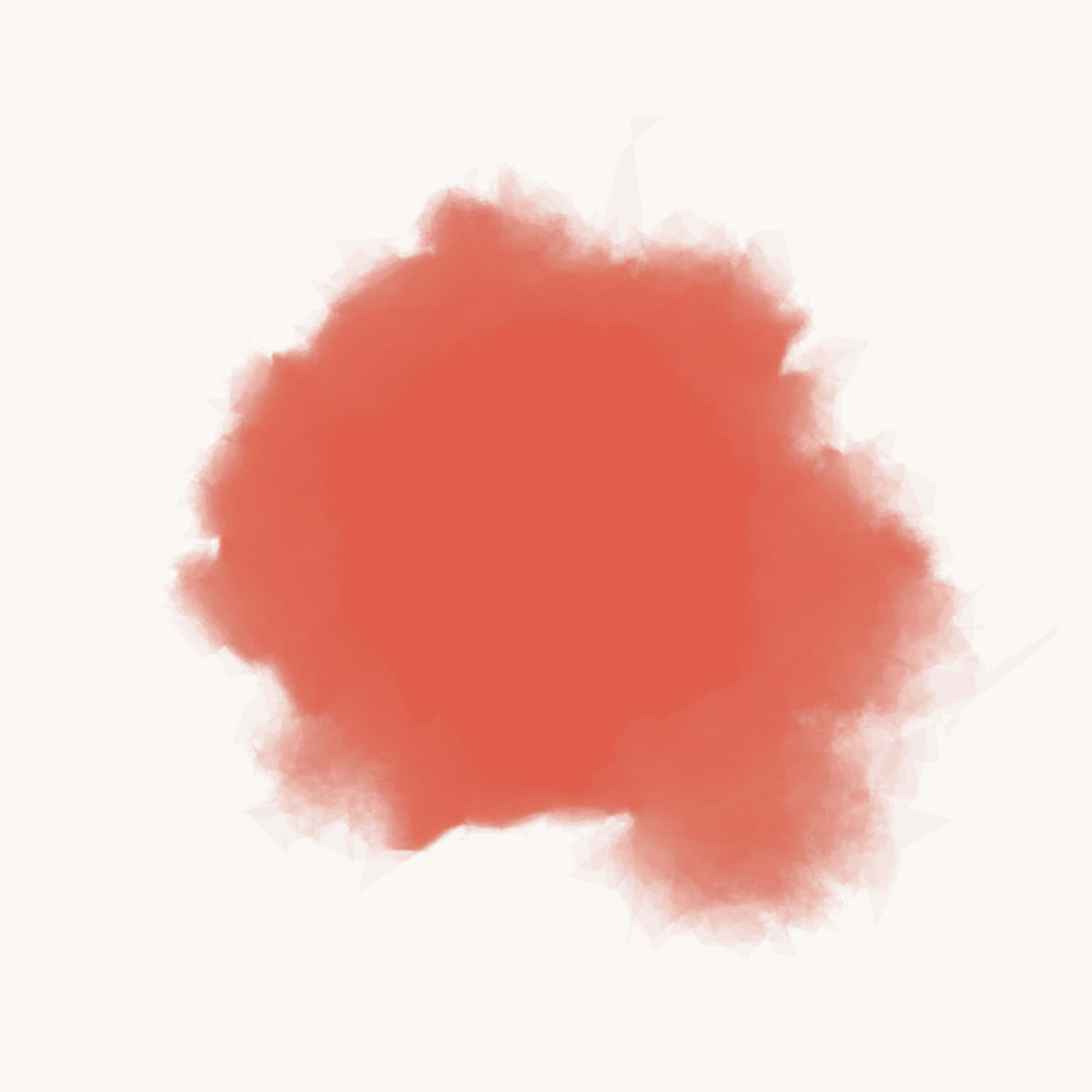
This is a lot more satisfying to me. Down in the bottom right side, you can see we have some really nice, big, soft transitions. We still have a few areas that are a little bit more abrupt, and a little bit more sharper boundary.
Creating a Darker Shape in the Center
Since I still have a pretty good amount of time, there's one other detail that I snuck into this that I want to talk about. If you look closely, the center of this is slightly more opaque than everything else. I'm not sure how visible that is on the projected screen. But that's something you'll see in a lot of natural watercolor. Most of the pigment stays in the center, and so you see the remnants of the original shape that you drew, a little bit.
To get just a touch of that effect, I did something like this, which is instead of doing all 50 layers the same way, where I do three rounds on the base polygon, and then three rounds for every single layer, I did something a little bit different. For the first third of the layers, I created the base polygon with only one round of deformation. Just a slight change. Then each layer got three on top of that.
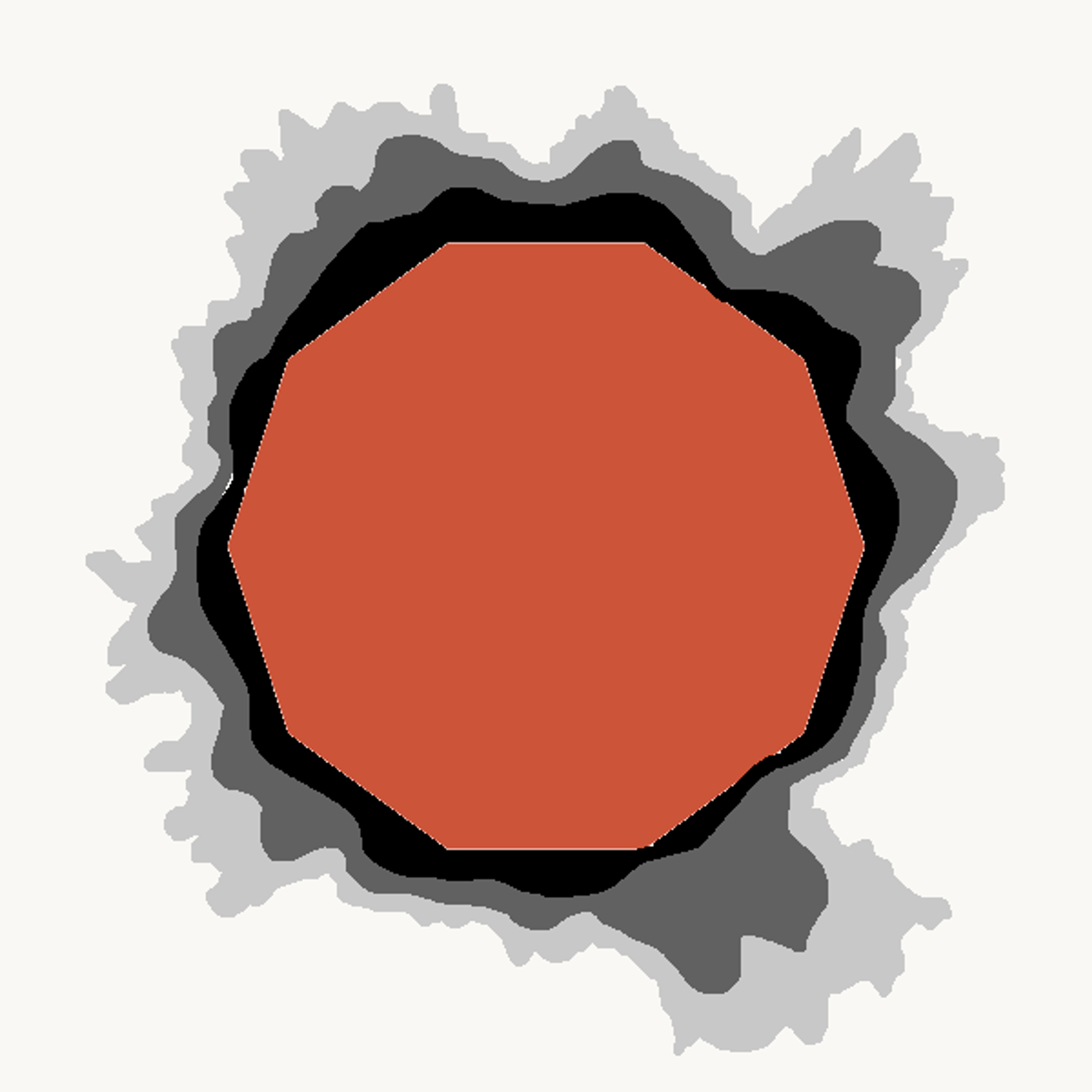
Progressively adding one more round of deformation so that some layers stay closer to the center
Now, when I moved on to the second third of the layers, I added one more round to the base polygon, and then did three for each layer on top of that. Then, for the final third, I did the full three and three.
The first third of the layers are going to be closer to the center, and as we keep progressing, we move further and further out. It concentrates the pigment, so to speak, in the center of our blob. If you look closely, you see that central effect.
Applying the Model
That pretty much wraps up my model of watercolor paint. Like I said, I kept it pretty simple, but now I have a nice tool at my disposal. I can reuse it in any way that I want to.
I've almost created a little bit of a new medium for myself as a generative artist. That's a cool aspect of generative artwork, is it's almost a meta-medium. Sometimes, with each piece, you're creating a new medium to create artwork within.
I'm just going to show you a couple of examples of how I've used this. This was just one of the first really basic pieces that I made with this technique. I really was interested to see how this responded in terms of different areas of color blending, and they don't always blend really nicely, especially if the colors are very different.
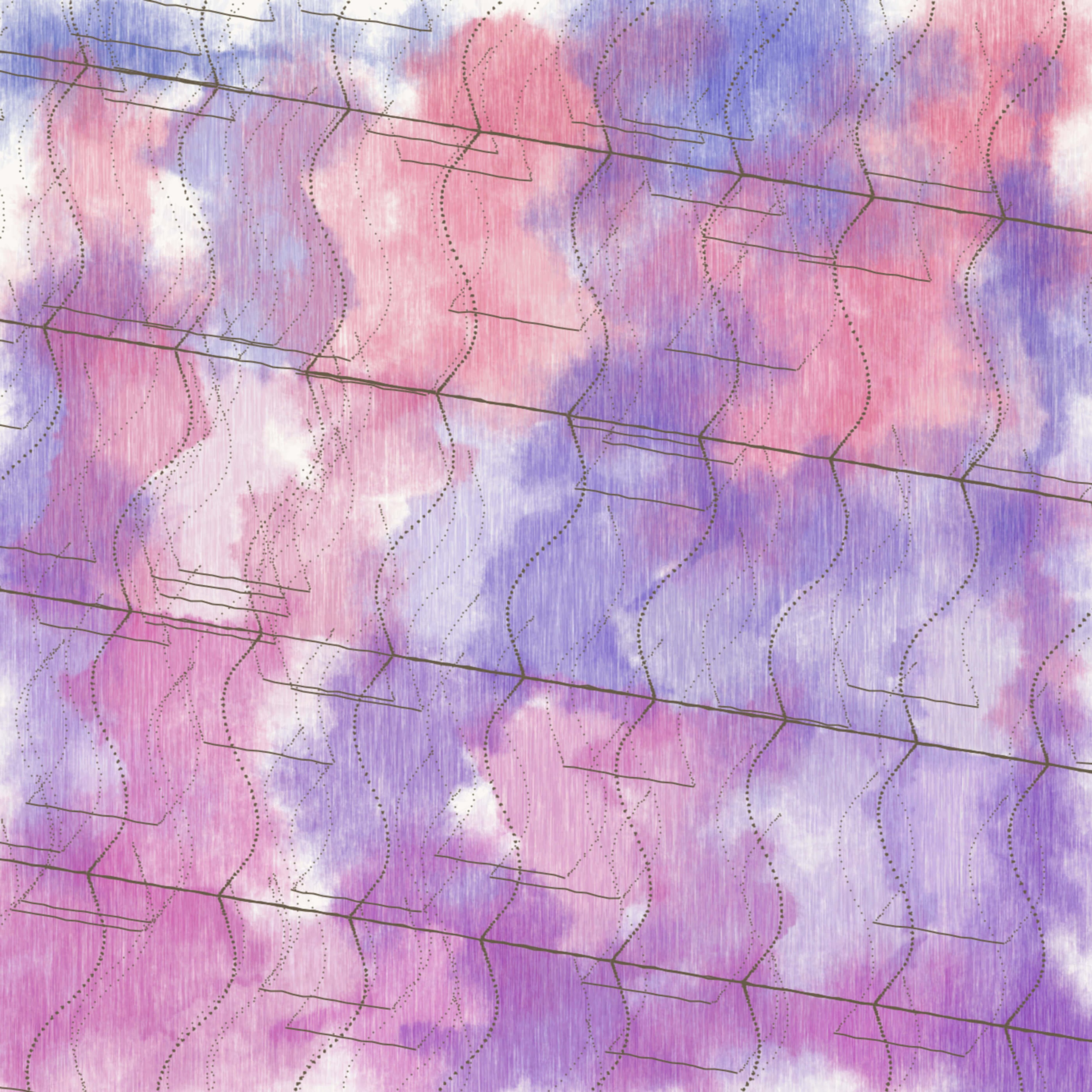
Isohedral XI, 2017
The same it true of paint, but it's especially weird doing it through Processing. I had to be careful about what colors I tried to blend. I did one tweak that made the color blending a little bit better, which was to use a texture mask for each of these blobs. The texture mask, you can see it looks like a grain on here. Like a paper grain. That allows each blob to have parts that are more transparent and more opaque, so layers underneath show through a little bit better.
The other thing that I did that helped out the color blending was, instead of doing one blob at a time all the way to completion, then the next blob all the way to completion, I defined all of the blobs up front, and then did just the first layer for every blob. Then just the second layer for every blob. Then the third, and so on. The whole thing gets painted at the same time. That helps to blend the colors a little bit more naturally, as well.
Eventually, I wanted to make more sophisticated pieces with this. These are a couple of finished pieces of artwork that I made using this technique. Here, I drifted a little bit further away from that more natural watercolor feel, which is okay. The reason that I did the watercolor study was not necessarily to make fake watercolor paintings, but it was to capture those interesting patterns and textures that I saw in watercolor.
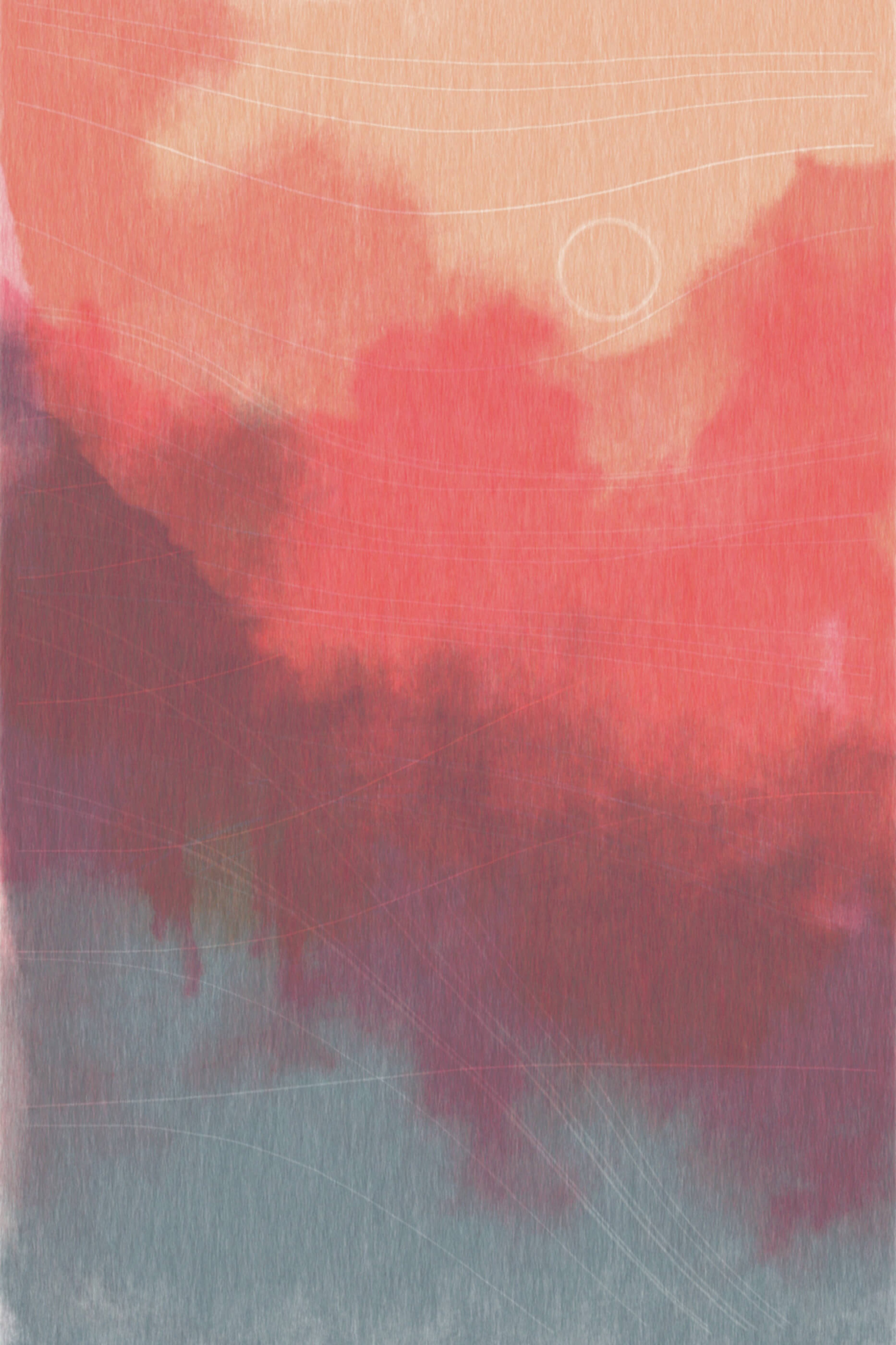
Linear II (Welcome Back), 2017
These look a little bit, to me, more like maybe fabric dye, or something like that, but you still keep all of these really cool, interesting watercolor-like textures in here. I also introduced a couple of decorative elements. Introduced some masks on the different layers of watercolor paint. That's where you see some the lighter lines, where it allows layers below it to show through.
But I want to talk just a little bit about how you put together full generative piece. It does resemble a lot how I modeled the watercolor process itself. There's a lot of carefully applied randomness in these. If I ran the program that generated this one a second time, I would get a pretty different result. That's by design.
It's a careful balancing act when you're working with randomness in generative artwork. You want those pleasant surprises that come from using randomness. You want it to do things that maybe you couldn't think of yourself, or that you didn't expect, or that are really off-the-wall. It's really amazing for that type of exploration.
Determining exactly what that structure is, is different for every piece and is usually the most challenging part of designing a piece of artwork.
But you don't want it to only do something pleasant every 2,000 images. You want it to do something pleasant every maybe 10 or 20 images. You try to find this system of constraints around the randomness, or this structure that makes it more likely to produce interesting things. Determining exactly what that structure is is different for every piece, and is usually the most challenging part of designing a piece of artwork. But it's what makes generative artwork a really fun way to work, for me.
Let me see how much time I've got here. Okay. This is pretty much everything that I have to say about the watercolor process, and about how I've applied it to a few pieces of artwork. Since we have some time, and people usually have no idea what generative artwork is about, I want to go ahead and open it up for questions. But before I do, thank you very much, everybody, for having me on! I appreciate it, thank you.
Audience Q & A
Q. Do you mostly work with static images in Processing, or do you utilize some that's more like animation, dynamic features in your works?
I do, occasionally, use animation, but so far, I've only focused on static imagery, because it's already such a new, difficult thing to do. Adding dimensions of time just complicates thin gs infinitely. I mean, literally, you're adding an infinite dimension to the work. It's hard enough for me to make static 2-D imagery, and I feel like it will be a long time before I've mastered that in any sense. I do play with animation some, but for now, I'm focusing on what I can learn just through static, 2-D imagery.
Q. How do you save your work? Can we see some code?
I save my work through seeds for the random number generator. I think everybody in here probably knows what a seed is, so I won't explain that. But every time I update the program and re-run it, I use a new seed, and I save the seed as part of the filename. That way, if I want to generate a much larger image, I can just re-run the program with different size settings, and use the seed. That will mostly work. There are some gotchas there. But I won't go into detail on those. Other than that, I just save images as just TIFF images, which are nice for printing.
On my website, I have blog posts specifically about the watercolor approach, and it shows code in there. I don't opensource all of my work. That's a long topic that I won't get into here. But I'm happy to talk with anybody about that afterward.
Q. Have you learned anything about water, and the sort of ways that water distorts things, and the physical processes by doing this type of study?
I did read a little bit about fluid dynamics, which fell into the realm of being too complicated for me. I talked about, I want it to be simple. I want to understand everything from the top to the bottom, and to do that with fluid dynamics would take me a really long time. I didn't care that much about having physically accurate simulation.
On the other hand, it taught me something about watercolor painting, the actual process of using watercolor paint. When you observe things with this very process-oriented mindset, this very analytical mindset, it's interesting. You learn a lot more in the reverse direction, as well. By doing this sort of generative work, my actual watercolor paintings have gotten a lot better, I think. I have learned a lot, but I can't say that I've learned too much about fluid dynamics.
Q. Have you looked at ink or pencil at all?
I have looked at both. There are some interesting textures and patterns that you get out of ink and pencil. Graininess. With ink, you get variations in the line thickness. But usually, what I study when I'm looking at ink and pencil is more about the imperfections in what happens when you draw something by hand. Or the way that, if you're trying to draw some pattern by hand, what's actually going on in your mind while you're doing that.
If you're trying to draw, say, a circle, over and over again with a pen, what are the rules that are actually going on in your mind about how you correct the pen to keep it close to the circle? Can you recreate that in a process? Can you capture that mixture of randomness and intent? I find that part of it a little bit more interesting than the specific textures of pen and pencil. But I would encourage you to investigate pen and pencil yourself.
Q. How long do your paintings take to render?
Anywhere from a tenth of a second to maybe one or two minutes, at the high end. That depends a lot on the polygon count, and the line count. The watercolor stuff is actually infuriatingly slow, because these polygons, they end up with a lot of edges. Especially this one, I think, was close to a minute. I don't like waiting quite that long for pieces to render. I try to keep things in the several seconds range, instead, if I can.
Q. When do you think your work will pass a Turing Test?
Yeah, I mean, translating the Turing Test to artwork is, I mean it is created by a human, right? So I hope I'm passing the Turing Test in that aspect. But I do very frequently have people think that I've done this work by hand. Maybe not as much with the watercolor, although people do say that, especially with line drawings by hand.
The image on the left, a lot of people, even looking at a really large print up close, they ask me, "How long did it take you to draw this by hand?" I told them, "I would be insane, if I tried to do this by hand." But that's what I love about trying to capture that human warmth in the work. That's what all that little, carefully placed randomness gives you, is that warm, natural feeling. Even though this is all triangles, ostensibly, it has a much more natural, warm feeling. People do mistake it for being drawn by hand pretty often.
Q. The normal distribution is awesome, and it's a good thing that you’re using it, but have you thought about using other distributions?
Yeah, like a Poisson distribution. I did take a probability class in university, and I remember I loved it, and I remember there being a lot of cool distributions, but that and the triangle distribution has come in handy in a couple of places. But other than that, normal distribution works for me about 95% of the time.
Q. Who are some other artists that we can take a look at, if we're interested in seeing more generative art?
Boy, there's a lot of them. Probably the biggest name in generative artwork, and one of the authors of Processing is a gentleman by the name of Casey Reas. He's been pretty successful in the actual art world.
Hmm, some of my favorites. There's a gentleman in Australia named Jonathan McCabe, who does ... His work is on Flickr, primarily. But he uses a lot of cellular automata work that recreates a lot of interesting biological patterns. I would suggest looking at, there's actually a generative artwork subreddit that I'm a moderator on, r/generative. That actually has a really good sampling of lots of generative artists. If you want to see a good variety, that's one spot that's actually one of the better collections on the internet of generative artwork.
Q. I know it's probably hard to estimate, because you're reusing some of the textures and the mediums you make as libraries, but how long do you spend on actually creating one of these pieces? Start concept to finished product?
There's a lot of variation in that. My typical range is probably five to ten hours. Sometimes I get lucky, and something good comes out in one hour. Sometimes, it's a real grind, and I work on it for 20 or 30 hours. That's especially true if I'm doing something that's like a commission, where I'm working back and forth with a client on a piece.
But generative artwork is really interesting in that way, because sometimes these really elaborate, detailed pieces just come together really quickly, and it only takes a few lines of code. It's all over the place. Whereas with something like a painting, you have a much more predictable amount of time, I think, that you're going to spend on a piece. I love how fast I can work with generative artwork most of the time.
Q. Have you considered pairing audio synthesis with the visual aspect of generative artwork?
I've considered it, but for the same reason that I don't do animation, I don't do that. It makes it really difficult, and I'm not quite there yet. I also lose some of the control that I like. I like having the control that having a no-input program gives you.
Q. Have you thought about importing randomness from nature?
I have not. What's an example that you might think of? Now I'm curious.
Q. Like sampling a photograph as a source of randomness.
I have not thought about that. That might be an interesting way to get some really unique probability distributions, though. That's a cool idea.
Q. A related question: have you thought about providing your own randomness, like from say webcam, or some other input like a keyboard or a Wii-mote?
I've thought about it maybe just briefly, but there weren't any huge advantages that stuck out to me. I don't want to make things interactive just for the sake of making people feel like they've had a meaningful input. A lot of work that does that, it feels cheap to me. I'd rather that they had just made something cool, without me waving a thing around. That's how I feel.
Q. Do you algorithmically generate all of your assets, and shapes, and all that? Or do you import SVGs, and use things like that to create them?
The answer is that I algorithmically generate, in almost all of my pieces, 100% of it. I don't import any geometric shapes. The closest thing that I can think of is, occasionally I will integrate hand-drawn elements. Digital painting elements. If I want to do something like a generative portrait, then I will integrate hand-drawn elements in it in various ways.
Q. Have you experimented with working in 3-D for projecting it back into 2-D?
Any time you look at a 3-D image on your screen, it is naturally projected back into 2-D. I'm not sure about that part of it, but-
Q. Do you do all of your computation in 2-D?
Yeah. I do all of my computations in 2-D. I don't do any three-dimensional geometry, or perspective, or anything like that. Sometimes I allude to three-dimensional elements, like this one on the right, you might perceive some depth there. But no, all of my math is basically two-dimensional.
Q. Do you tend to have a specific concept of what you’ll make before you start, or do you take shorter iterations, and get feedback of where it's moving?
The answer is that most often, I'm working very iteratively, and it's very exploratory. That's one of the strengths of the medium, is that it's so mutable. You don't have to figure out everything upfront.
Any painter will tell you, even if you try to plan out a whole painting, and you do studies and sketches, when you go to paint the final painting, things don't work out, and you have to adjust things on the fly. It's already difficult to plan things out perfectly. So I find that I make the best work when I know very little upfront about what I'm going to do, and I just try to be open to see new things come out of the artwork.
Time for one more question. Who has the better question? This guy looks pretty confident. I'll talk to you afterwards.
Q. If we purchase one of your works, do we get the source code, too?
Yes. That's a question I like. I knew I went with this guy for a reason. The question is, if you purchase one of my works, do you get the source code, too?
The answer is yes. I provide a printout of the source code to the works, along with the prints. All of my prints are single-edition works. I don't do multi-edition prints of anything.
Thanks, you all, very much for all the great questions. I really enjoyed it. Thank you.