Color Arrangment in Generative Art
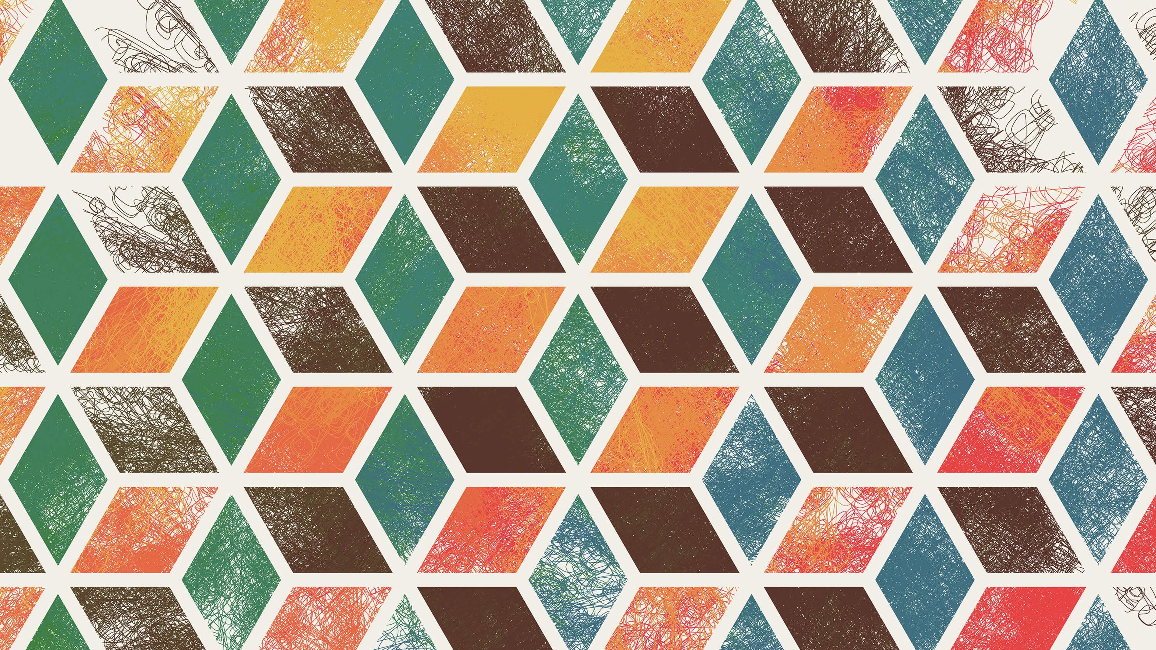
Many aspiring generative artists find color to be one of the most difficult aspects of their work. On top of the standard color-related challenges you’ll find in any medium, in generative art you typically have much less control over the exact color choices for any particular element in your work. The kind of randomization that’s standard in generative art means that the algorithm is selecting the final colors, not you.
When facing this problem, many generative artists select one of the simplest approaches: each element gets a random color (with terrible results), or each element gets a color randomly selected from a predefined palette (with somewhat better results).
There are higher-level strategies that you can use to compose, organize, and arrange your color choices. These can help take your work beyond the scattershot odds of totally random choice. They can establish a relationship between your colors, and add compositional strength to your artwork. When done well, some of these techniques can make a work interesting all on their own. Read about some of these strategies below, and consider using them next time you’re puzzling over how to color you work.
A Quick Note On Using Other People’s Color Palettes
While we’re on the topic of color, I want to point out the hazards of simply adopting predefined color palettes that somebody else has created for your own work. Consider this a crutch. It may feel easier at first, but if you stick with this practice, it will inhibit your development as an artist. Each of us has a unique set of color preferences and color “history” built into us. Getting in tune with your own color preferences is part of how you grow as an artist, and you will eventually build your own personal set of well-worn colors and knowledge about particular color relationships. If you feel overwhelmed when trying to select colors as a beginning artist, rather than reaching for somebody else’s palette, I suggest you simplify your work to a level you can manage instead. Start with only one or two colors and gradually build over time.
Getting in tune with your own color preferences is part of how you grow as an artist...
Gradients
One of the simplest techniques you can use is to organize or select your colors along a gradient. For example, you might start with yellow hues at the top of your image, and as you move down the image, slowly change to orange and then red hues. You can also make the gradient change the saturation of the colors instead of (or in addition to) the hue: gradually move from neutral tones to more intense colors. Likewise for color value/brightness.
(NOTE: if you’re using RGB, I strongly recommend switching to an HSB/HSV color model instead. This will make everything easier.)
Especially in some of my earlier work, this was a great go-to technique for me. In Isohedral I, I had two gradients moving in perpendicular directions: one shifting from yellow to red, and another shifting from green to blue.
In Isohedral III, I used a similar strategy with two vertical gradients: one from yellow to red, and another from blue to green.
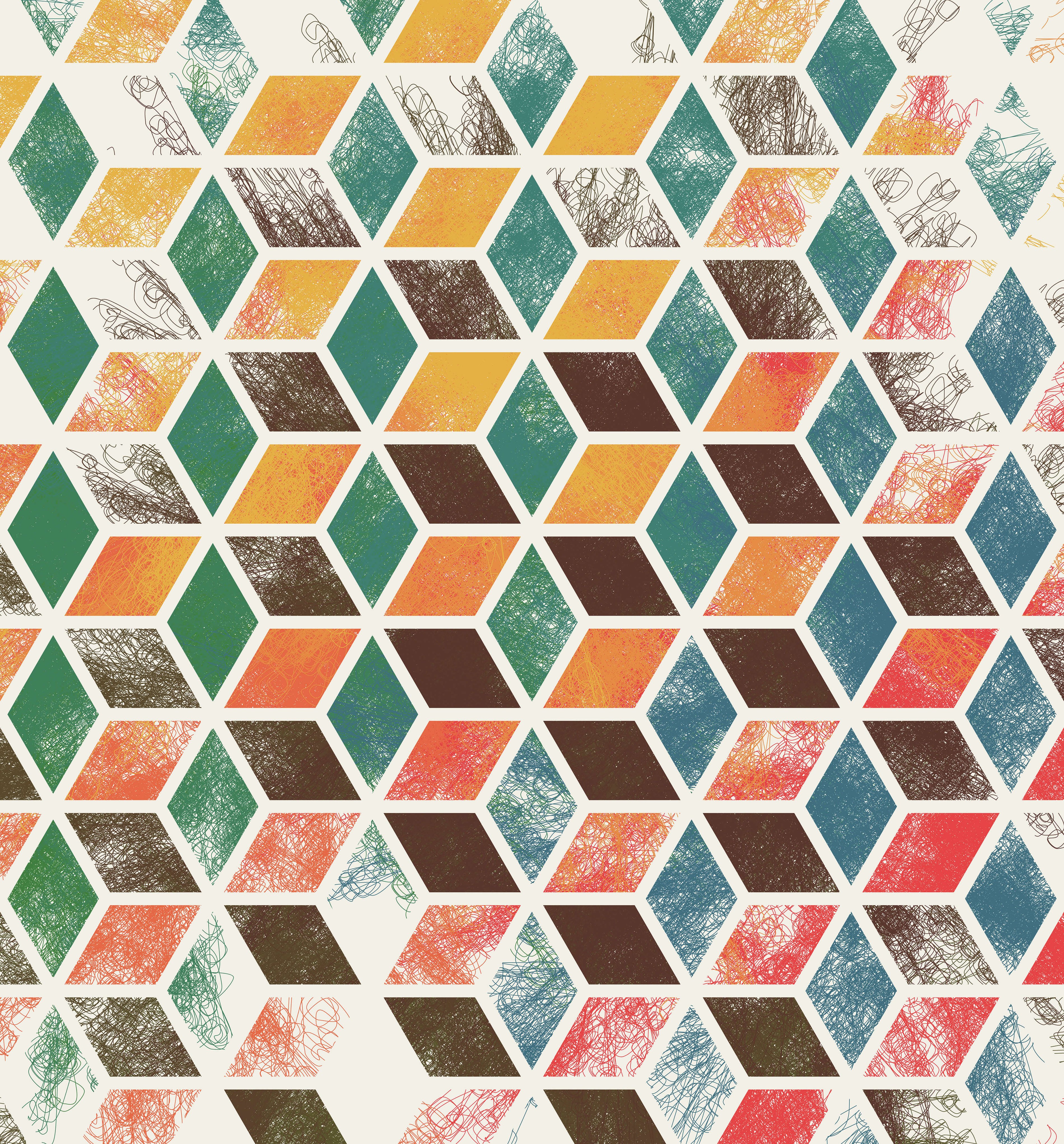
Isohedral I, 2016
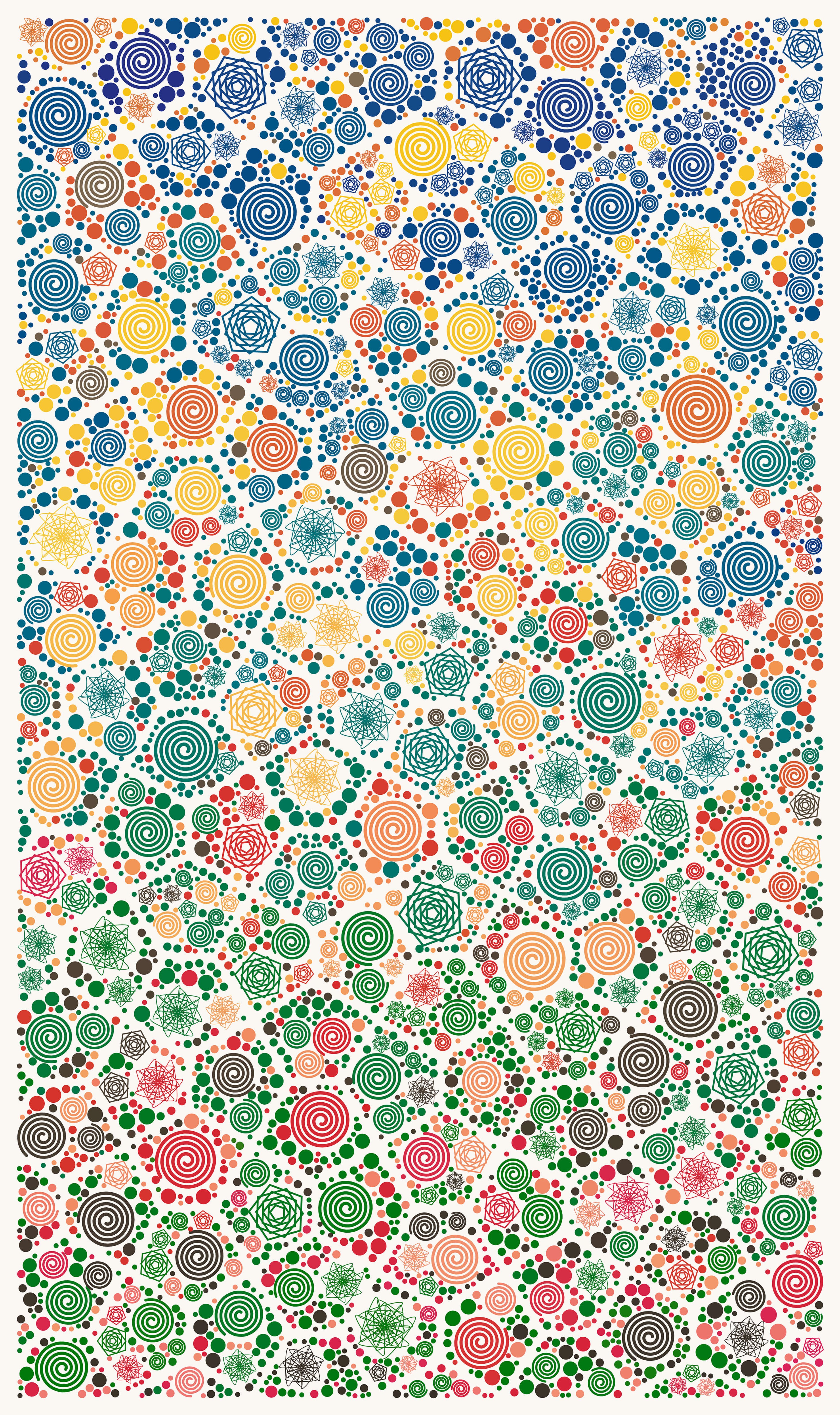
Isohedral III, 2016
In Indigo Dream, there are a couple of gradients going on, but they are more randomized, so they don’t stand out quite as clearly. The general trend is from bright values at the top to darker values at the bottom. There is also a probabilistic gradient: warm colors are more likely to be randomly selected at the top, and cooler colors are more likely to be randomly selected at the bottom.
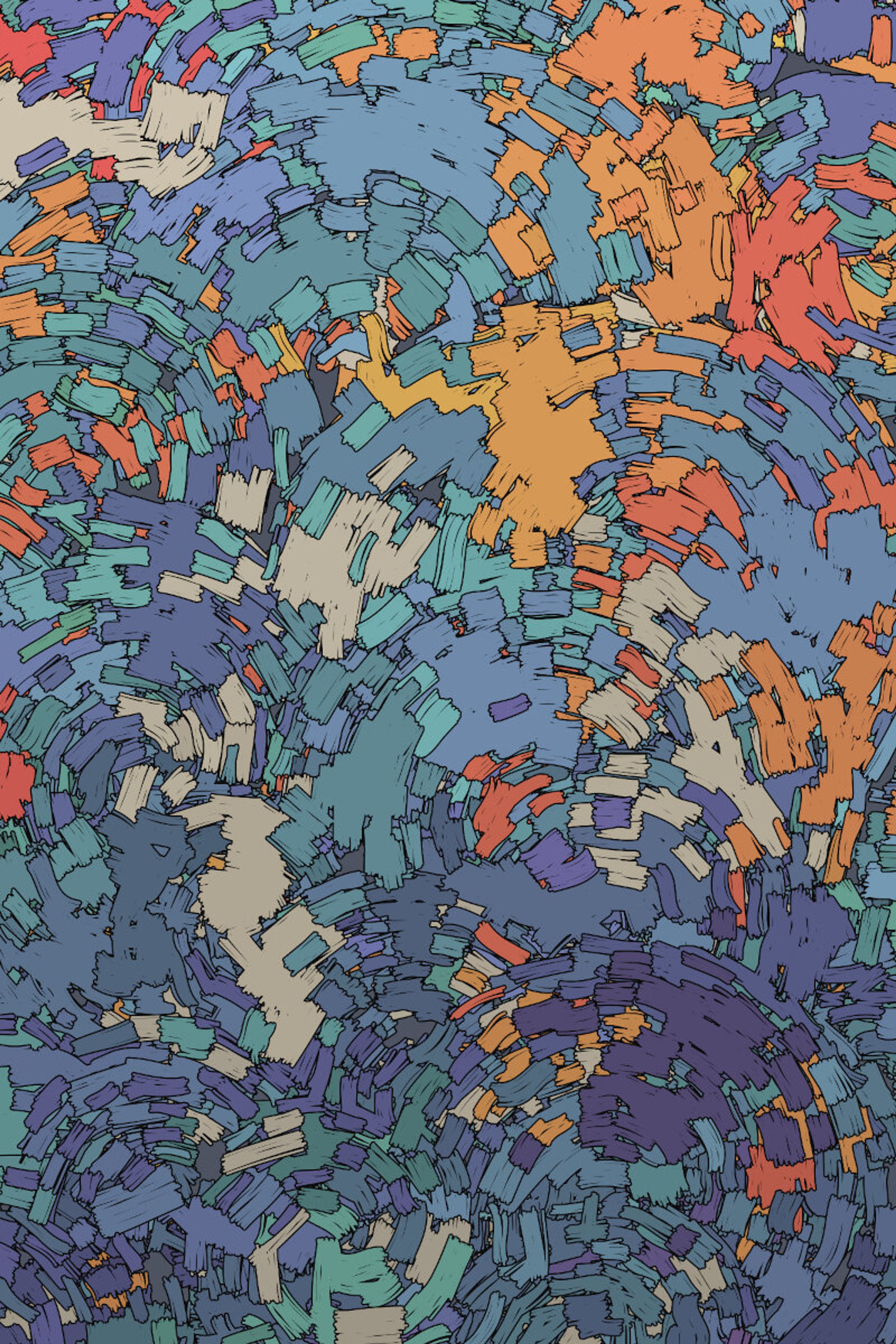
Indigo Dream, 2016
Even in highly randomize or chaotic work, a bit of gradient can add structure and large-scale compositional shapes. Or, it may help to create a feeling of reference to something else. For example, in Talpa, I shifted the probabilities for color selection along a vertical gradient, so that blues were more likely at the top and warm tones were more likely at the bottom. This gave it just the bit of the feeling of a landscape that I wanted.
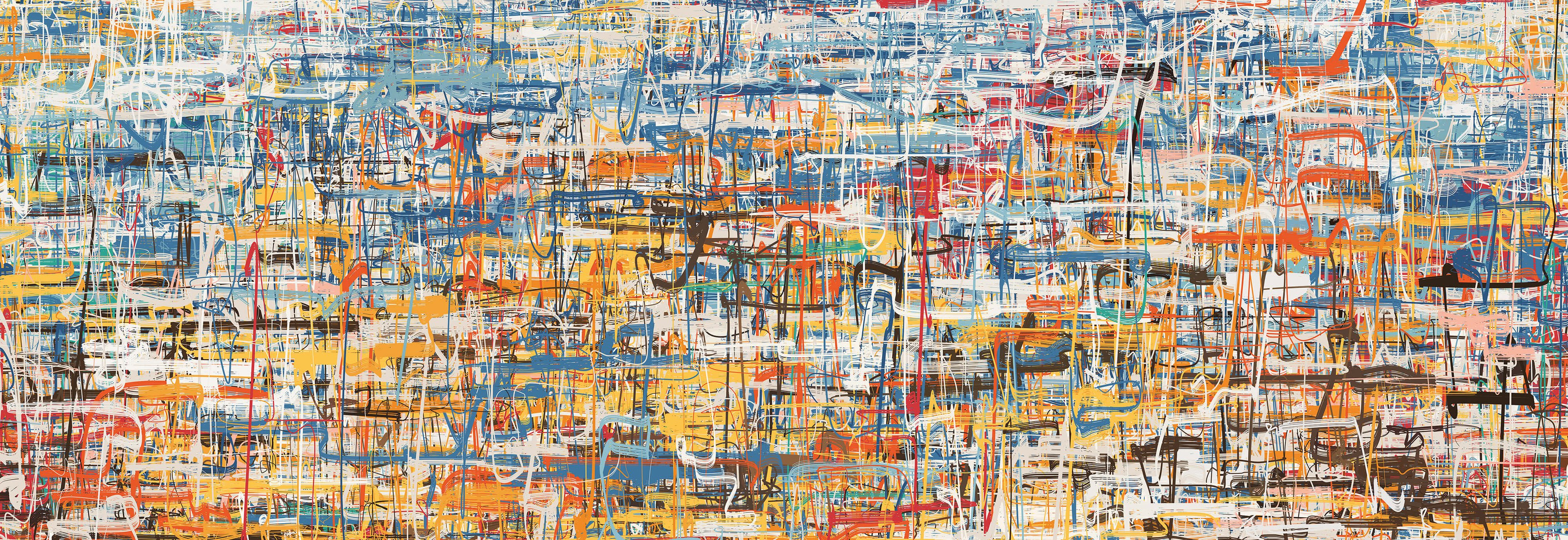
Talpa, 2020
Clumping
A looser, more “local” strategy is to try to clump pockets of the same (or similar) colors together. Essentially, this is a way of building stronger shapes or areas of color within your work. Even if you use individually small marks of color, they can build to a bigger shape.
I used this sort of approach quite transparently in works like Non-Repeating, where there are distinct areas where particular colors are concentrated.
In Sun to the East, it’s not quite as obvious what’s going on, but there are regions where particular colors are likely to be most dense. They have the freedom to wander outside of those bounds, but there’s enough critical mass that you’ll see patches of stronger red, brown, or blue.
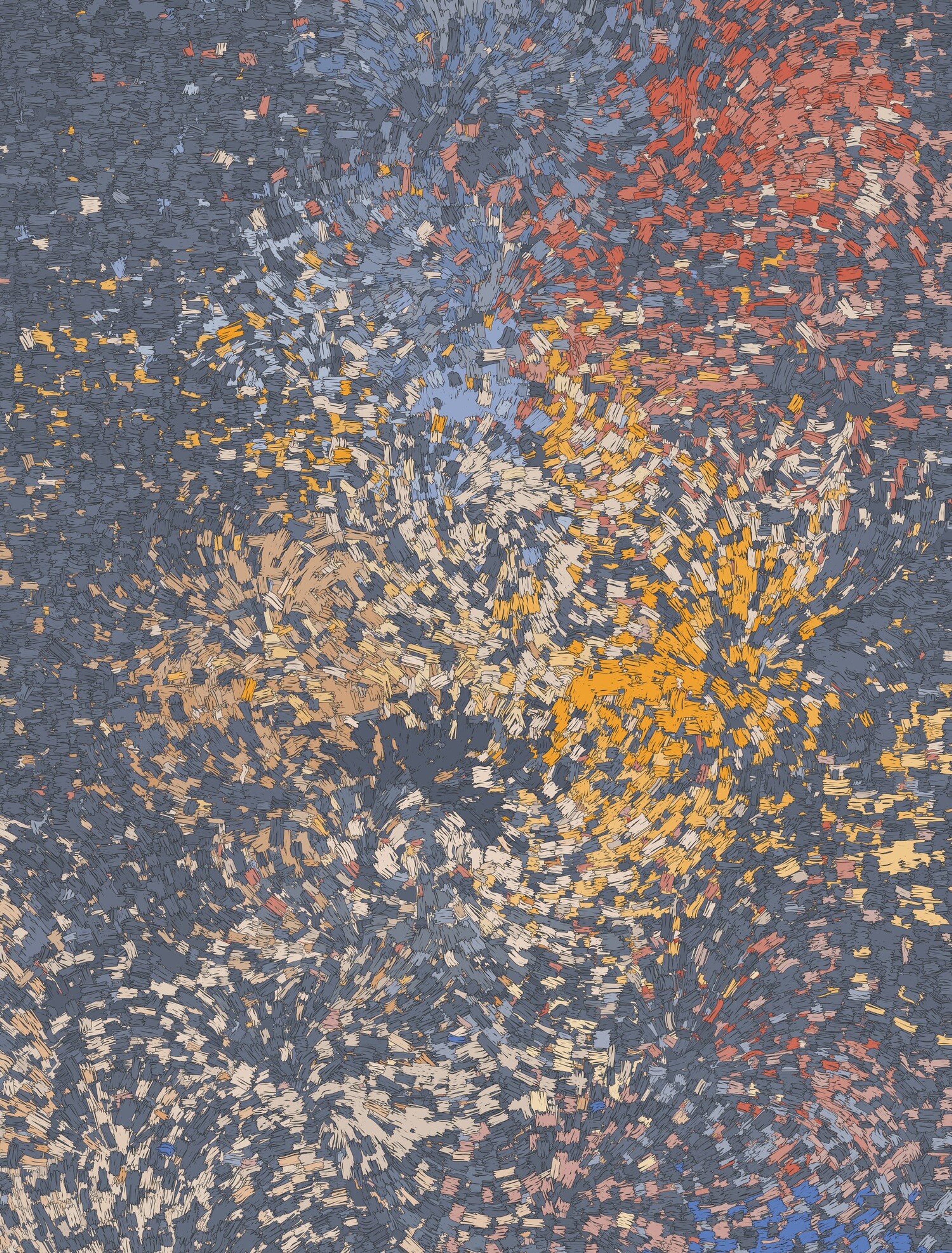
Non-Repeating, 2017
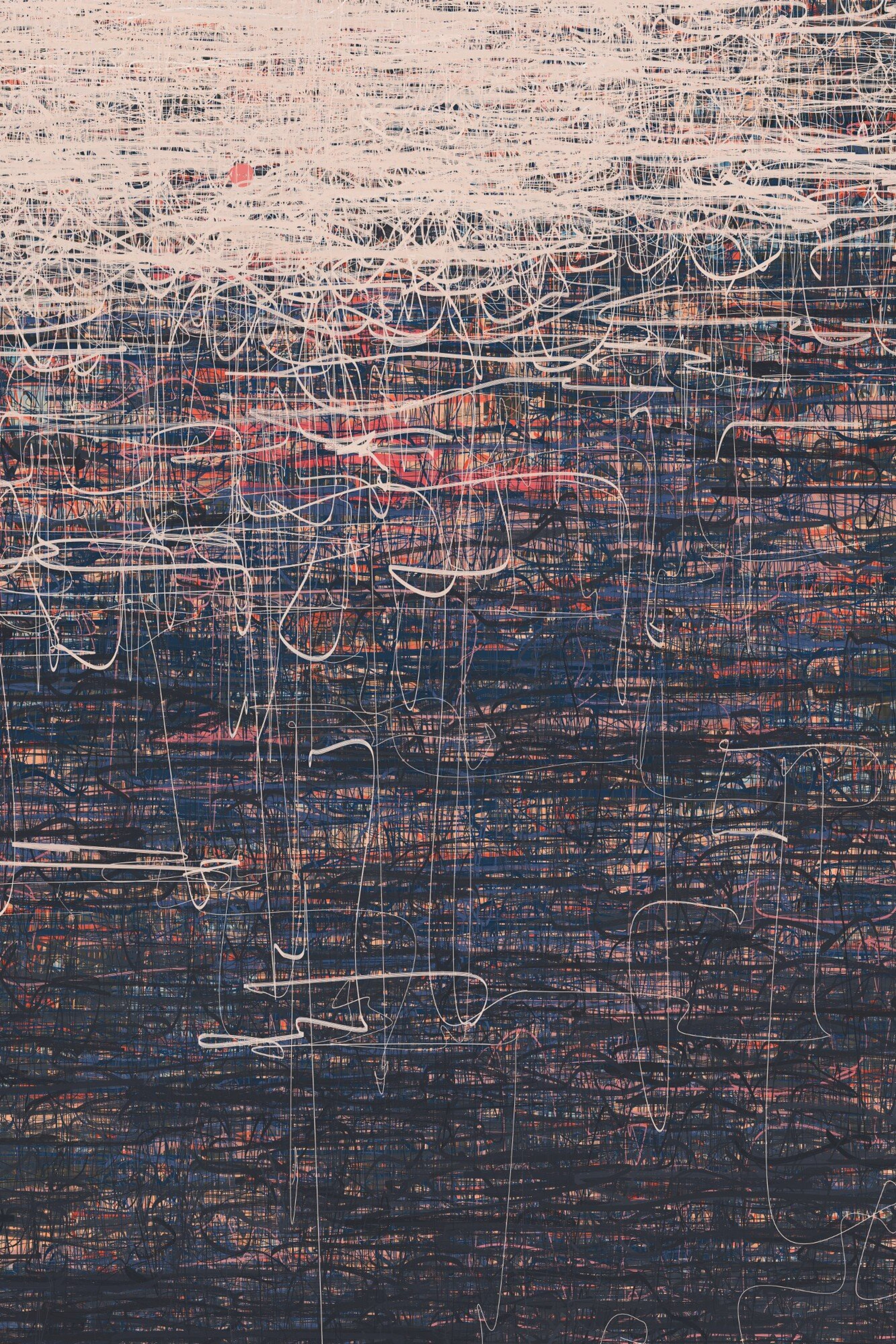
Sun to the East, 2019
In Anticlassic, the clumping is less intentional (because the program, in general, is less controlled), but it’s still pretty critical to give the work a sense of structure and potency.
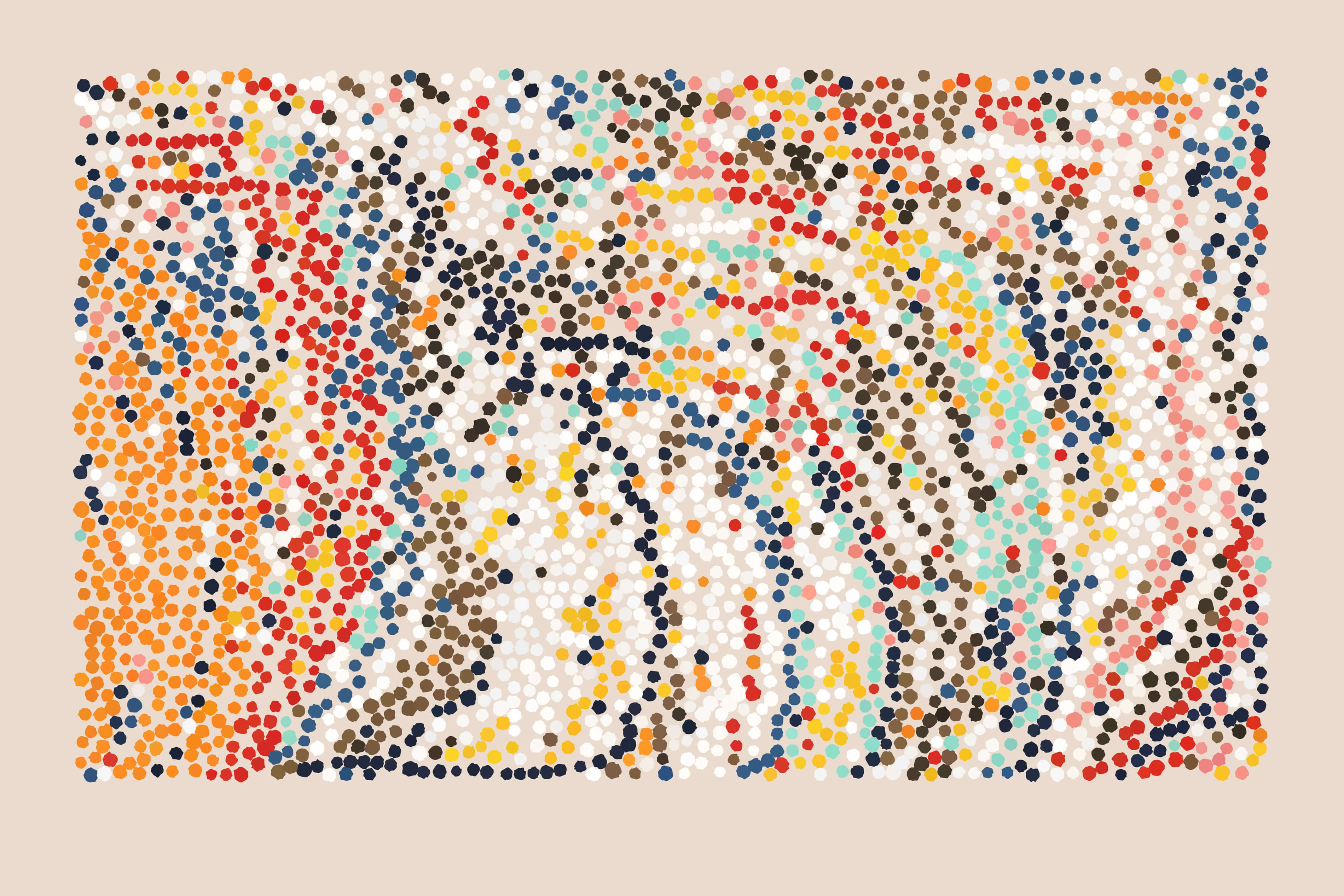
Anticlassic 0.8, 2020
Sorting / Sequences
One unusual approach you can use when you’re working through programming is to sort your colors. You can begin by generating a lot of color selections, and then sort them by some attribute like hue. Alternatively, define a “sorted” sequence of colors, and then gradually/probabilistically step through that sequence of colors as you create new elements.
In Exit from Delusion, I defined the approximate sequence of colors that I wanted. The final color choices for each element were based on that sequence, but with some random variation around where the “current” position in the sequence was, allowing a few out-of-sequence colors to be mixed in.
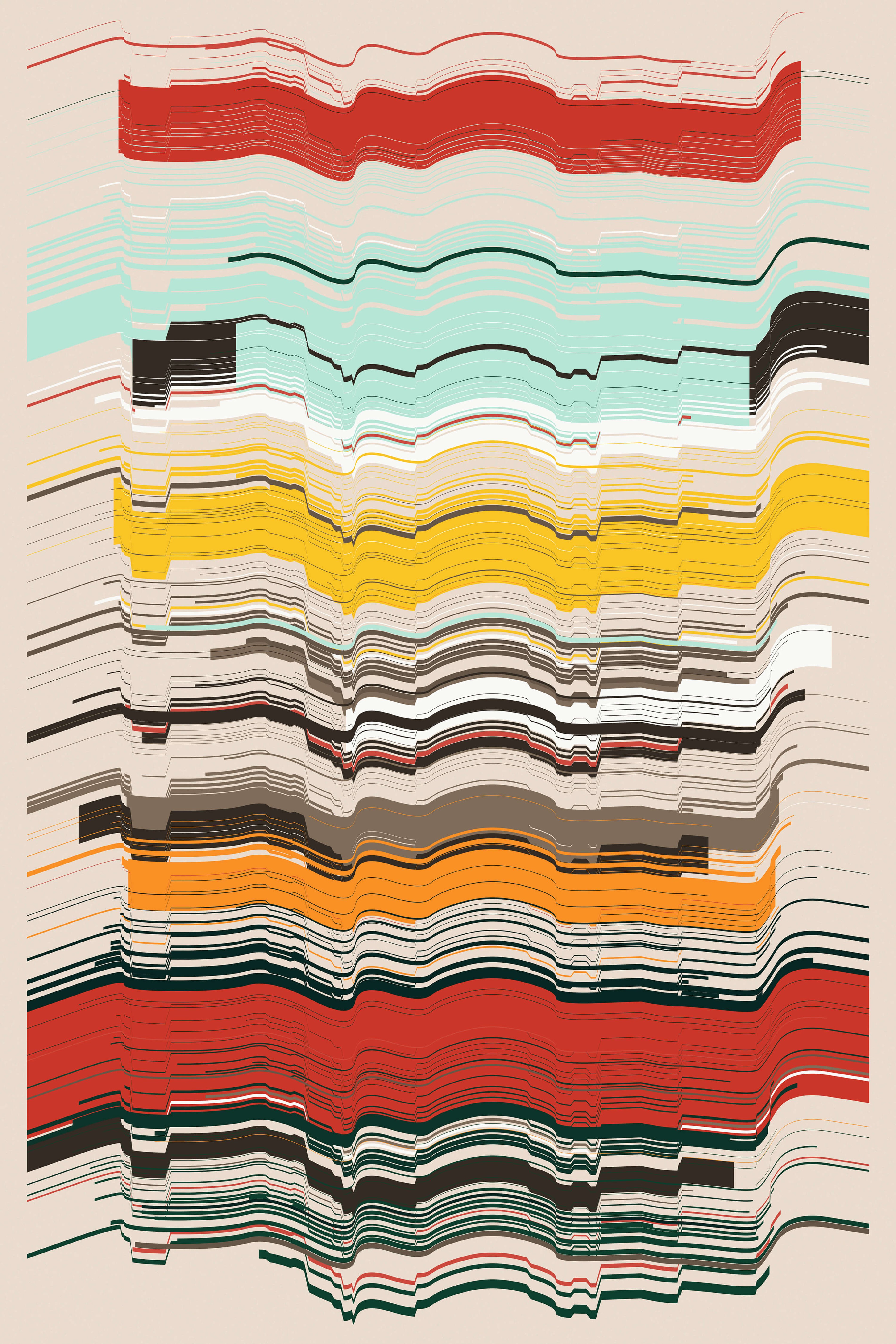
Exit from Delusion 0.0, 2019
In Itasca, I built on that same strategy (and a lot of the same colors!) more successfully. Further shifts in the color sequence along the middle band allowed for some more interesting mixtures of colors.

Itasca, 2020
With Festival Notes, I also worked with color sequences. In my earlier sketches, the order was randomly generated rather than manually defined which allowed for some nice variety. Because the same sequences were used, it resulted in some nice color shapes or “bands”.
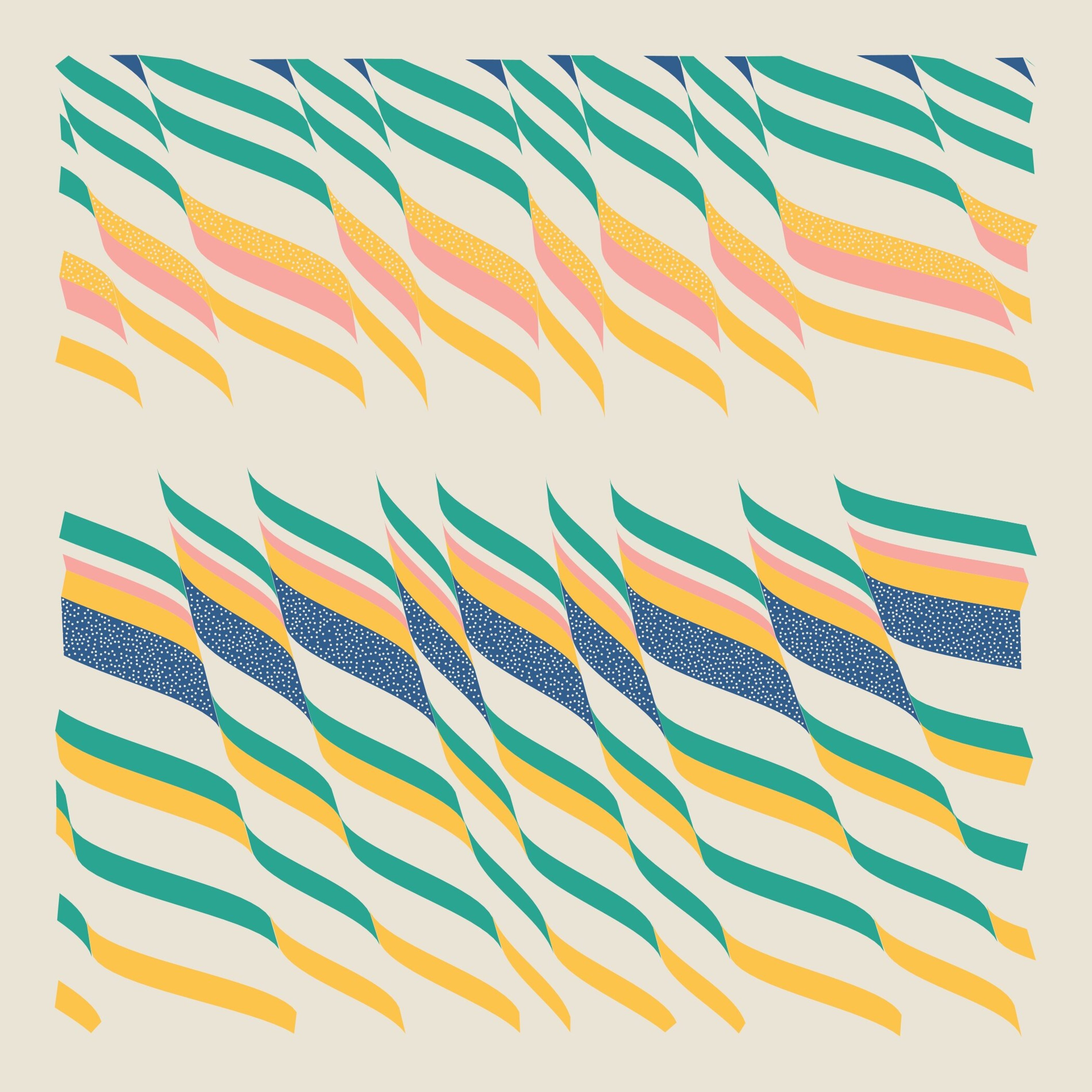
Sketch for Festival Notes, 2019
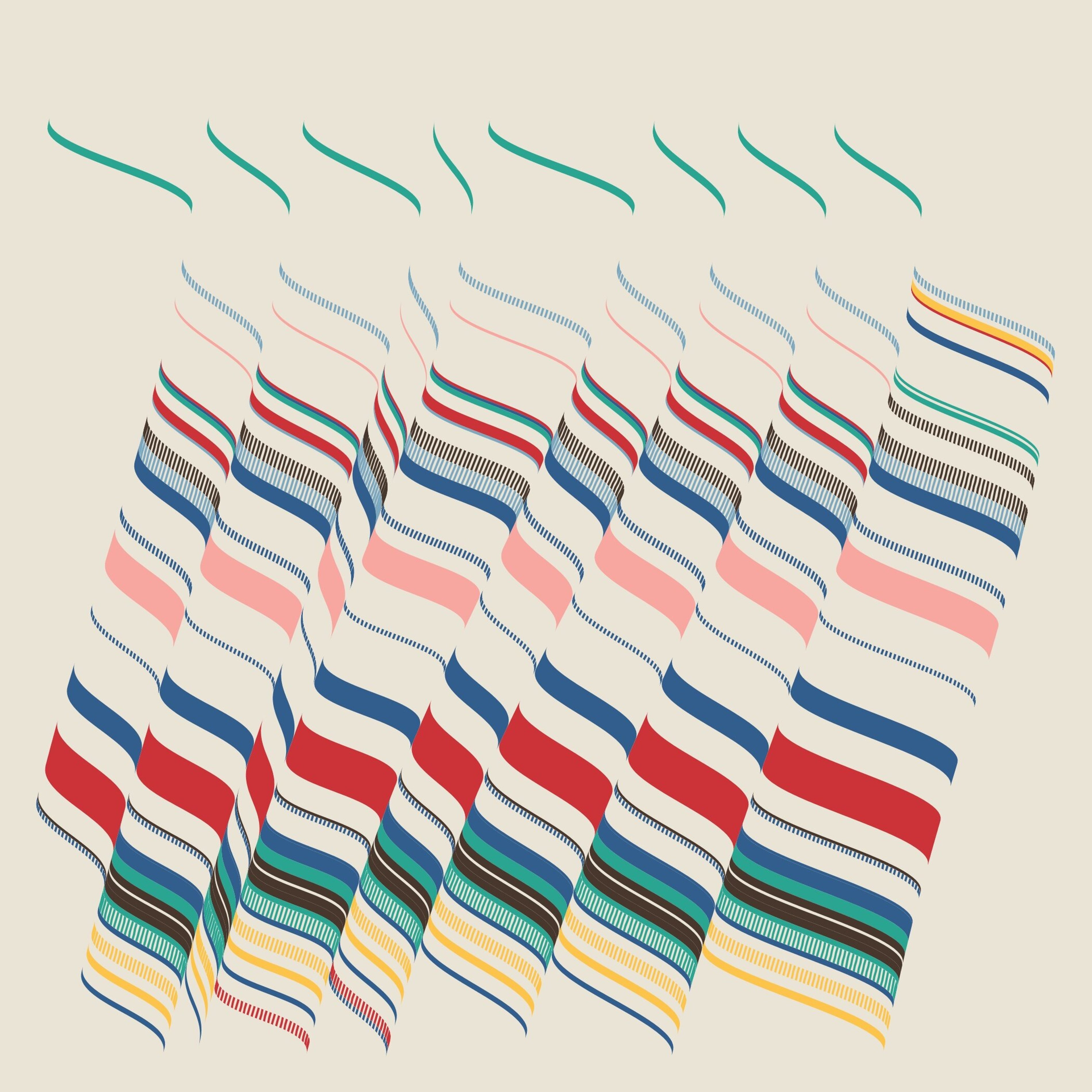
Sketch for Festival Notes, 2019
Color Sampling/Mapping
The colors that you select for your elements can be defined by a second image entirely. For example, you might use a photograph or digital painting as a means of selecting the color for elements in a particular position. I experimented with a bit of sampling from photos in 2016 with sketches like this.
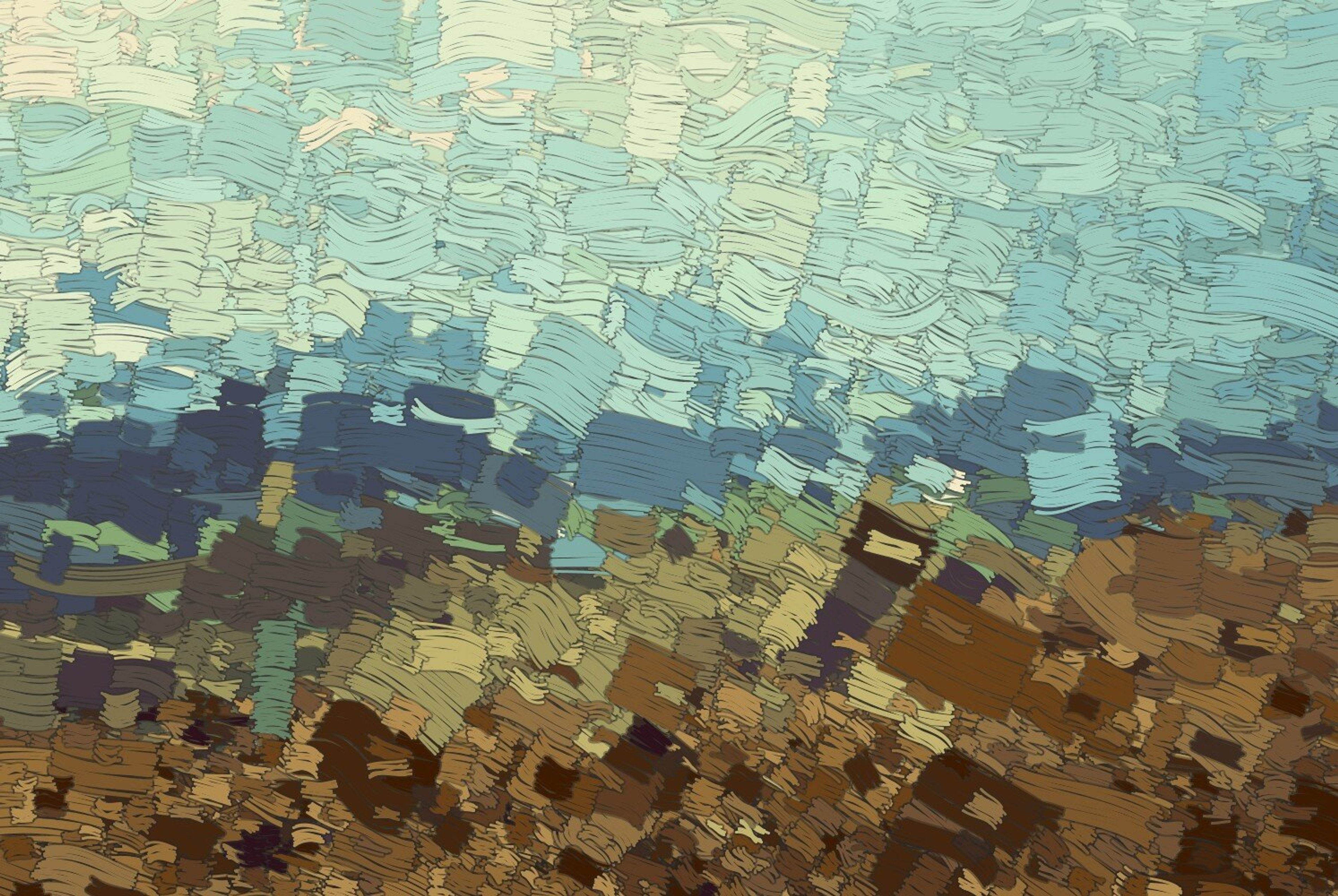
A digital sketch from 2016
Note that when working with photos, you’ll often want to manipulate the colors in some way to give them the boldness or distinction you need. If I remember correctly, in this sketch I processed the colors with K-nearest-neighbors clustering to establish the “main” colors, and then shifted them a bit for artistic effect.
Of course, rather than relying on a photo or painting, you could simply generate the color map as a second layer or image! Sometimes it’s easier to break out that kind of structural thinking into a separate step.
Inheritance
If you generate shapes with subdivision, recursion, or some other parent/child relationship, you can use a form of inheritance when assigning colors. For example, if the parent shape has a red color, then any children of that shape have a high probability of being red as well (along with a low probability of changing to a new color). This can help to create large chunks or shapes a lot of the same color, while still allowing the flexibility for interesting variations in colors.
My most successful use of this strategy was on the album cover and poster art for Max Cooper’s album One Hundred Billion Sparks.
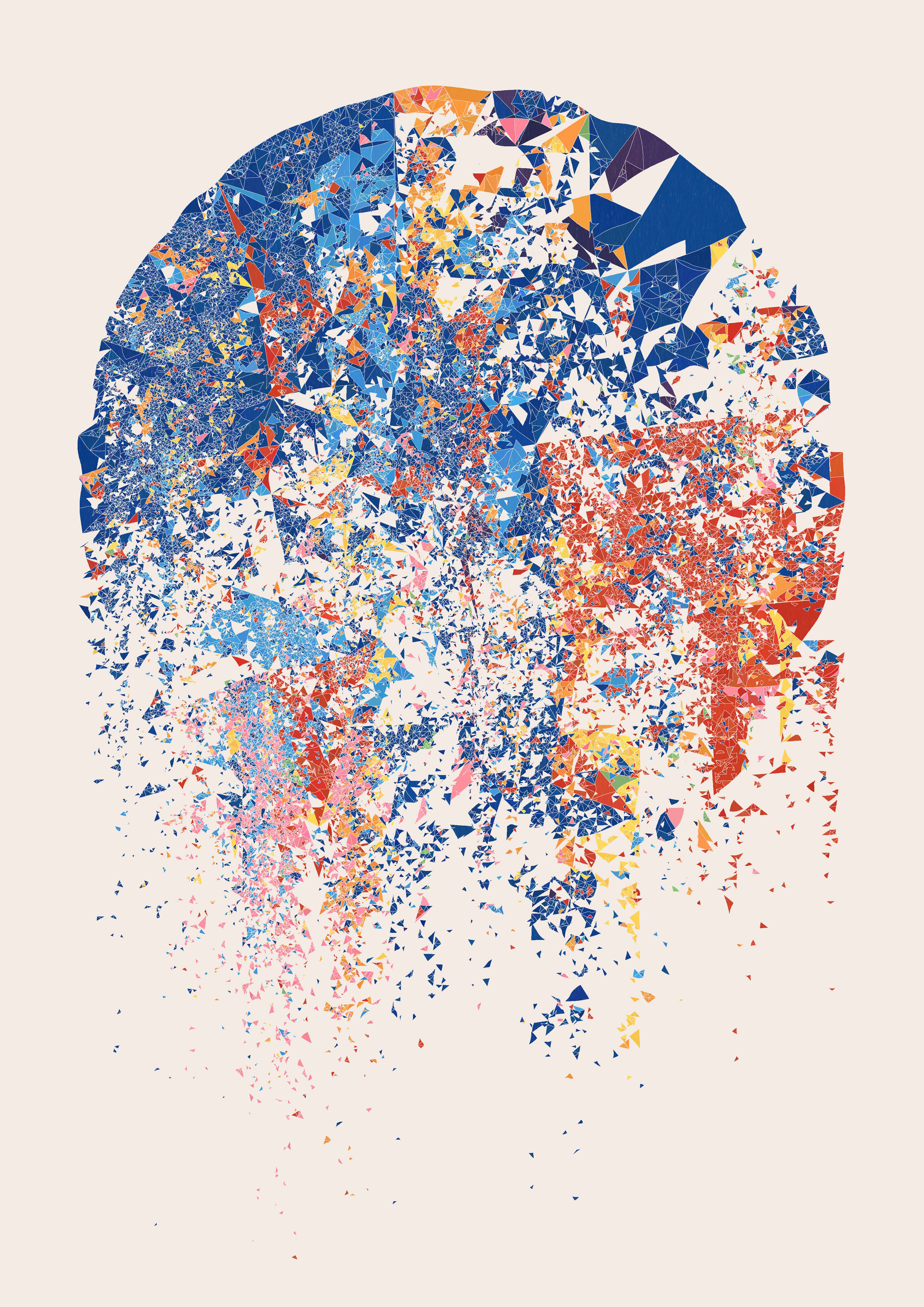
Album/poster art for One Hundred Billion Sparks, 2018
I suppose you don’t even need a strong parent/child relationship for this kind of color influence to work. If you’re feeling adventurous, try working with a graph structure instead and come up with your own rules for how colors are selected.
Compositional Shapes
One final strategy you can use is to think about forming large compositional shapes with your color choices. These can be relatively simple. For example, in Fragments of Vision, the colors were organized around a circle, with more warm colors inside, and more cool colors outside.
While I was working on Side Effects Inclue|d, I didn’t have any single compositional shape hard-coded in. Instead, I spent a lot of time tweaking the method of color assignment for strings of dots so that it would result in large sections of the image having mostly one color or another. If you look at one of the iterations here, you’ll notice the big pockets of dark colors and light colors:
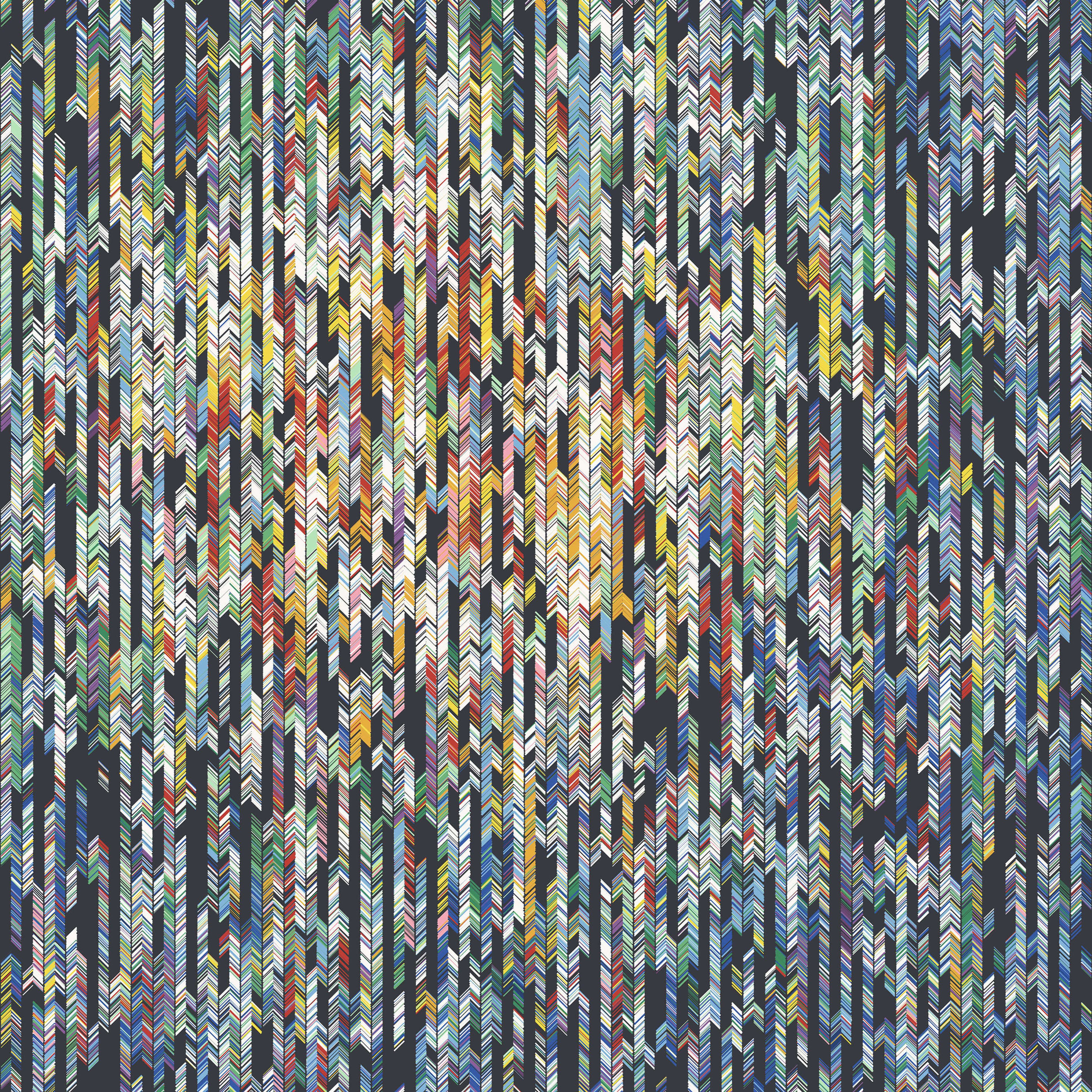
Fragments of Vision D, 2018
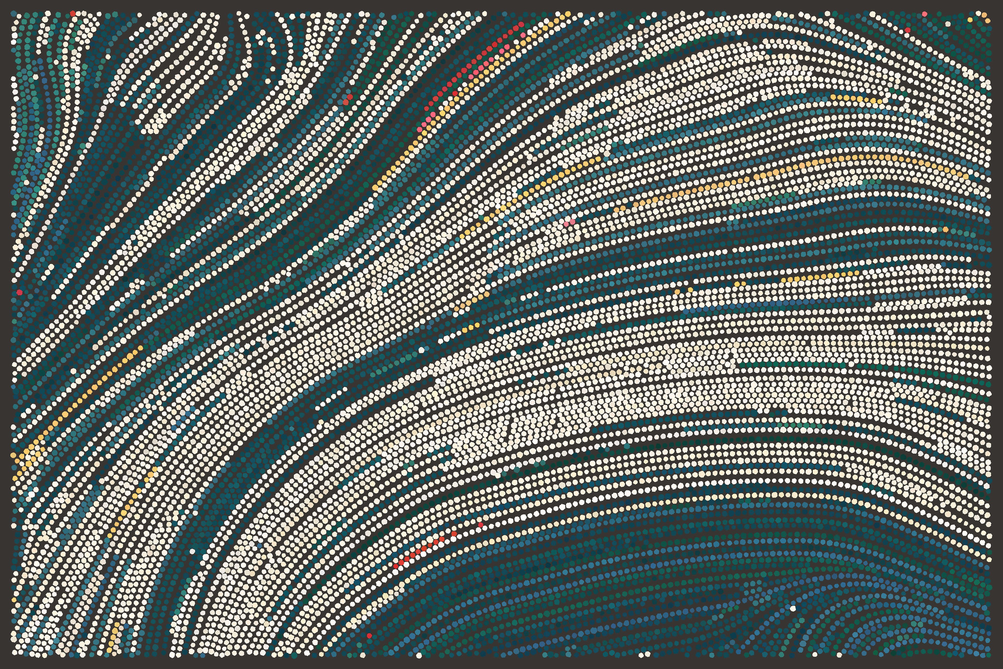
Side Effects Inclue\d 0.68, 2019
Those sorts of large shapes can give your image strength and structure that simply wouldn’t be there if the colors were more randomly distributed. One good test is to squint your eyes and see how much of that structure remains visible.
Wrap Up
There’s a lot more that could be said about color, of course, but I hope these ideas are a helpful starting point for you. I think the main takeaway is that good color work isn’t just about choosing the right colors, but about placing them strategically. Even if none of these ideas fit your needs, consider whether there’s another approach more closely related to your work that can take things to the next level.
–
From time to time, I write about my thoughts and artistic process. If you'd like to be notified the next time I publish an essay, sign up for my newsletter in the menu.