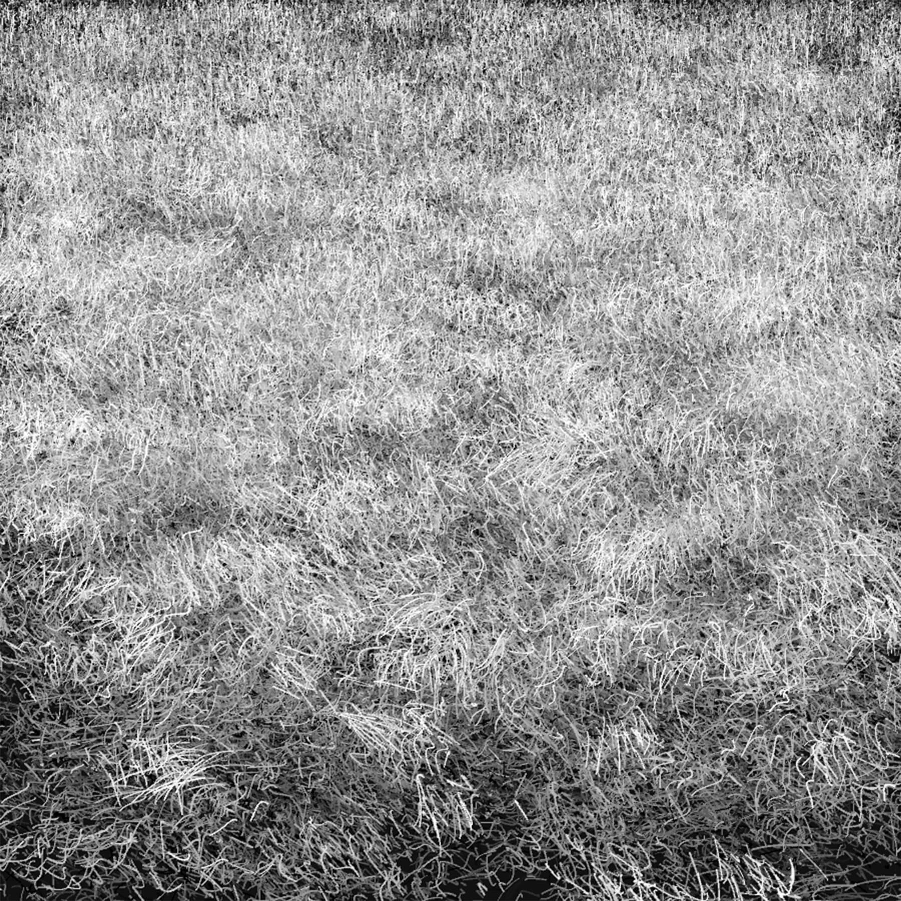
Texture Study: Dormant Grass
Texture is a blast to play with. The more that I work with texture, the more I believe that algorithmic artwork is specially equipped for it. Textures that would be extremely tedious to create by hand can be whipped out in several hours by code. When you're done, you're free to reuse the work in a new piece for little additional cost.
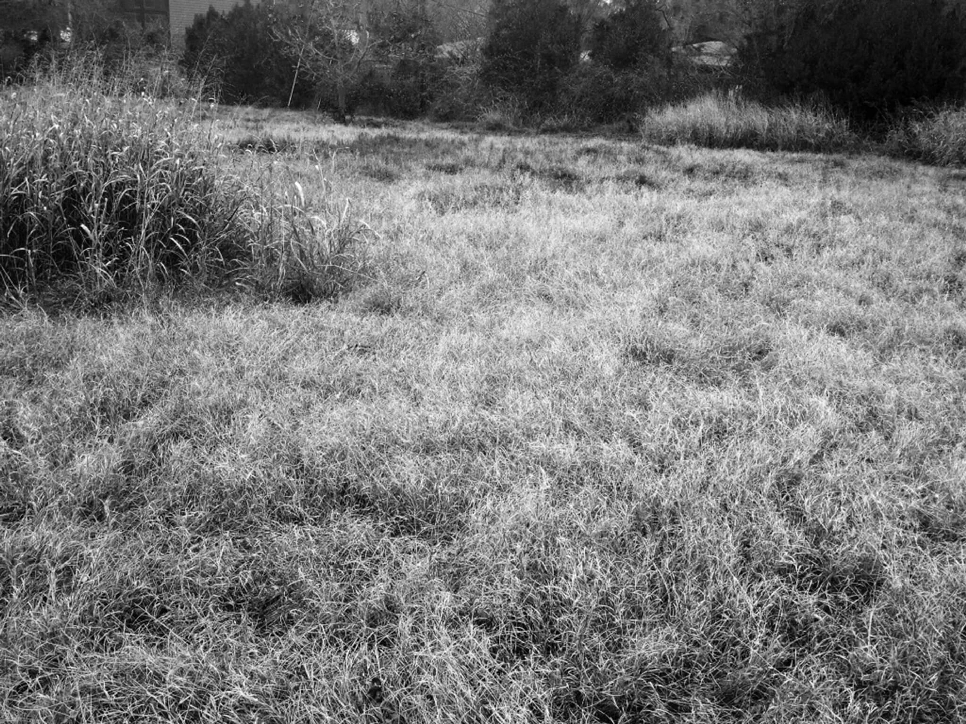
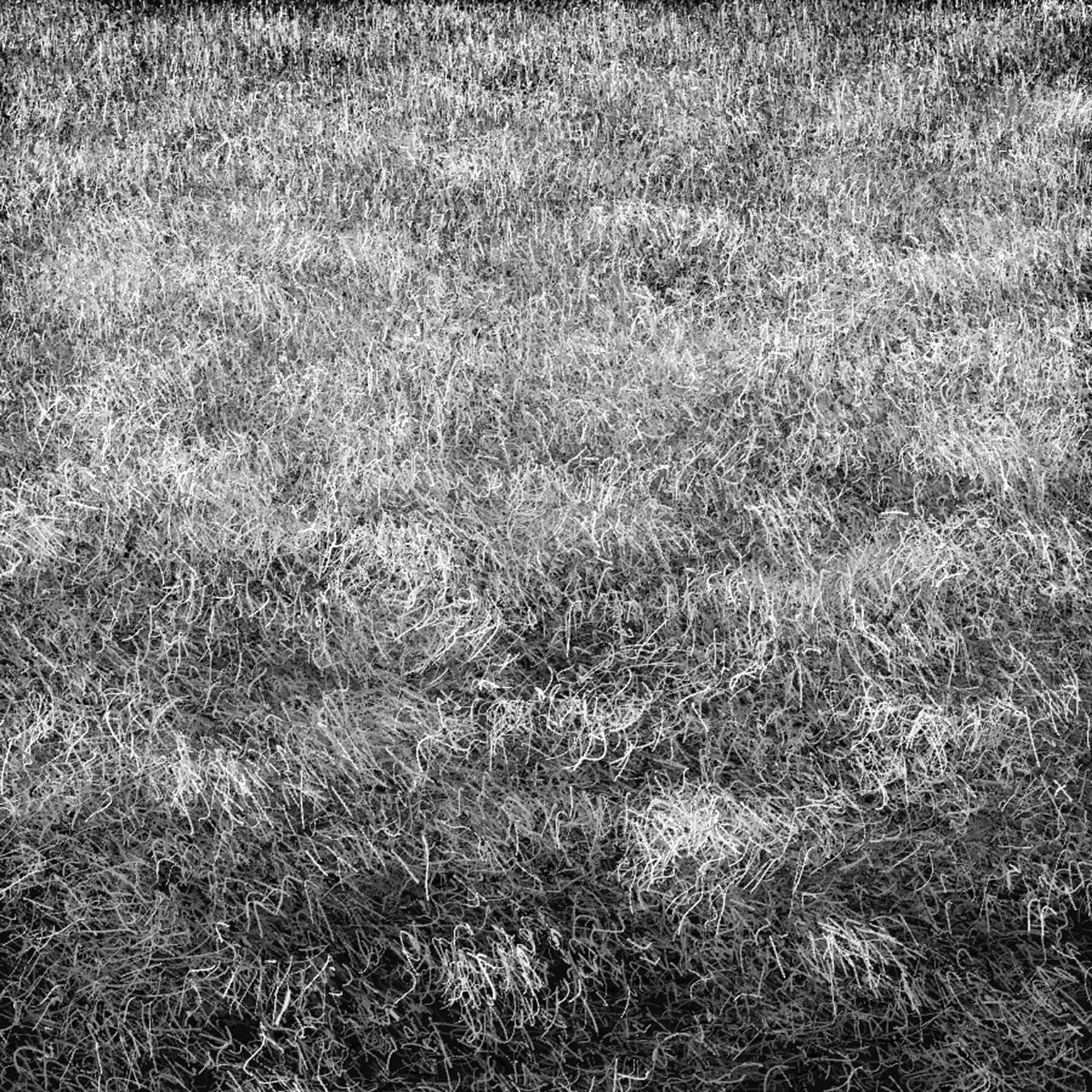
In this essay, I will explain a recent texture study that I completed. Off the trails near my home, there are unmowed sections of land where the native Texas grasses grow freely. These long grasses always catch my eye. They're so soft, and despite being fairly uniform, they contain a lot of subtle variety. Every time I see them, I know these natural textures are far more sophisticated than any of the textures I use in my work.

What do you do when you find something better than your work? You study it and learn from it, of course. So that's what we'll do here.
First Analysis
The first thing that I notice about the grass is that it's clumpy. Due to perspective, the clumps near the foreground have a rounder and more irregular shape, while the clumps closer to the horizon are flatter, squished, and more regular.
Additionally, lighter strands of grass are consistently on top of darker strands. This makes sense, because the grass is naturally pretty uniformly light in value. Most of the darker values are due to shadow or dirt, both of which have to be below the lighter values.
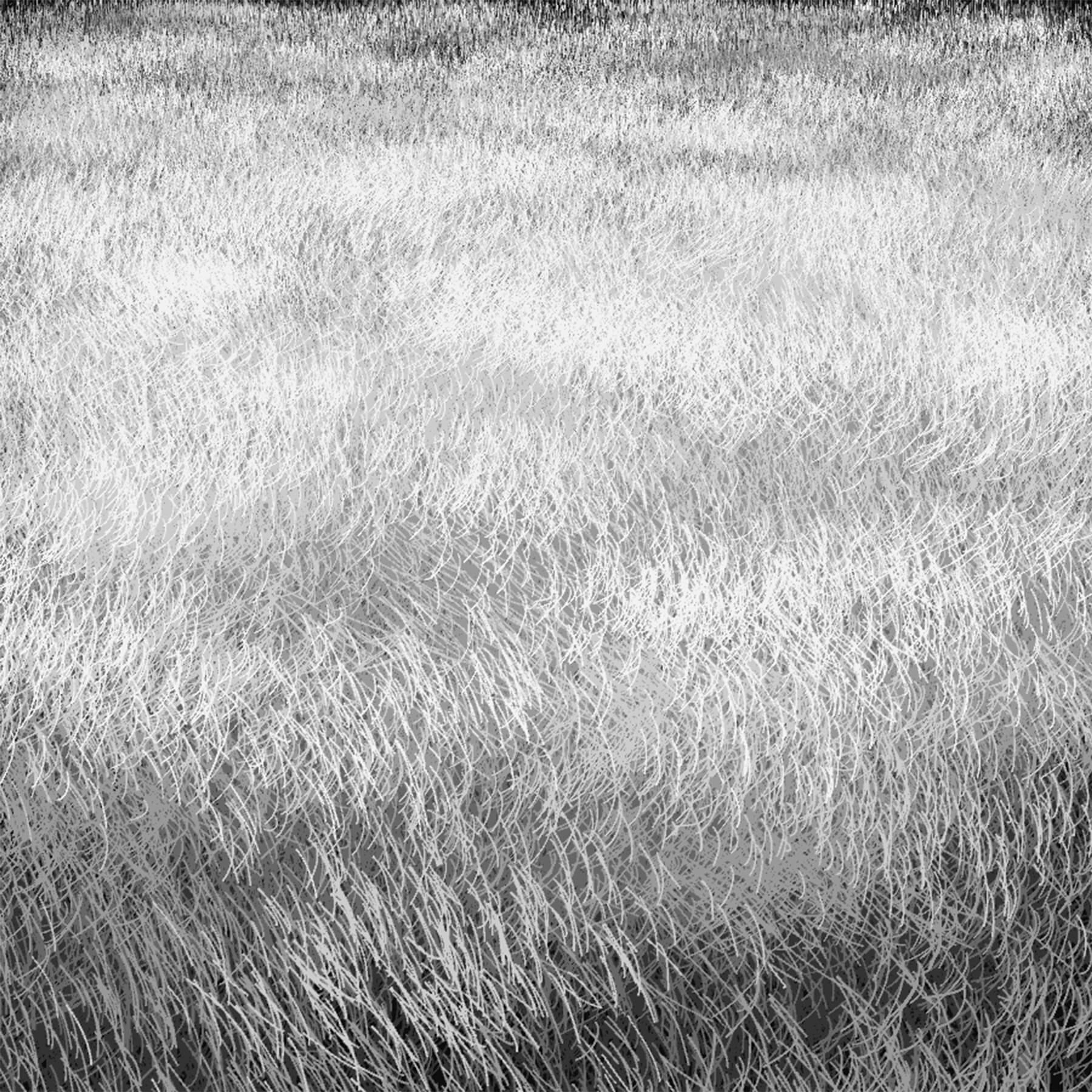
As a first step, I modeled the clumps and their values as ellipses. Lighter clumps have a slightly different distribution from the darker clumps, being concentrated roughly 2/3rds of the way up to the horizon.
If you squint, the value structures are pretty close to matching the reference at this point. But, of course, we don't have any texture yet.

Adding Lines
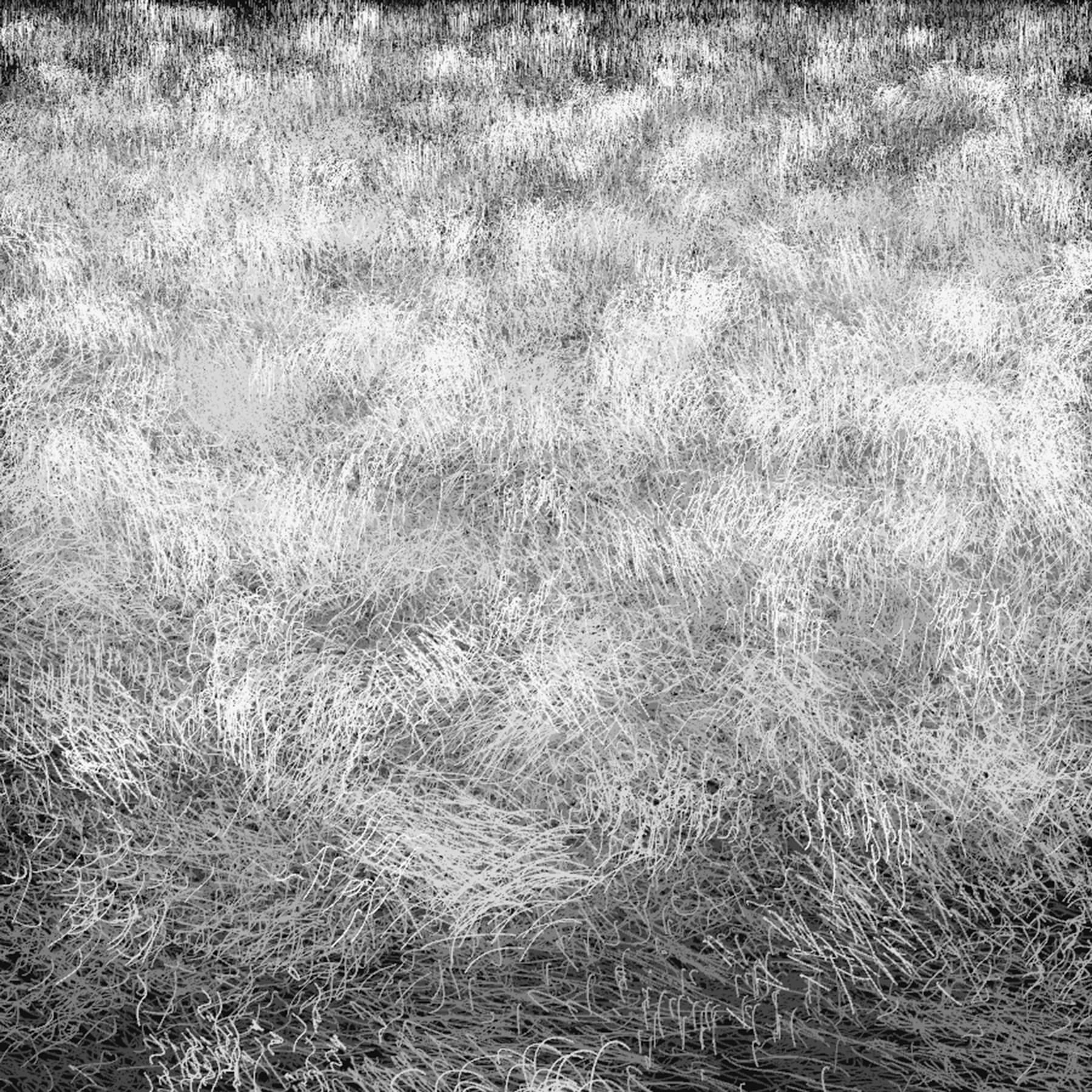
Grass has mostly vertical lines, so I simply started with those. In place of each ellipse, I generated 100 vertical lines with X and Y locations determined by a Gaussian distribution. The mean of the distribution matched the center of the (replaced) ellipse, and the standard deviation matched the height and width of the ellipse.
To match perspective, the width and height of the lines is scaled depending on the Y position of the line. Near the top, they're thin and short. Near the bottom, they're thick and tall.

This at least looks like some sort of grass or grain. The texture is nice and soft already. But in real life, grass isn't perfectly straight.
Slants and Curves
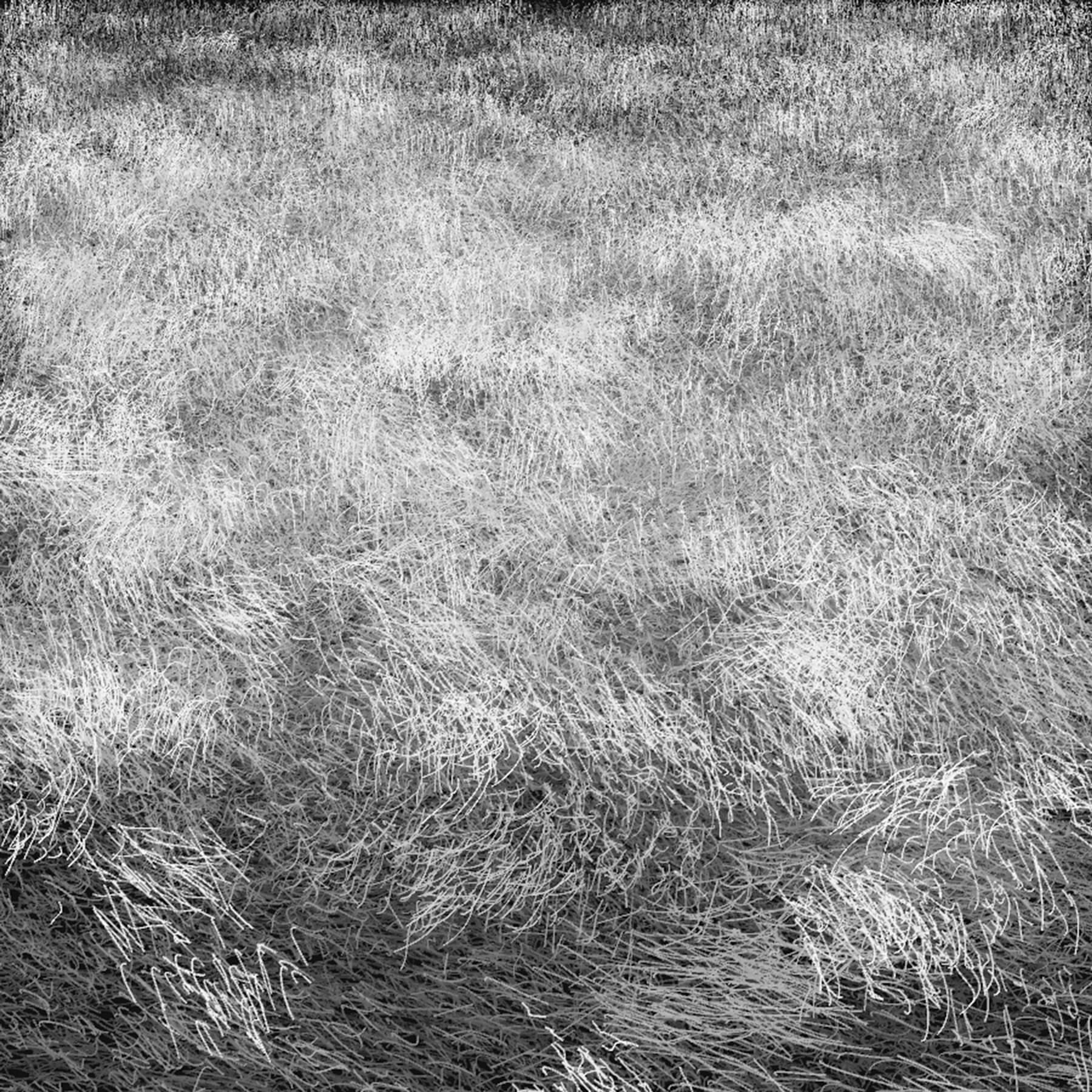
To give the blades of grass variety, I added two things: a slant and a curve. I'll describe the slant first.
Due to perspective, grass closer to the foreground tends to have stronger and more erratic slants. Closer to the horizon, it appears nearly vertical. Also, blades of grass within a clump tend to slant the same way, although there can be a lot of variation (especially near the foreground). When each clump of grass is drawn, an average slant for the clump is first calculated, and then individual blades may have a slant that slightly differs from that.
The curvature of the blades of grass follow a similar pattern. Near the horizon, the perceived amount of curvature is small, but up close, the curves are quite obvious. The curves are quadratic Bezier curves, so to increase curvature near the foreground, I simply increased how far the control points could move away from the center of the blade.

There's a little more liveliness in the texture now, but it's pretty far from the reference. It looks like a field of wheat, perhaps.
What do you do when you find something better than your work? You study it and learn from it, of course.
Refining to Match Reality
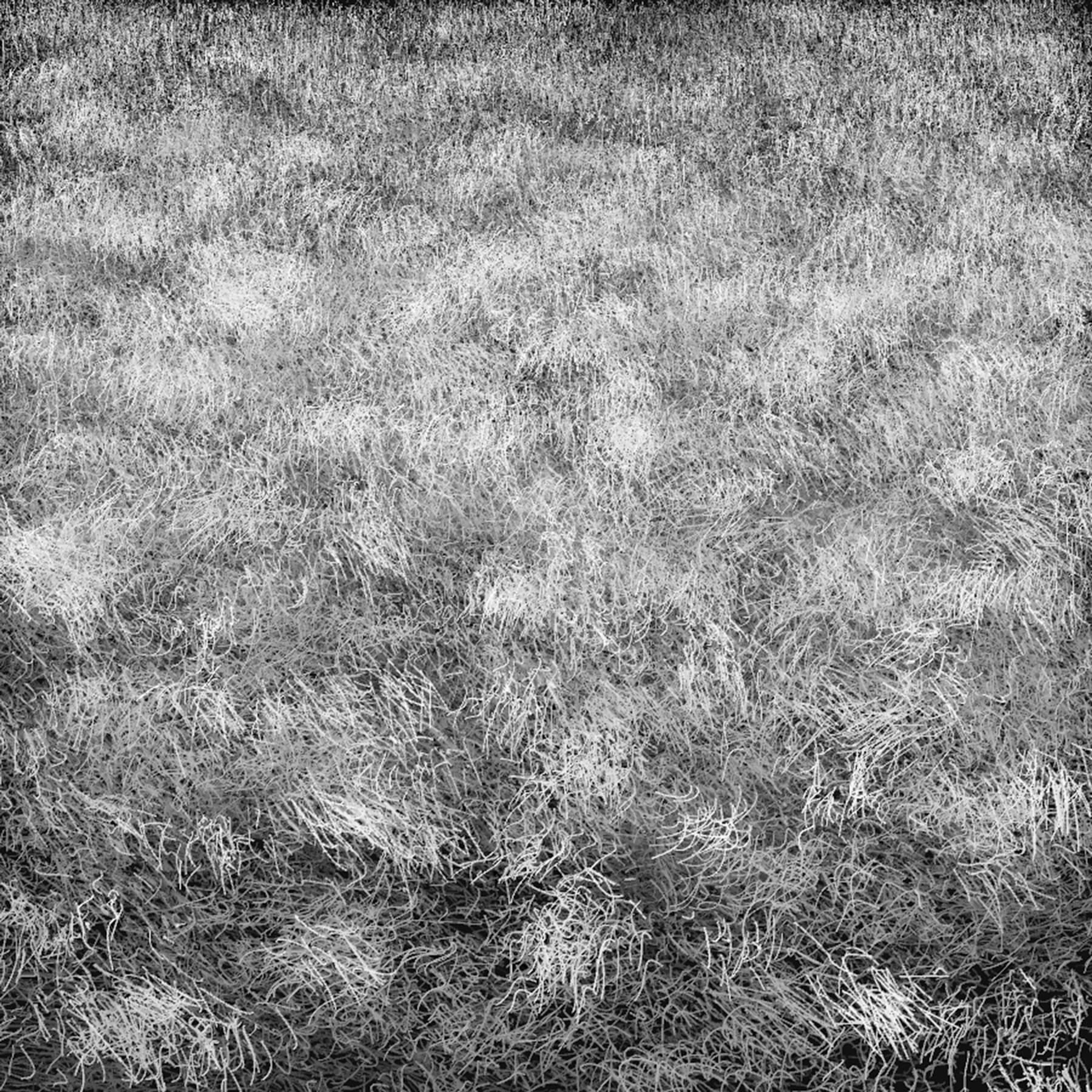
With the basic structures in place, we can look more closely at the reference to see where the differences are and refine the study. It's too light, and the strokes are too long and too thick.
To darken it a bit, I lowered the number of bright patches and made them smaller. I also made the blades of grass shorter and thinner, as well as tweaked the curvature to make the clumps less uniform.

The light patches were still popping too much. The lightest values were too light, and the smaller clumps were becoming very concentrated. To remedy this, I stretched out the clumps horizontally (especially near the horizon) and lowered the number of strokes within the lighter clumps. I also dropped the lightest value from a 9 to an 8.5.

The grass was still too long, so I shortened it once again. This time, instead of shortening it uniformly, I changed the code that picks the height of the stroke to take the value (lightness) of the stroke into account. Dark strokes are shorter, light strokes are longer. Put another way, longer strokes are more likely to be light, because they rise above the shadows of the other grass.
If you squint at this point, it should look pretty close to the reference photo. What's missing is some of the variety in details and a few tweaks to the values.


Variety, Values, and Finishing Touches
Up to this point, I was using five or six values. I decided to expand that to a full range of values. Each clump could be assigned one of eight values (from roughly 1 to 9 on a value scale). Within the clump, individual blades of grass have some variation in their value. I used a Gaussian distribution with a mean centered on the average value for the clump.
I also increased the amount of variation in the height of blades within a clump, especially for lighter values.
Last, to break up some of the stronger clumps and add more small patches and pieces of grass, I decreased the size of the clumps, decreased the average number of blades within a clump, and increased the variation in the number of blades within a clump. To compensate and keep the value ratios the same, I increased the total number of clumps.
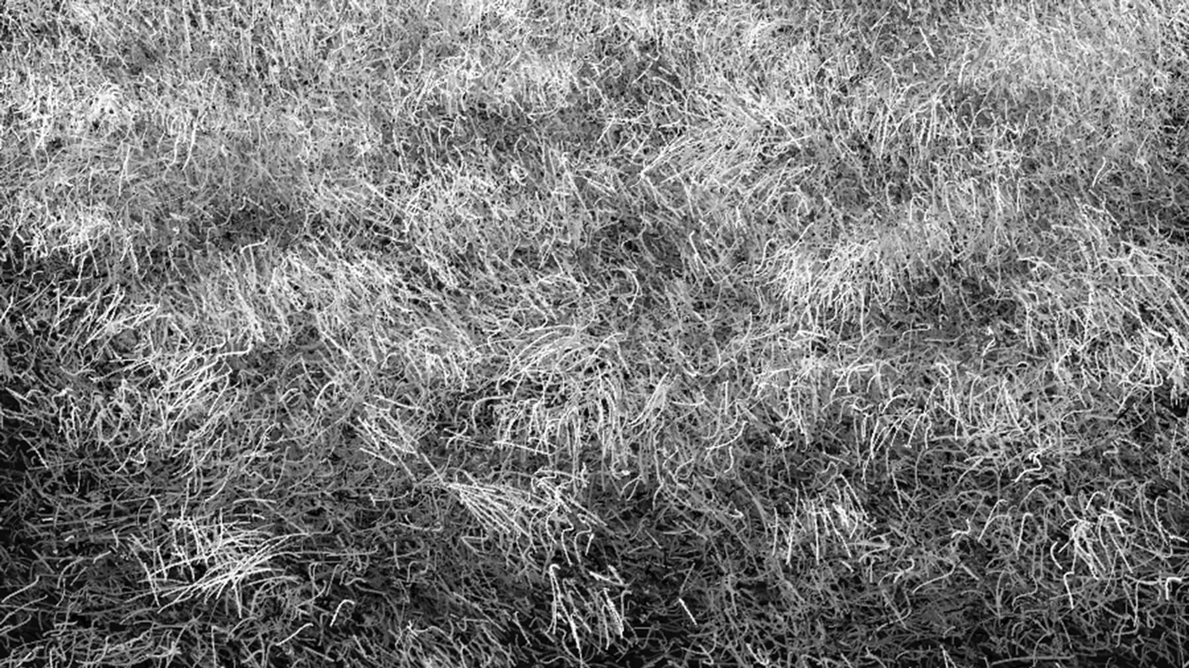
The final result is a texture with a little more life-like variety:

Dormant Grass Study, 2014
What I Learned
So what did I get out of my study?
First, nature comes packed with a huge amount of variety. There are definitely patterns, but they're subtle and not strict. So many things may influence a natural texture that you have to take a lot of overlapping patterns into account.
Second, it is possible to capture some of the character of natural textures with algorithms. This is especially true if you pick something with a lot of "repetition". In this case, there are probably tens of thousands of blades of grass. Over those kinds of numbers, patterns can start to form.
–
From time to time, I write about my thoughts and artistic process. If you'd like to be notified the next time I publish an essay, sign up for my newsletter in the menu.