Wall
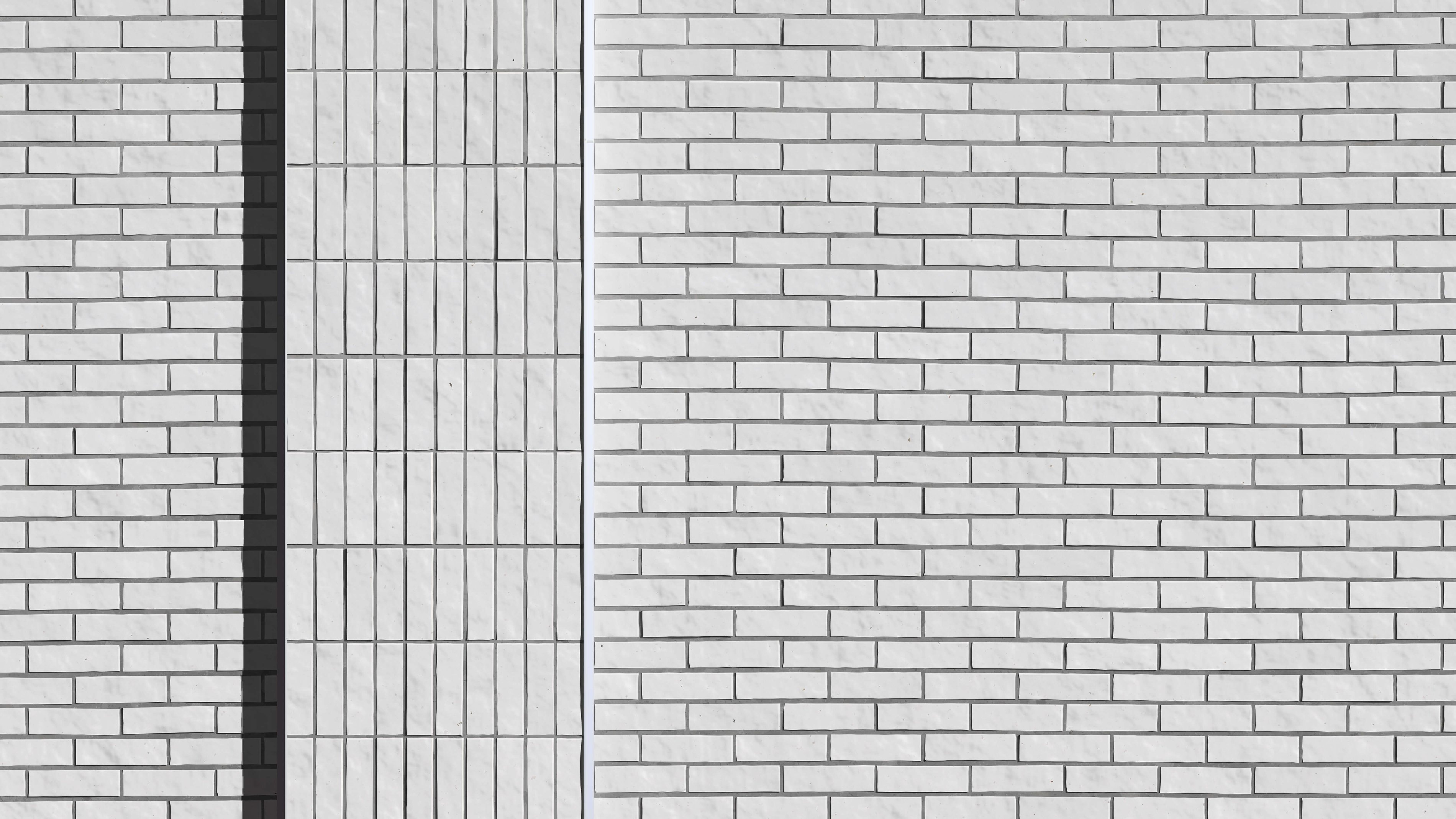
Wall is an exercise in the appreciation of the analog world. It takes a photorealistic approach to the generative examination of a brick wall located in Austin, Texas.
These kinds of generative studies were formative exercises for me, most notably my 2014 Dormant Grass Study. They opened my eyes to the complexity of the world. Every object, and every surface, is absolutely covered in layer upon layer of patterns. Each pattern has its own cause, and hence its own characteristics and quirks. Entropy and chaos play a role at every level. This gives the analog world a depth and richness that, by default, the digital world lacks.
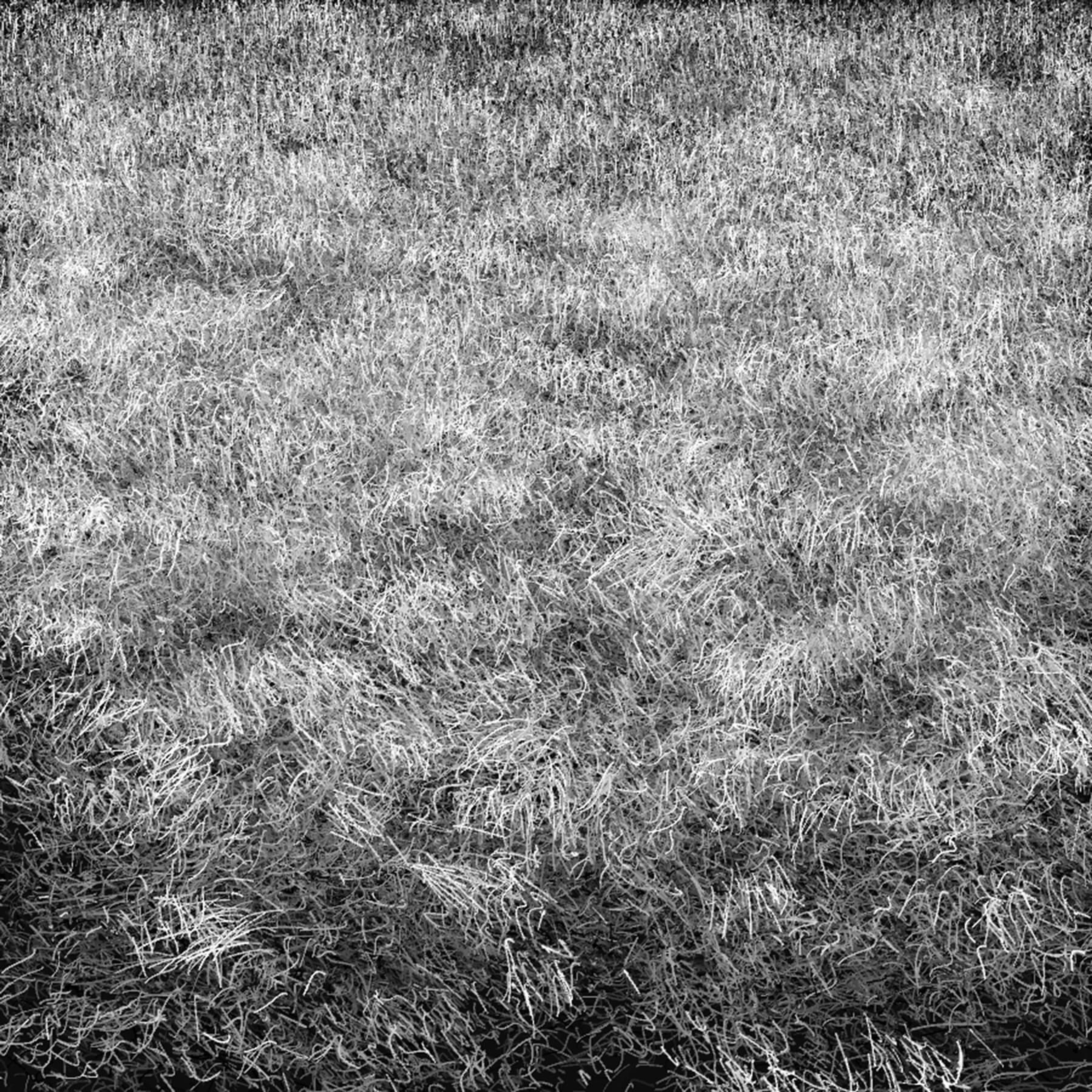
Dormant Grass Study, 2014
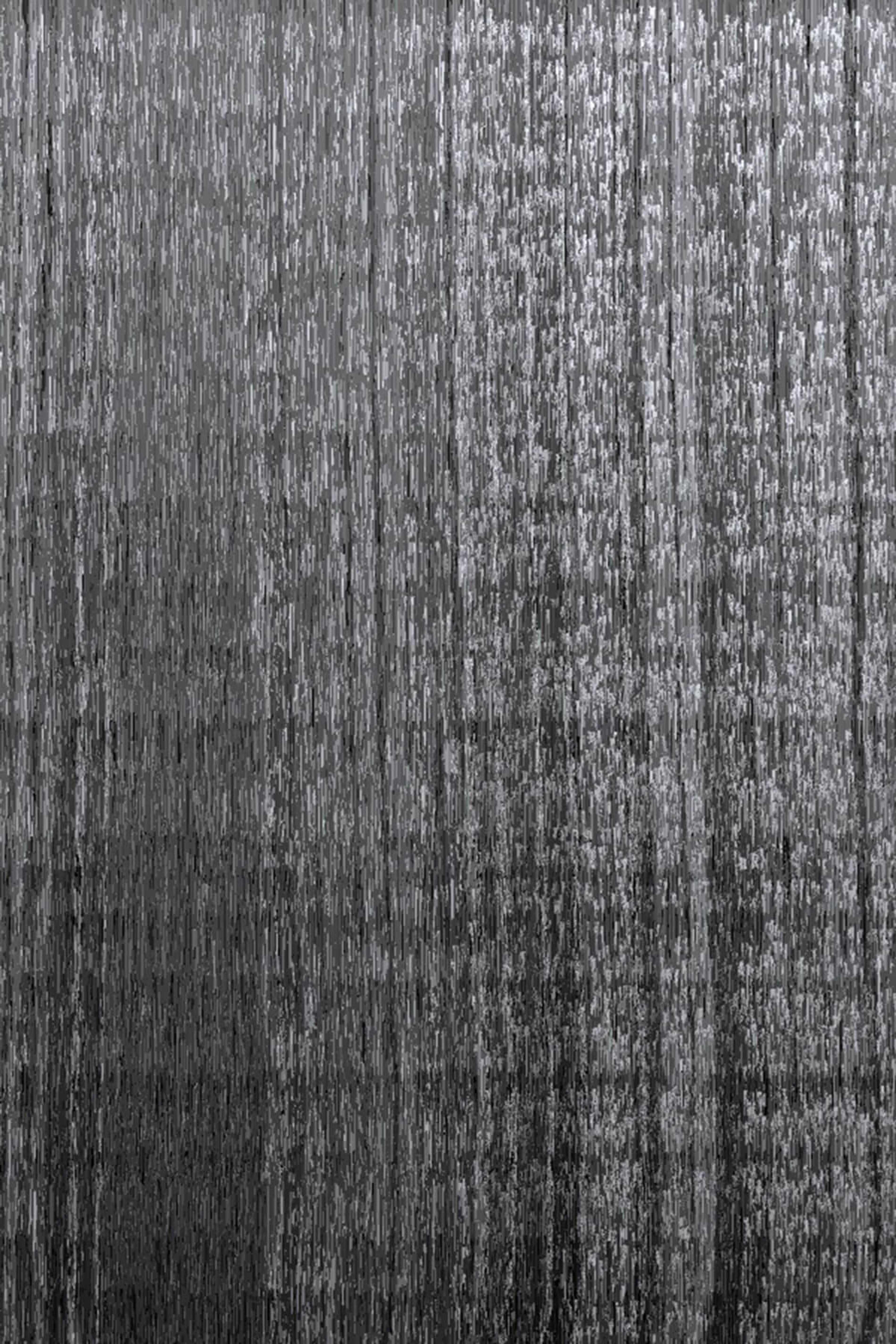
Wooden Fenceboard Study, 2014
I had been wanting to circle back to that early approach, to take some time to study and appreciate that disparity between the digital and analog. When Kevin Rose pitched the Proof: Grails concept to me, where he strongly encouraged the artists to tackle unusual or uncommon subjects or approaches, I knew right away that this was one of the best opportunities I would have for this type of work.
The generative approach to photorealism can be quite different from how someone with paint or pencils might work. With those manual tools, the artist works by laboriously recreating each mark and detail in the original image, bit by bit. With this generative work, I instead tried to study and recreate what I saw in terms of patterns. I examined every object and surface to see what the “normal” behavior was, to note what deviations from the norm were common, and to pick out any extremely unusual outliers that might exist. If possible, I tried to think about the pattern in terms of the forces that shaped it, hoping that this mental model would provide insight.
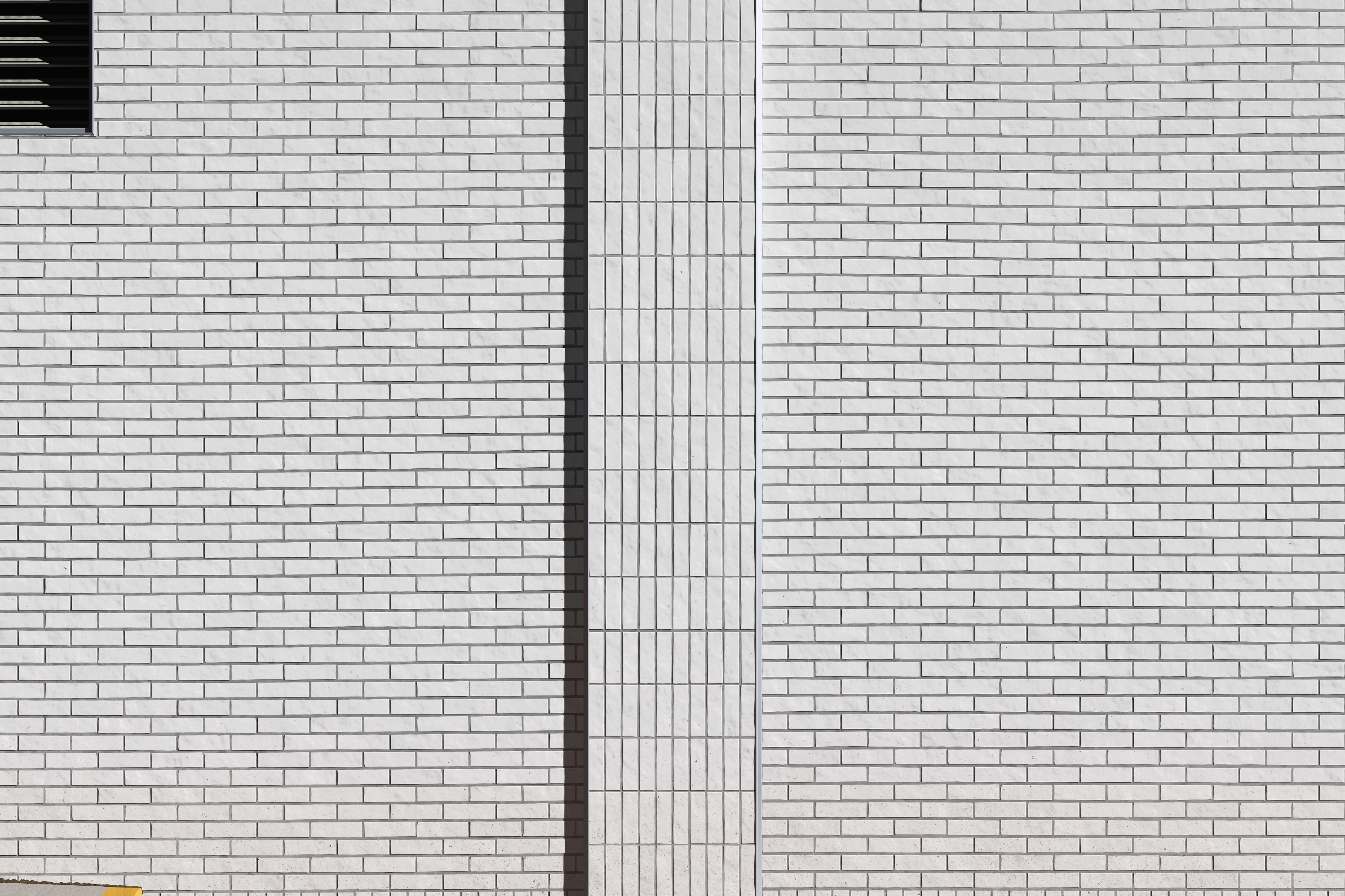
Wall, 2022
The further I dug into the work, the more patterns I noticed. The obvious ones up front were around brick placement, minor rotations and shifts of each brick, caused by inconsistencies in laying them by hand. The vertical bricks in the center pillar had different kinds of inconsistencies, like larger variation in the thickness of the horizontal lines of grout. The depth of the brick, and hence the size of the cast shadow and intensity of the edge highlight, stood out early on. The grout did not have a uniform “average” darkness - instead it tended to darken in the middle in large regions. I imagine this was due to passers-by brushing against the wall, perhaps cleaned-up vandalism. Subtle aspects of the lighting started to become more apparent. Near the sidewalk (mostly cobblestone), a bit of warm-toned light reflected and changed the tone of the bricks; this effect was especially visible in the shadow cast by the center pillar. The metal corner liner for the center pillar also reflected a bit of light, most strongly seen near the top of the image. The vent in the top left was full of subtleties, from the shifting intensity of reflected light hitting the bottom of the metal slats, to the softly rounded shadow edges, to the grimy top surface of the slats. Perhaps my favorite aspect of the entire wall was the splatter, most present near the ground. There was a huge variation in the scale, color, opacity, skew, and density in the splatter shapes. This was a testament to the huge number of sources or causes of the splatters.
After focusing intensely on this work, I realized I could have easily spent a full year analyzing each aspect in detail. This was a beautiful reminder of the level of richness I’d like to achieve with my digital generative work.
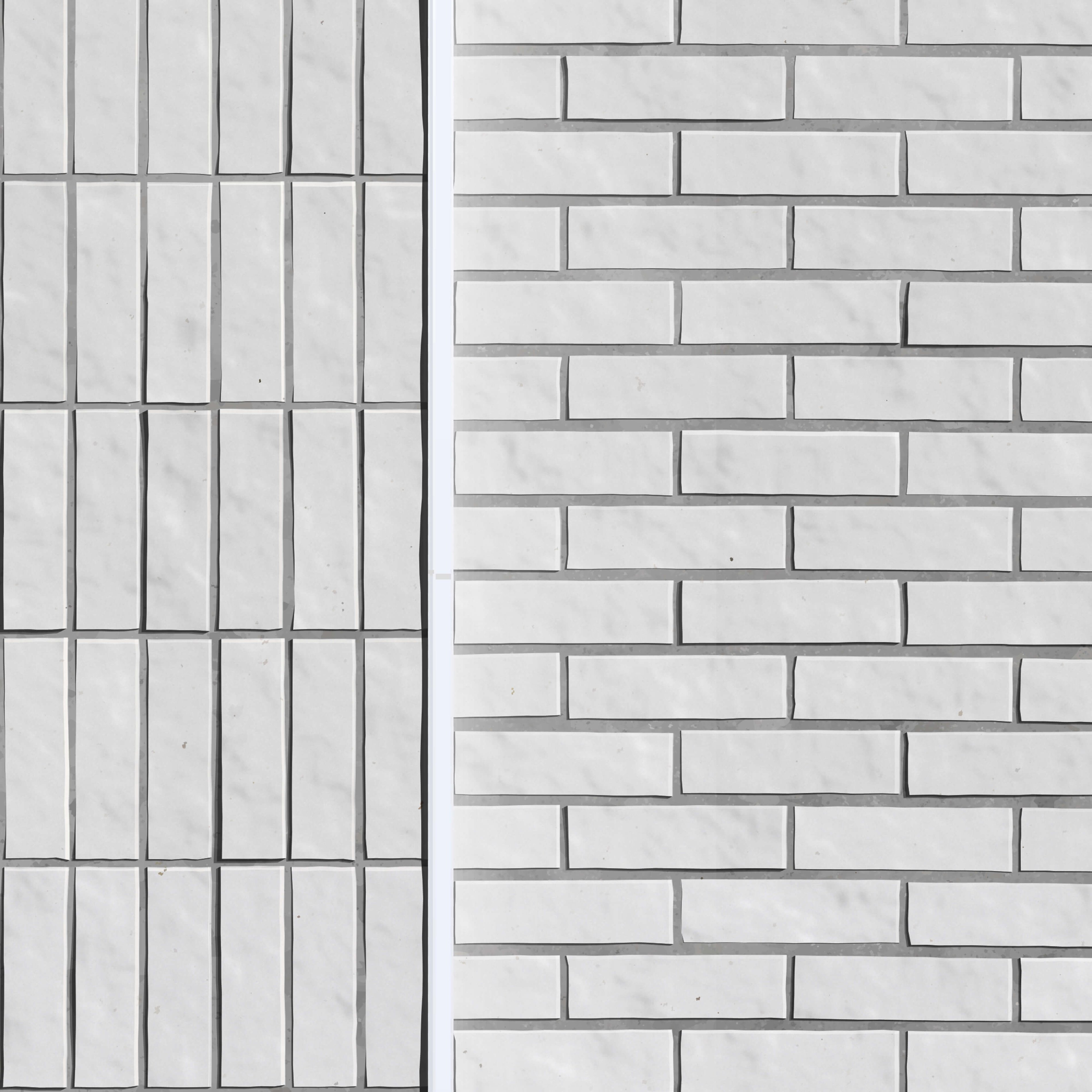
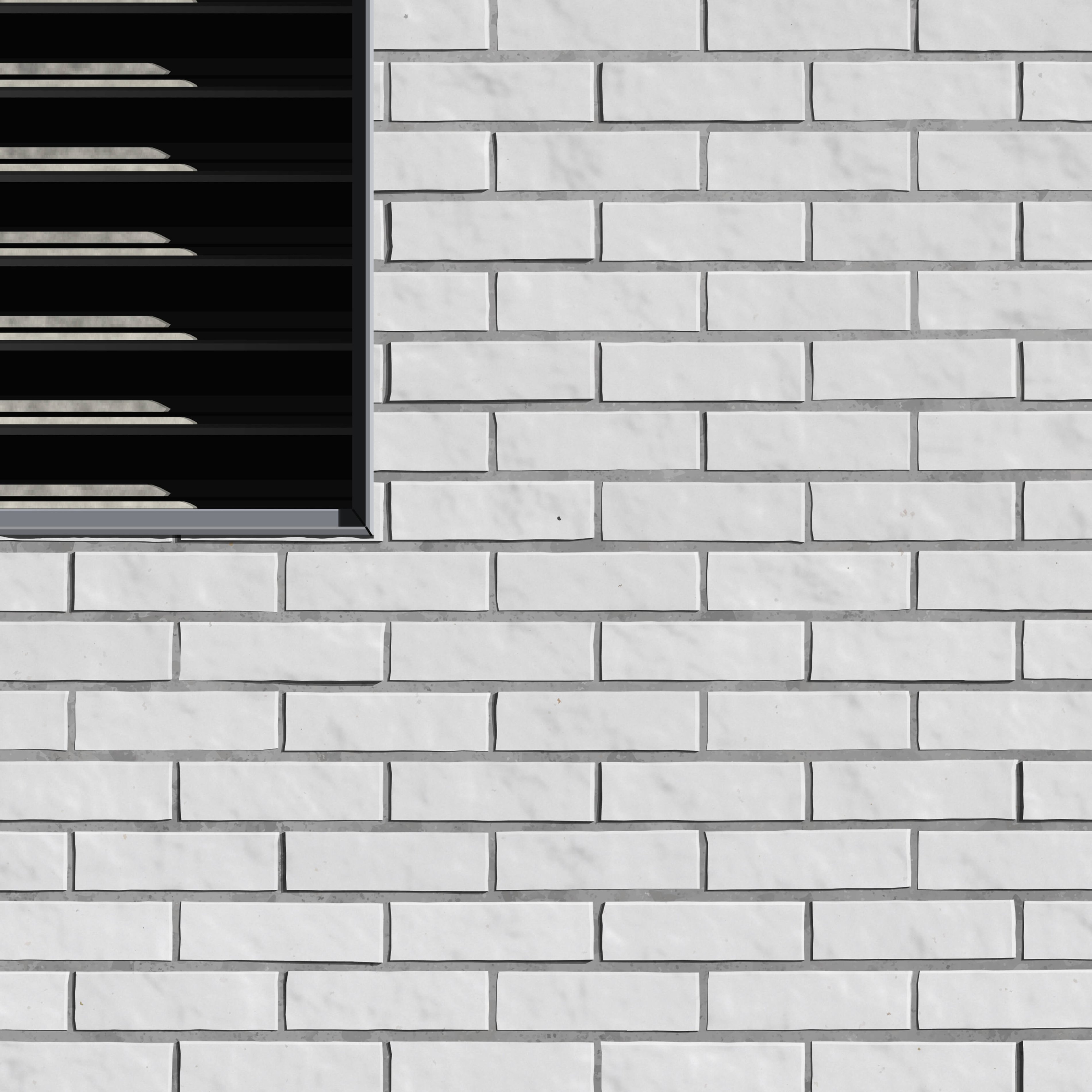
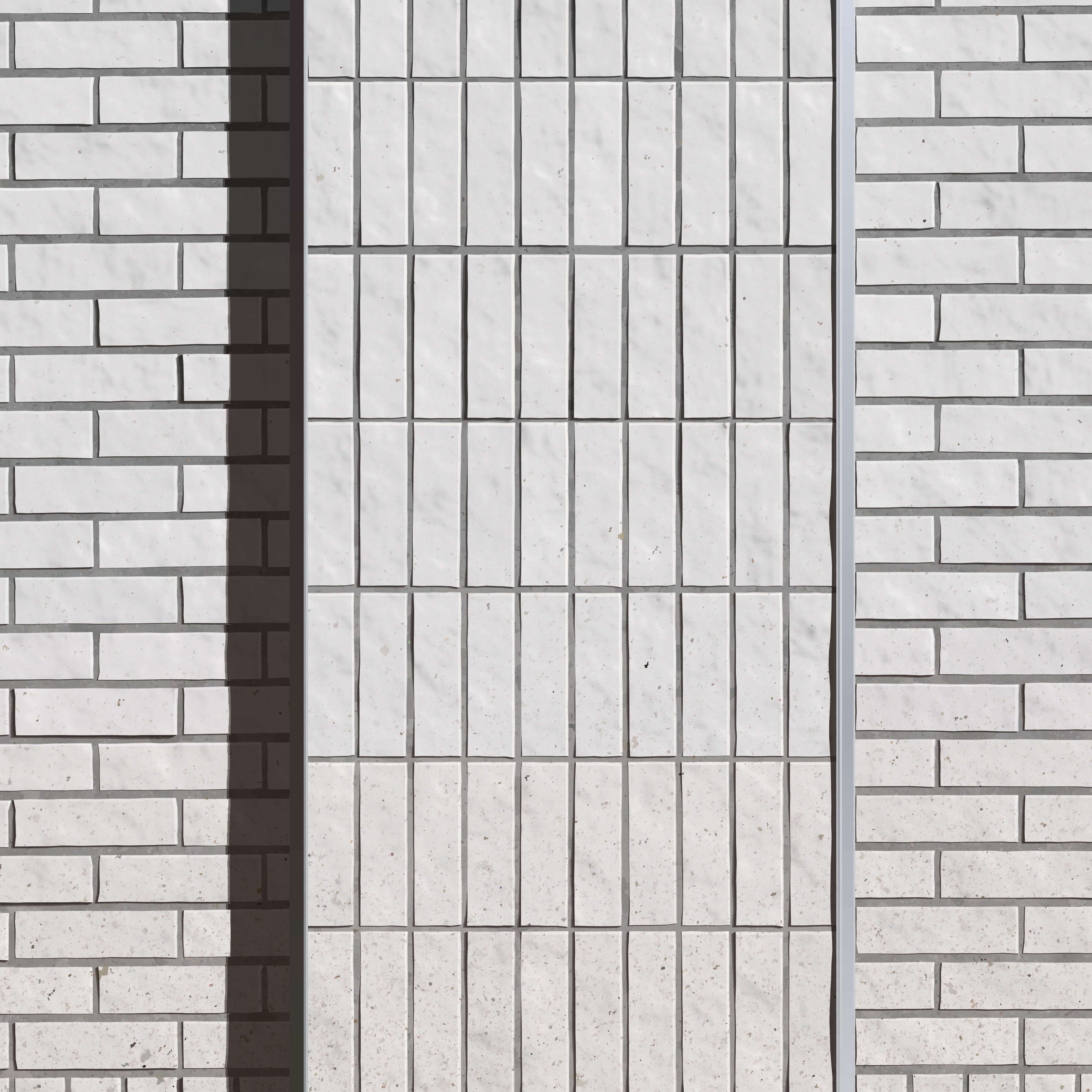
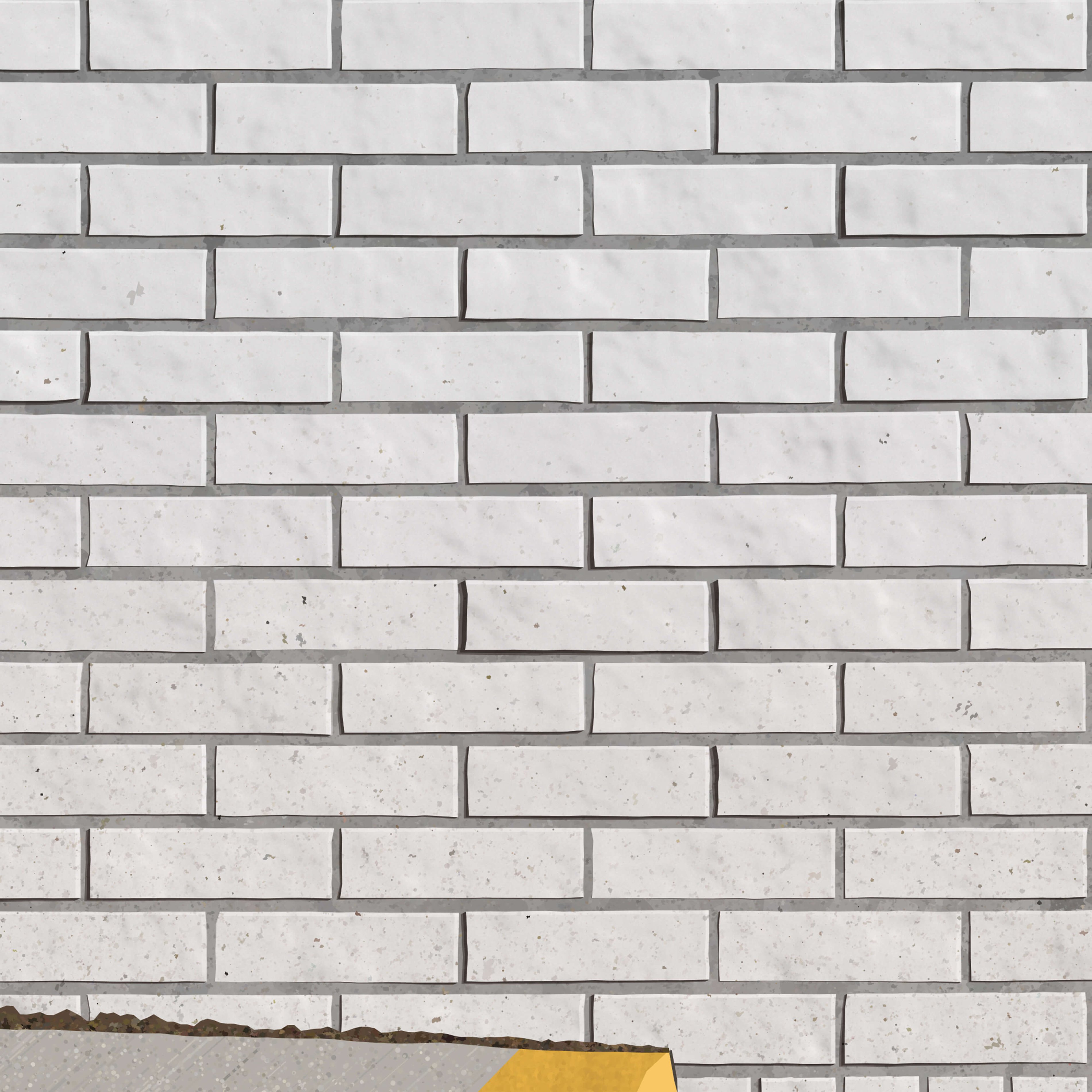
I selected a brick wall as the subject for this work primarily because of its simple structure. The regular framework of the brick grid provides the perfect opportunity to appreciate imperfections and deviations away from the norm. Those subtleties stand out. My appreciation for this effect stems heavily from Agnes Martin’s simple grid drawings.
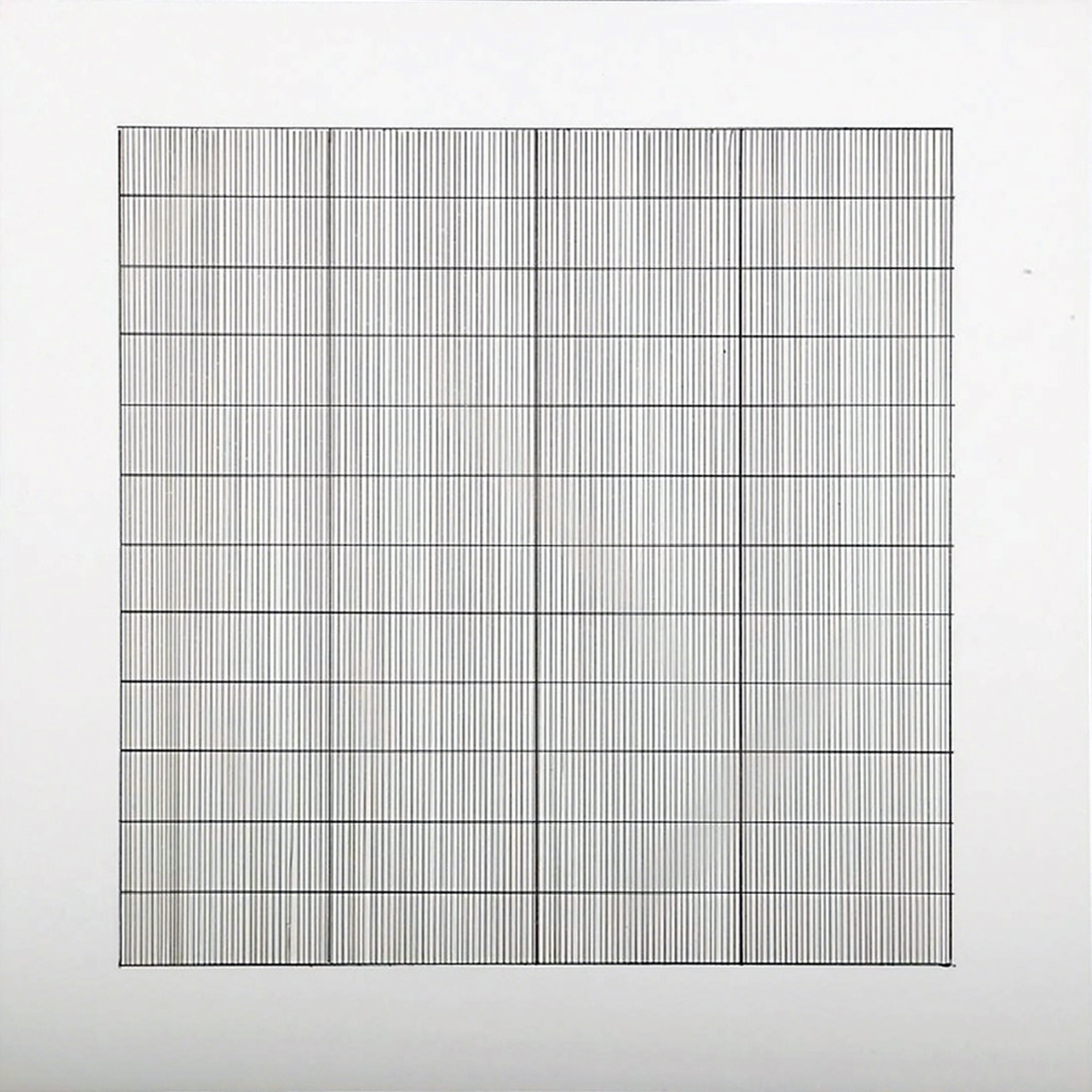
Agnes Martin, Untitled, 12 x 12 in, Lithograph, 1990
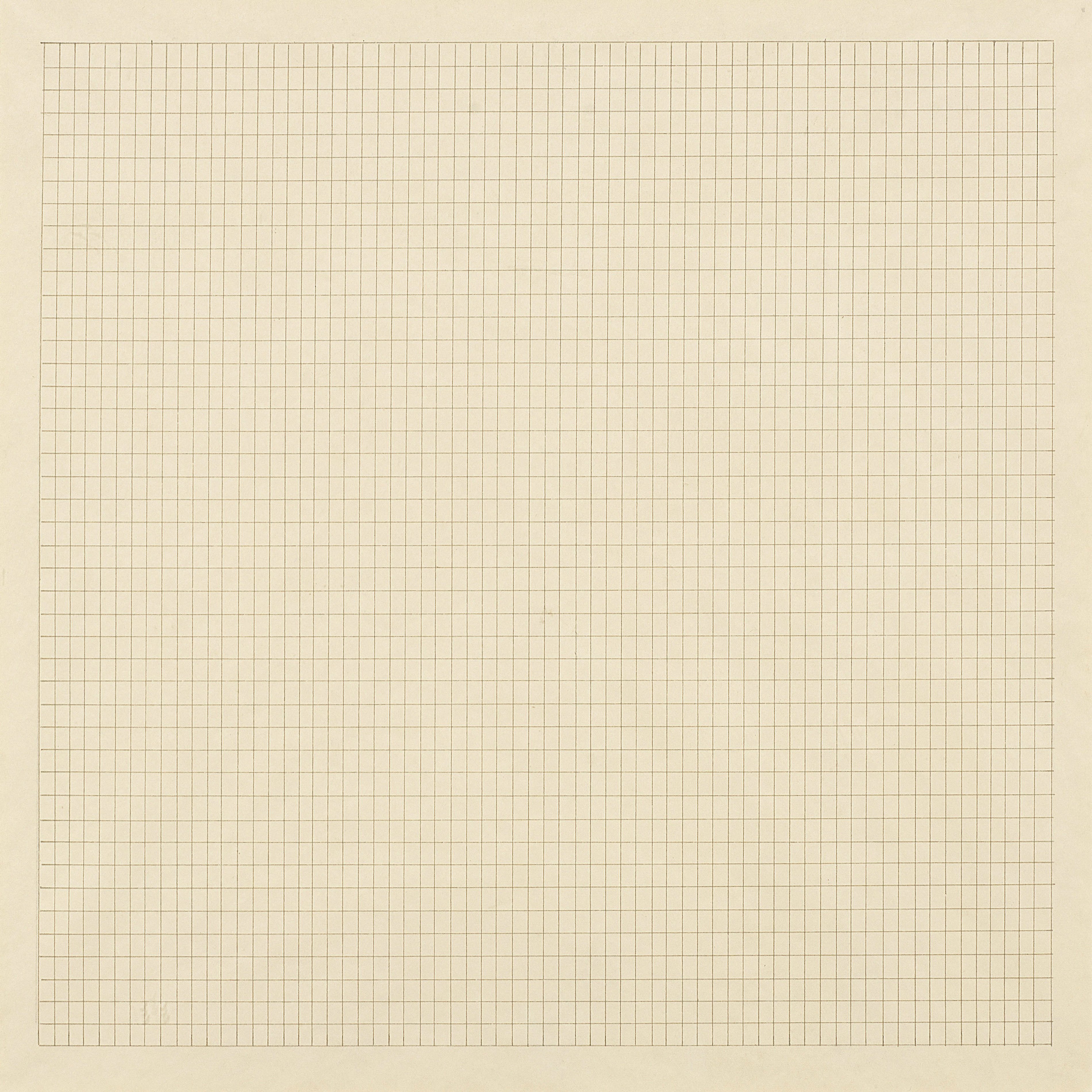
Agnes Martin, Spring Field, 1962
By attempting to draw the grid as perfectly as she could, Martin interestingly highlighted the ways in which her execution was imperfect. For me, the “tries-to-be-perfect” structure of the brickwork plays a similar role.
Project Documentation
I have open-sourced the primary code behind Wall on github.
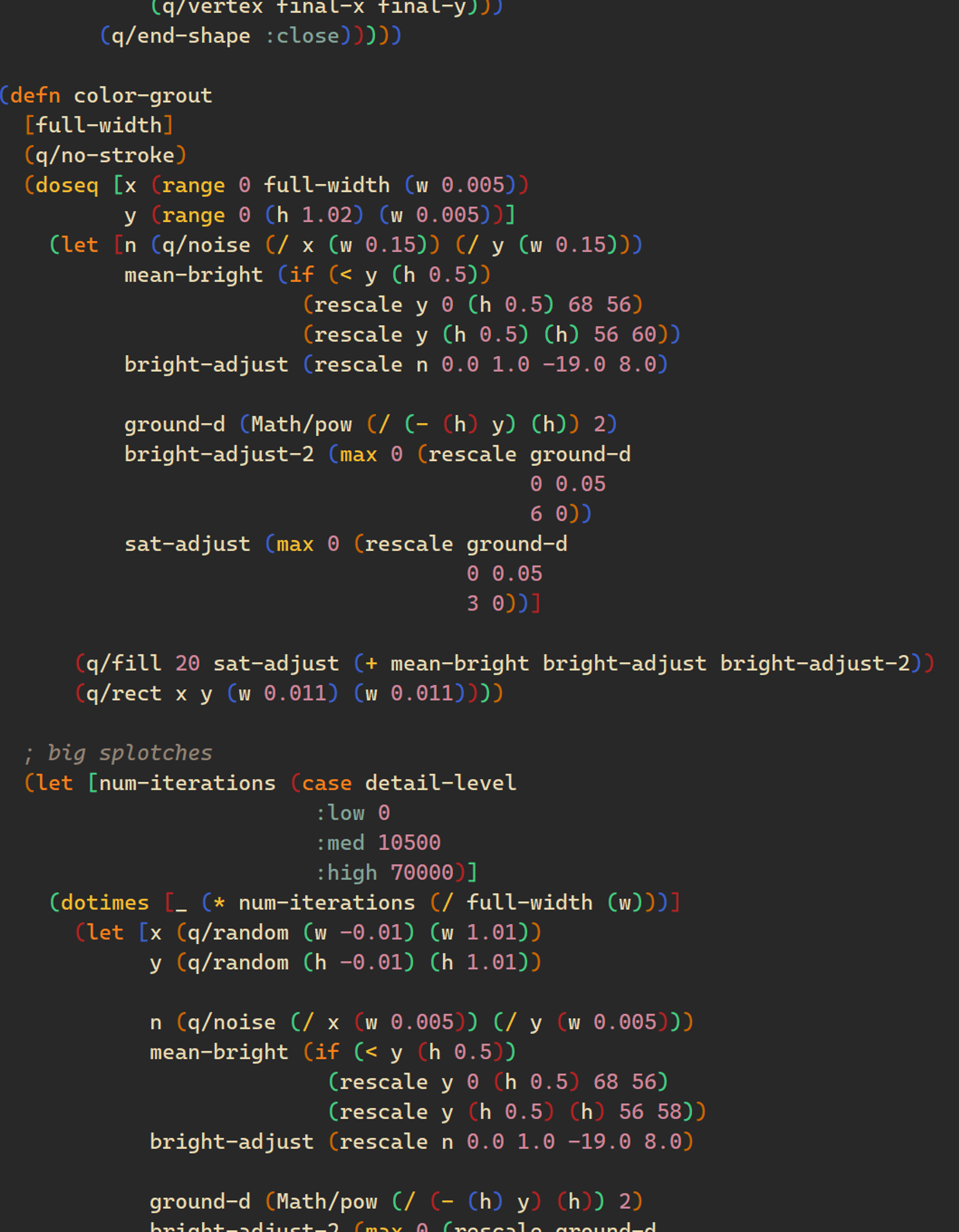
A snippet of the source code from Wall
I could have easily spent a full year analyzing each aspect in detail...
The following video captures the development process, one frame per run of the algorithm during development. Many of the subtleties will of course be lost here, but you can observe my focus shifting to different aspects of the image at different times. You can also note that I sometimes switched to a “debug” view that made certain behaviors more obvious, in order to help me correct or fine-tune them.
Additional Resources
Collect: 73 editions of this work were minted. See what's available on OpenSea.
Prints: Holders of a Wall NFT can purchase limited edition framed prints on concrete, if available.