My Artistic Process: Haecceity Series
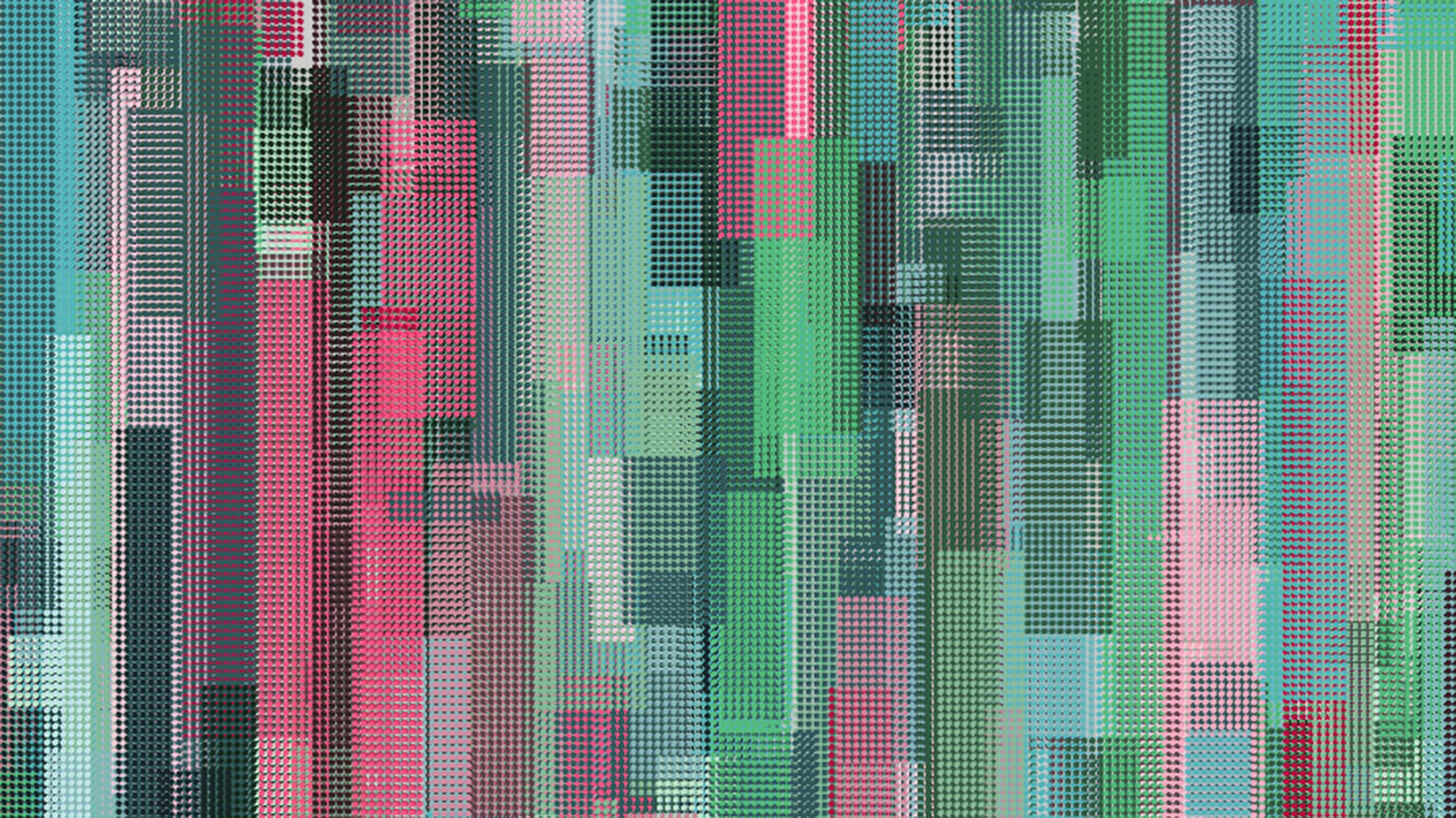
I want to explain how I create my artwork. Algorithmic artwork can be so different from painting that most people have no idea how my works come together, but they're curious. I hope this may be helpful for others looking to get started in programmatic artwork. It's hard to come by any info on the subject, which is a shame.
I'll be walking you through my latest series: Haecceity. Like most of my work, this was created using Processing. I spent about twenty to thirty hours on this, from start to finish.
Early Concept
When I started this series, I wanted to work on mixing colors and creating softness without using transparency. A layer of transparent green over red produces a muddy brown, but as seen in Fig. 1, a layer of red dots over a green background allows the viewer to see both colors simultaneously and purely. Similar techniques were used in Pointillist works by Seurat, Pissarro, and others.
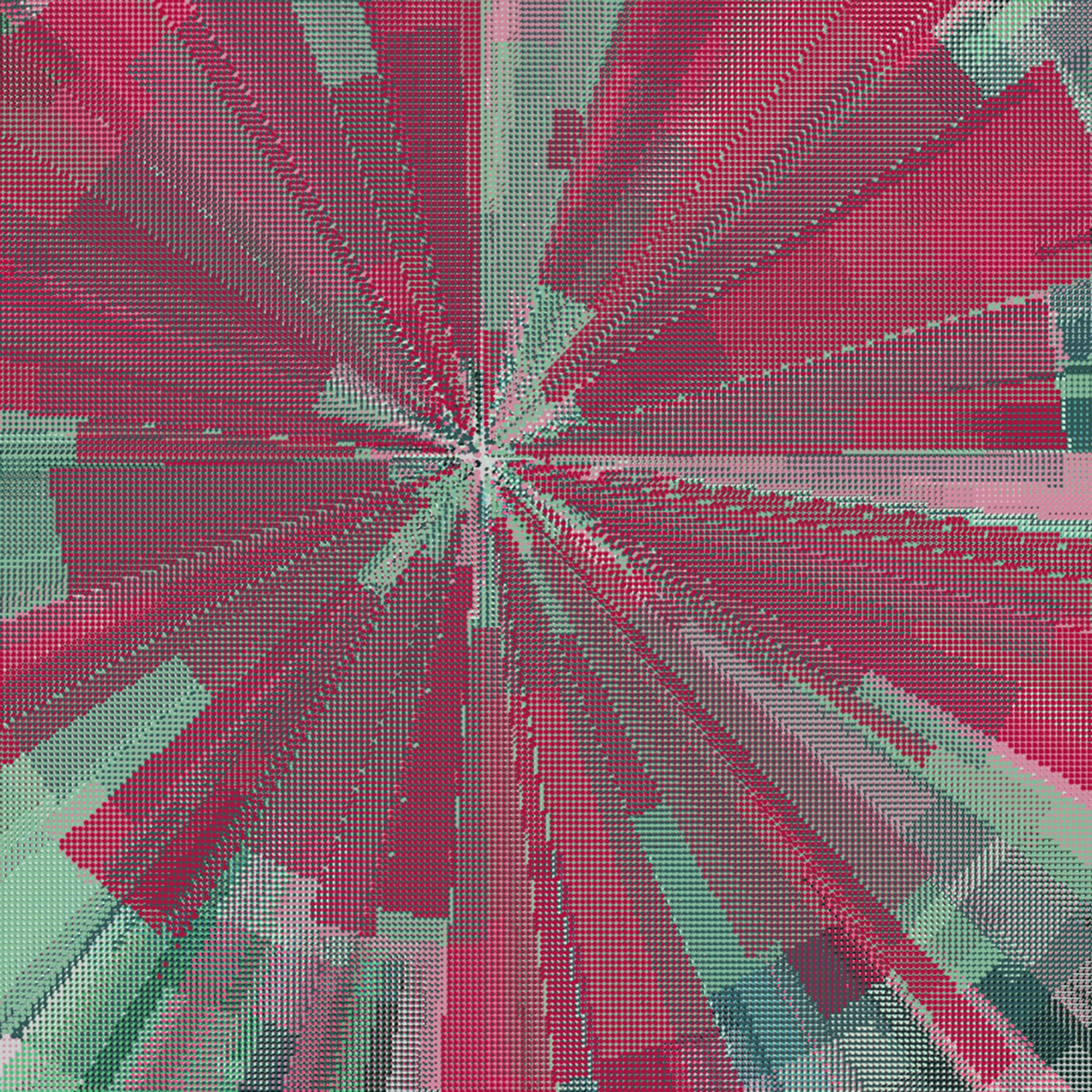
Fig. 1 First rough concept
The radial shapes were created with code left over from an earlier sketchbook entry. However, I disliked the bulls-eye effect of the radial format, so my next change was to switch to vertical strips. The size and position of the strips are picked through controlled randomness.
The color palette was designed ahead of time to provide a balance of light, middle-tone, and dark values as well as varying levels of saturation. Each color in the palette is assigned a probability. When a rectangle is created, a color is randomly chosen from the palette, with some colors having a higher chance of selection than others.
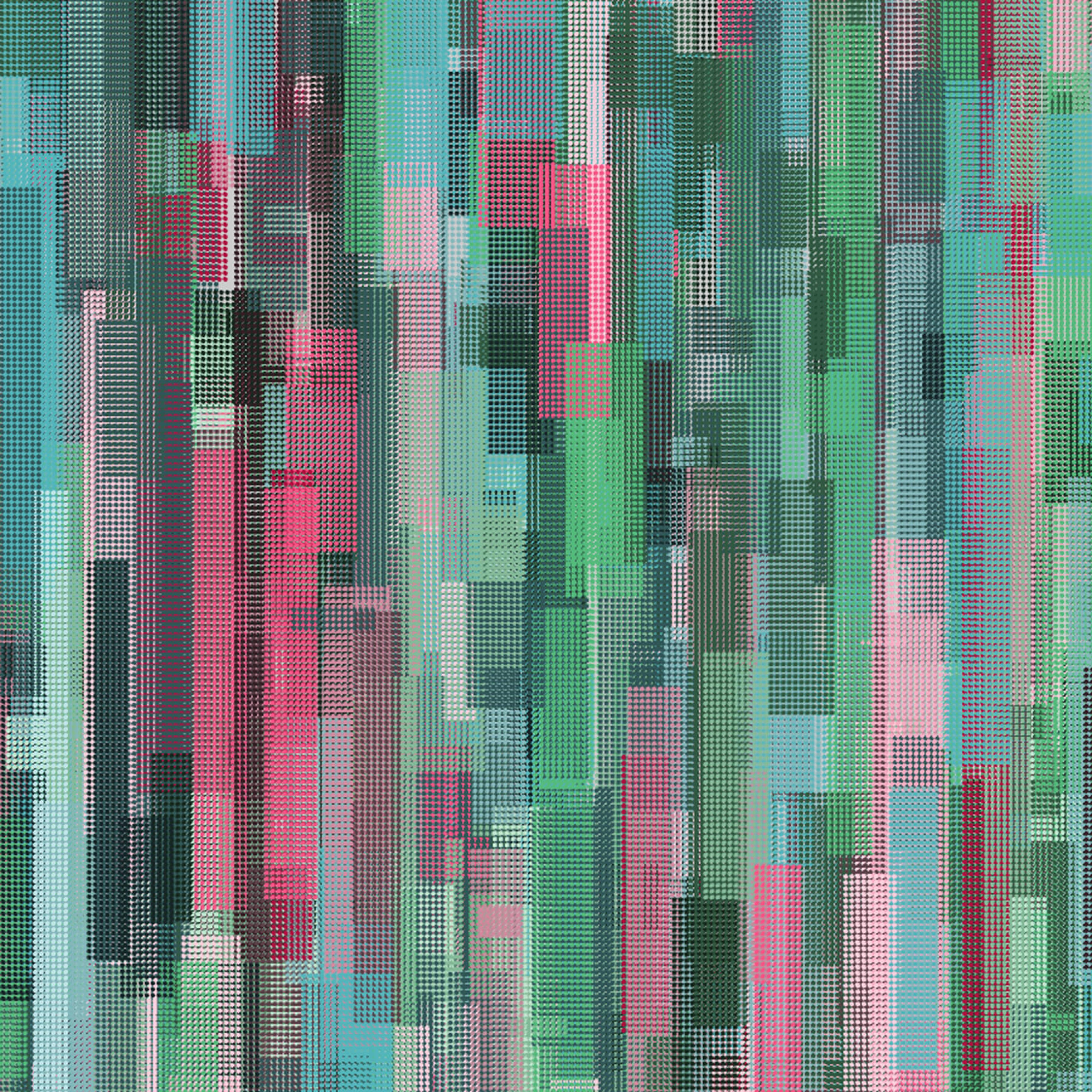
Fig. 2 Vertical Rhythms
Lighter Textures
To break up the hard rectangular shapes, I began experimenting with lighter textures. Instead of filling the rectangles with full grids, some of the dots in the grid are randomly omitted. In other rectangles, thin lines are used in place of dots.
At this stage, the work is very atmospheric and is developing a sense of depth. Compositionally, there's much to be desired: it's very scattered and overwhelming.
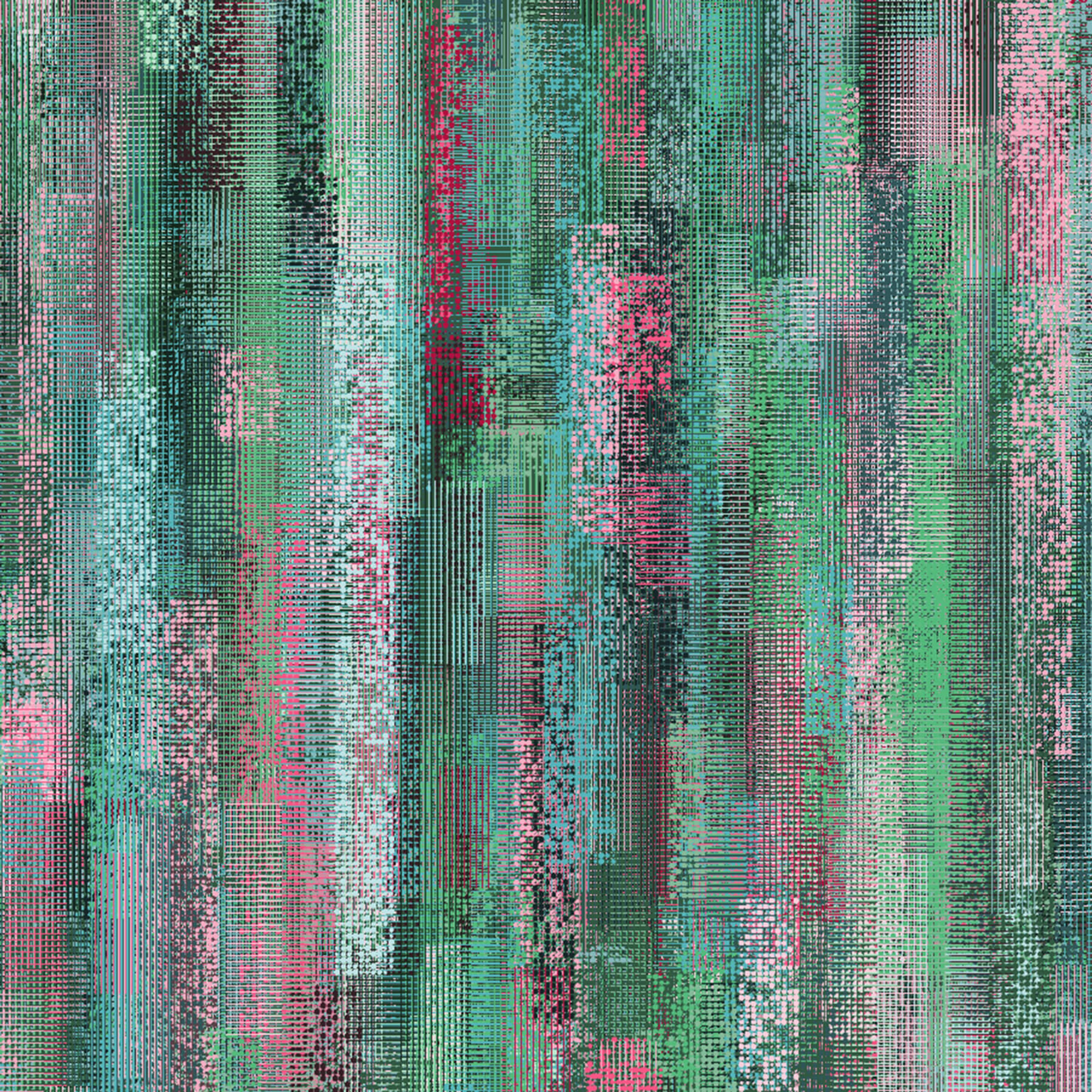
Fig. 3 Lighter Textures
Color Grouping
To strengthen the composition and create larger "chunks", I devised a new way to assign colors to the shapes. Instead of assigning colors at random, I used a color-mapping technique that works like this:
- First, pick 50 random points in the image and assign them a hue: red, blue, or green. I'll call these "hue points".
- Next, pick 10 more random points and assign them a value group: light, dark, or middle-tone. I'll call these "value points".
- Then, when a rectangle is created, gather the five nearest hue points. Randomly pick one of the five neighboring hue points, with the closest being the most likely and the furthest being the least likely. The hue of the chosen neighboring hue point will be used for the rectangle.
Similarly, from the three closest value points, pick a value (light, dark, or middle-tone) and assign it to the rectangle. The combination of the assigned hue and value are used to restrict the possible colors for the rectangle to one or two colors from the palette.
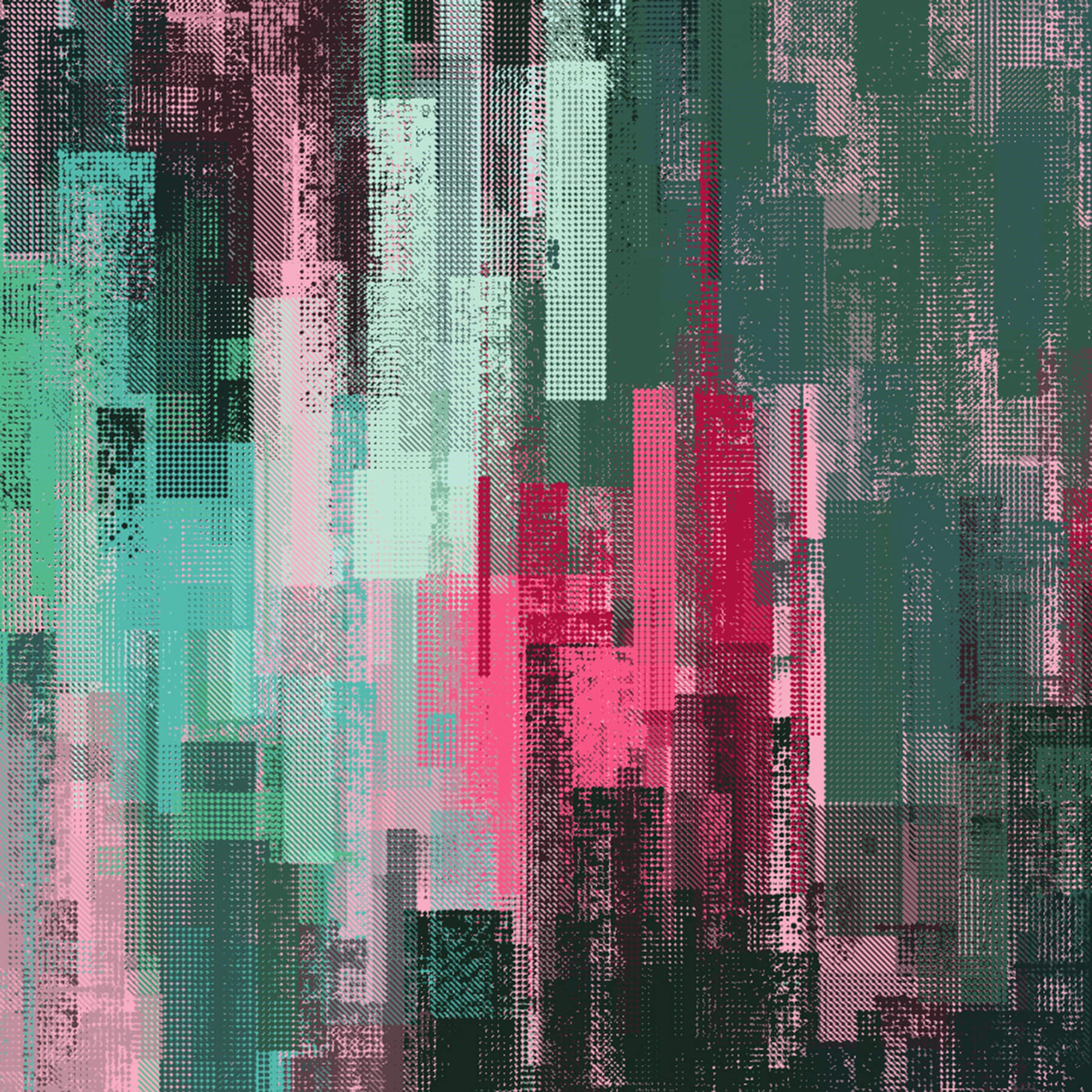
Fig. 4 Color Grouping
The color mapping technique creates large areas of similar hue and value, strengthening the composition. It worked so well that I felt the composition needed to be softened again.
Some of the hard, rectangular shapes had to go. I changed the behavior of some of the rectangles so that they were not a single, solid color. Instead, dots or lines within the texture would each have their color assigned through the color-mapping technique described above. This created some areas for colors to blend and create soft edges.
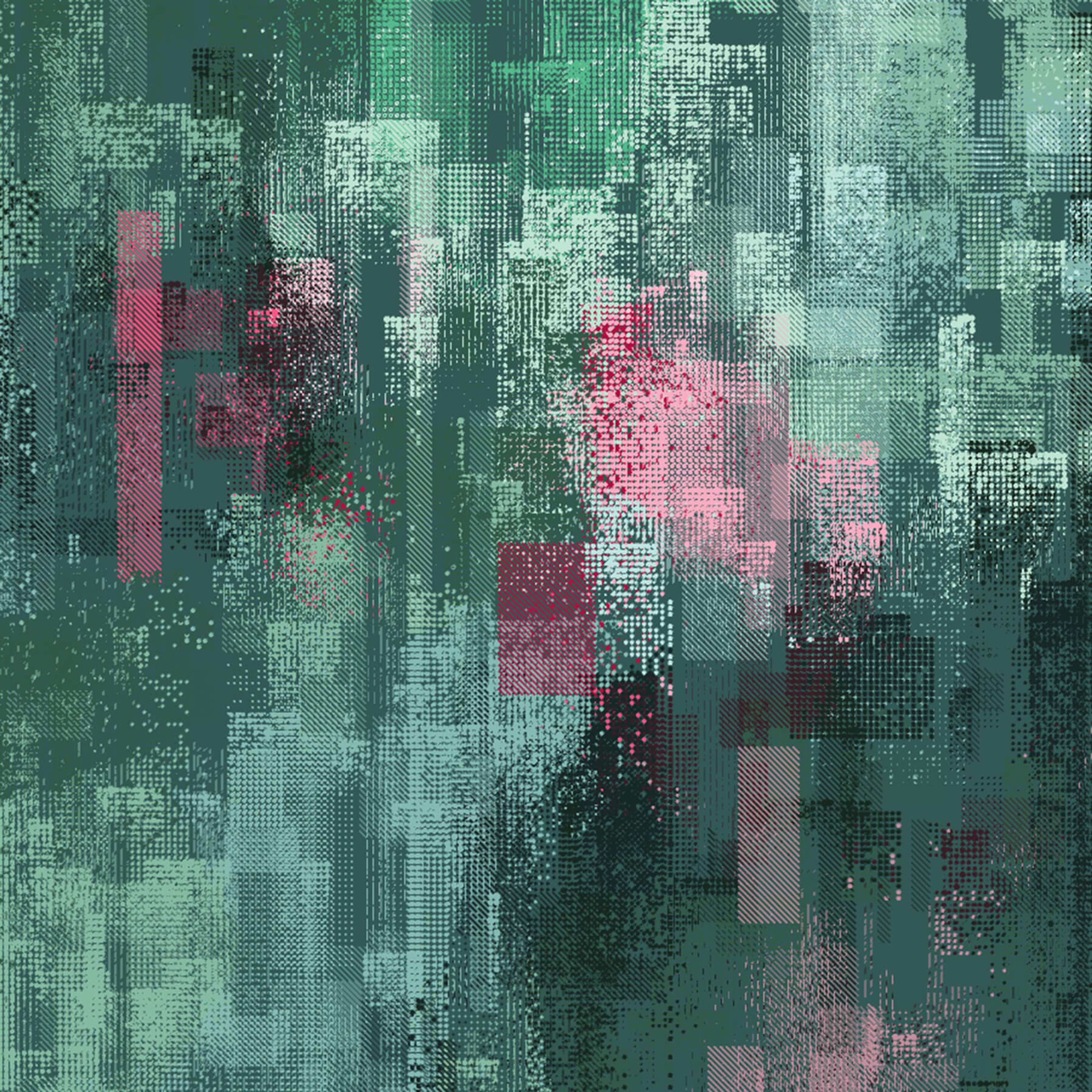
Fig. 5 Re-softened
The image was still extremely busy, and texture was everywhere. I needed some empty space to balance the overwhelming texture.
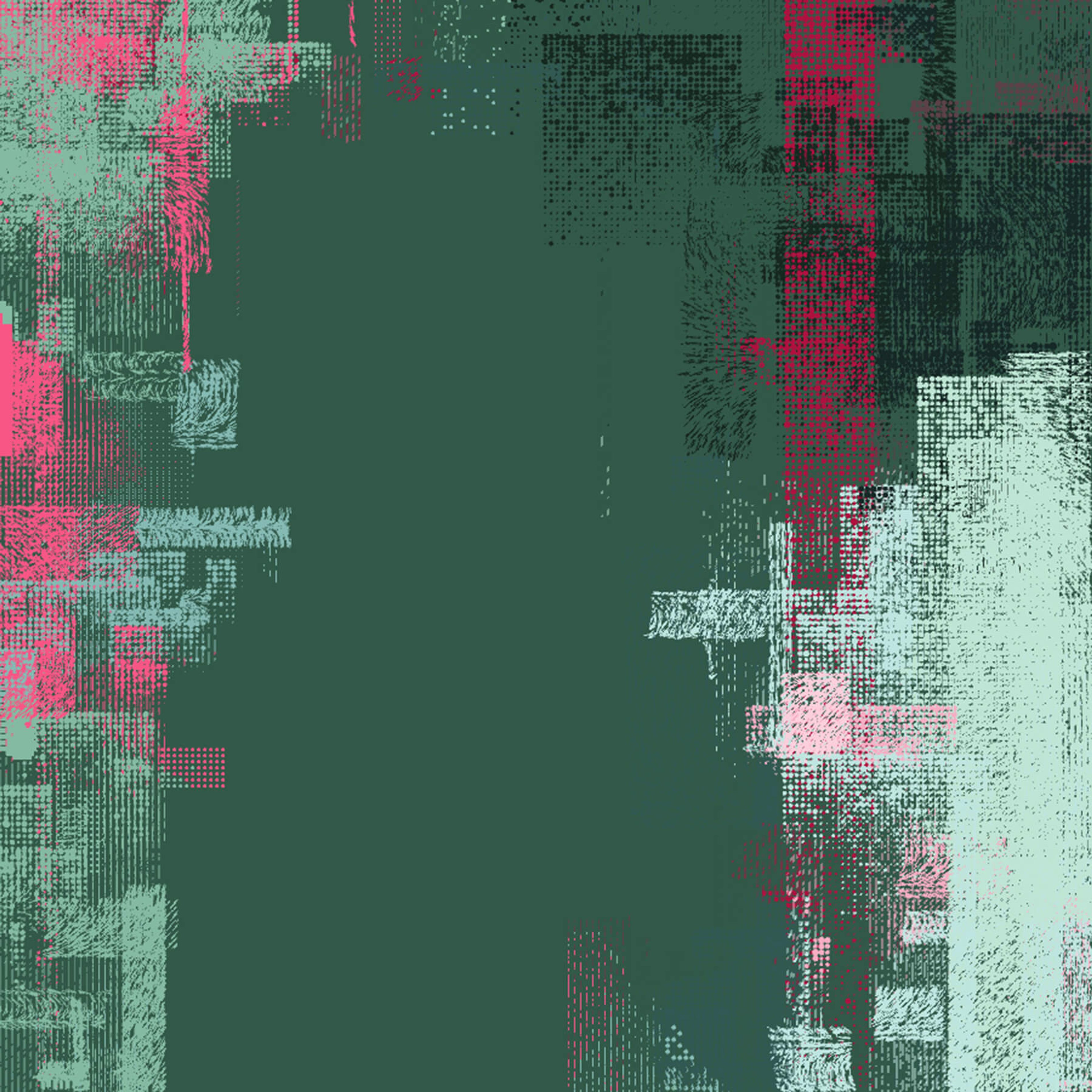
Fig. 6 Negative Space
Ahhh, negative space. Too much of a good thing can be a bad thing, and there was too much texture. With negative space in the image, your brain has a chance to relax and appreciate the details. The negative space also has the side-effect of creating large compositional blocks, interesting silhouettes, and adding rhythm and balance to the image.
To create the negative space, about three points are randomly chosen in the image. No rectangles were allowed to be centered within a certain distance of those points.
Organic Details
The rectangles were a little boring on their own. They look good from a distance, but don't hold your interest for long. I wanted more spontaneous shapes – something with organic curves.
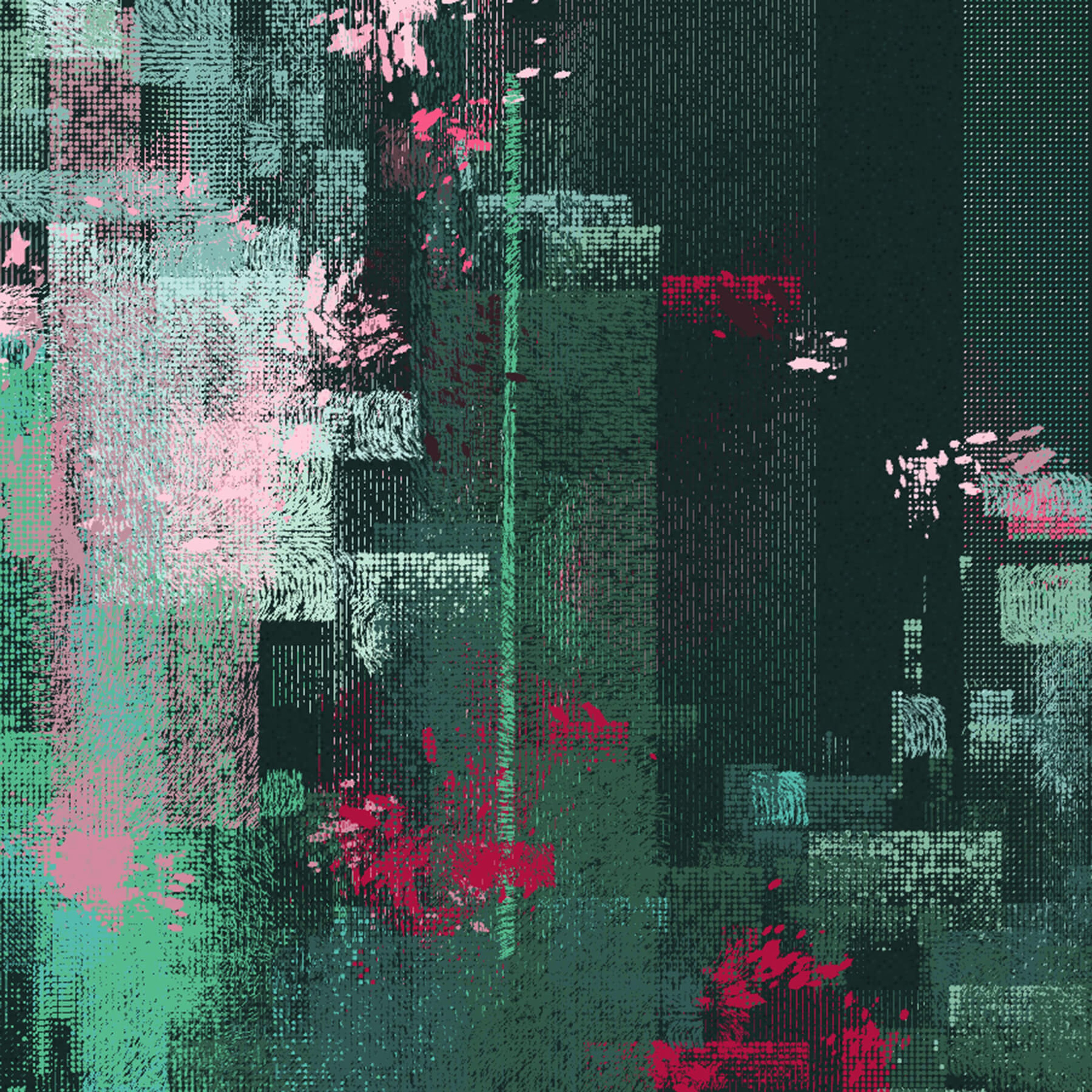
Fig. 7 Organic Shapes
Mangled bezier curves fit the bill. Whenever a red(ish) rectangle is generated, the splatter shapes may be generated on and around it. These break out of the rectangular format and give an almost floral impression.
At this point, I felt that the images were nearly complete. I tweaked the splatter shapes, color palette, and some of the textures. Then I began the generation and curation process.
Curation
The programs that I write generate a huge variety of images; the quality of the output ranges from bland to surprisingly excellent. To get the best work from the program, I need to generate a lot of images and select the best ones.
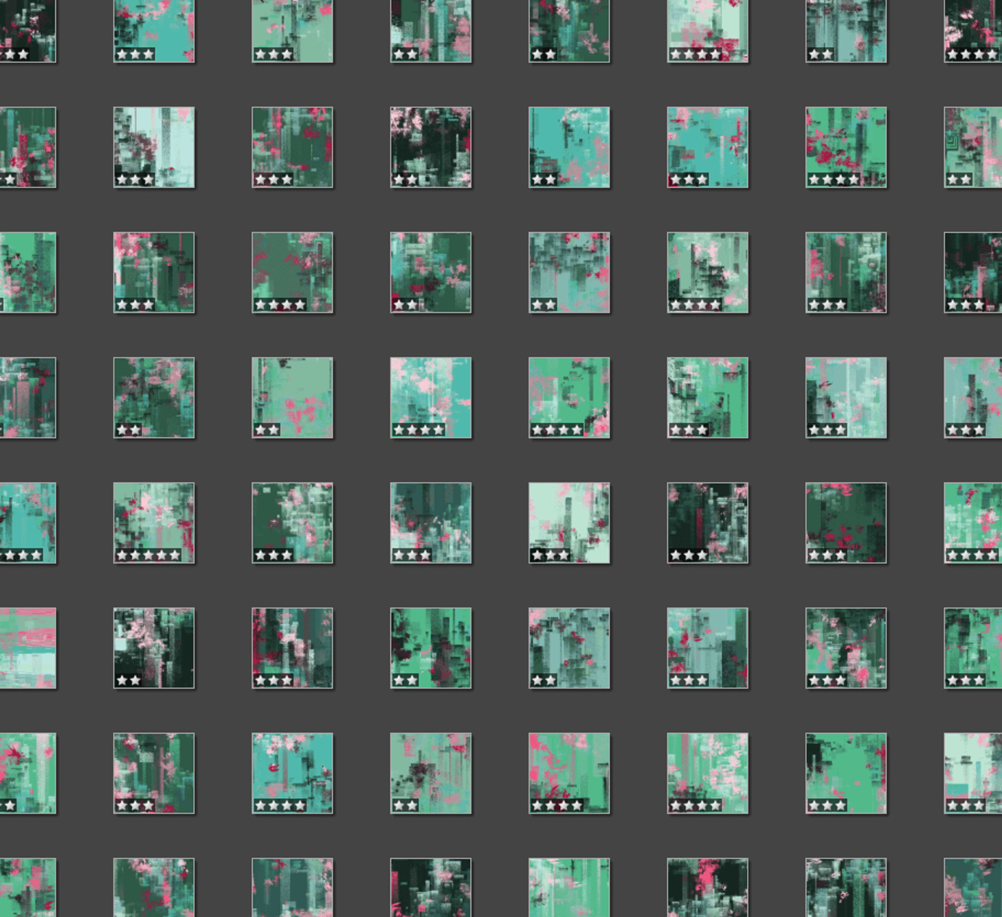
Fig. 8 Rating Generated Images
For this series, I generated about 950 images over several days. I then rated each image between one and five stars. I'm not sure why, but this was much harder towards the end.
Out of the 950 originals, 149 had four or more stars, which meant they were good enough for a second look. After studying the best images for their compositional strength, balance, rhythm, and quality of detail, I narrowed the images down to 24 finalists. The final seven images were chosen from the finalists to complement each other, show the range of the program, and generally work as a series.
Final Series
These are the final seven images that I selected for the Haecceity series:
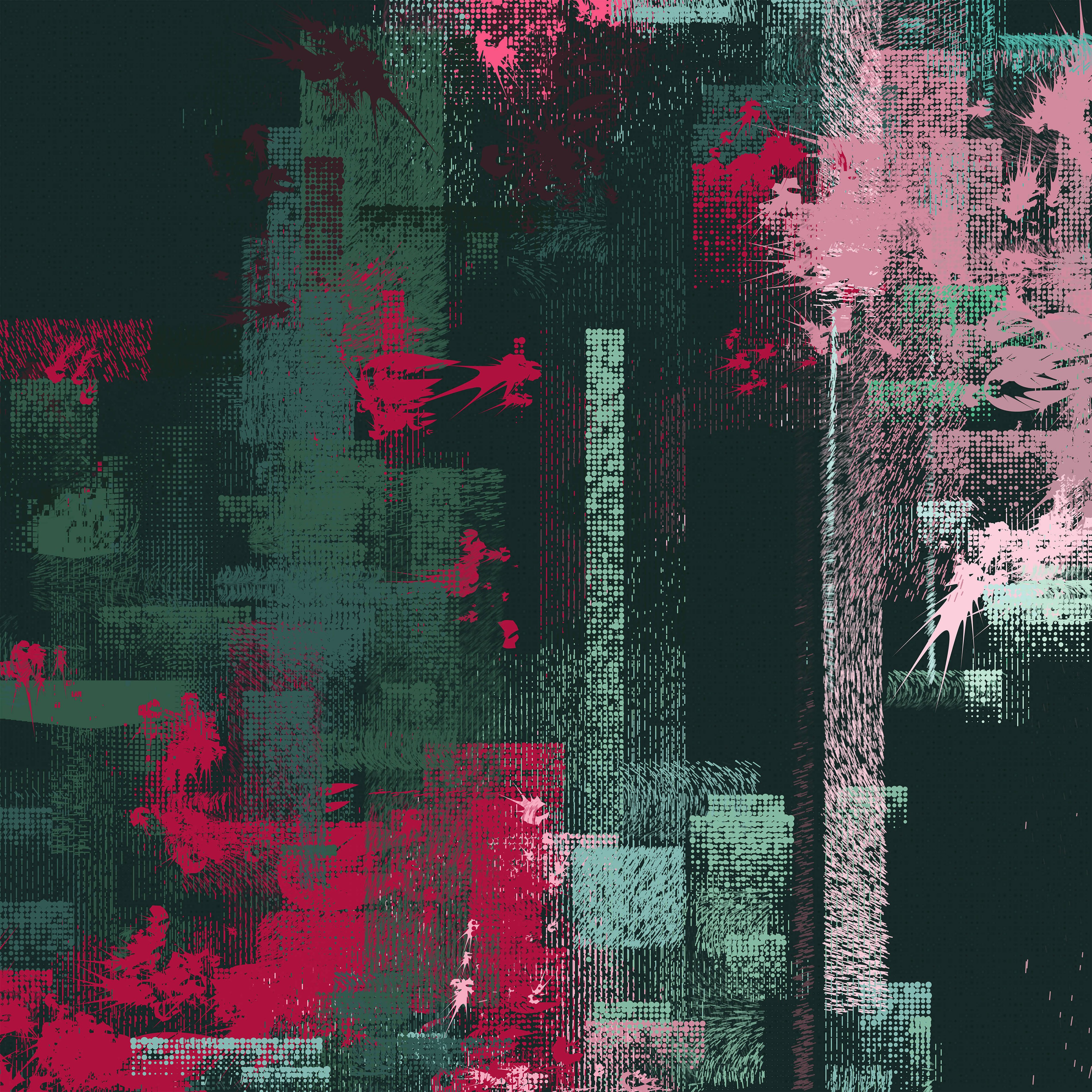
Haecceity 786
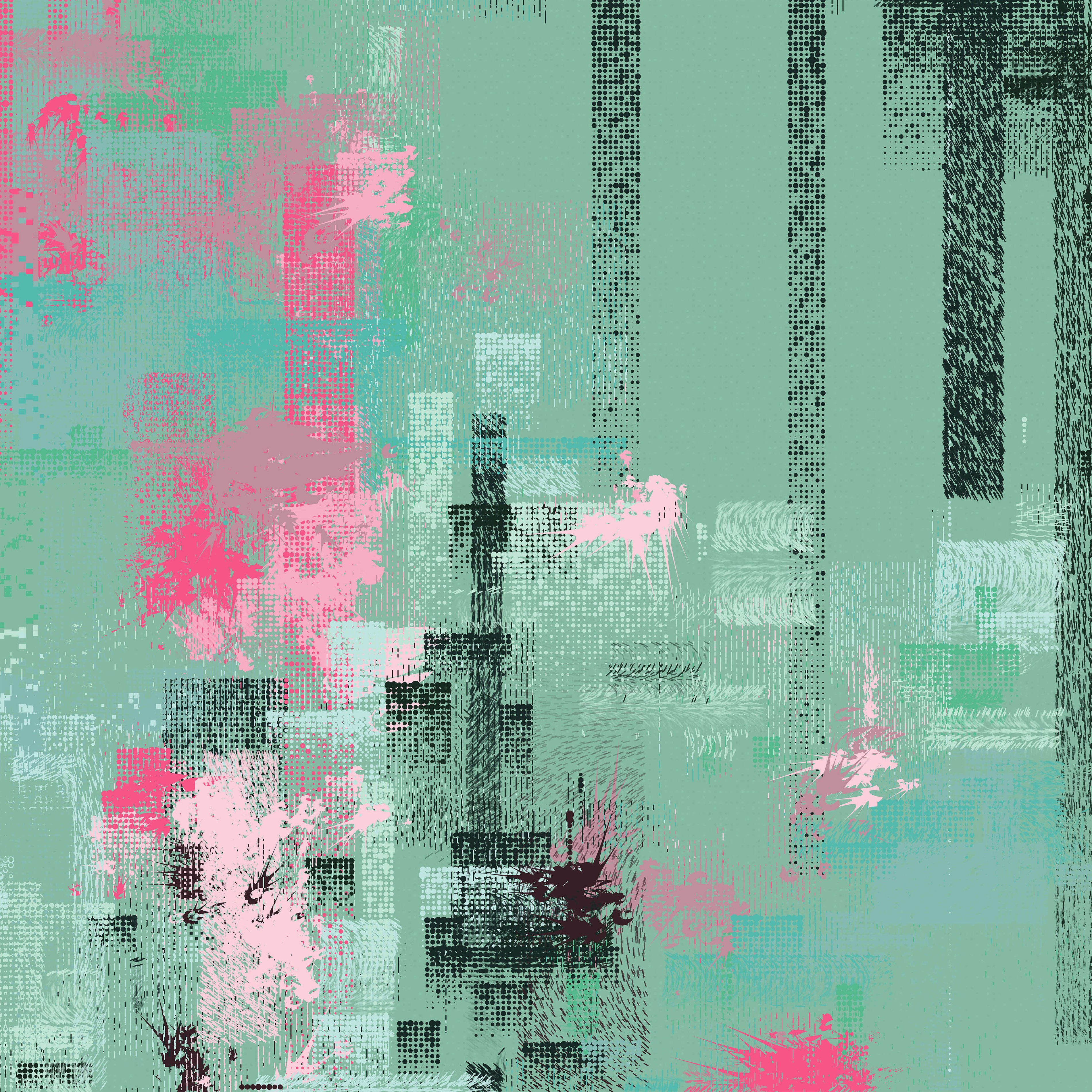
Haecceity 660
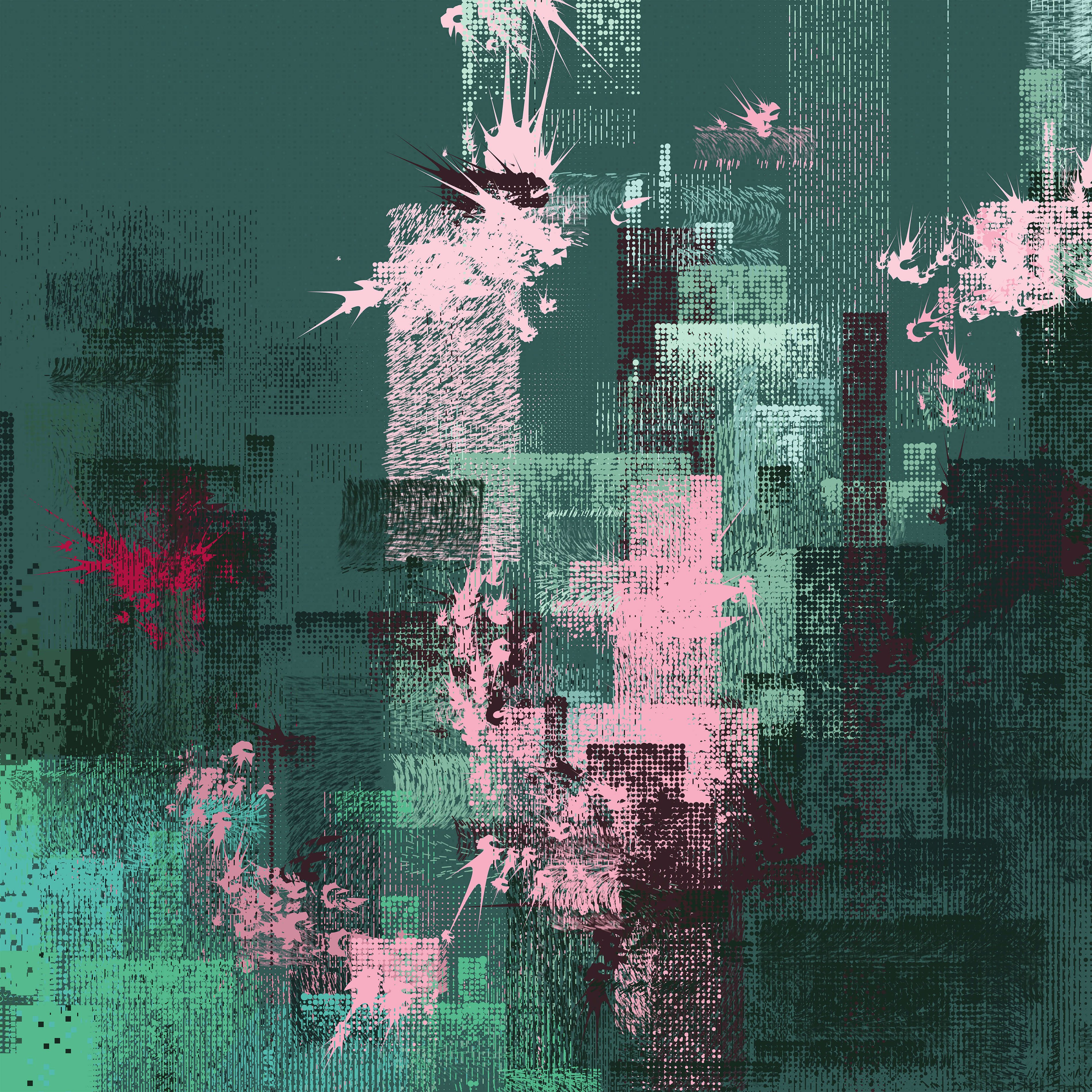
Haecceity 608
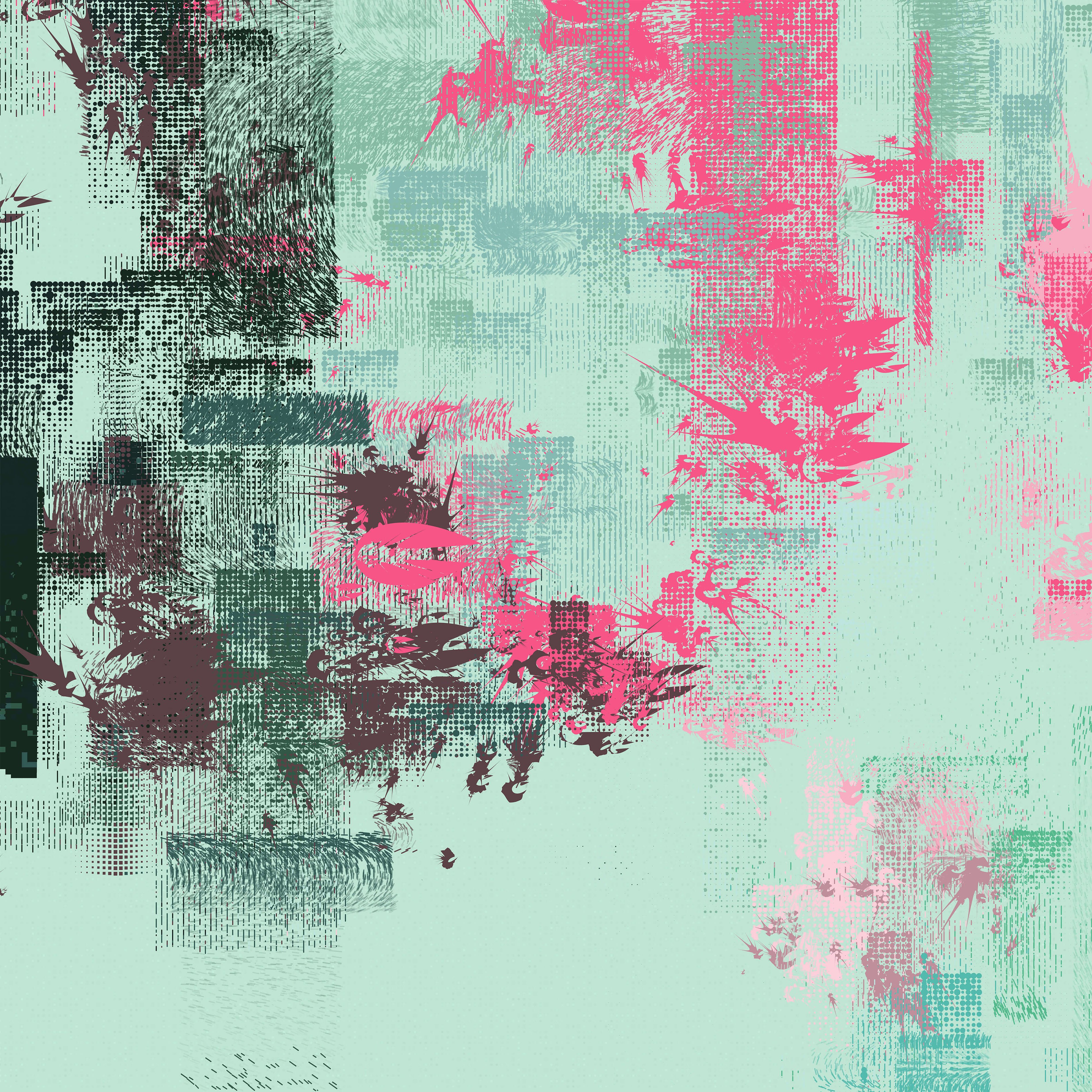
Haecceity 602
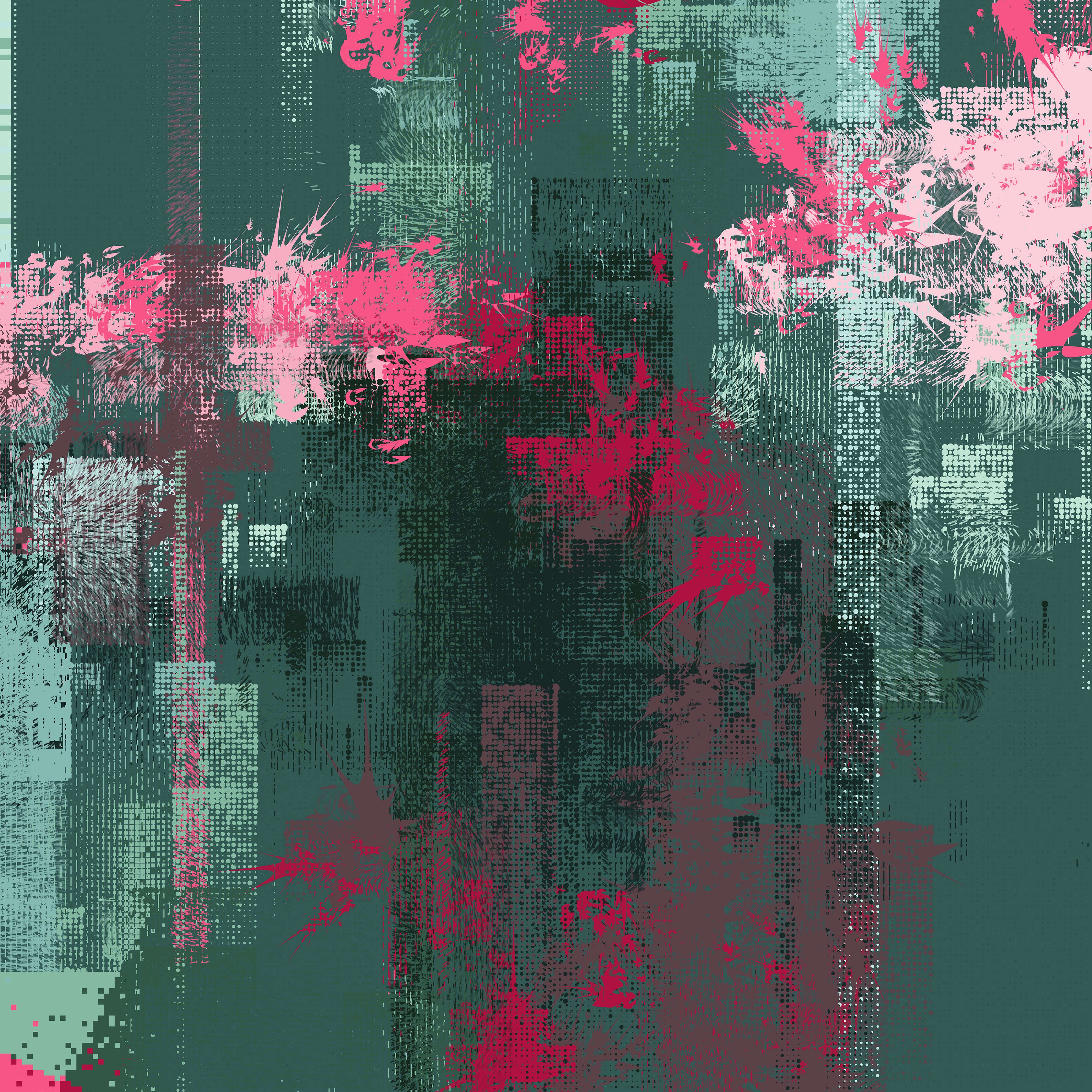
Haecceity 166
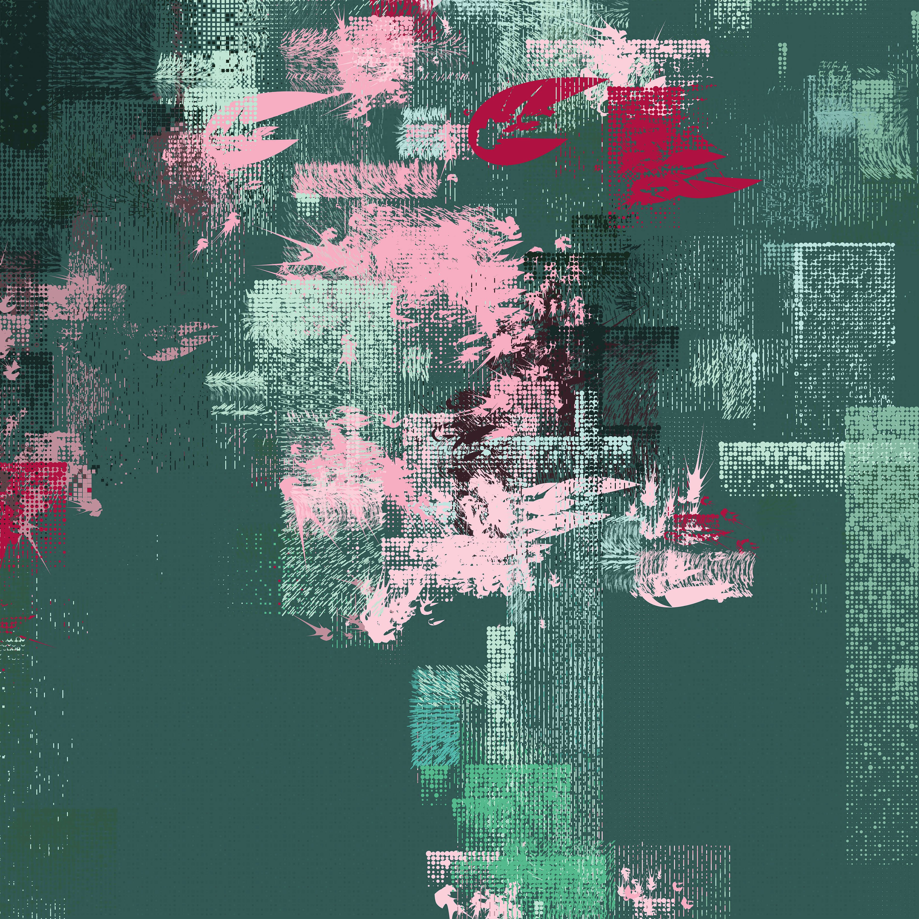
Haecceity 341
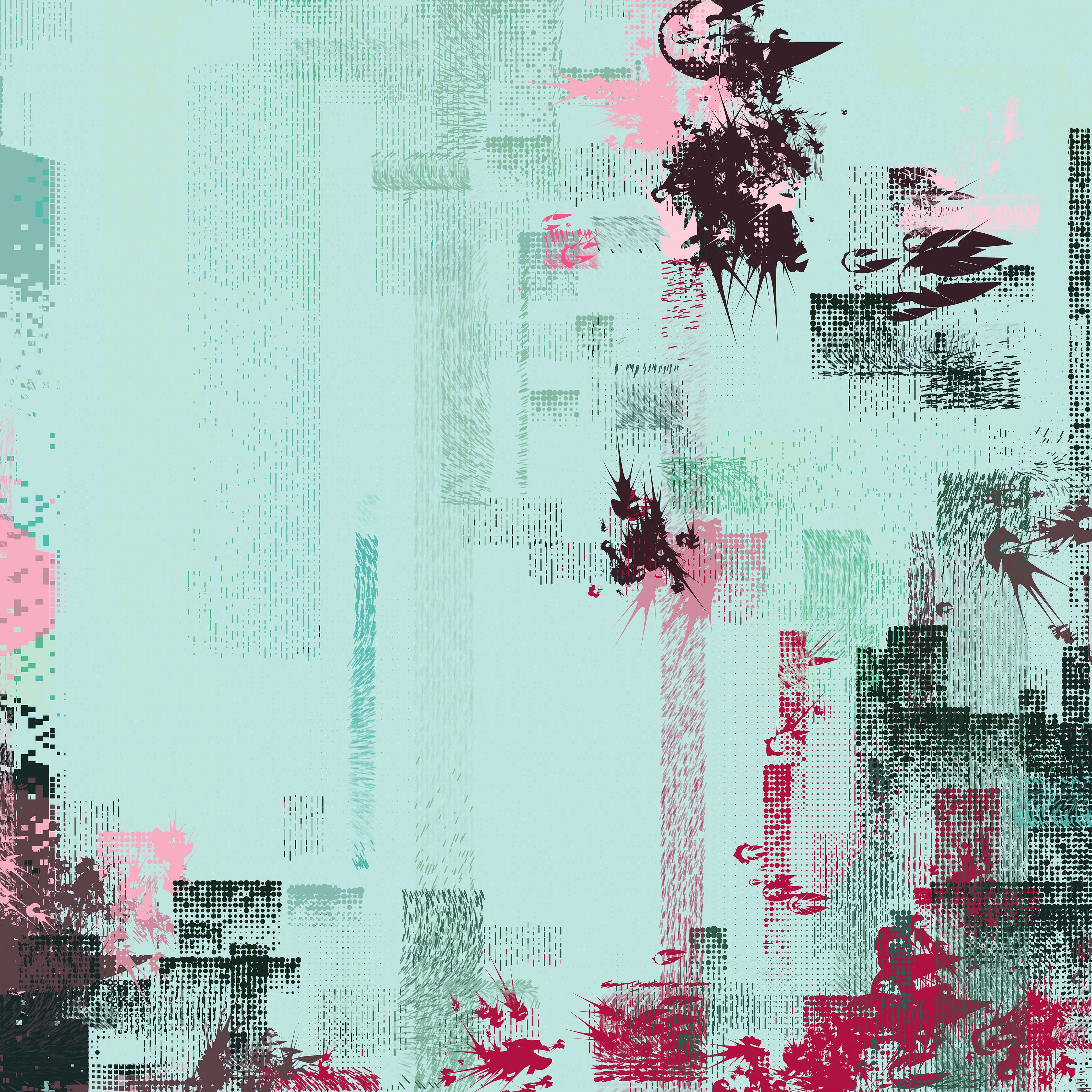
Haecceity 260
From time to time, I write about my thoughts and artistic process. If you'd like to be notified the next time I publish an essay, sign up for my newsletter in the menu.