The Design Philosophy of the QQL Algorithm
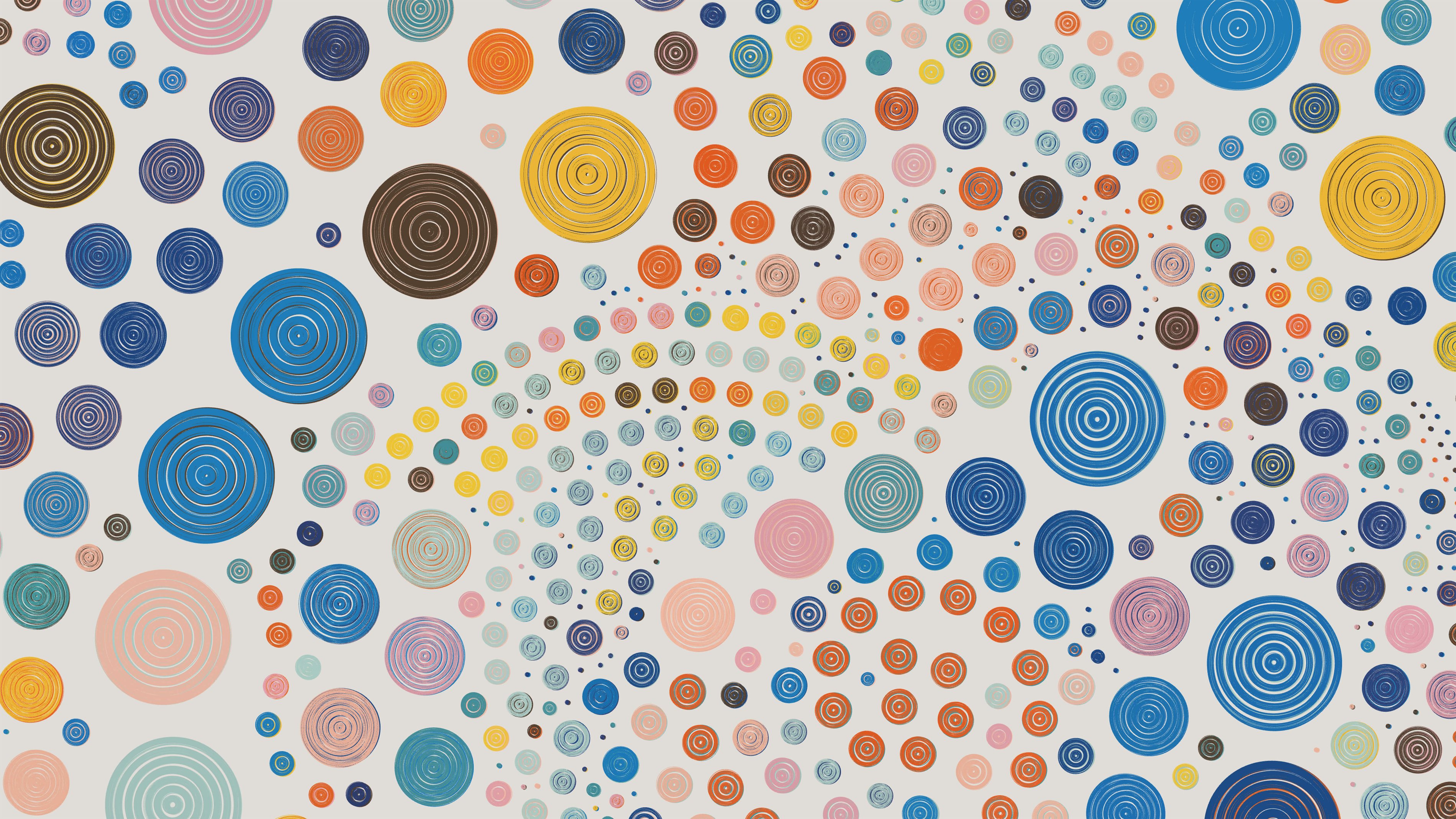
A year and half ago, QQL was released. While QQL is experimental on several fronts, such as minting mechanics and community curation, the core of it is a sophisticated long-form generative art algorithm. In many ways, designing that algorithm was a fascinating process, and one that helped me to clearly organize my thoughts about long-form work. Because this was a collaboration between myself and Dandelion Mané, the co-creator of QQL, a significant amount of time was spent discussing the philosophy of the design. Perhaps because we both share engineering backgrounds, we were eager for a philosophy that was clear, communicable, and actionable. In this essay, I will share the final design philosophy that we arrived at.

Dandelion and Tyler in the studio
Emergence was perhaps our favorite property of good long-form generative art, so it was a pleasure to focus on that in the design process.
Before we dive in, it's worth remembering an important characteristic of QQL: mints from the algorithm are not generated randomly. They are carefully curated by the community of collectors, often after combing through thousands of outputs from the algorithm. This means that the algorithm can afford to take a lot of "risk". It's okay if 20% of the outputs are bad, as long as 1% of them are excellent. Collectors will ignore bad outputs and only seek out those top 1%. As a result, when designing the algorithm, we had the opportunity to optimize it for emergence. In other words, we could optimize it so that those top 1% might be wild and unexpected — truly surprising results. Emergence was perhaps our favorite property of good long-form generative art, so it was a pleasure to focus on that in the design process.
Looking back at the results thus far, I feel quite comfortable saying that QQL has been wildly successful when it comes to emergence. Not only has there been huge variety in what people generate and appreciate, but there have been a truly remarkable number of those bizarre, one-in-a-million, what-are-the-odds kinds of outputs. These are real surprises, images that neither I nor Dandelion anticipated in any way. In many cases, we're not even sure exactly how the algorithm arrived at such a result! I couldn't be more pleased with an outcome like that. My goal, by sharing the design philosophy of the QQL algorithm here, is to assist other generative artists in achieving similar results, if they so desire.
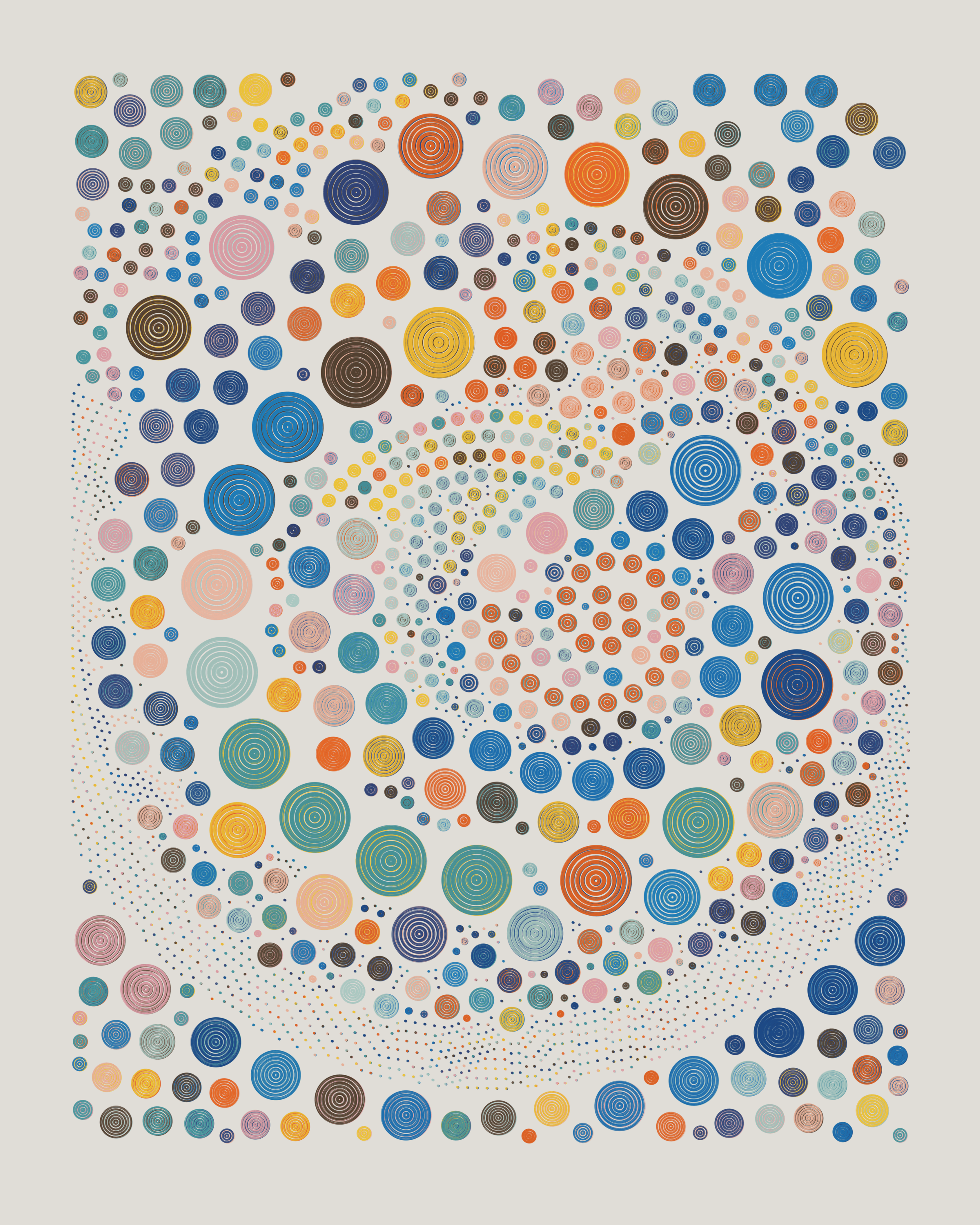
QQL #138
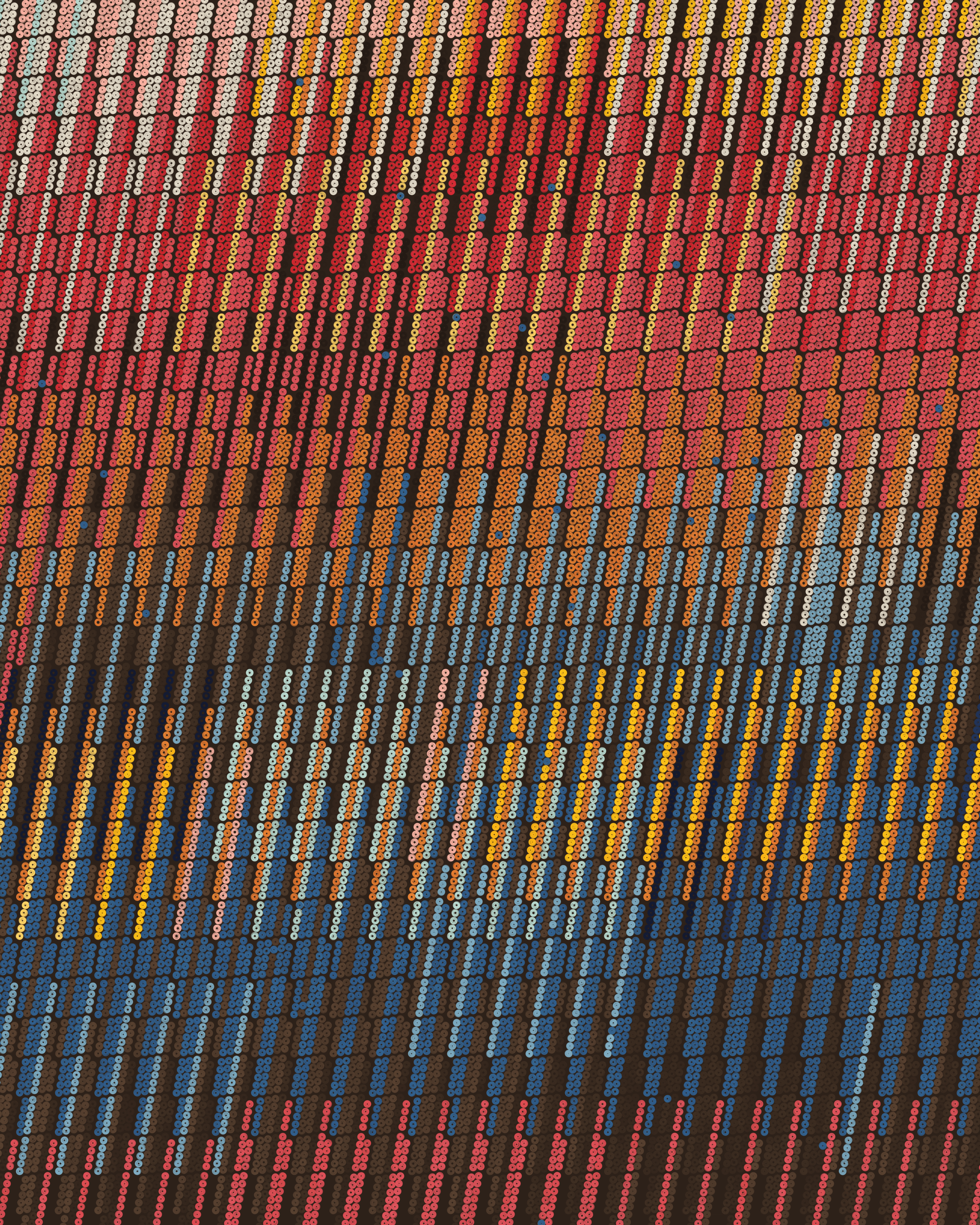
QQL #154
Orthogonal Features
Because Dandelion and I decided early on to optimize the algorithm for emergence, we began to contemplate what qualities in a long-form algorithm actually facilitate emergence. We took a look back at Fidenza, which had been particularly successful in this regard. There were many outputs that were highly unexpected, and in general, the algorithm had a wonderful feeling of surprise as you scrolled through the results. At an abstract level, we wondered, what was it that made that happen?
The core idea we began to focus on was feature design, and specifically how different features were related to each other. You can think of features as the high-level decisions that shape what kind of output will be generated. We thought that the most effective features were those that were:
- Independent, in the sense that the value of that particular feature could vary wildly, without restricting the range of possible values for any other feature. This quality makes the features highly composable, which is important for getting wide-reaching and unpredictable combinations.
- Distinct, in the sense that any pair of features are not overly correlated or linked in behavior. Each feature should bring a distinct contribution to the overall result, and not be blended in a messy way with any other feature.
We called features with these properties orthogonal features, which roughly means that the features are “perpendicular”, in some sense. If you think about the entire potential output space of a generative algorithm, it is a multi-dimensional space. The different features are what contribute new dimensions to that output space. For example, if a simple algorithm only has three features, scale (small to large), turbulence (calm to wild), and texture (smooth to rough), then the potential output space has three dimensions, and looks something like this:

This is a very clear and well-behaved space, because those three features are perfectly orthogonal. They are independent, composable, and distinct. You would never confuse one for the other, and any particular value for one feature could be safely mixed with any combination of values for the other two features. These features are clearly orthogonal.
When designing QQL, we wanted to strive for features with the same properties. And, whenever we felt that the algorithm needed greater variety, we searched for a new, orthogonal feature that could be added to the space. This may sound simple, but it's actually quite difficult to do well. Many potential features are hard to combine with the entire potential output space of the algorithm. It’s also common for a feature idea to begin as something small that’s hard to generalize. Or, the feature idea may be fuzzy, and hard to distill into clear boundaries. It takes some work to cleanly separate those feature ideas into distinct, independent, powerful concepts.
After many rounds of reworking, the final feature set for QQL ended up being:
- Color Palette
- Color Variety
- Color Mode
- Structure
- Flow Direction (or Flow Pattern)
- Flow Turbulence
- Density
- Ring Size
- Ring Size Variety (e.g. constant size vs a mixture of sizes)
- Ring Thickness
- Ring Pattern (i.e. 1 vs 3 vs 7 rings per dot)
- Margin
Most of these are highly orthogonal. There are no restrictions against particular combinations. And, each is generally a clear and distinct concept from any other feature (although some deal with closely related aspects of the output, such as Ring Size and Ring Size Variety). With twelve orthogonal features, the output space has a substantial amount of variety. I believe this is what made it worthwhile for the community to generate over 30 million QQLs in the first year — it's able to continuously surprise.
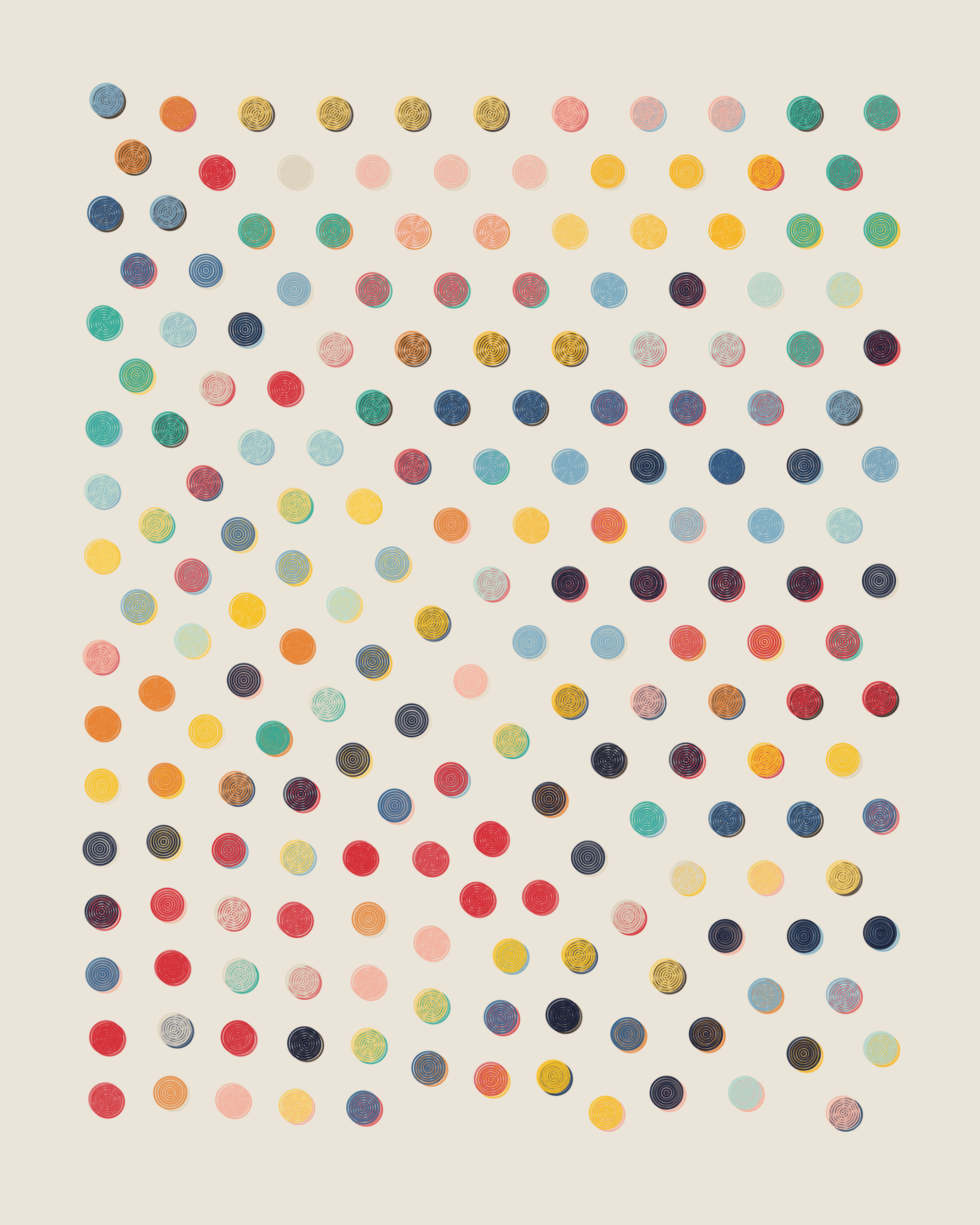
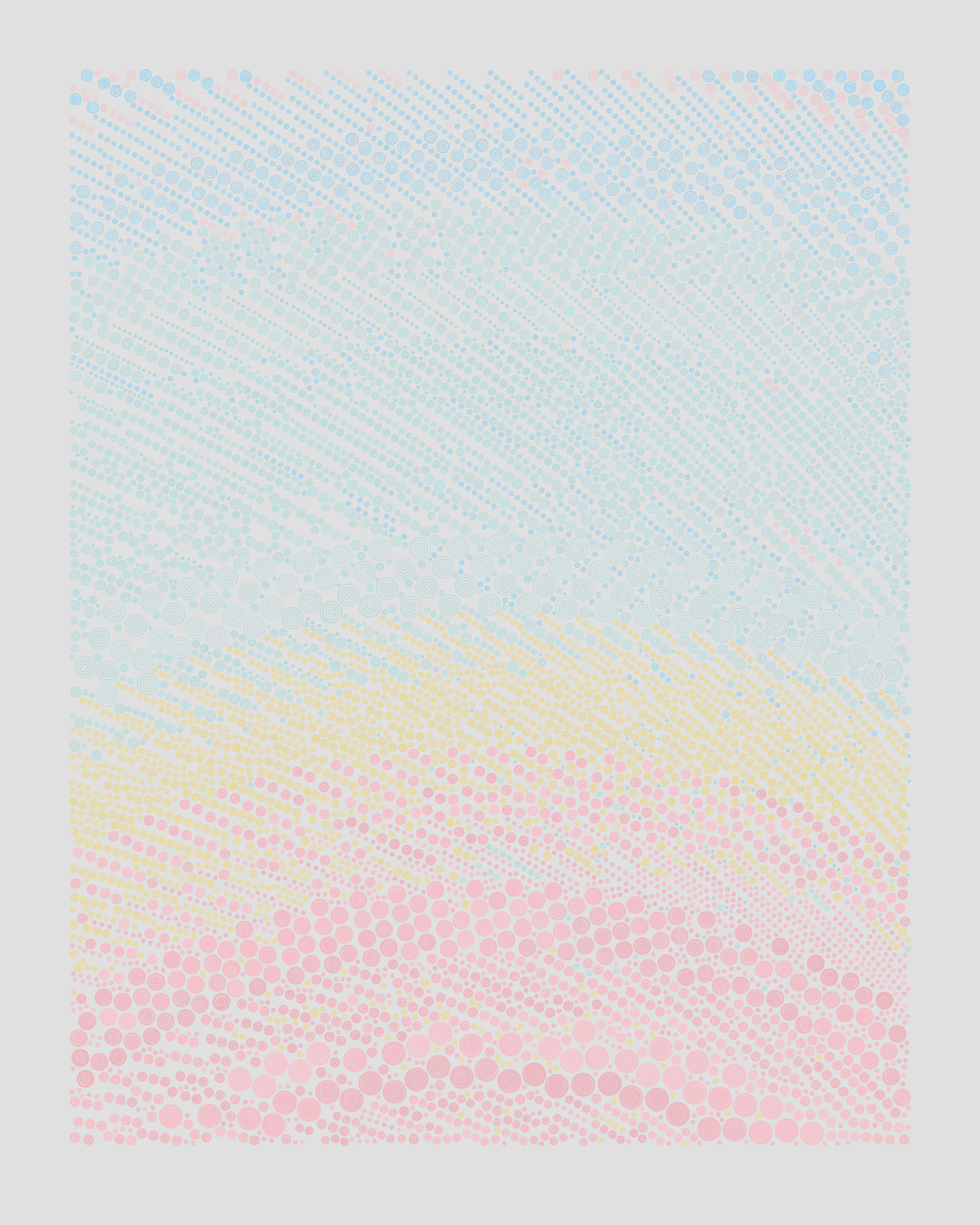
QQL #1 features high color variety, low density, medium size with no size variation, and 7 rings per dot.
QQL #245 features a circular spiral structure, high density, and small sizes with some amount of variation.
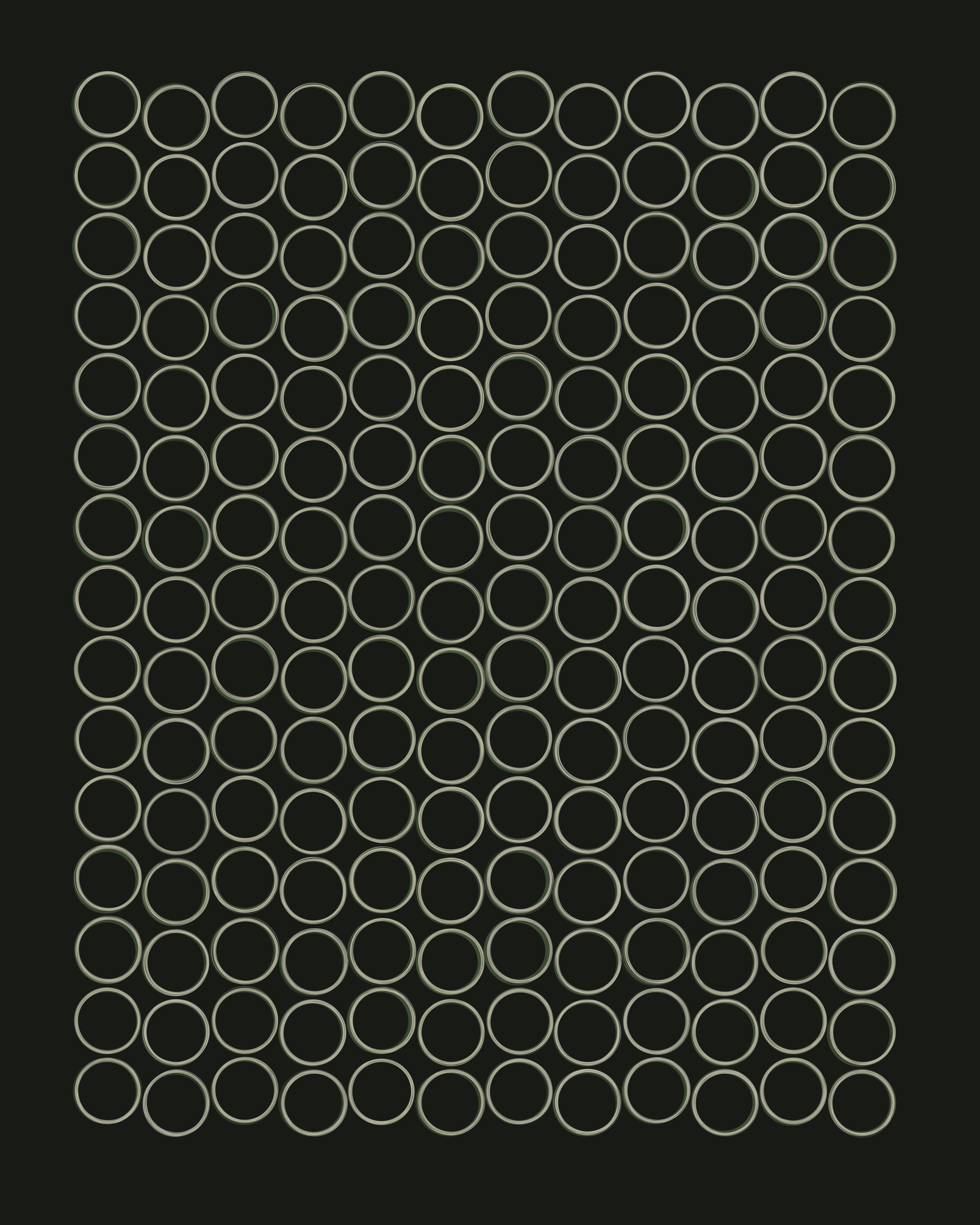
QQL #240 features a strict Formation structure, vertical flow with no turbulence, high density, and 1-ring dots.

QQL #117 features the large size, but with wild size variety, which means it can jump from huge rings all the way down to tiny dots.
Continuous (and Probabilistic) Features
My first long-form work, Fidenza, had a lot of "binary" features. These are features that are either on or off, with nothing in between. The Spiral, Outline, Super Blocks, Soft Shapes, Sharp Angles, and Margin features were all binary. On the one hand, this is nice, because it makes it very easy to tell if a particular feature is enabled or not. On the other hand, it constricts the output space to a more limited range, and eliminates the possibility of outcomes somewhere in the middle. What if Fidenza had not just Smooth Angles and Sharp Angles, but also Semi-Sharp Angles and Very Sharp Angles? Or, what if outlines didn't always need to be complete, but could also be partial, and selectively applied? Or what if there was a possibility for a loose spiral as well as a tight spiral?
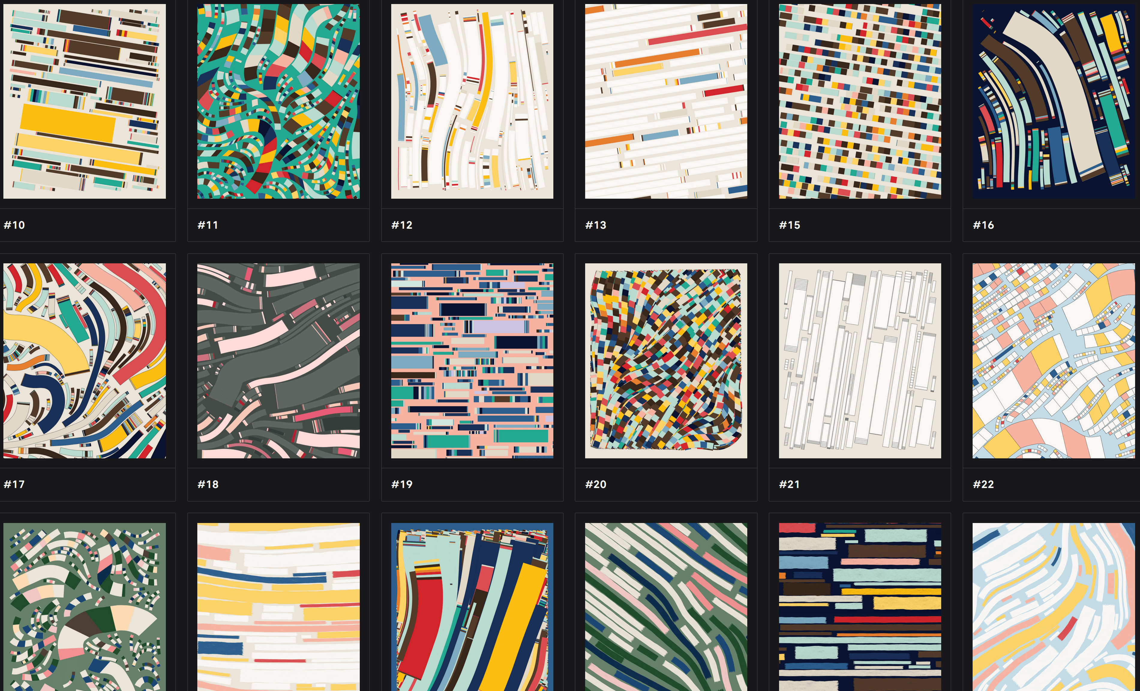
A random selection of Fidenzas, showing many binary or otherwise non-continuous features.
While working on Incomplete Control, I decided to avoid these kinds of binary features and instead to focus on "continuous" features. These could have a low value, a high value, or anything in between. There was a smooth range of potential values for every feature. As a result, the set of outputs from Incomplete Control are not divisible into clear camps based on features. Every output has other outputs that are "close" to it in the output space, something that was not true for Fidenza. With Fidenza, a Spiral was fundamentally separated from the rest of the set. I liked that the continuous features gave Incomplete Control a highly "unified" feeling, like it was one particular idea instead of a bag of separate ideas.
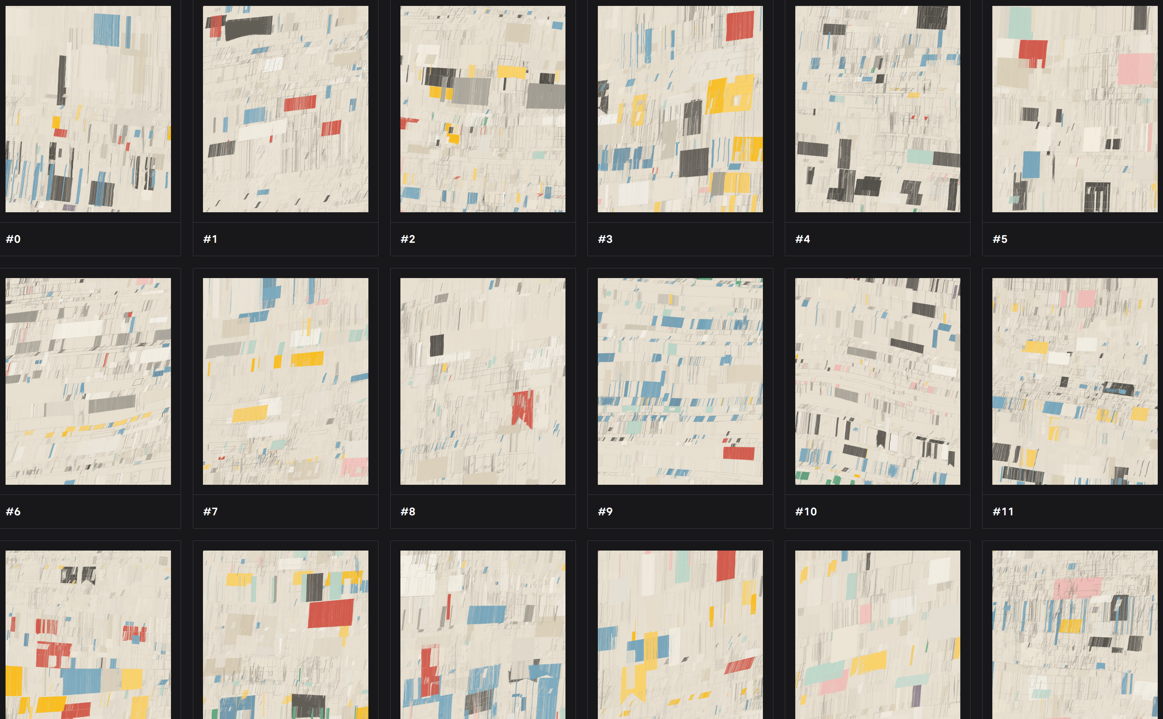
A random selection of Incomplete Controls, showing continuous feature behavior.
When designing QQL, Dandelion and I had a strong preference to use continuous features, whenever possible. Most of the final features express a "range" of values:
- Color Variety (low to high)
- Turbulence (low to high)
- Ring Size (small to large)
- Ring Size Variety (low to high)
- Spacing (dense to sparse)
- Ring Thickness (thick to thin)
- Direction (any tilt angle is possible, and spirals can have any degree of tightness)
As an aide to continuous feature design, we also heavily utilized "probabilistic" feature values. This means that when you select a Ring Size of "large", you don't get the exact same large size every time. Instead, some amount of randomized variability is introduced. This means the rings are generally large, but sometimes you might get massive rings, and other times they're merely "big". This probabilistic approach had a couple of benefits.
First, it allowed for a better user interface, and correspondingly, better trait values when browsing the collection of mints. Imagine if Ring Size could have been a value between 1 and 100. The interface would need a slider (with fine-grained control), and when browsing the collection, you would need to use a drop-down with up to 100 options just to explore that feature. By using probabilistic values, we were able to simply offer "Small", "Medium", and "Large" in the user interface, and when browsing the collection you have the same experience. But, even with only three size options, the randomization allows actual outputs to span a range of behaviors that is closer to that 1-to-100 approach.
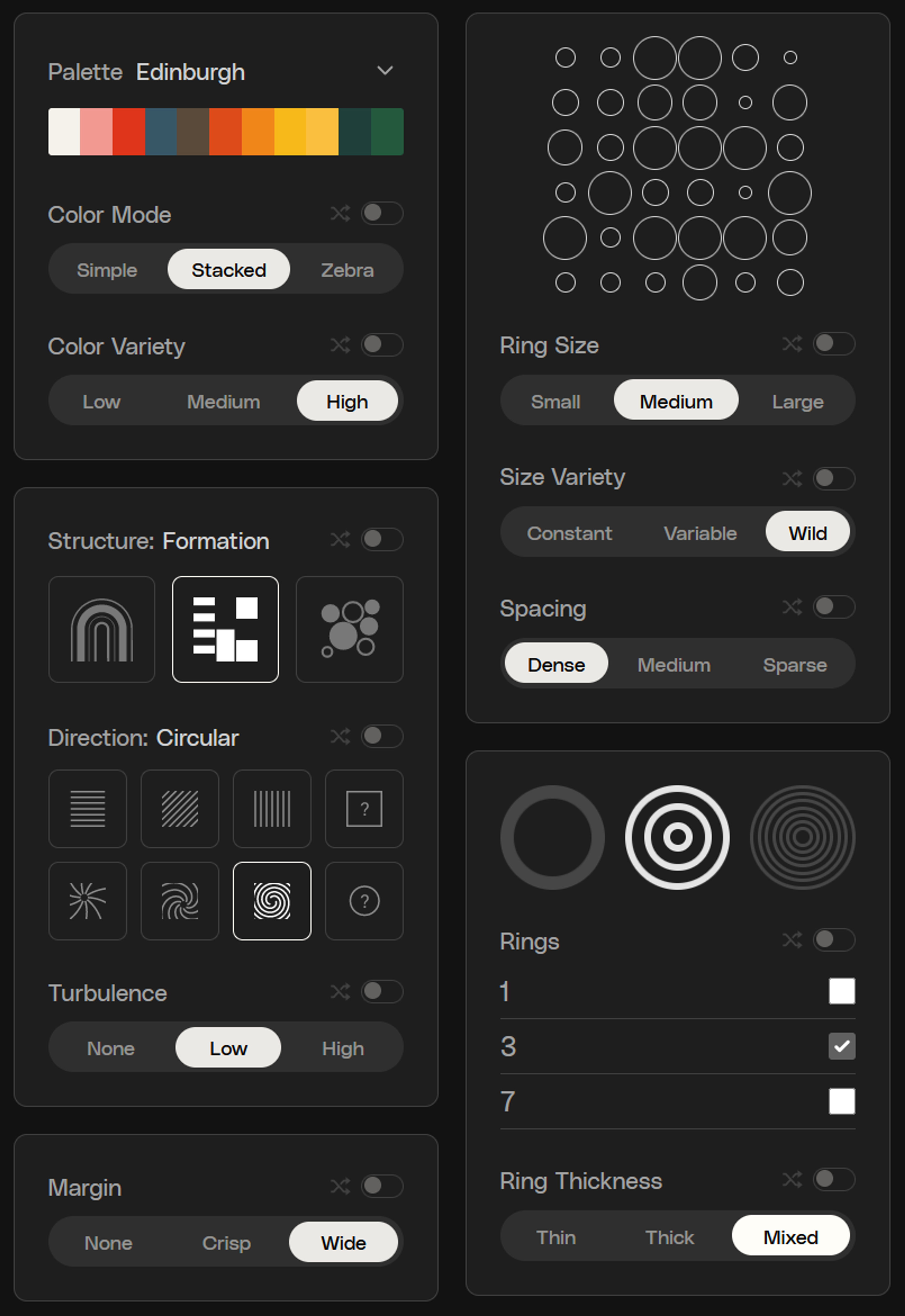
The QQL Control Panel
The second benefit is that the probabilistic approach offers more opportunities for outliers and surprise combinations. Sticking with Ring Size as an example, you can, on rare occasions, get very large or very small rings. Or, you can get a size that's just a hair below "Medium" that just so happens to allow a particular circle-packing pattern to line up. These kinds of subtle shifts in feature values can really help to maximize emergence.
Overall, these design decisions around features seem to have been highly effective, and are a big part of why QQL produces such a wide variety of interesting and unique behaviors.
The Motif
Let's zoom back out to high-level design philosophy. As I wrote in The Rise of Long-Form Generative Art, it's always important to balance variety in a long-form generative algorithm with unity and cohesion. So far, most of this essay has discussed ways to achieve variety. But, there's no point to adding more and more variety to an algorithm if the result just feels like five different ideas stuffed into a bag. As the artist, it's important that you take counter-balancing steps to ensure a cohesive result.
Towards this end, Dandelion and I both felt that it was crucial for QQL to have a clear visual identity. In other words, we wanted to ensure that if you saw almost any output from the algorithm, you could recognize it as a QQL. So, even though we designed a large set of highly orthogonal features to produce a high level of variety, we didn't want that variety to ever break or obscure the core visual language of the work.
One way that we attempted to ensure this was to be very rigorous with the use of a motif. We settled on the "ring-dot" as the motif for QQL. No matter what features were selected, or what extreme outlier behavior happened, the ring-dot should to be present and visually identifiable.
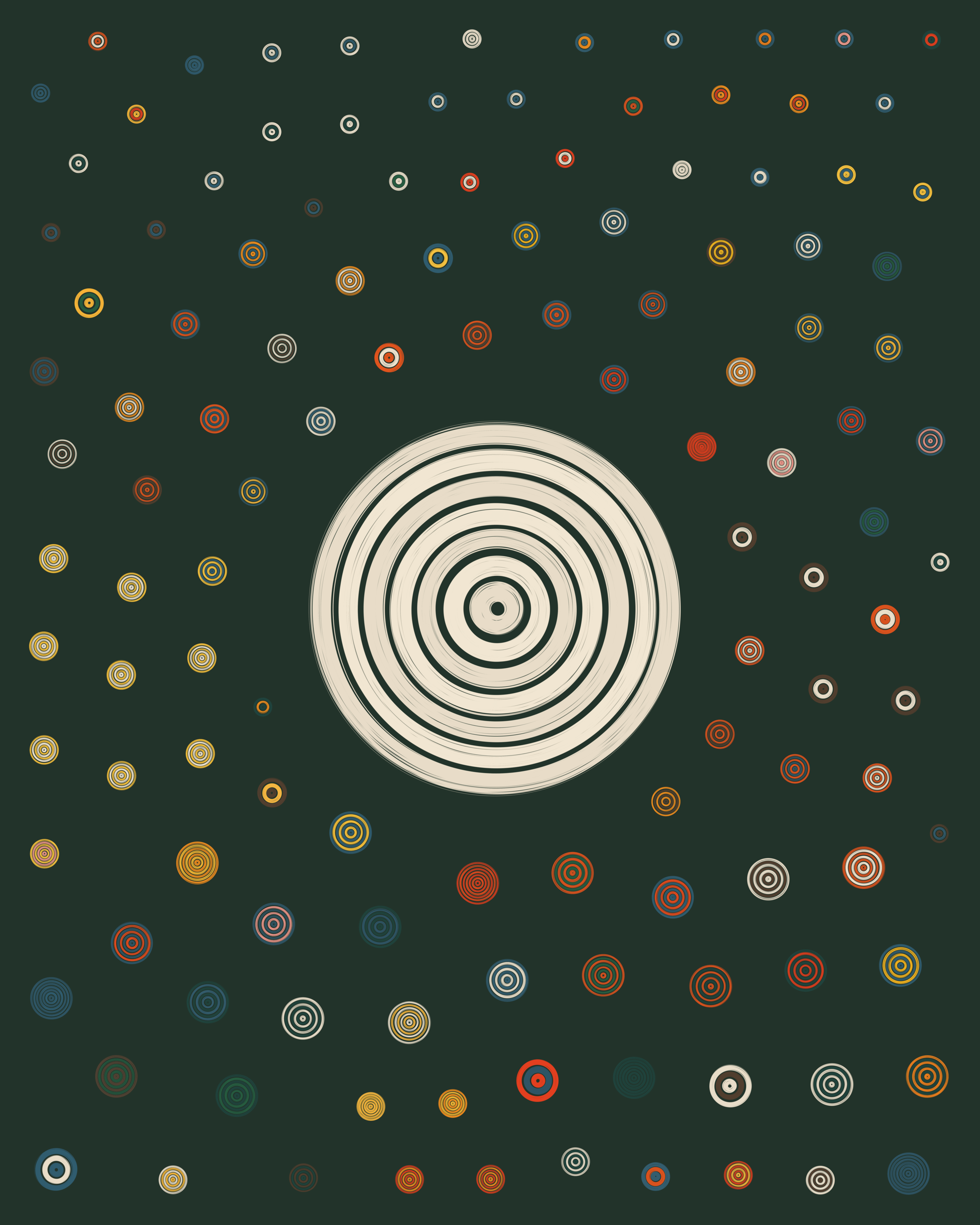
QQL #55, featuring a prominent ring-dot in the center.
We were willing to sacrifice the range of some features, or even whole features entirely, in order to strongly preserve the motif. For example, we experimented with incredibly small values for Ring Size, but found that this lost a clear sense of ring-dot and instead moved into a "smooth" space that felt very different. Similarly, we experimented with extreme values of Density that would pack the dots to a high level of overlap. This too seemed to lose some of the core visual identity of the algorithm, and so we decided to maintain a minimum level of spacing around the dots. In some ways, that spacing also became part of the motif. Other experimental features, like multiple layers, or alternative rough textures for ring-dots, were likewise discarded in order to keep the motif strong. In the end, we felt this was absolutely the right decision. Those experimental features were interesting to see, but not at the expense of the core identity of the work.
In Summary
If I had to briefly summarize the design goals of QQL, I would describe them like this:
- Optimize for emergence
- Make features highly composable
- Keep the aesthetics connected across the entire set
Dandelion and I knew that if we achieved these, we could give curators and collectors an opportunity to express themselves and their aesthetic values. The algorithm would naturally span a range of emotional qualities. And, at the same time, it would maintain its identity as a single work of art. Now, looking back at a year and a half of QQL, I couldn’t be more pleased with how our work achieved those goals.