Flow Fields
Flow fields are incredibly powerful and flexible tools for producing interesting curves. They are one of the main tools I've used in my own generative art over the last few years, and I find myself going back to them over and over again. It's entirely possible that I've used them in more programs than any other person alive.
Flow fields are also something that many programmers reach for early on when they first get into creating algorithmic artwork, but few take the time to polish their use and explore the crazy variety of ways they can be used. In this essay, I'm going to cover the basics of flow fields, suggestions for different variations on their use, and tips for making them look good.
A Grid Of Angles
Flow fields are based around a grid. Roughly speaking, this grid covers the whole image/canvas. At each point in the grid, you store an angle. Your grid should be stored as a 2D array of floating point numbers. Each item in the array holds an angle and represents a point in the grid.
When you initialize the grid, you need to pick a resolution. In other words, the spacing between the elements in the grid. The higher the resolution, the finer details you can create, and the smoother the curves. The downside is that performance can suffer if you crank it way up. I usually use around 0.5% of the image width for my resolution. I also use an integer length for the spacing to make the math easy and to avoid floating point precision errors.
The last configuration bits you need to decide on are the bounds of the grid. You might be tempted to make them match the sides and top of the frame/image. I've found it's better to make it larger -- sometimes much larger. Why? If your curves go outside the bounds of the image, it's nice if they don't simply disappear forever. I like them to have a chance of turning around and curving back into the image. Also, it's sometimes better to start curves outside the image and let them flow into it.
Let's assume we've got an image that's 1000 x 1000 pixels, and we want to give ourselves 50% extra margin outside the bounds of the image. We can initialize our grid like this (pseudocode):
left_x = int(width * -0.5)
right_x = int(width * 1.5)
top_y = int(height * -0.5)
bottom_y = int(height * 1.5)

resolution = int(width * 0.01)

num_columns = (right_x - left_x) / resolution
num_rows = (bottom_y - top_y) / resolution

grid = float[num_columns][num_rows]

default_angle = PI * 0.25

for (column in num_columns) {
  for (row in num_rows) {
    grid[column][row] = default_angle
  }
}
If we were to run a little program to visualize the grid in this state, it would look approximately like this (resolution adjusted for visibility):

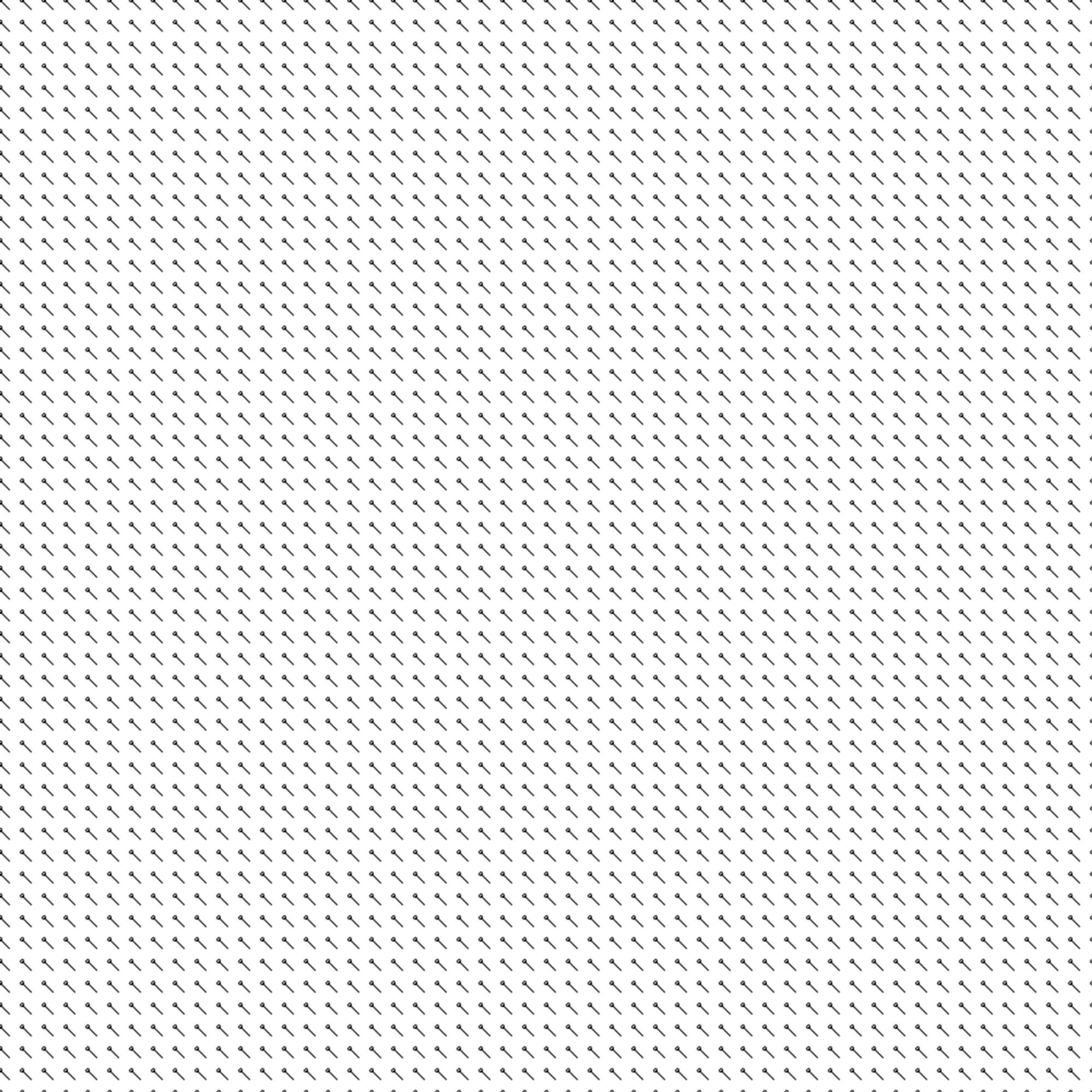
Default grid with all angles set to pi* 0.25
We now have a usable field. Sadly, like this it would only draw straight lines. We'll work on that. For now, let's just make it turn a bit as it moves down the image by doing this:
for (column in num_columns) {
  for (row in num_rows) {
    angle = (row / float(num_rows)) * PI
    grid[column][row] = angle
  }
}
That looks something like:

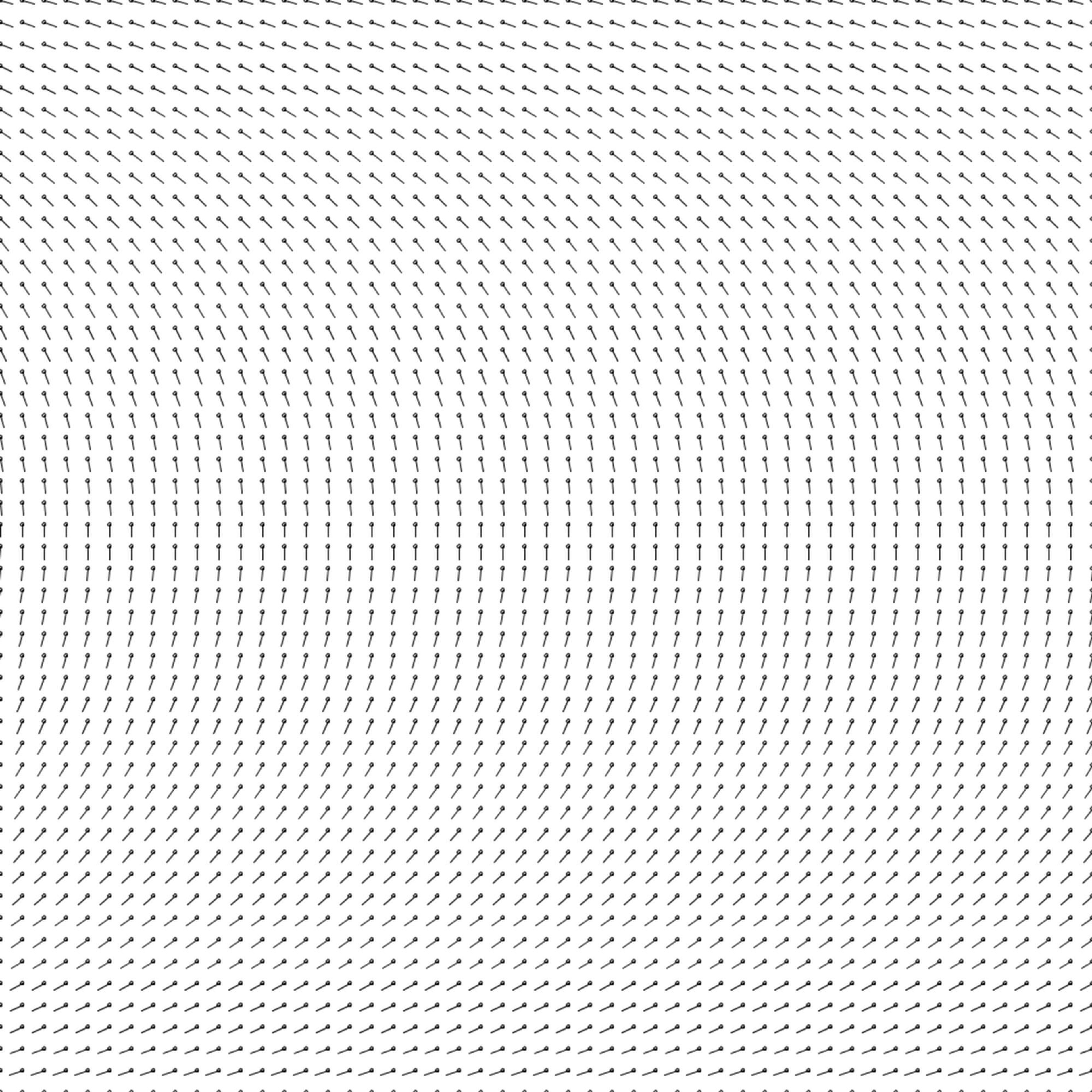
Curved grid
Drawing Curves Through The Field
Now we're going to use the grid to draw a curve. Here's the basic concept. We pick a starting point. We find a corresponding nearby point in the grid. We take the angle from that point in the grid, and take a small step in the direction of that angle. In our new location, we perform another lookup in the grid, and then repeat this process in a loop.
In pseudocode, that's something like:
// starting point
x = 500
y = 100

begin_curve()

for (n in [0..num_steps]) {

  draw_vertex(x, y)

  x_offset = x - left_x
  y_offset = y - top_y

	column_index = int(x_offset / resolution)
	row_index = int(y_offset / resolution)

	// NOTE: normally you want to check the bounds here
	grid_angle = grid[column_index][row_index]

  x_step = step_length * cos(grid_angle)
  y_step = step_length * sin(grid_angle)

  x = x + x_step
  y = y + y_step
}

end_curve()
If we execute this for one curve, we'll get something that looks like:

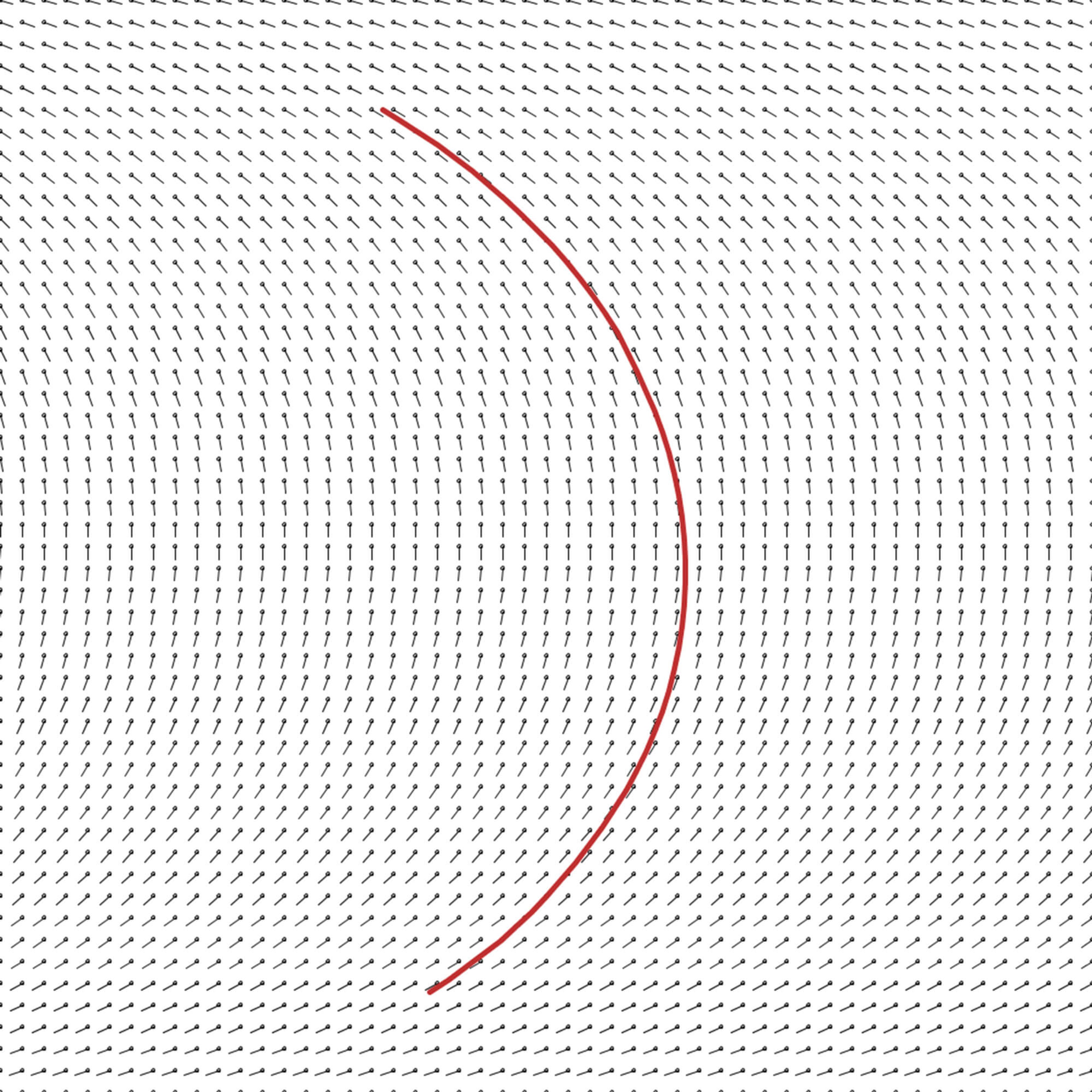
Drawing a single, simple curve through the field.
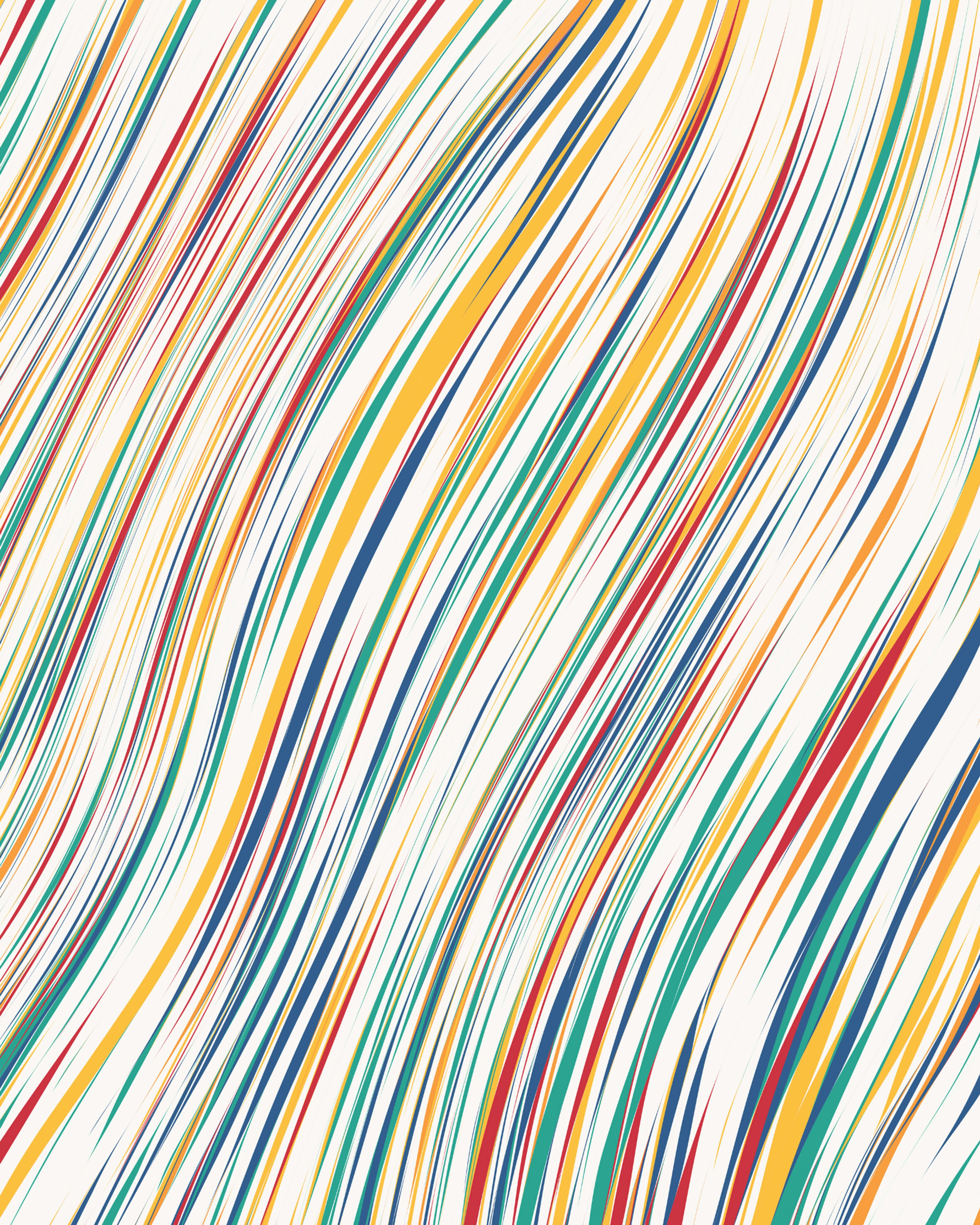
We need to pick values for a few key parameters of how we draw the curves: the step_length, num_steps, and the starting position (x, y). The simplest is the step_length. Typically, this should be small enough that you don't see any sharp points on the curve. For me, that's usually around 0.1% to 0.5% of the image width. I go larger for quicker render speeds, and smaller if there are tight turns that need to be clean.
The other variables need longer discussion, so they'll each get a section here.
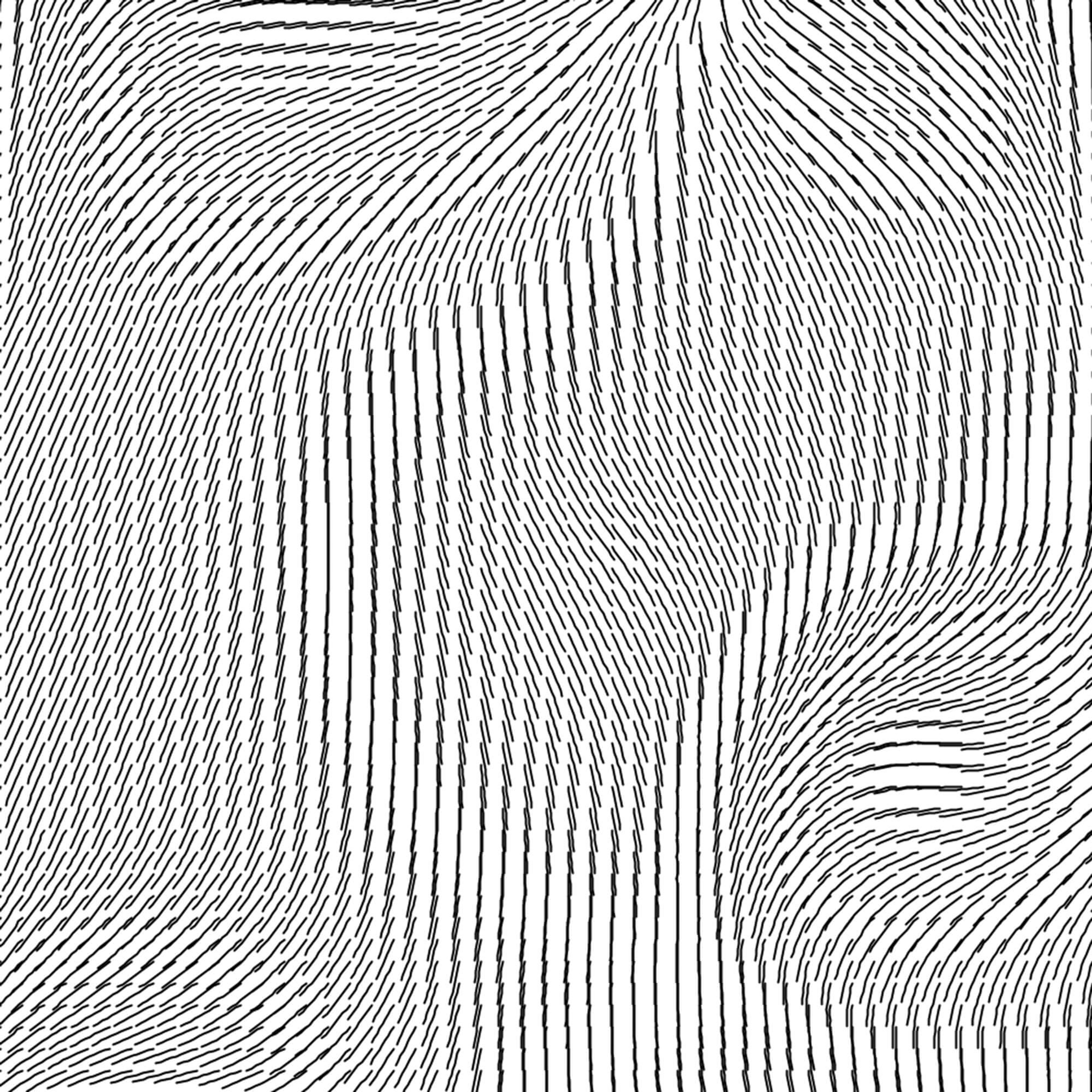
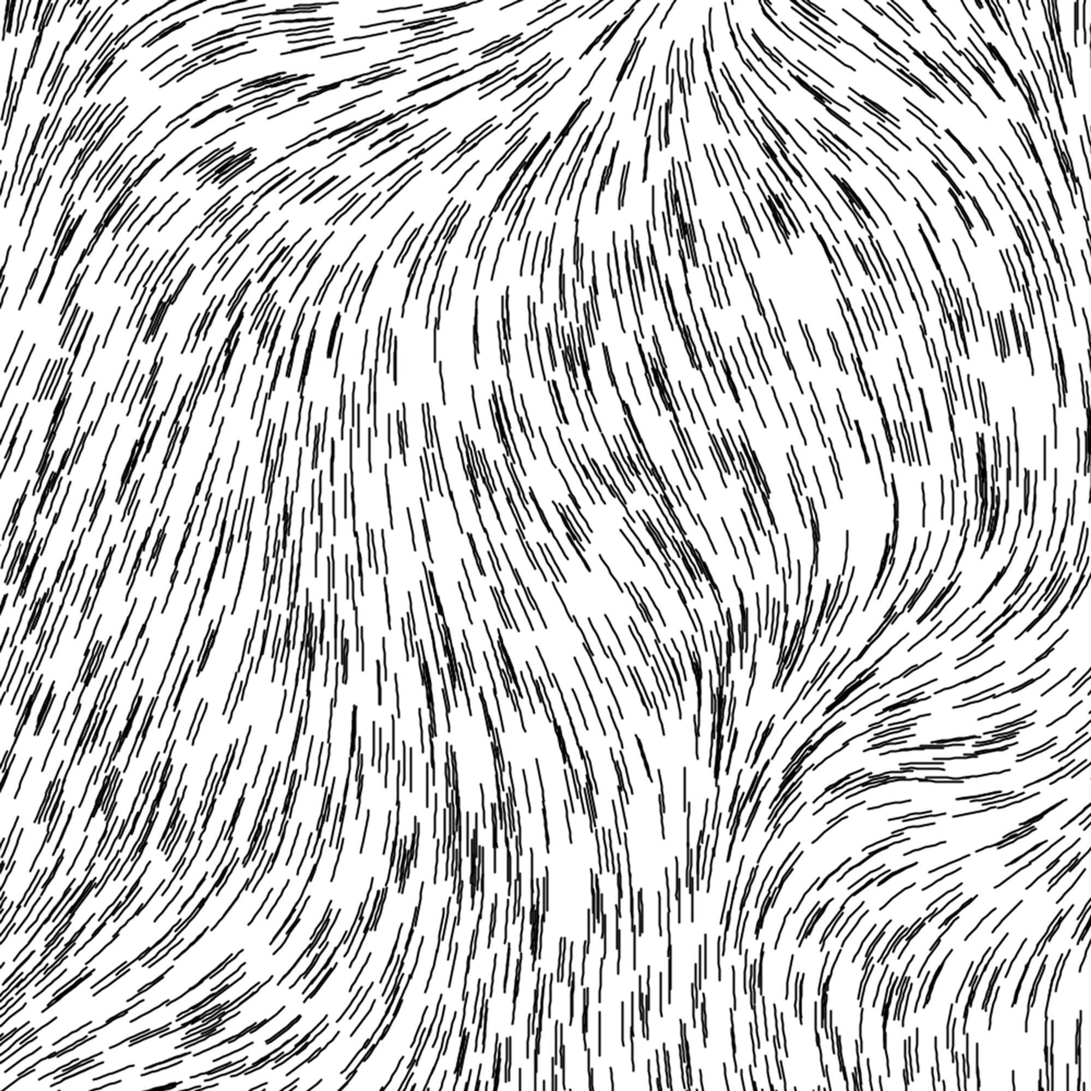
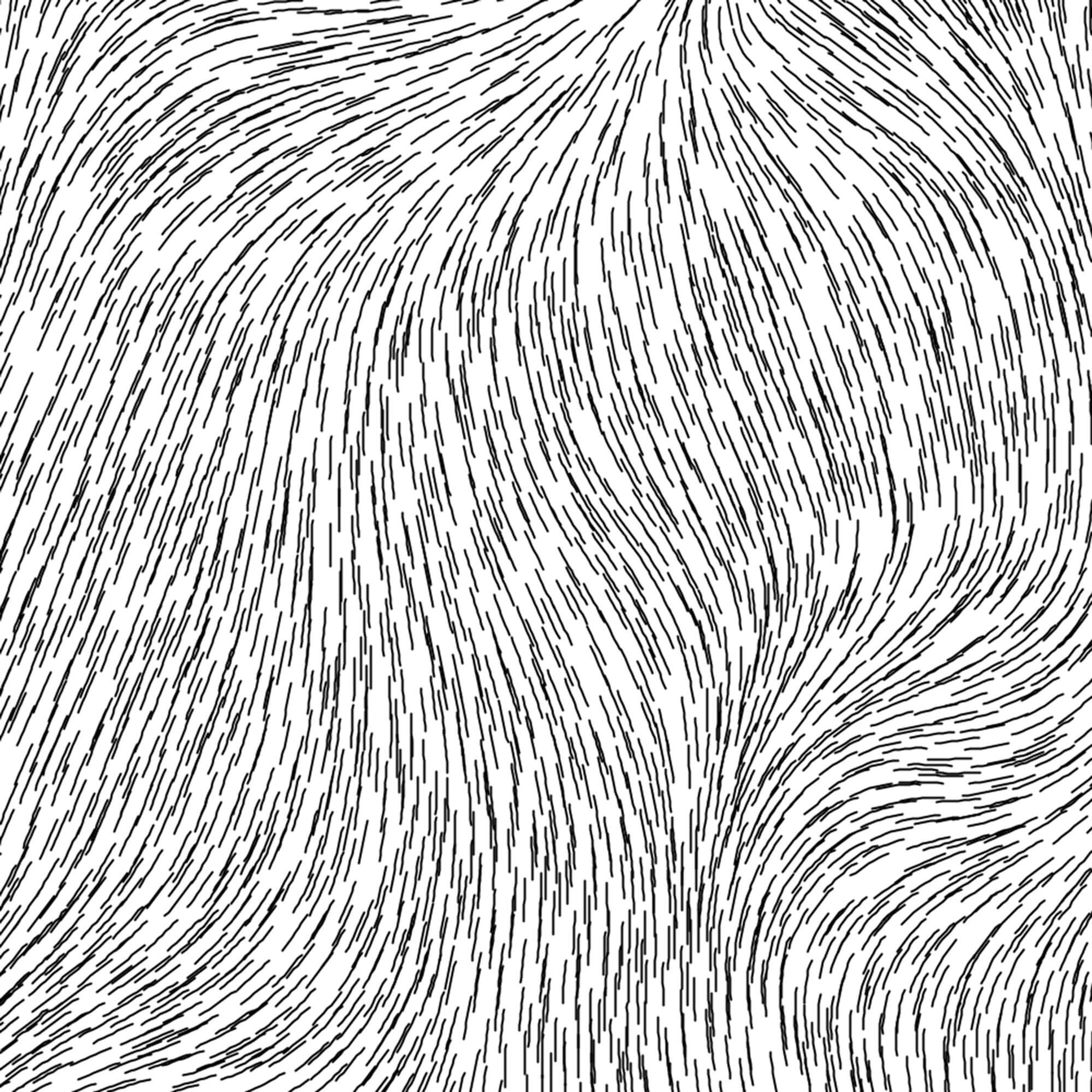
Values For num_steps
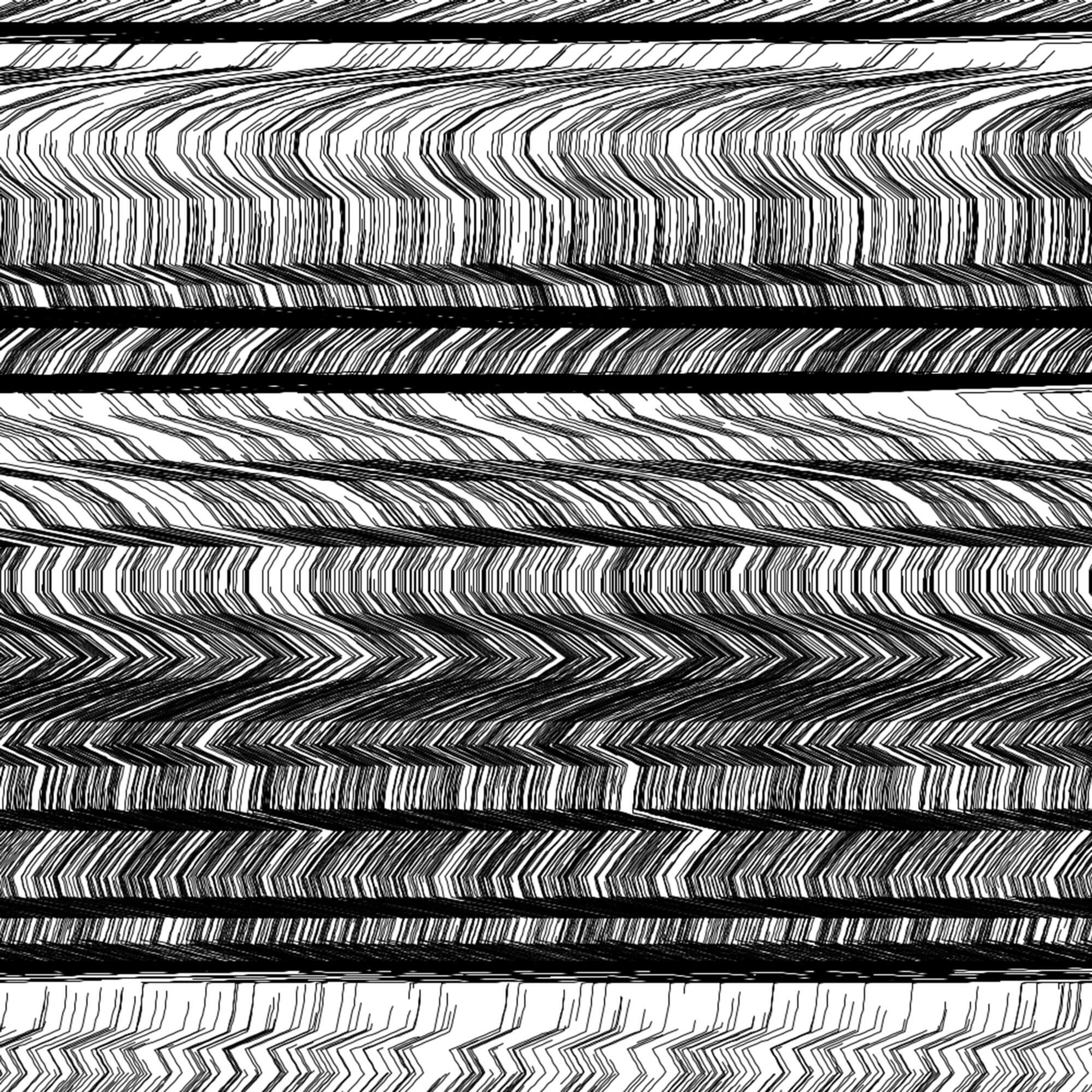
The value of num_steps will affect the texture of the result. Short curves may look more like "fur". Long curves are more fluid. Here's an example of the same program run with two different values for num_steps. First, with short curves, and then with long curves:

With short curves

With long curves
Note how the first feels rougher, and the second feels smoother. The first has more patchy areas of light and dark, but it's more consistent and has a flatter feeling. The second has much more visible long lines that lead the eye, and break up the image in a particular way.
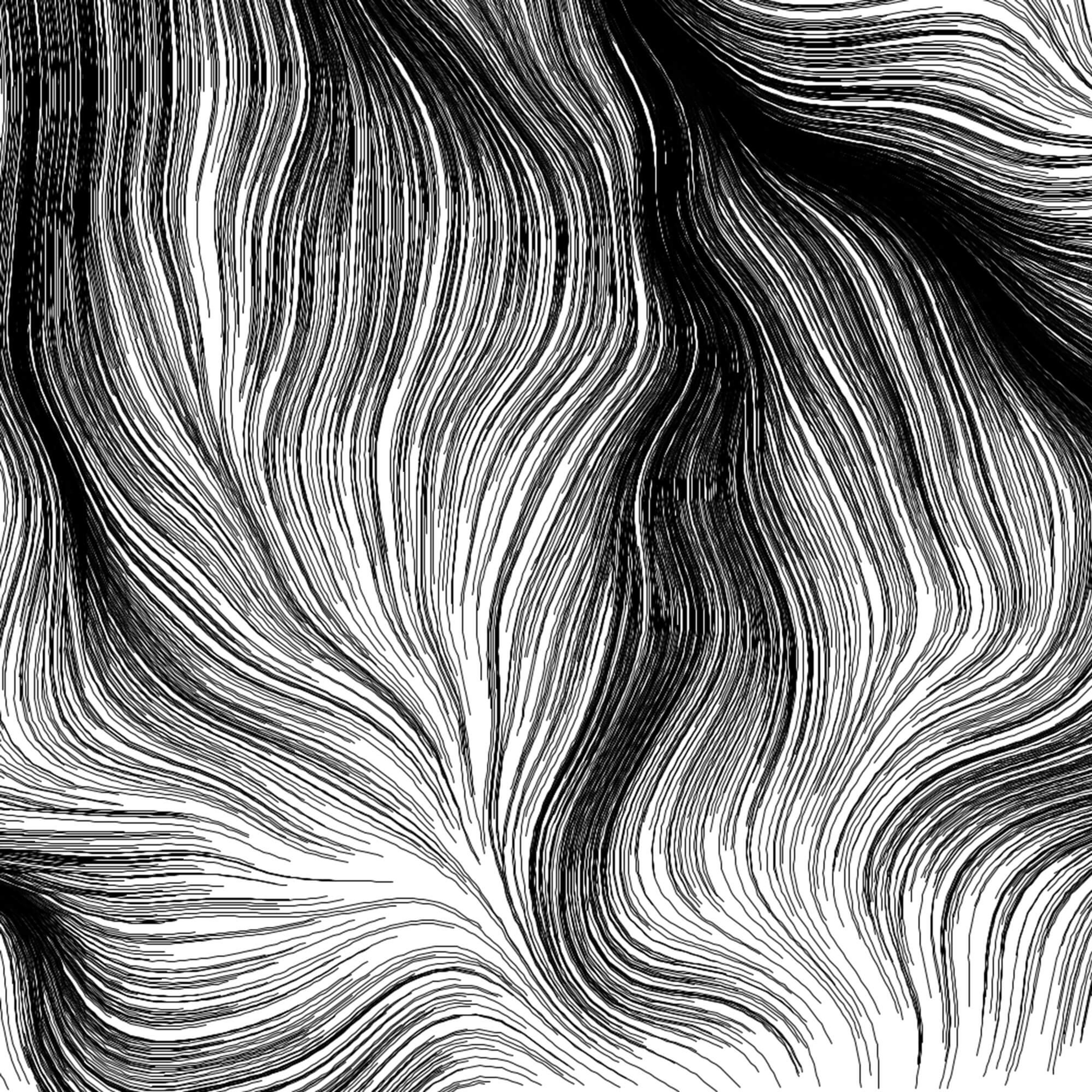
Another consideration is if you're blending colors. The shorter curves may keep distinct sections of colors more separate, where longer curves may drag one color further into another color's section. When I'm using a lot of color variation, I usually pick a short to medium length curve to avoid really drawn out blending areas:

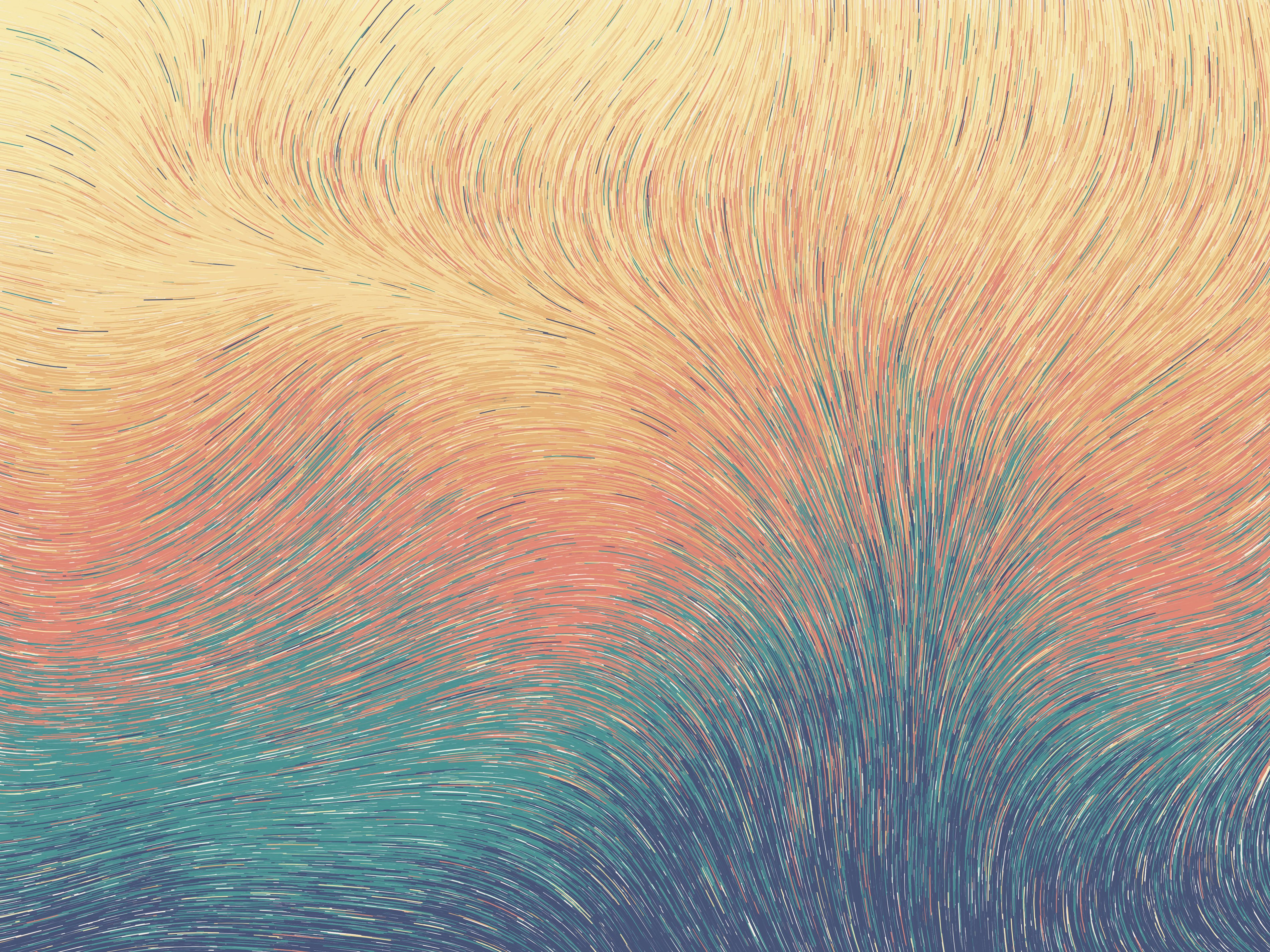
Unfenced Existence, 2018

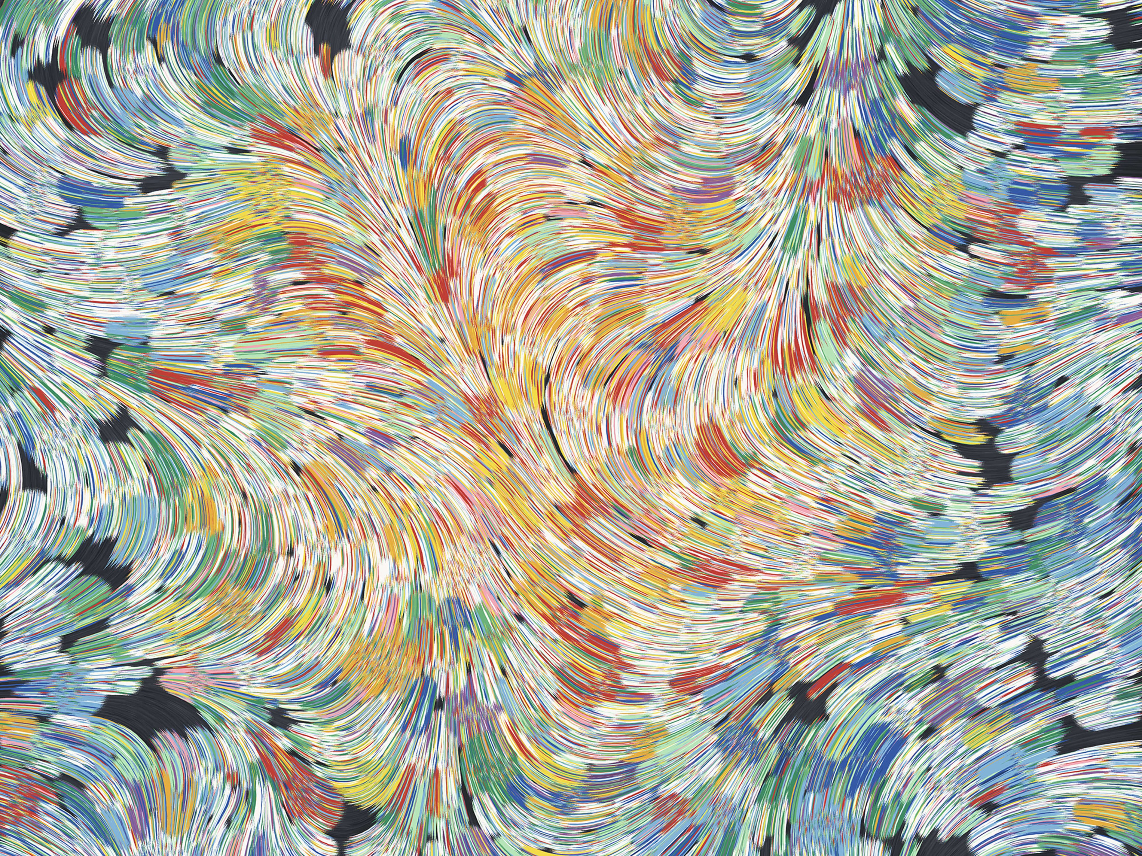
Detail from Fragments of Thought D, 2018
On the other hand, if I'm using very similar colors, going with longer curves can work just fine. Note the background here, which uses subtly different cream colors:

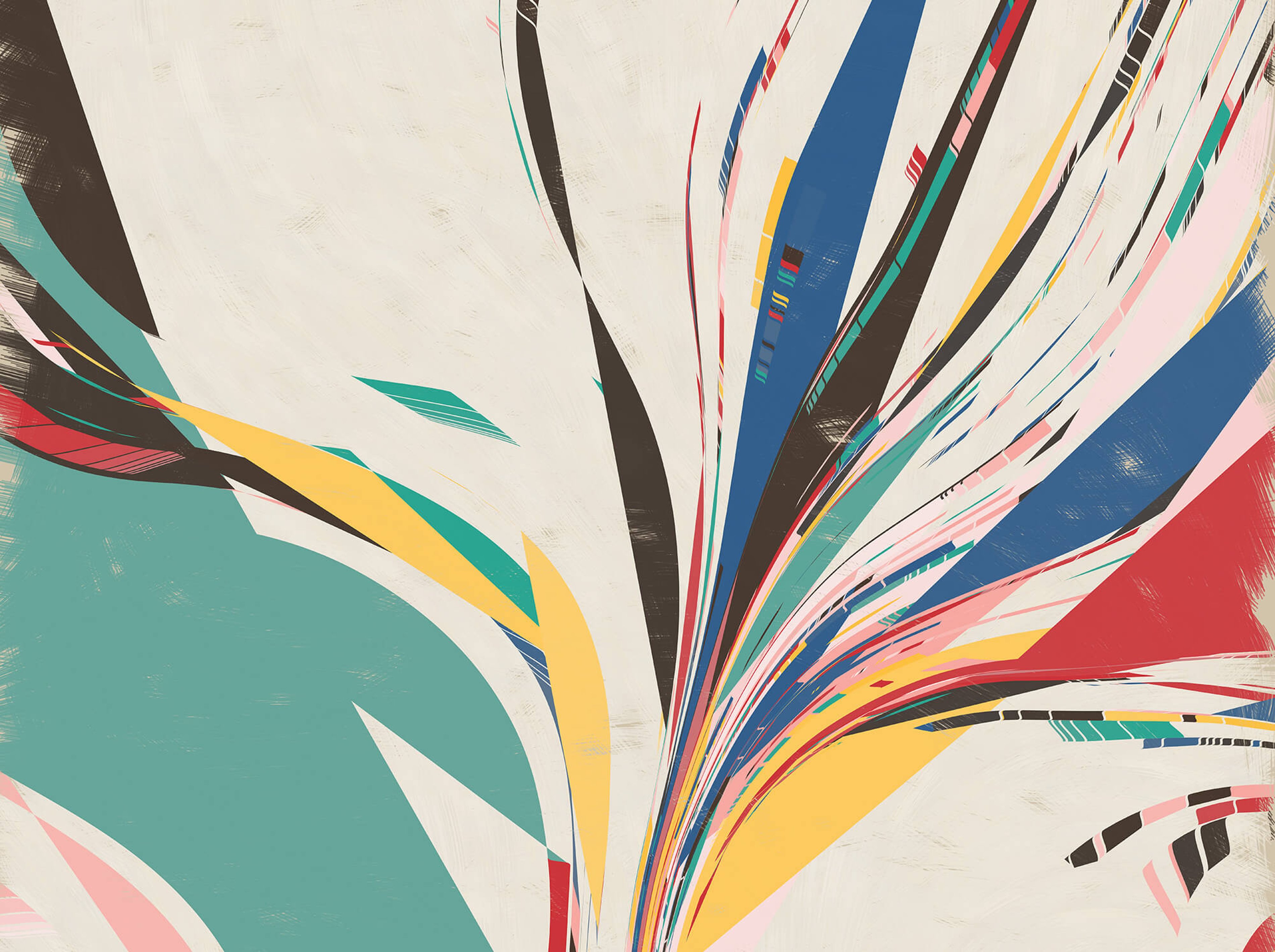
Detail from Loxodography 0.26, 2019
Selecting Starting Positions
All of your curves have to start somewhere. Usually, I use one of three options for picking the starting points:
- Use a regular grid for starting points
- Use uniformly random selection to pick the points
- Use circle packing
The regular grid is the simplest, but sometimes it can feel overly stiff. Uniformly random selection has a looser feeling, but it will leave some clumps and some sparse areas, which are not always what you want. The circle packing approach has a nice balance: things are pretty evenly spaced out, but with enough random variation that it's more relaxed.
These differences are subtle if you're just drawing long lines with no color variation or other special behavior:

Grid

Random

Circle Packing
But if you make the lines short, the difference is super obvious:

Grid

Random

Circle Packing
Other design choices can make this aspect of flow fields important, so I recommend considering it carefully. You may also want to experiment with other choices, like starting everything from the edges or the center.
Distorting The Vectors
One big design decision is how you want to distort the vectors in your field. The method you use for this will determine what shapes your curves take. It will determine whether there are loops, abrupt turns, and overlapping lines.
Perlin Noise
About 90% of the time, people use Perlin noise to initialize the vectors. This is handy and easy, because it gives you smooth, continuous values across the 2D plane. It also has a nice variety of "scale" in the noise - there are some large features, medium features, and small features. Processing makes it very easy to use: the noise() function returns Perlin noise values (between 0.0 and 1.0) given some coordinates.
If we go back to our initialization code, instead of putting in the default_angle, we can do something like:
for (column in num_columns) {
  for (row in num_rows) {

    // Processing's noise() works best when the step between
    // points is approximately 0.005, so scale down to that
    scaled_x = column * 0.005
    scaled_y = row * 0.005

    // get our noise value, between 0.0 and 1.0
    noise_val = noise(scaled_x, scaled_y)

    // translate the noise value to an angle (betwen 0 and 2 * PI)
    angle = map(noise_val, 0.0, 1.0, 0.0, PI * 2.0)

    grid[column][row] = angle
  }
}
You'll want to play with noiseDetail() settings and the exact parameters of how you scale the noise value to angles in order to get the effects you like.

Using Perlin noise for angles
For what it's worth, I actually recommend that you try to come up with your own distortion techniques instead of relying on Perlin noise, simply because it's so overdone. But, it can still be a good tool to know about or start out with.
Non-Continuous Distortions
An important attribute of the distortion technique you choose is whether it is "continuous" or not. By that, I mean that the transition across neighboring vectors is smooth, without sudden jumps. As I mentioned, Perlin noise is like this. I have a custom distortion technique that I like to use that also has this property. When you use continuous distortion, your curves will not cross each other, and they'll be smooth and organic.
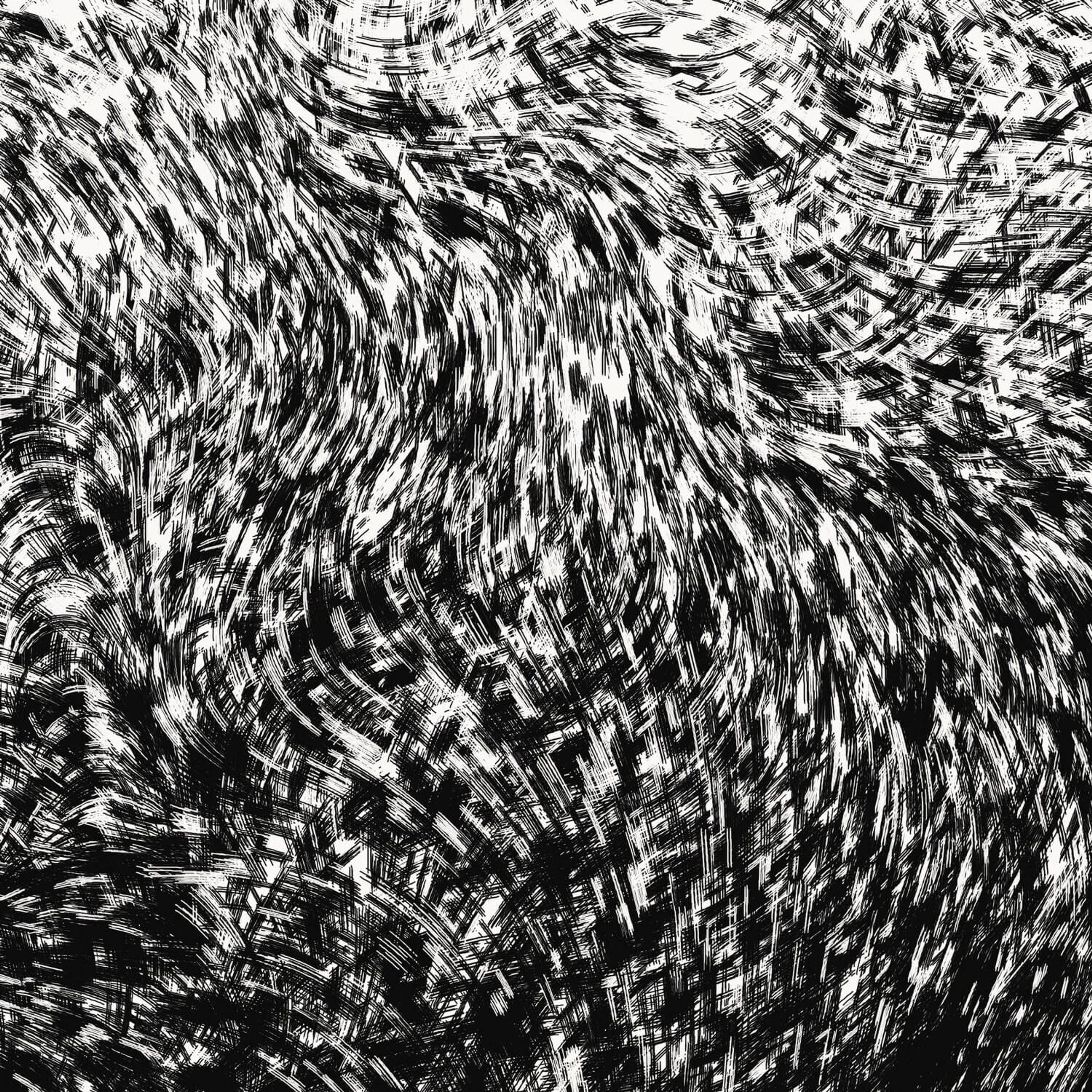
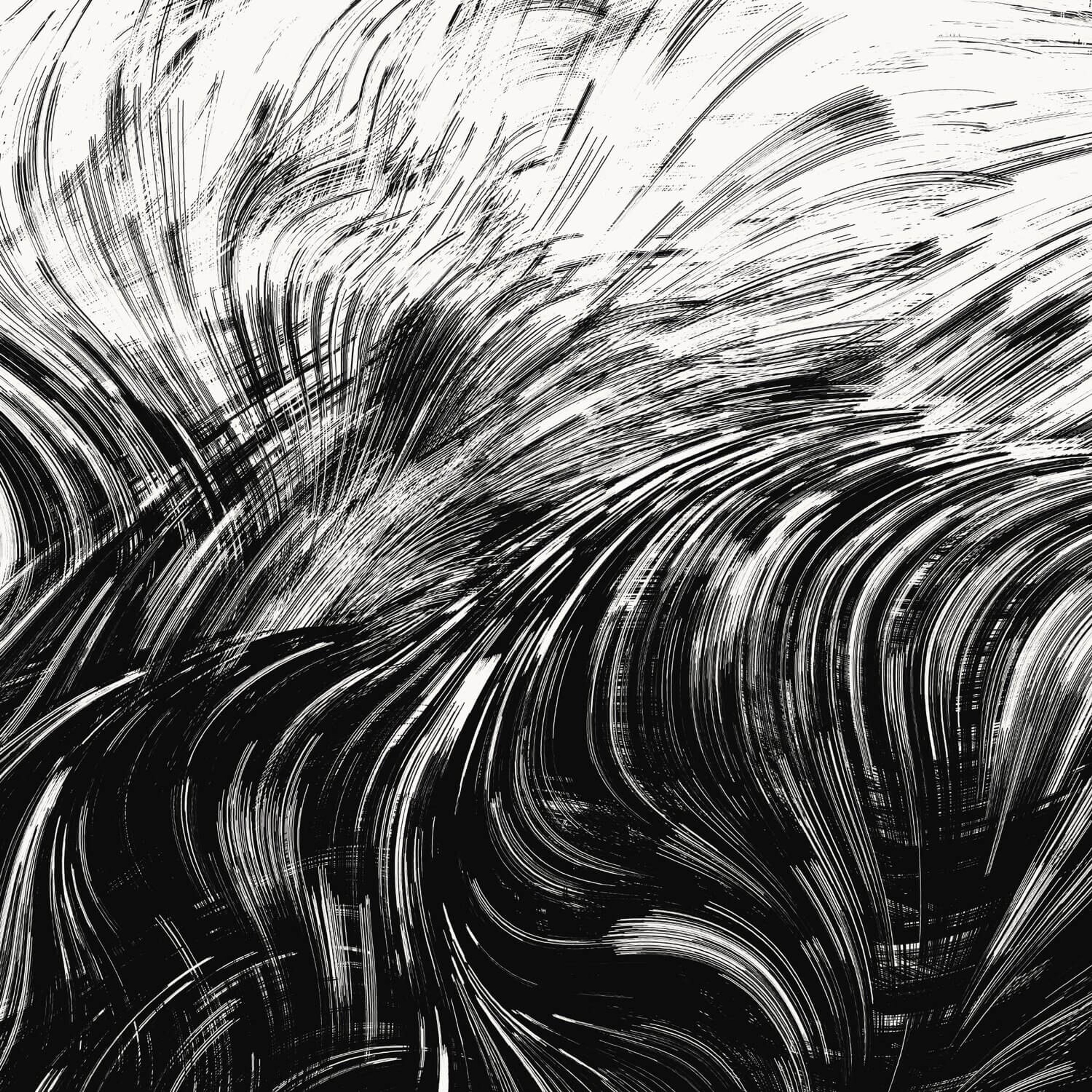
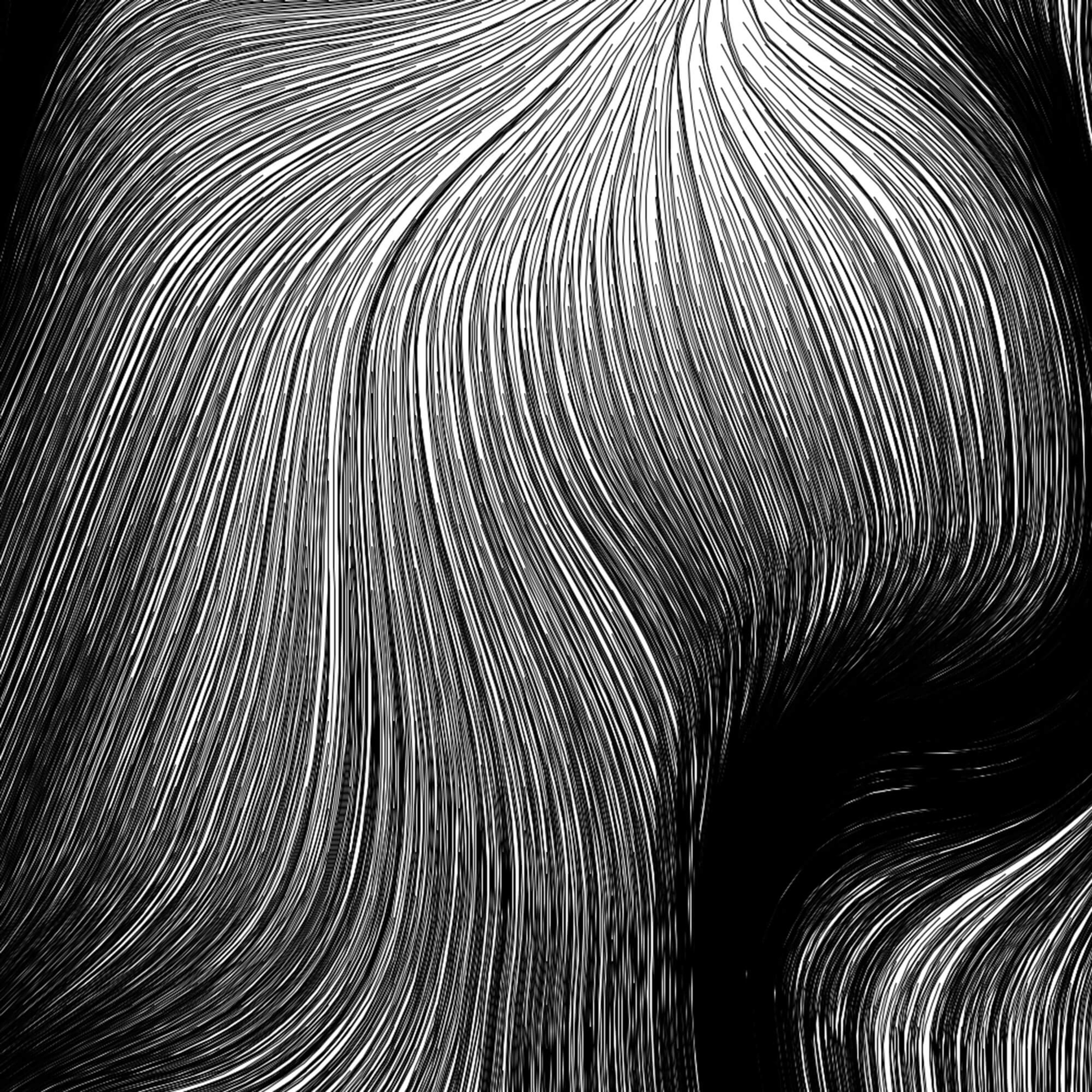
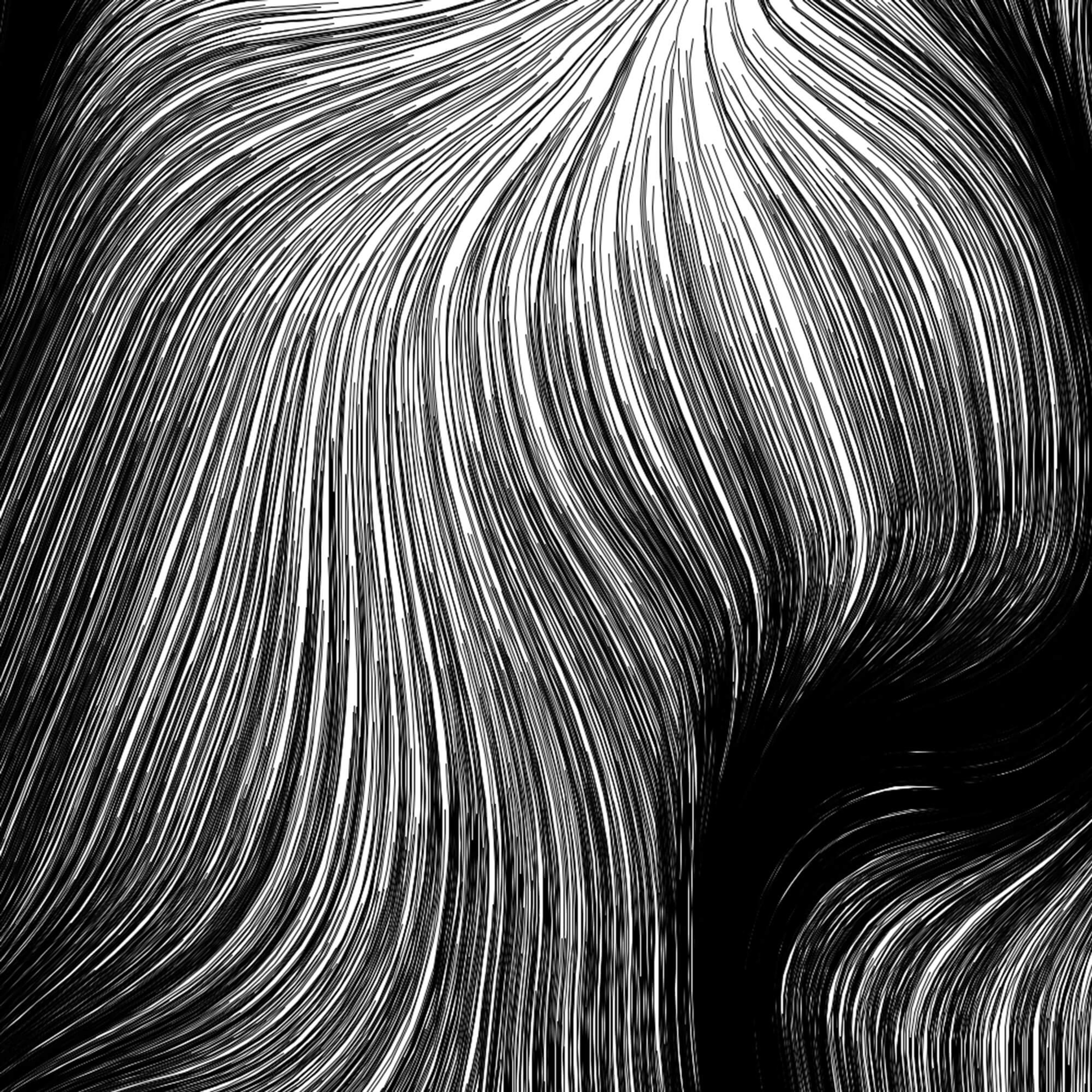
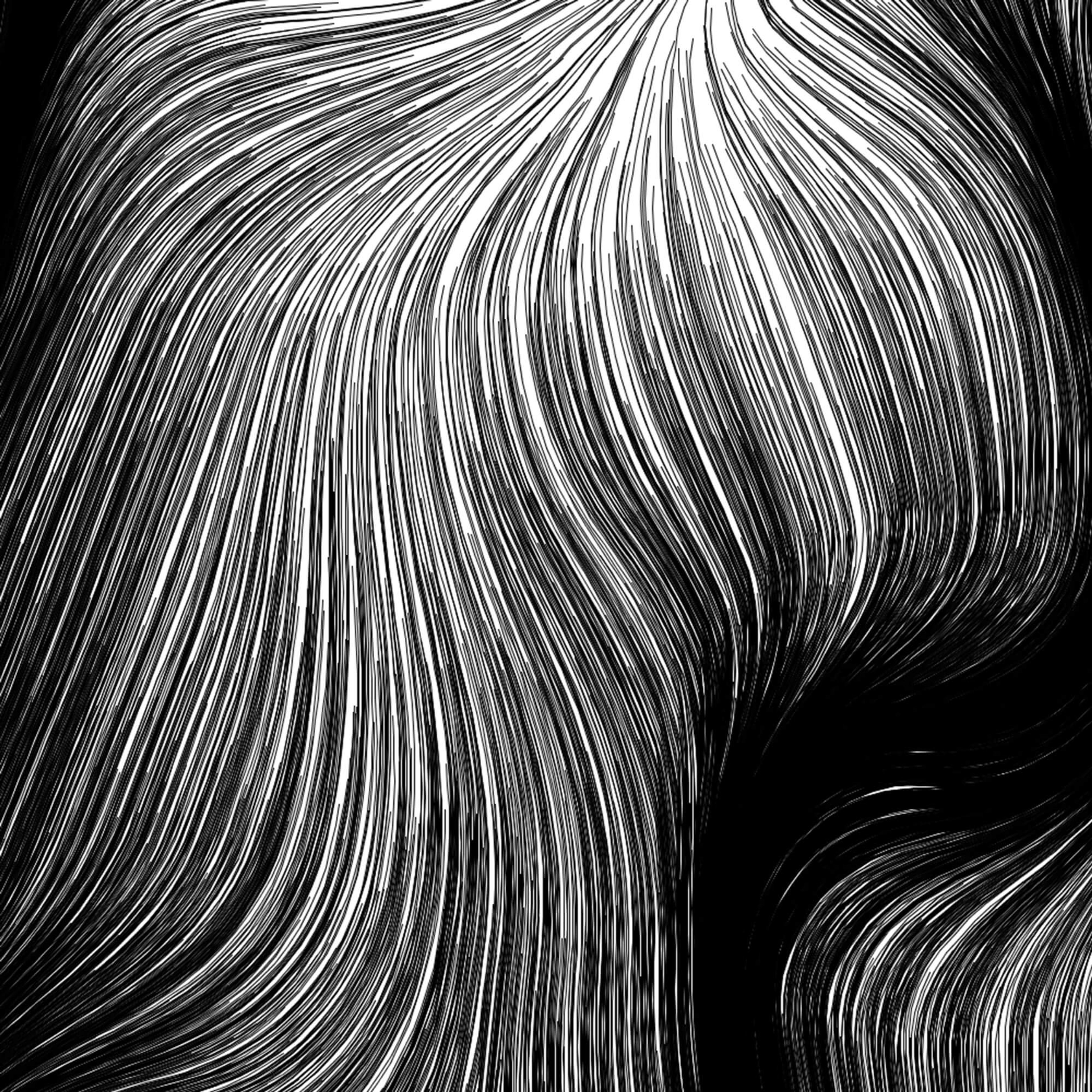
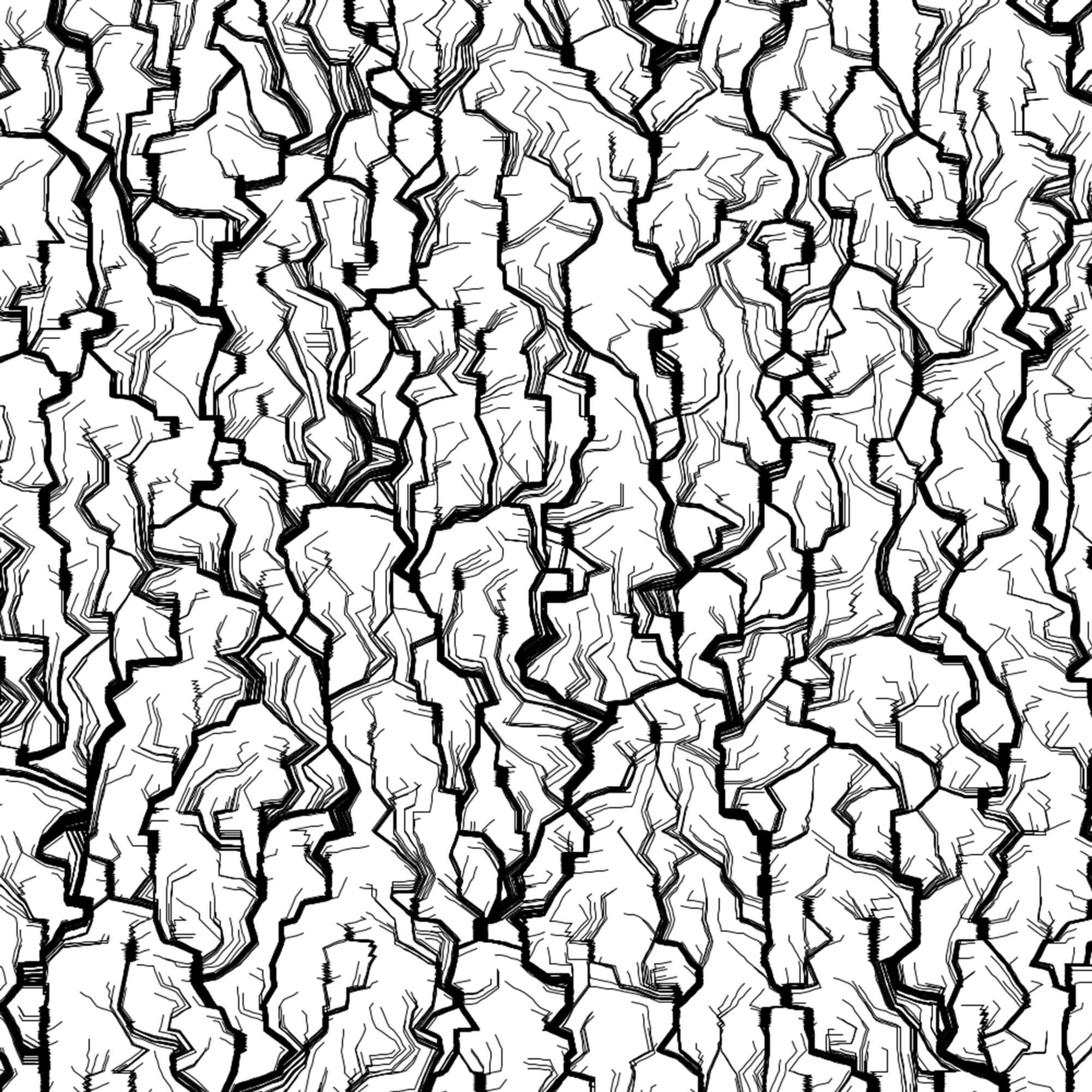
However, it's also worth experimenting with non-continuous vector distortion. A simple example of that is to start with Perlin noise, but round each vector's angle to a multiple of pi/10. We get more sculpted, rocky forms this way.
If we crank it up to pi/4, things get crazy.

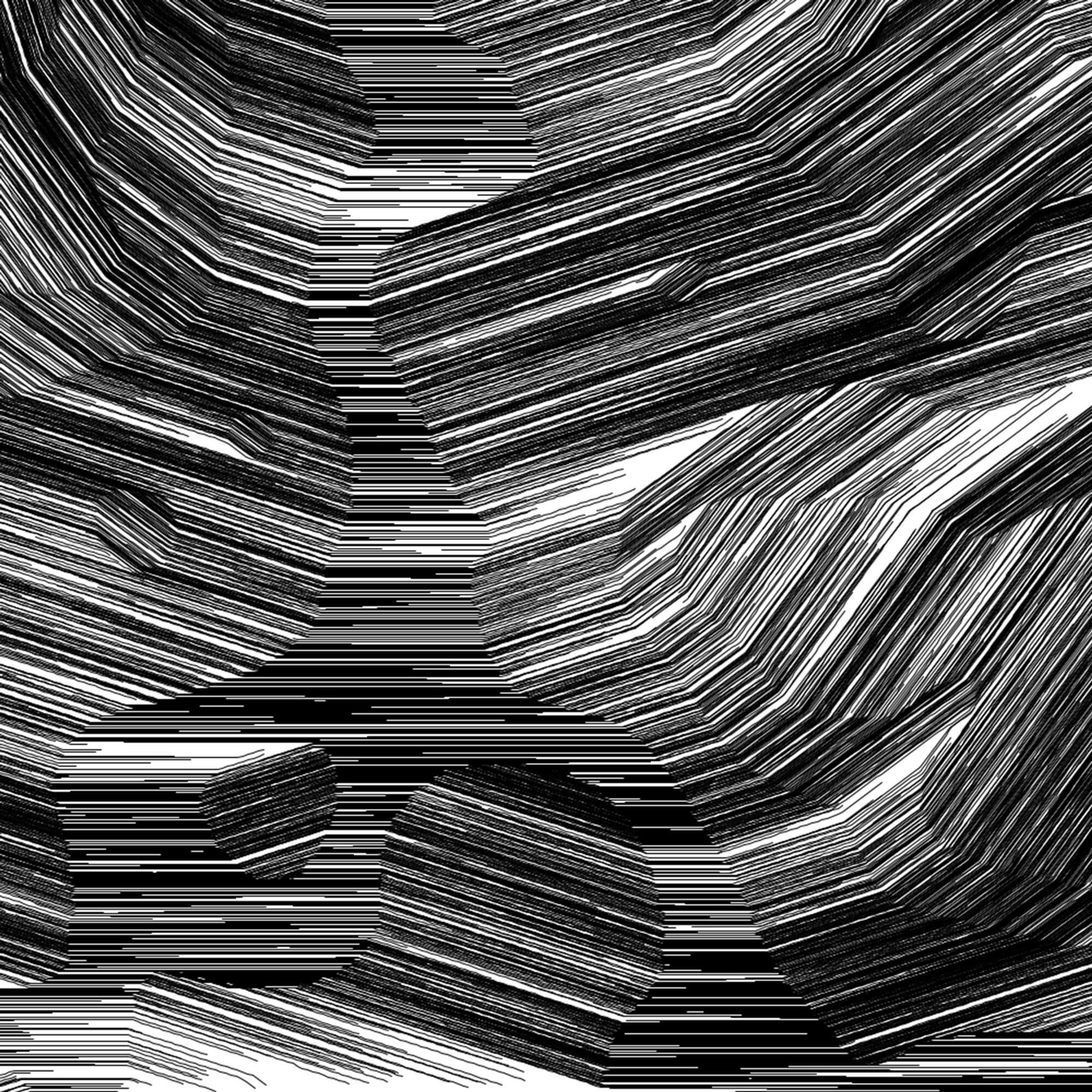
pi/10

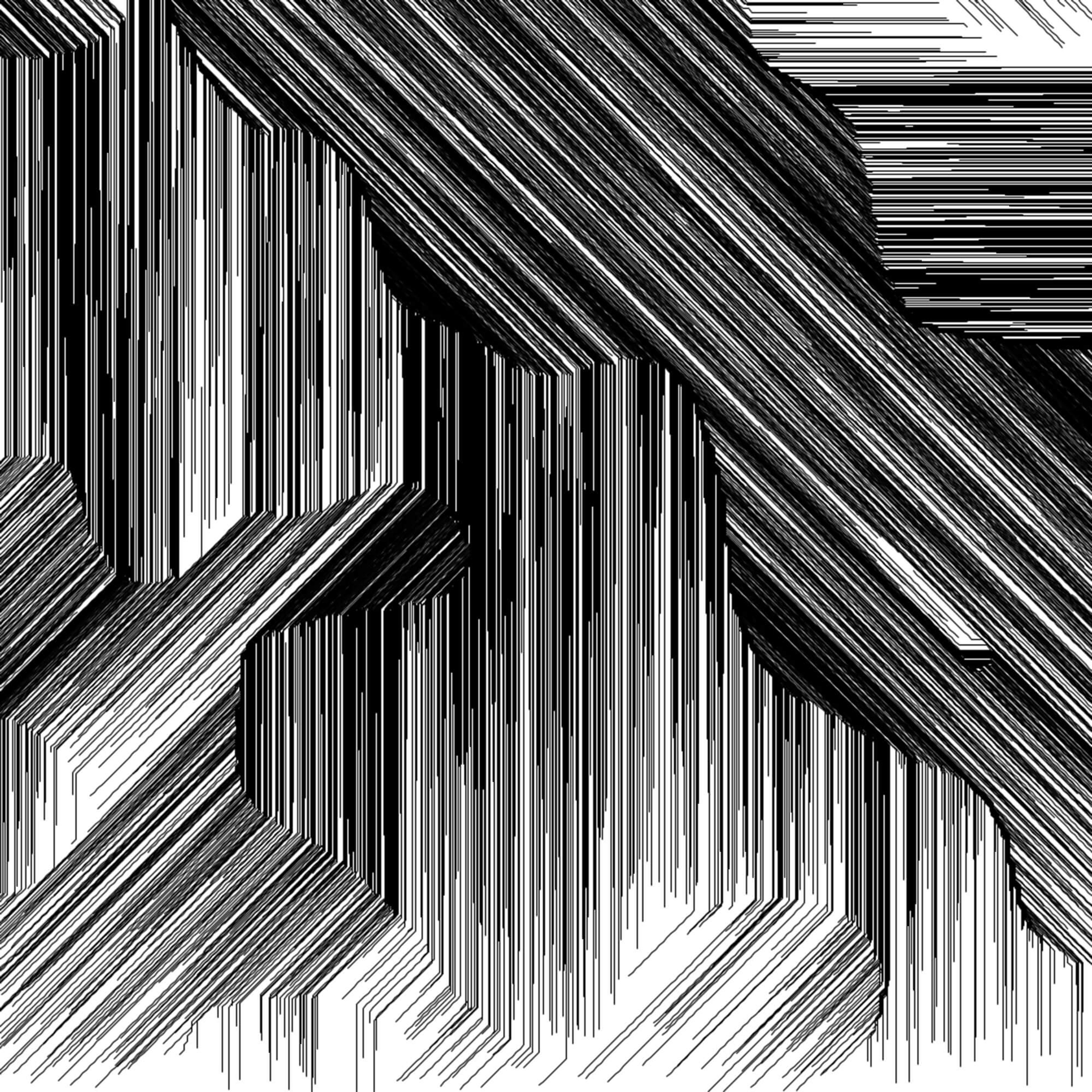
pi/4
Alternatively, you could simply pick a random angle (between 0 and pi) for each row of vectors or pick a random angle for every single vector.

Random angle per row

Random angle per vector
Ben Kovach also pointed me to a great paper that describes a solid technique for creating evenly spaced flow lines.
The point is that non-continuous distortions can also produce good stuff.
Mixing With Other Techniques
There are an endless number of ways to play with flow fields and use them in new ways. For inspiration, here a few of the things I've tried out.
You can enforce a minimum distance between curves. At each step of a curve, check if any other existing curves are too close, and if so, stop. I used this technique on Mirror Removal in 2019 [1].

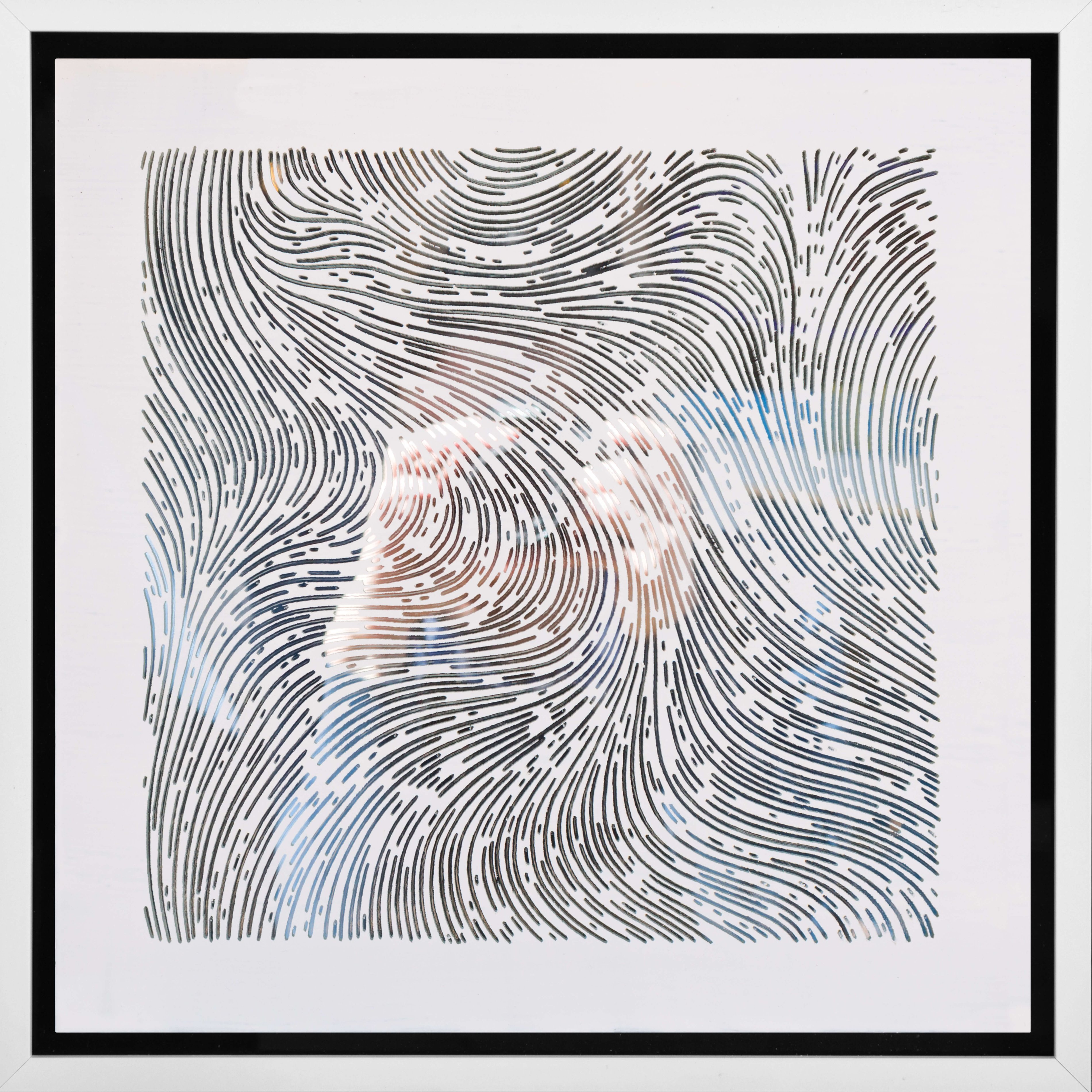
Mirror Removal #5, 2019
You can draw dots in place of continuous curves. If you add checks to avoid collisions, the effect can be very nice:

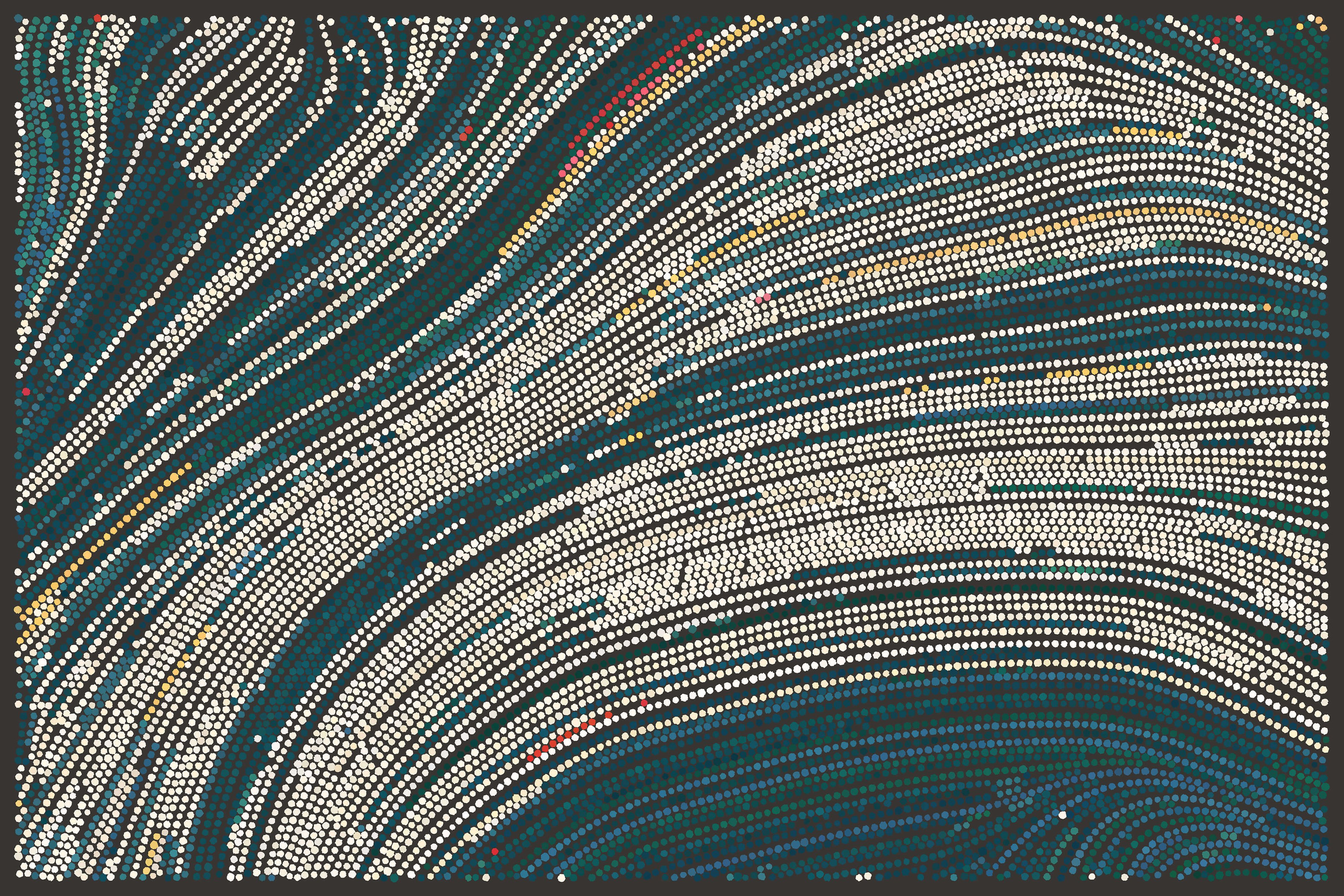
Side Effects Inclue\d, 2019
You can slightly distort the grid in between rounds of drawing. This will change the curves you get subtly, giving you variety and overlapping curves without totally changing everything, like in Festival Notes.
You can also transition between neighboring curves to create the outline of a polygon. If you interpolate between two neighbors (possibly with non-linear easing), you can get smooth, lovely shapes, as seen in Stripes.

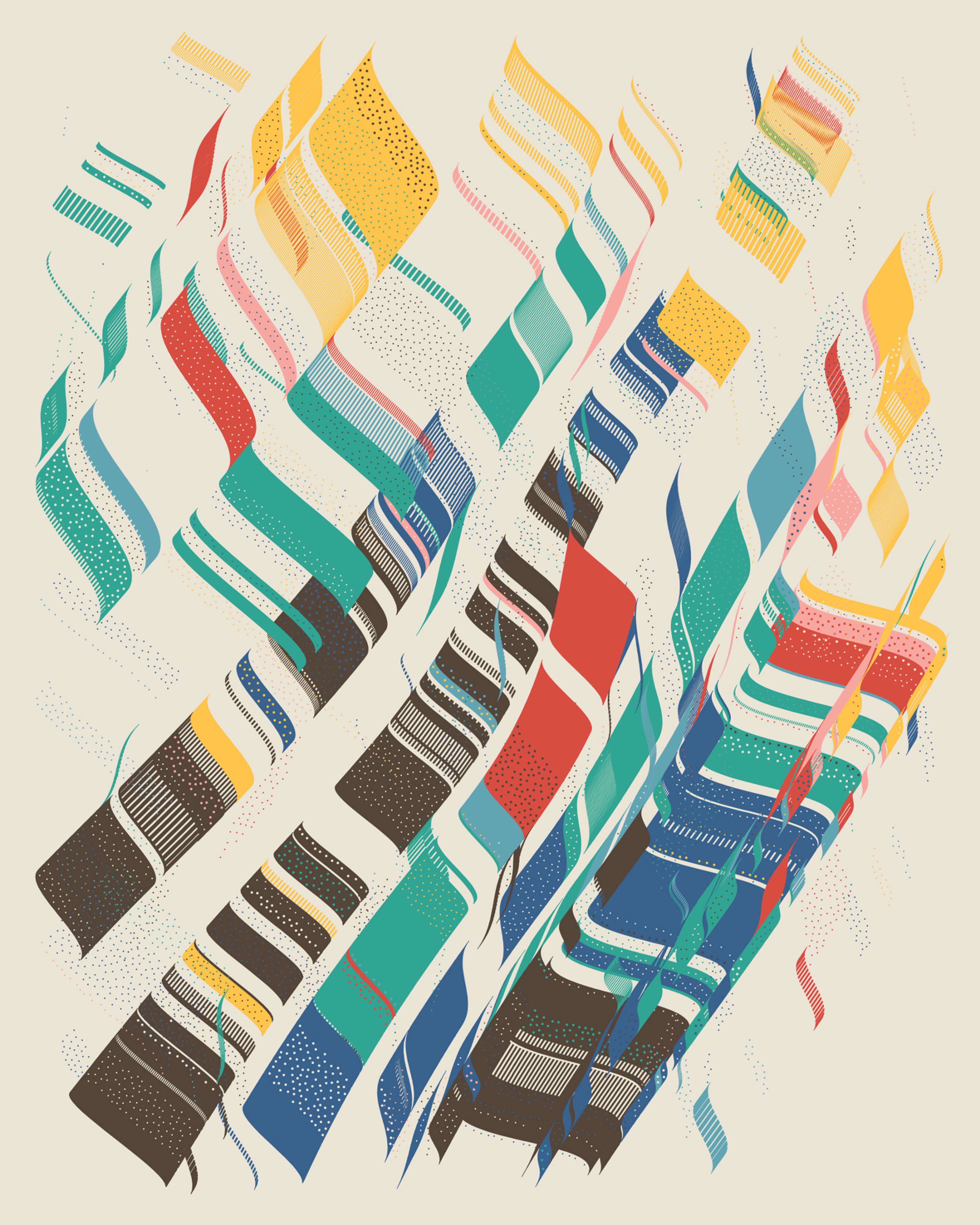
Festival Notes 0.161, 2019

Stripes 0.30, 2019
You can insert objects that distort the grid around them. With Ectogenesis, I approximated how fluid would move and wrap around an object.
I'll admit, the code was kinda tricky to get just right on this one.

Detail from Ectogenesis 0.175, 2019
Wrap Up
That's most of what I have to say about flow fields. As with any technique, I think the important part is first trying to understand them from top to bottom and then loosening up and doing them your own way. Don't just use Perlin noise and call it a day.
–
EDIT: Claudio Esperança has created an amazing interactive version of the examples in this essay using Observable. I recommend playing around with it!
–
From time to time, I write about my thoughts and artistic process. If you'd like to be notified the next time I publish an essay, sign up for my newsletter in the menu.