Aesthetically Pleasing Triangle Subdivision
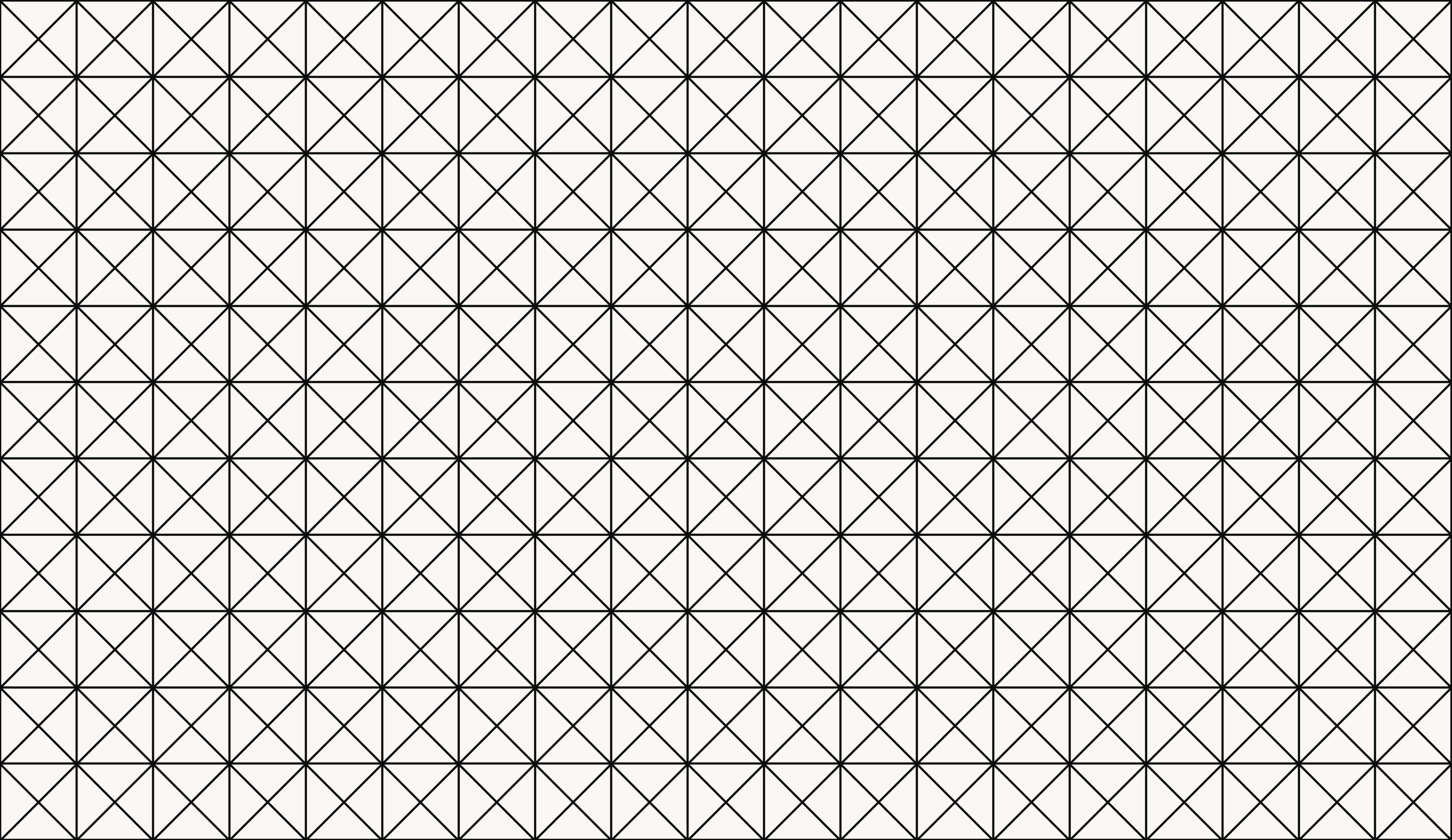
Triangles are a natural shape to experiment with in generative artwork. Mesh grids of triangles are especially common. One common approach is to use something like Delaunay triangulation to create a mesh. I've been experimenting with a technique that's simpler, rougher, and a little more flexible. So far the results have been good. I'd like to show you how this basic strategy for triangle subdivision looks pleasing.
Bland Splitting
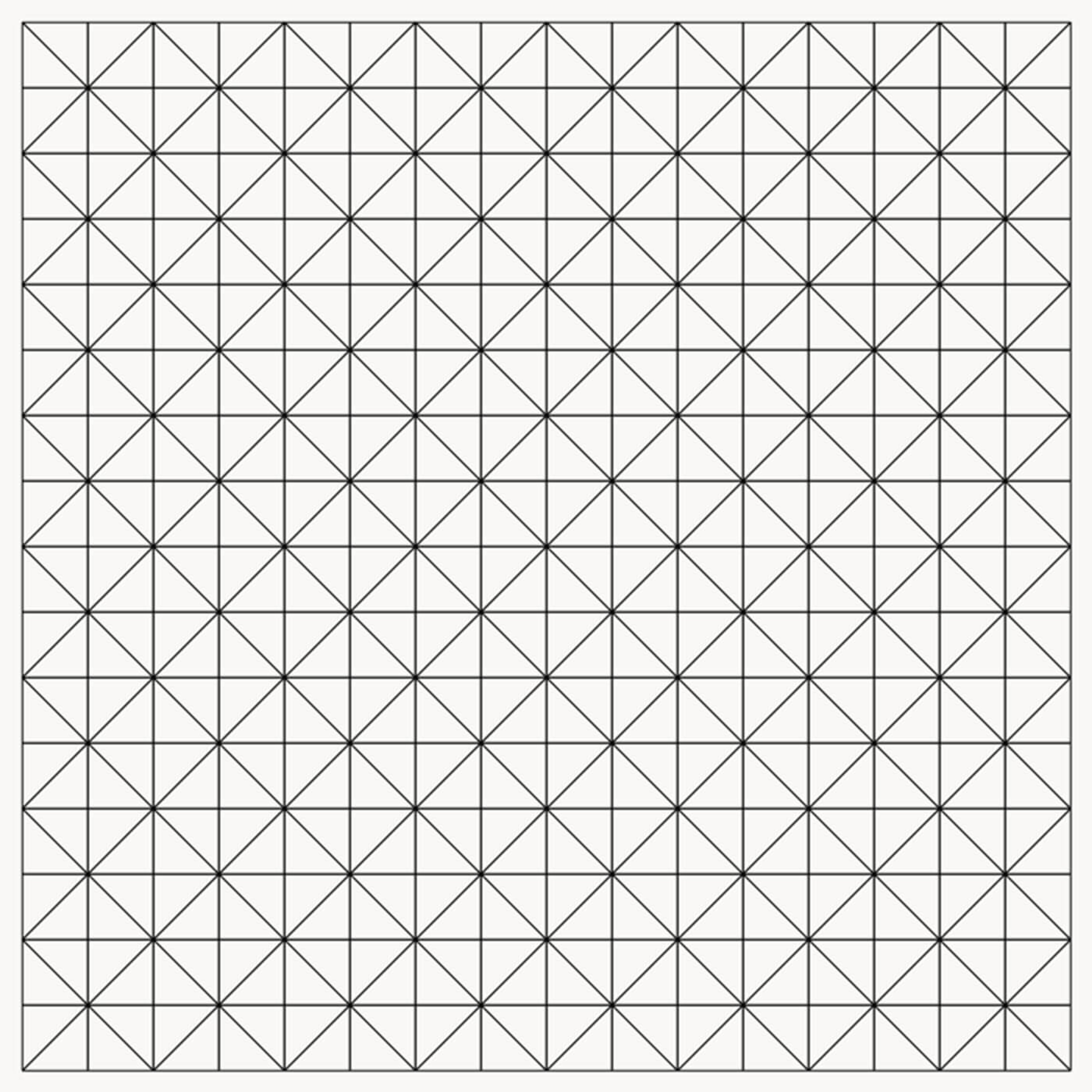
A naive approach to splitting a triangle with points A, B, and C might look like this:
- Pick one of the three points for the start of the splitting line. Let's pick point A.
- Calculate the middle of the side opposing point A, and call it point D.
- Draw a line from point A to point D, splitting the triangle into two new triangles.
When this algorithm is applied recursively, it produces a regular, rigid effect:
Randomized Splitting
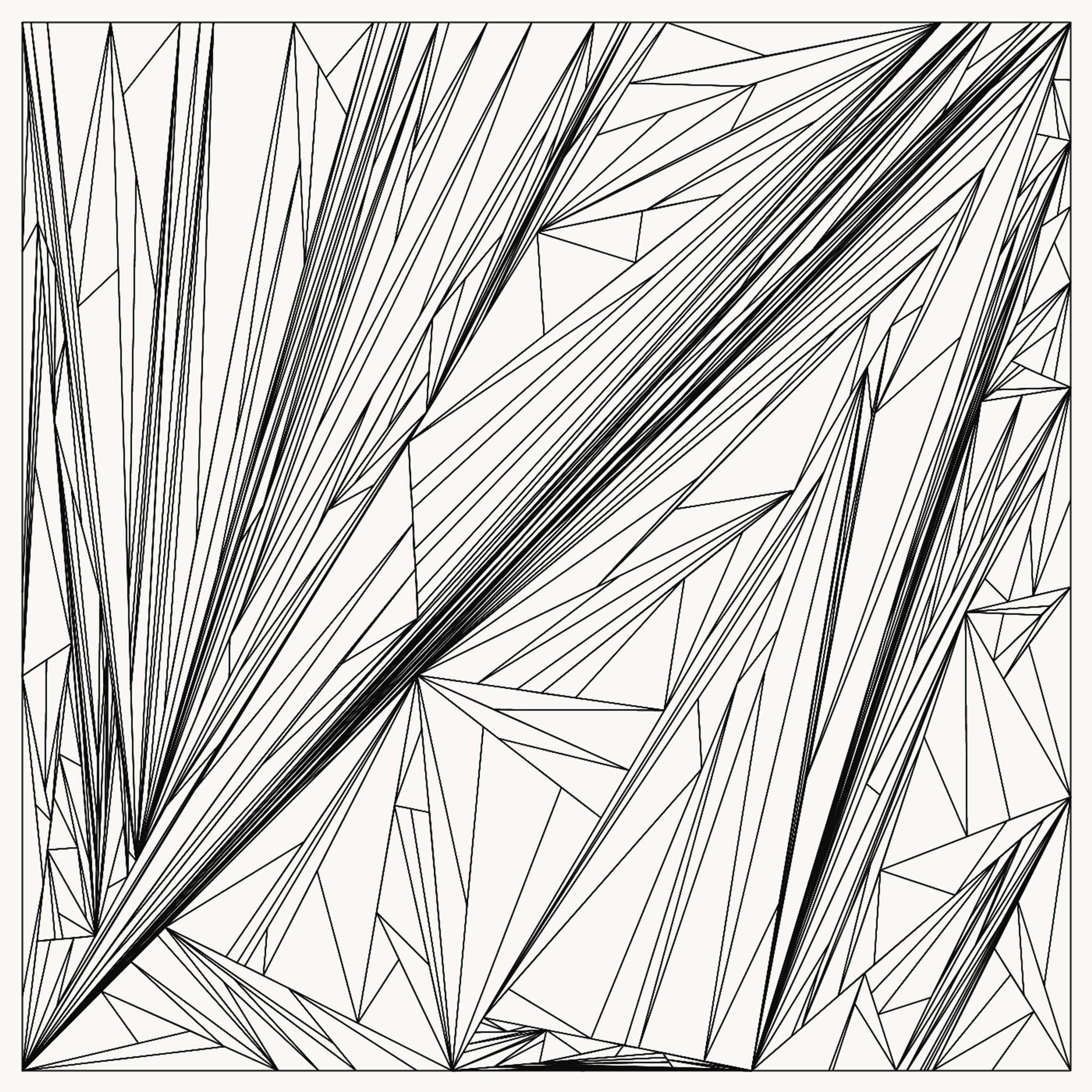
To make things a little more interesting, you can randomize the location of point D. A simple way to do this is to pick a random value t between 0 and 1, and use that to interpolate between points B and C. For example, when t = 0, D = B. When t = 1, D = C. When t = 0.5, D falls exactly between B and C.
If you use a (truncated) Gaussian distribution for picking t centered on 0.5, you'll get much more varied results than before:
Self-Balancing Splitting
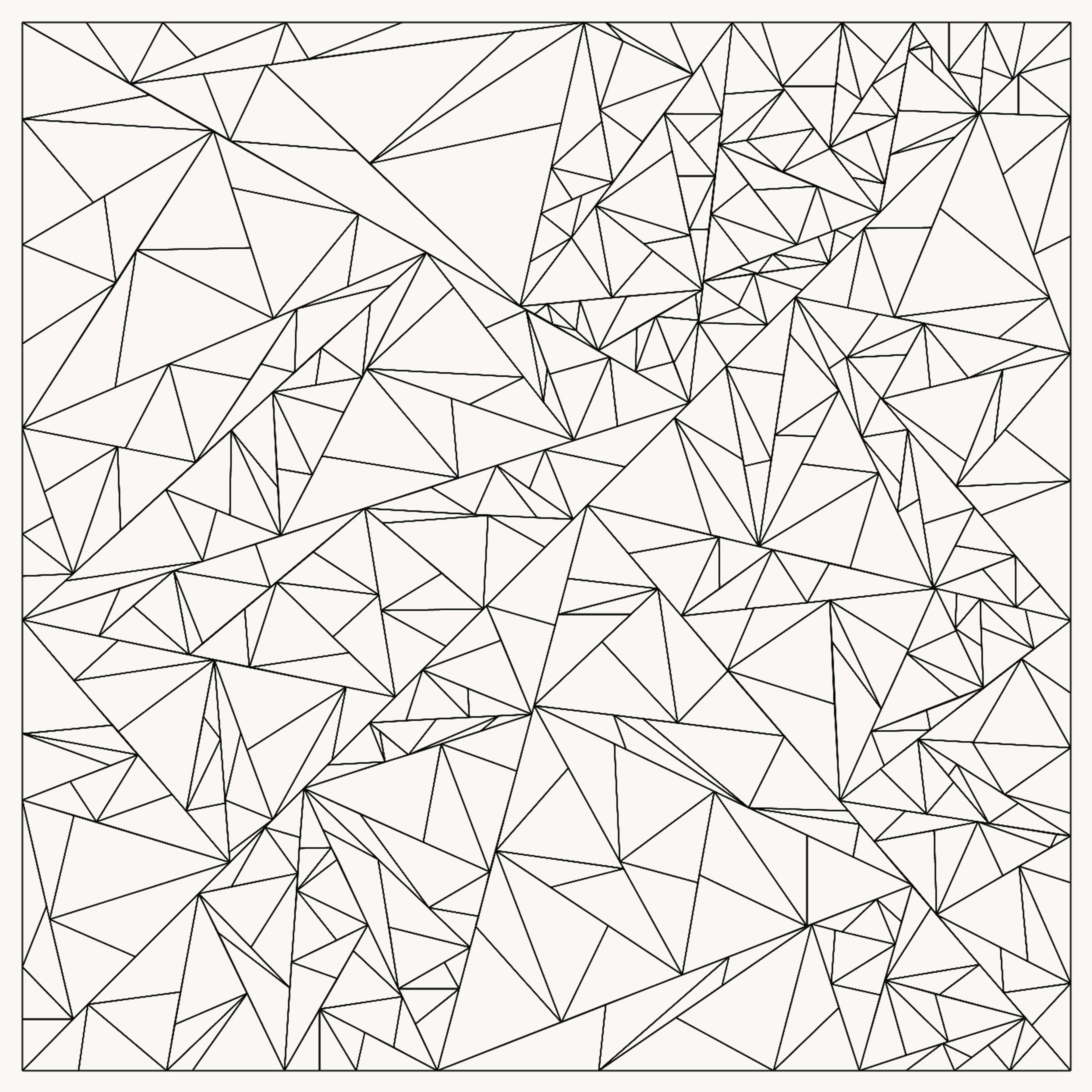
One quality of the previous approach is that it tends to produce very skewed, stretched out triangles. I'm personally not a huge fan of this. I noticed that if I tried to draw "pleasing" triangle subdivisions by hand, this never happened. So, mentally, I must have been considering other rules subconsciously that avoided this. With a bit of thinking, I realized that I was typically trying to split the triangles in a way that minimized the difference between the longest side and the shortest side.
A simple way to follow this rule is to always make point D fall on the longest side of the triangle. With this one change to the algorithm, the triangle subdivision becomes self-balancing:
Varying Recursion Depth
If you want more variety in the generated image, try varying the recursion depth (i.e. how many times you subdivide a triangle). I've experimented with a couple of different approaches to this.
Non-Deterministic Base Case
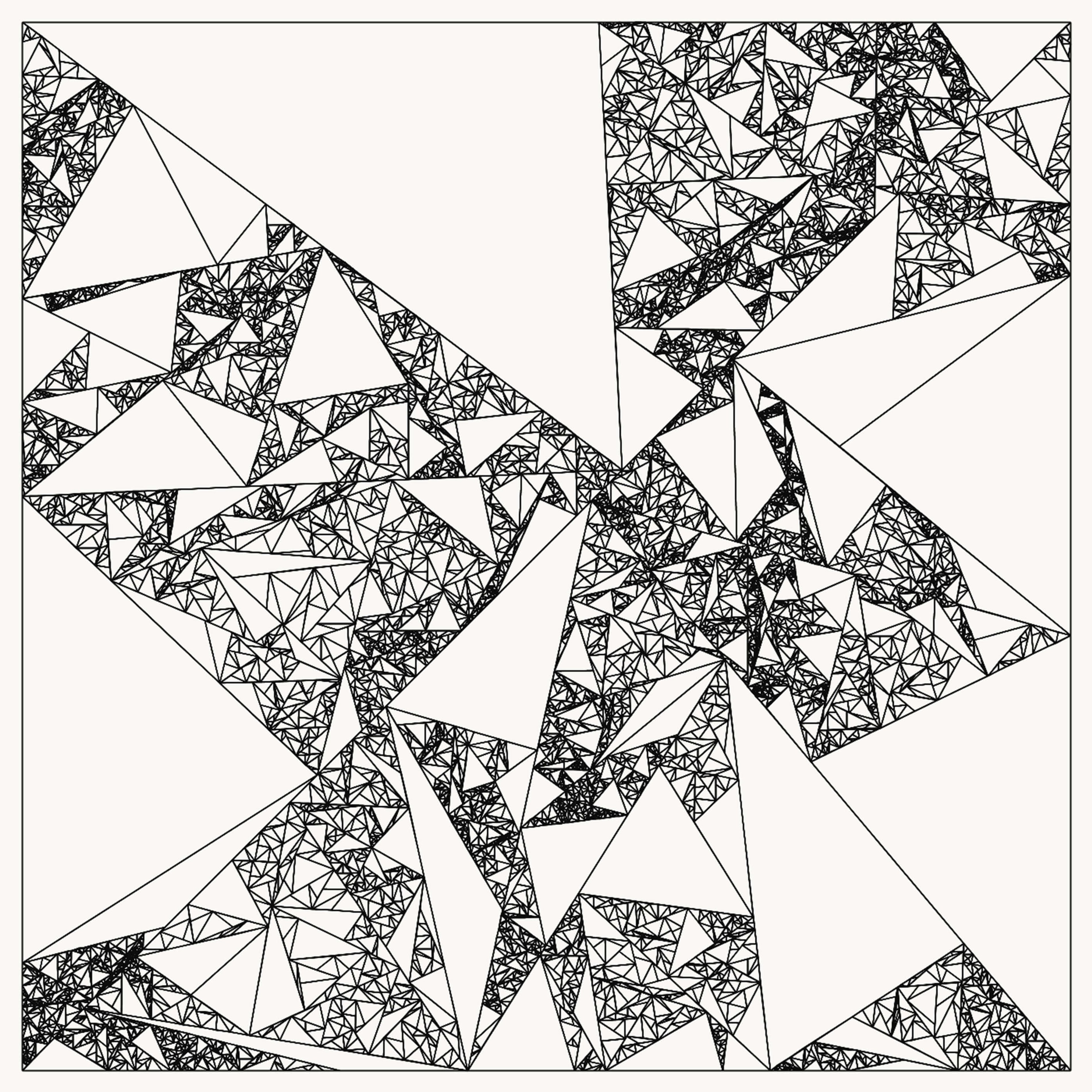
The simplest approach is to utilize a random number generator in the recursive function to determine if the base case has been hit. In other words, if we should stop subdividing. You can do a simple biased coin flip to determine if you should continue:
(if (or (odds 0.1)
    (>= depth 14))
  ; avoid resource exhaustion with a reasonable max
  ; stop the recursion
  [curves]
  ; continue with recursion
  (do
    ...))
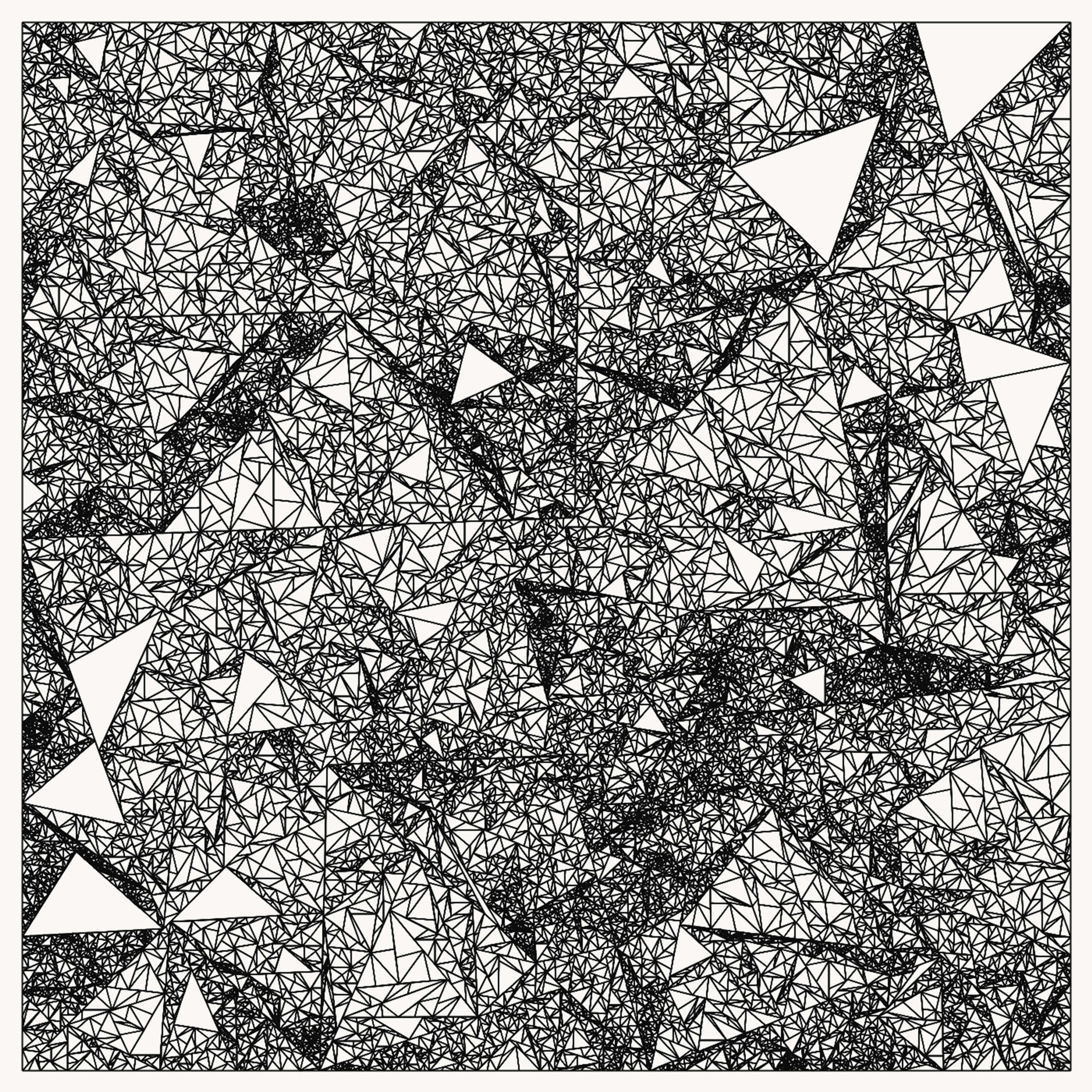
This can be easily adjusted to make the image more dense by changing the stopping odds to 0.01:
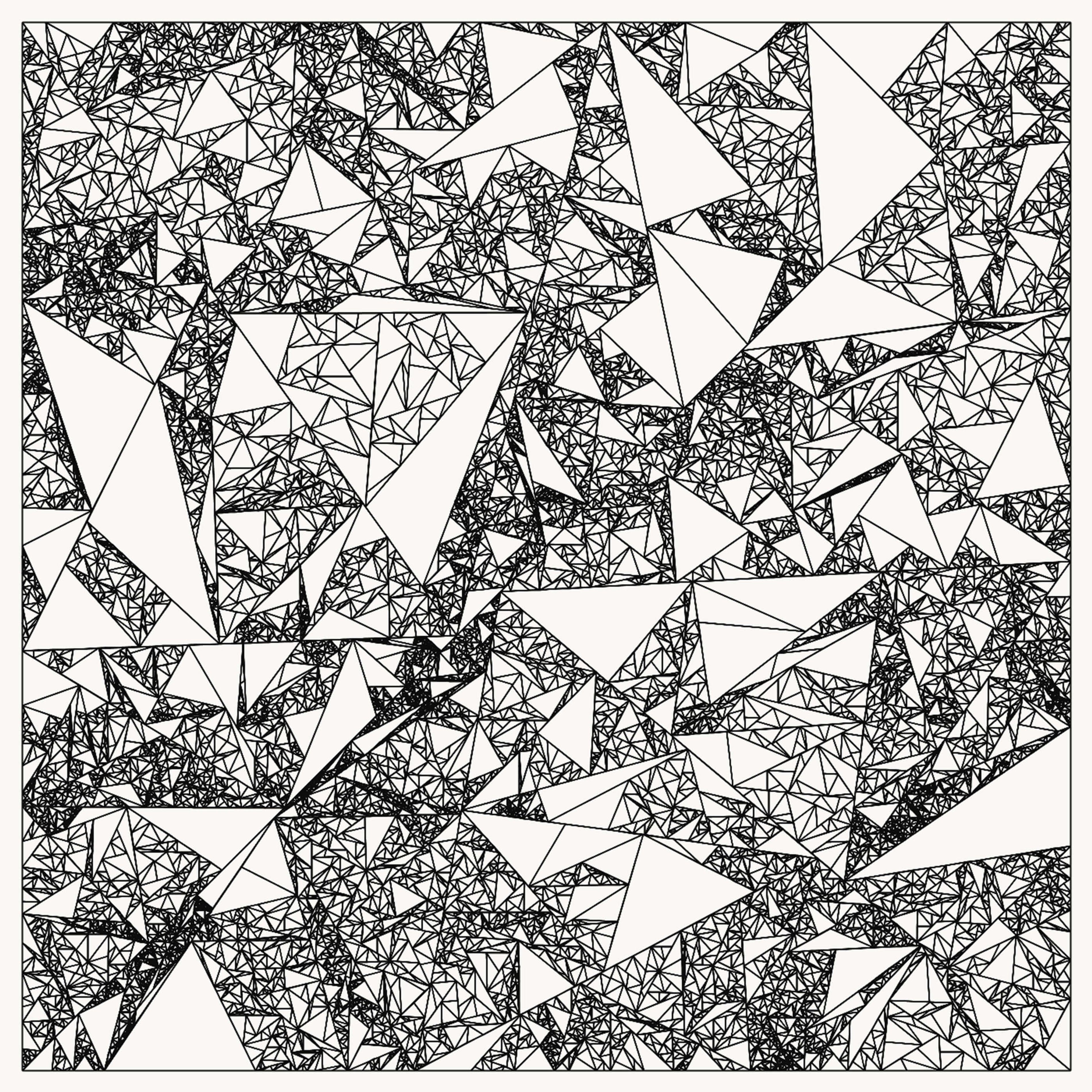
Or, you can make it more likely to stop as the depth increases:
(if (or (odds (rescale depth 0 14 0.0 0.07))
        (>= depth 14))
  ...)
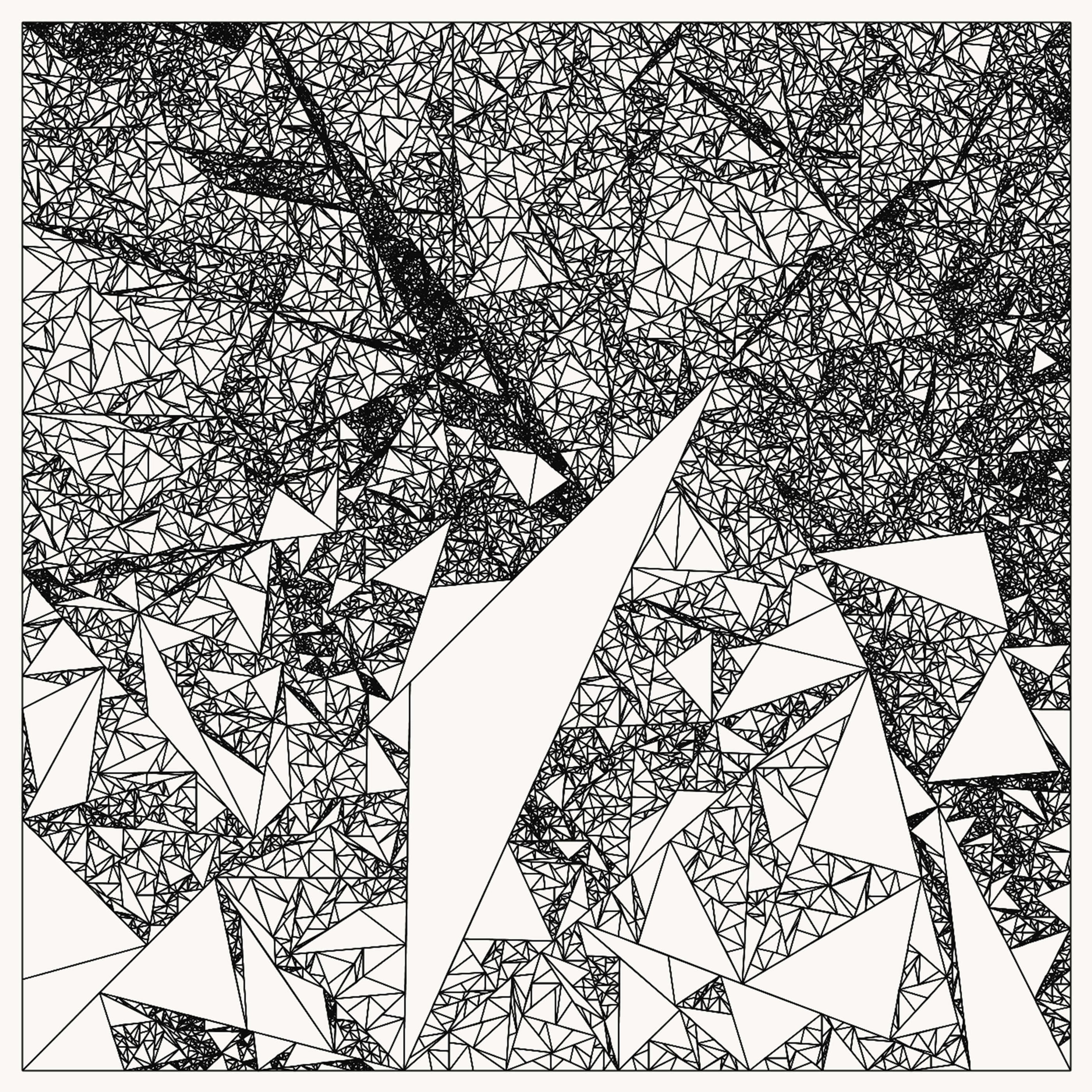
You can also make the depth dependent on some other factor, such as the y-axis position of the center of the triangle:
(if (or (odds (max 0 (rescale avg-y 0 (h) -0.05 0.12)))
        (>= depth 14))
  ...)
Inherited Depth
I often like my images to have "big" shapes or areas in them that share a quality, like being dark or light, dense or sparse. One way to encourage that with triangle subdivision is to set an approximate termination depth early on, while we're still dealing with fairly large triangles.
Here's a super naive approach where we set a random termination depth once we're on the third round of recursion:
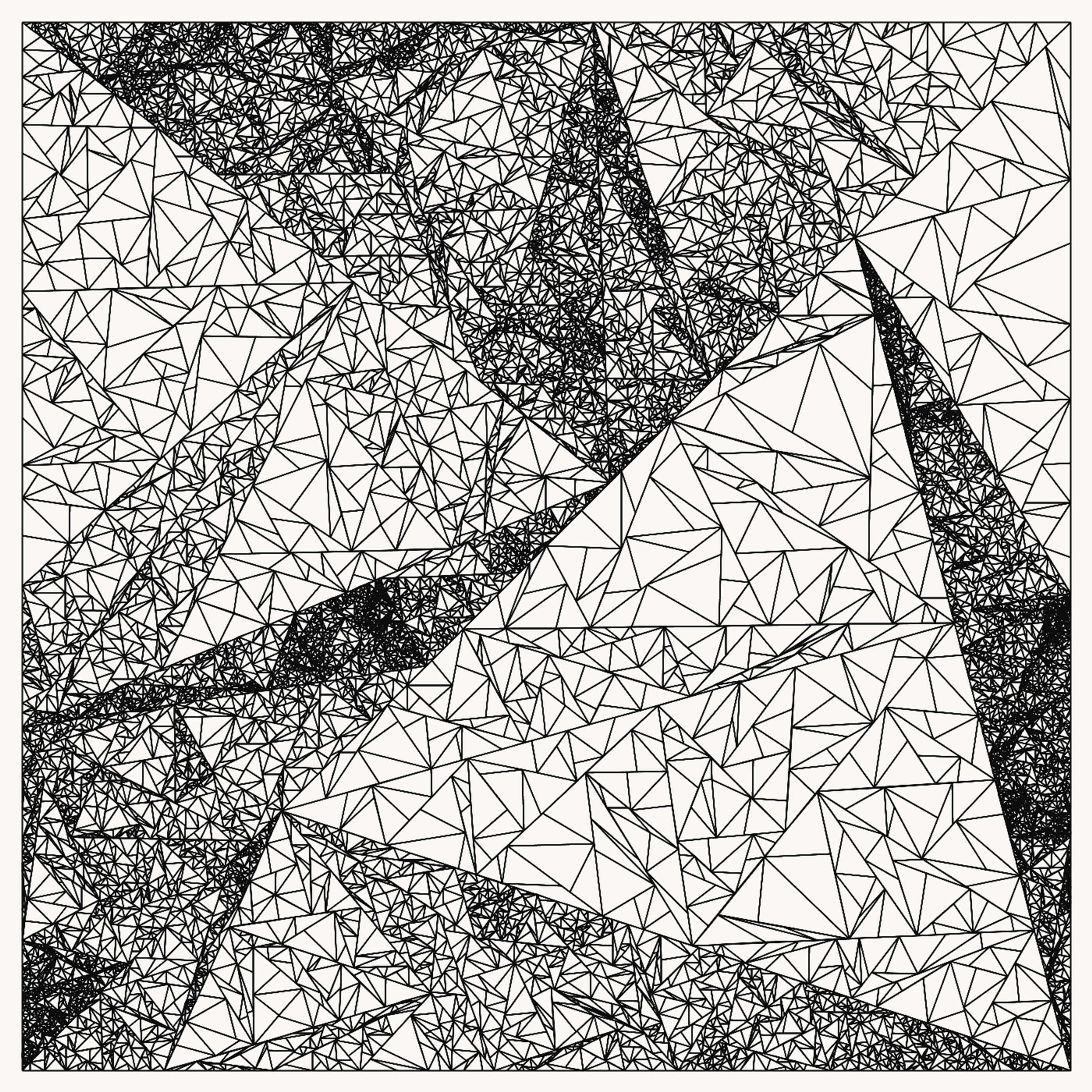
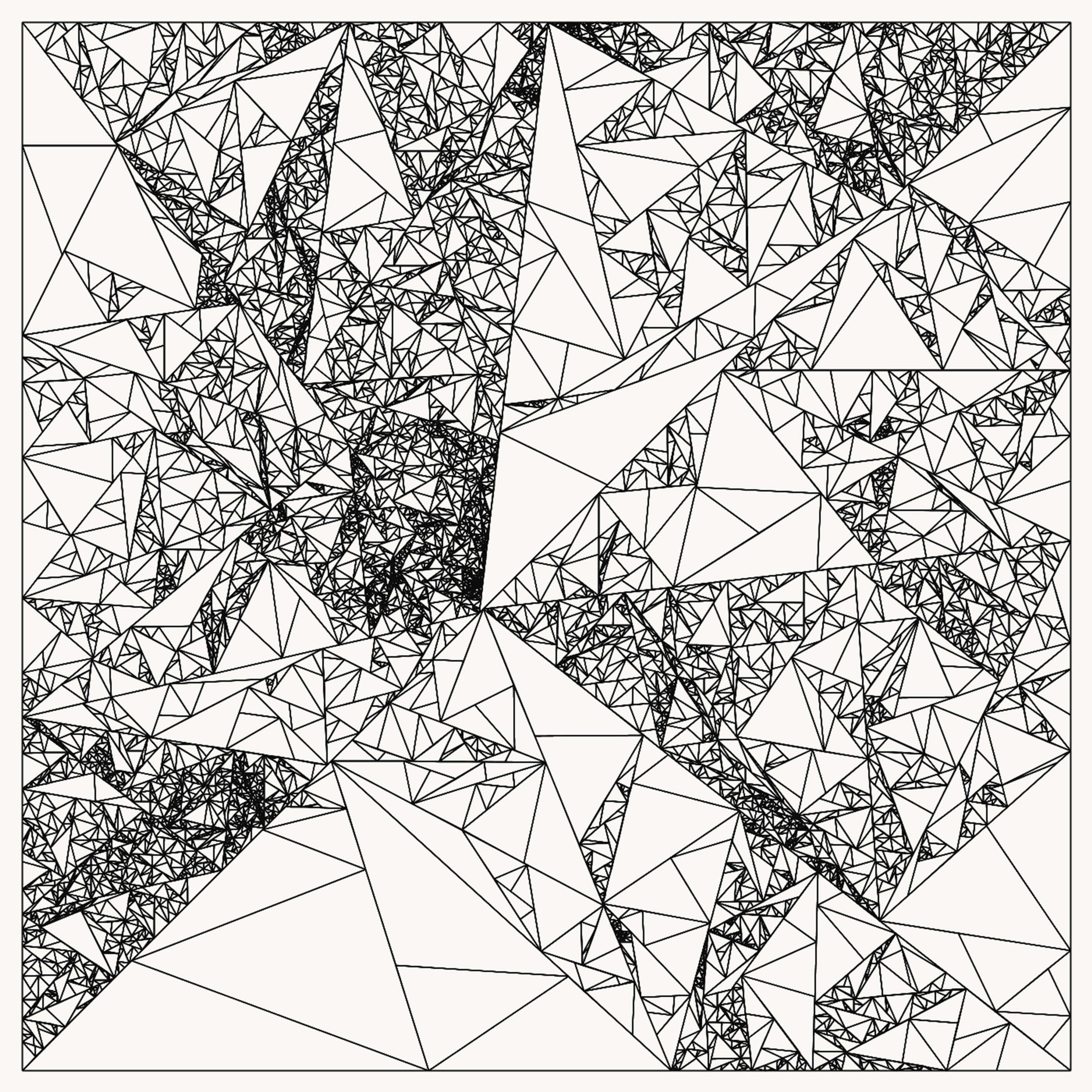
You can introduce more nuance by doing a slightly more complicated version of this. In the first three rounds, allow the termination depth to be randomly reset, similar to the previous technique. However, children are free to adjust their termination depth by one (going one deeper or one shallower than the parent), with decreasing probability of this happening as we reach greater depths (smaller triangles).
Here's what that might look like:
Bonus: Replacing Lines With Curves
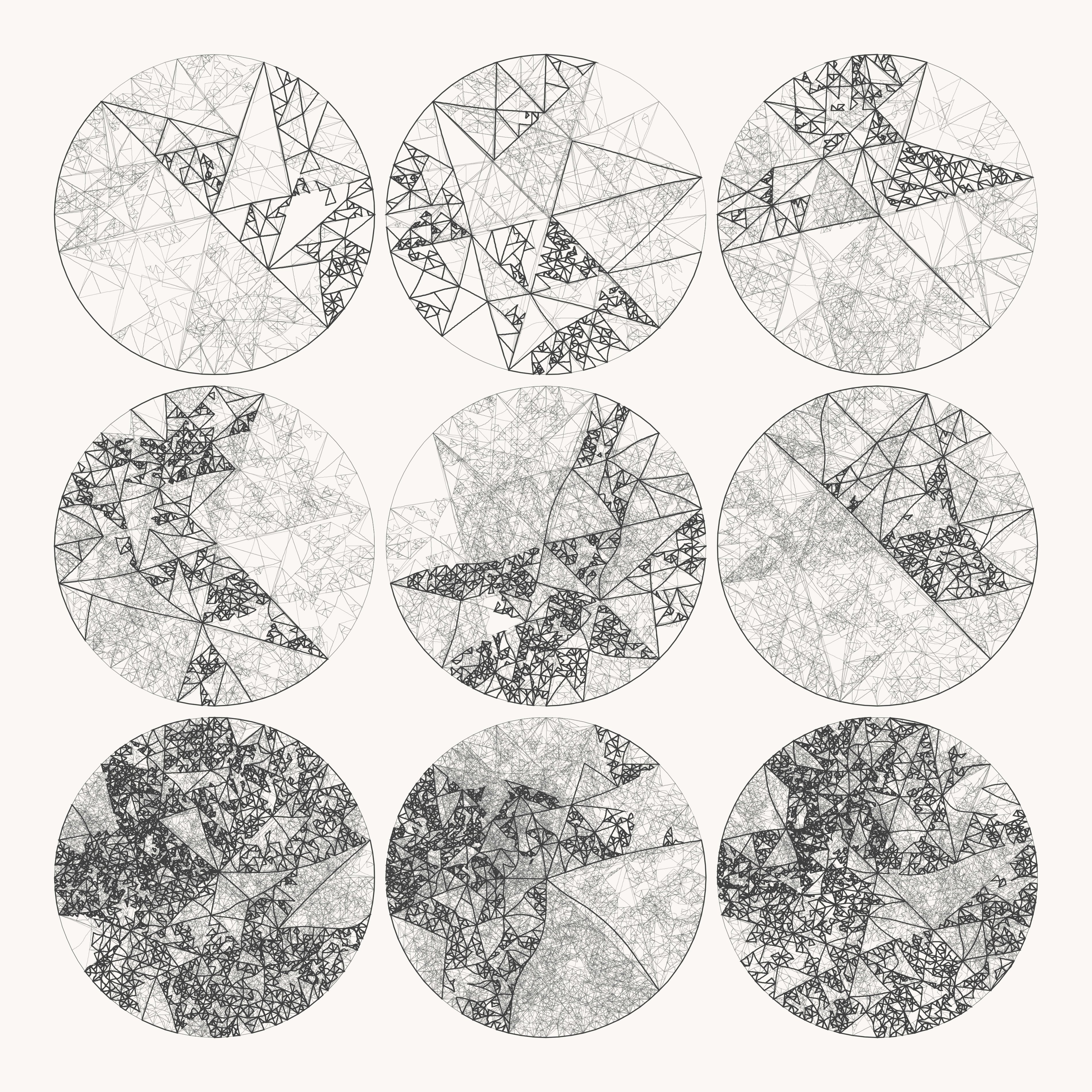
Things get fun when we relax our definition of "triangle". Instead of always using straight lines for the sides of triangles, you can use multi-segment curves. Instead of splitting lines, you can split the curve at a segment end that approximates the value of t.
For fun, I defined my starting "triangles" to have curves that matched the perimeter of a circle. Each side of the "triangle" spans 1/3rd of the circle. When combined with the inherited depth method above (and some extra effects for good measure), the result looks like this:
You can also warp the curves. I tried applying gaussian noise to one or two points in the middle of each line, and then running the result through a Chaikin-curve algorithm to smooth it out. This produces a very interesting texture when the recursion depth is high. I used this technique to produce Voyage:
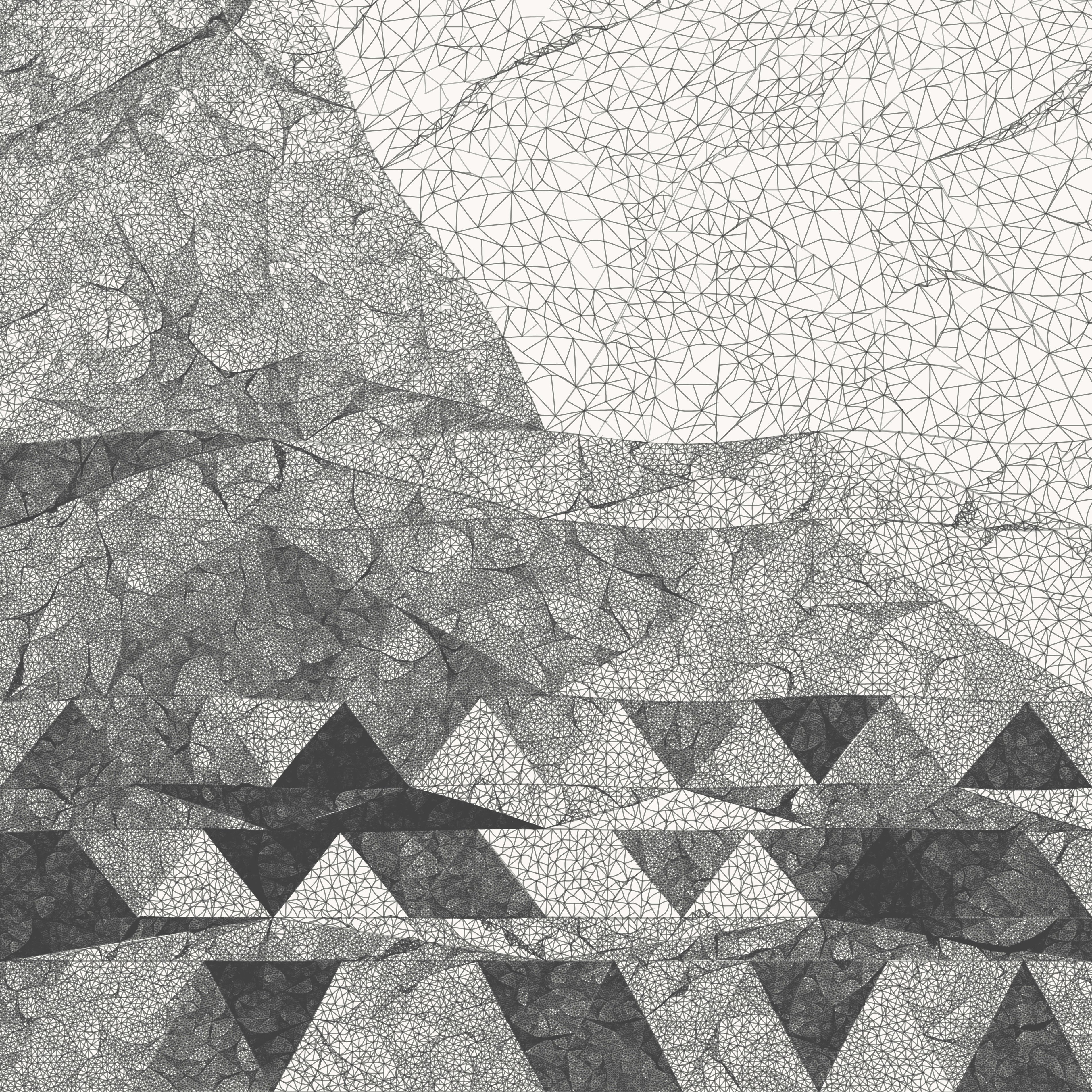
Voyage, 2017
–
EDIT: Anthony DePasquale created a super slick interactive version of this algorithm that allows you to play with all of the parameters. Try it out and generate your own images without writing any code.
–
From time to time, I write about my thoughts and artistic process. If you'd like to be notified the next time I publish an essay, sign up for my newsletter in the menu.